Photoshop Pictures: Zone


results 1 - 4 of 4

Entering Another Dimension - created by pearlie


Entering Another Dimension
Favs: 2SBS: 1Hi-resRank: 14/37Score: 63.7% (0)10276 views

Rod Serling was a multi-talented man and a good writer. His television series "The Twilight Zone" ran for five seasons in the early 1960s and was extraordinary. Over the years, there were several introductions narrated by Serling. Here is one: You're traveling through another dimension — a dimension not only of sight and sound but of mind. A journey into a wondrous land whose boundaries are that of imagination. That's a signpost up ahead – your next stop: the Twilight Zone!

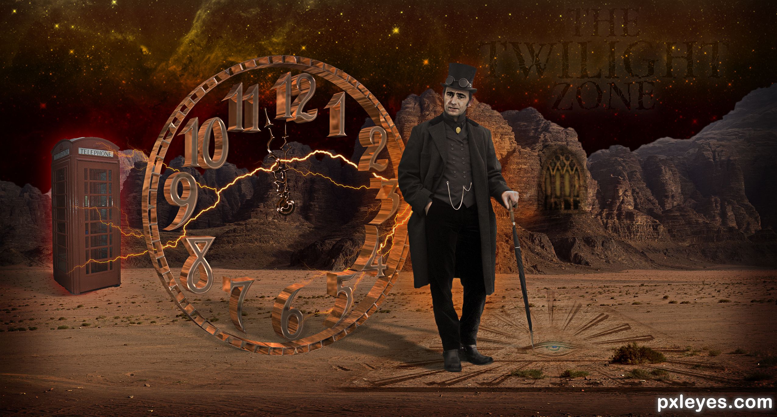
I loved watching these shows and others like Night Gallery that Rod Serling did, love time travel stuff, and steampunk. So, Rod had to be a Victorian gentleman in this interpretation of traveling through time – literally. Source image was the clock, a black and white flat image, converted to a 3D brass version here. This was the winner in a weekly contest! (5 years and 1318 days ago)

avatar George55
George55 says:

I like this a lot. Your images were placed in the right place. I like to see the Twilight Zone in the right corner.

avatar Drivenslush

That opening of the show always meant I had to go to bed, hehehe, now that I watch that show as an adult, I can see why my parents didn't want me to see it as a kid.. hehehe.. I don't think it would be possible for me to be more screwed up.. giggle snort Great Job author

avatar CorneliaMladenova

This is enchanting

Howdie stranger!
If you want to rate this picture or participate in this contest, just:

LOGIN HERE or REGISTER FOR FREE


Conflict zone - created by genuine2009


Conflict zone
Favs: 6SBS: n/aHi-resRank: 3/37Score: 58.5% (49)12536 views

Credit:
http://jademacalla.deviantart.com
(5 years and 3042 days ago)

1 Source:

avatar Toothpick134

A really great image! I feel the danger..

avatar lolu
lolu says:

Amazing ! So realistic you make this picture live...You create a story in it, you give the pics a soul. Bravo Good luck author

avatar baumillerkyle

Great pic.. I like the green tint. Goes very well with the soldiers.

avatar MoNophian
MoNophian says:

Gripping Condition...Keep watch,there enemies everywhere..And beware for mines...
Very very GOOD Story...

avatar greymval
greymval says:

Great blend! The only thing that i don't like is that all 3 soldiers look the same ( flipping doesn't count).
You could search for other backheads, paint backpack, apply gasmask, helmets etc.
Since you're lvl 15+, blending shouldn't take you long, so no reason for lazyness :P.

avatar MnMCarta
MnMCarta says:

Striking image!

avatar pingenvy
pingenvy says:

Nice chop, but I agree with greymval. I would use different guys in the background, as that was the first thing I noticed.

avatar layerstack

Have to agree, different guys needed. But still a great piece of work

avatar jawshoewhah
jawshoewhah [banned] says:

I honestly didn't even notice that the guys were all the same until someone pointed it out but overall it's an impressive blend so GL!

avatar Siddhartha

Very impressive....looks like a call of duty c.d cover :P....but i agree with everyone else that u shud hv used different guys....

author says:

like an ideea!... Why should I use another guy,,,or soldier????...I want to know your opinion....not only as mere opinion...maybe even learn something....?!?!!!??

avatar CrystleClear

i se a lot of emotion, this is fabulous

avatar greymval
greymval says:

"Why should I use another guy,,,or soldier?"

This way it will look like a platoon is advancing through enemy territory and it would make the image more realistic, cause right now most of the people can see it's the same guy pasted 3 times.
It will also mean you worked harder and bring you higher votes - but that's secondary.
As i said you can use the same guy, just change head, backpack, apply gasmask, helmets, etc.
Unfortunately the contest is over, so in case you modify your entry, just post it in your albulms, cause that would be really cool.

avatar erikuri
erikuri says:

Congratulations!

author says:

thx all...for your comm and tips!....

no avatar

congrats ...

avatar hereisanoop

Congrtats.. very nice

avatar spaceranger

Congrats!!

Howdie stranger!
If you want to rate this picture or participate in this contest, just:

LOGIN HERE or REGISTER FOR FREE


Tow Zone - created by junkieball


Tow Zone
Favs: 0SBS: n/aHi-resRank: 7/37Score: 51.4% (5)5840 views

I took the image of the truck and place the traffic sign into the image.

From here i used the free transform tool to adjust the perspective. (5 years and 3061 days ago)

2 Sources:

avatar robvdn
robvdn says:

Funny idea but the perspective on the sign is to strong compared to the car, you might want to correct this.

avatar jawshoewhah
jawshoewhah [banned] says:

I would have to agree.

author says:

Thanks for the comments will try to look at that tomorrow.

avatar erathion
erathion says:

U could get rid of some part of the high way...then the sign and the truck would be in the focus...GL author

avatar jawshoewhah
jawshoewhah [banned] says:

Why not just crop closer to the back of the truck and make the sign it's actual size?

author says:

I kept the image as per the orginal source as the resolution of the truck was quite low. I had to increase the image size by 100 percent as it stands now. I was concerned i'd lose to much image quality on the truck by cropping it.

Howdie stranger!
If you want to rate this picture or participate in this contest, just:

LOGIN HERE or REGISTER FOR FREE


Dead Zone - created by XphotoshoperrX


Dead Zone
Favs: 0SBS: n/aHi-resRank: 29/37Score: 50.6% (0)6732 views

(5 years and 3612 days ago)

3 Sources:

avatar tapiona
tapiona says:

good luck, maybe make blood red?

avatar gitsadr
gitsadr says:

im feeling very good today gl

author says:

i made the blood blue cuz i whant somthing new diferint

avatar Mike
Mike says:

you could have made the backgrounds brighter so the blue blood pop out more... GL

avatar Lelaina
Lelaina says:

Looks like ink. I like the blue

avatar Akassa
Akassa says:

I would remove the text if i was you, nice idea.

avatar RGB
RGB says:

i think this chop is from the old PST Good luck!

avatar ReapRevenge
ReapRevenge [banned] says:

Nice !!!!!

avatar fille
fille says:

scary teeth! good luck!

avatar Lodd
Lodd says:

i think it needs a stronger shadow to stand out more. And the letters needs to look more painted.

no avatar
TJ says:

Nice image.

avatar mellowdesign

I'm not getting the blue blood thing or the text on the wall. Work on your shadows also, the sword shadow would be further away and the skull would only really have shadow under. Also, brighten your bricks up - at the mo they have a 'blue' tinge. Good luck.

avatar CSevrip
CSevrip says:

blue blood

avatar CSevrip
CSevrip says:

blue blood

avatar animmax
animmax says:

Another back from the dead.. GL.

avatar George55
George55 says:

nice entry

avatar wazowski
wazowski says:

Not bad, but maybe bit confusing image. The sword is hanging? Or how is it dripping blood otherwise? As said above, you may want to remove the text. Otherwise integrate it more with the wall by using a displacement map and/or blending mode with some highlight. Good luck!

avatar loopyluv
loopyluv says:

Blood=Red! GL

avatar chakra1985

very nice

avatar nasirkhan
nasirkhan says:

nice work

avatar Ory
Ory says:

I like it, as other have said tho, it would be better without the text

avatar CrAzYChelie

Very nice chop!! Good luck!

avatar gopankarichal

good, can avoid blood

avatar genuine2009

gl

avatar OliviasArts

lol @ the teeth.

Howdie stranger!
If you want to rate this picture or participate in this contest, just:

LOGIN HERE or REGISTER FOR FREE