Photoshop Pictures: Logo


results 1 - 5 of 87

Entry number 97488 - created by Fabiociolli


Entry number 97488
Favs: 0SBS: n/aHi-resRank: 4/15Score: 58.1% (20)13243 views

only source:

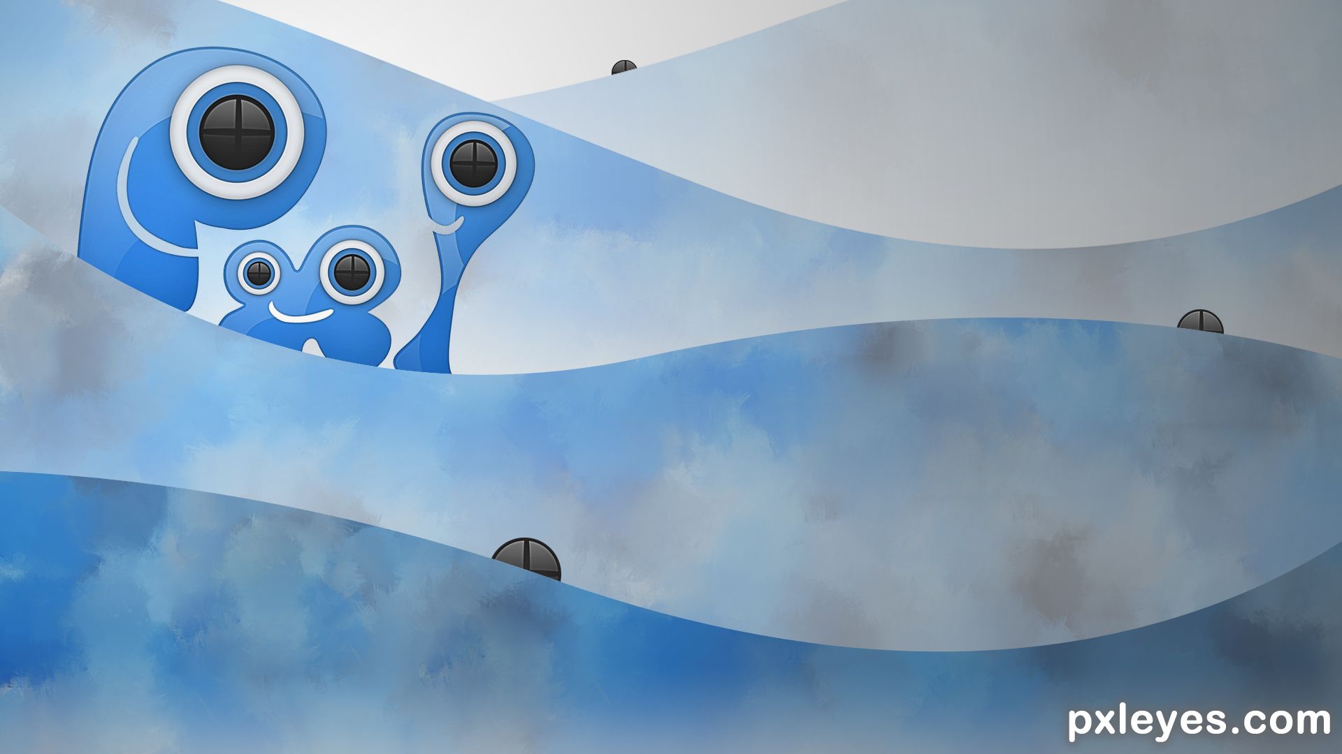
-i start making a copy of PXL logo, scaled by 20% untill background was filled with copies of that one, then merge all copies in one layer.

-create a new personal "smudge brush" with a preset grungy brush

-smudge in the way you like to have a unique solid background. This is my blue texture.

-play with pen tool to create some simple wave shape. copy and paste every layer and create a similar landscape things adding more white or "light" each time

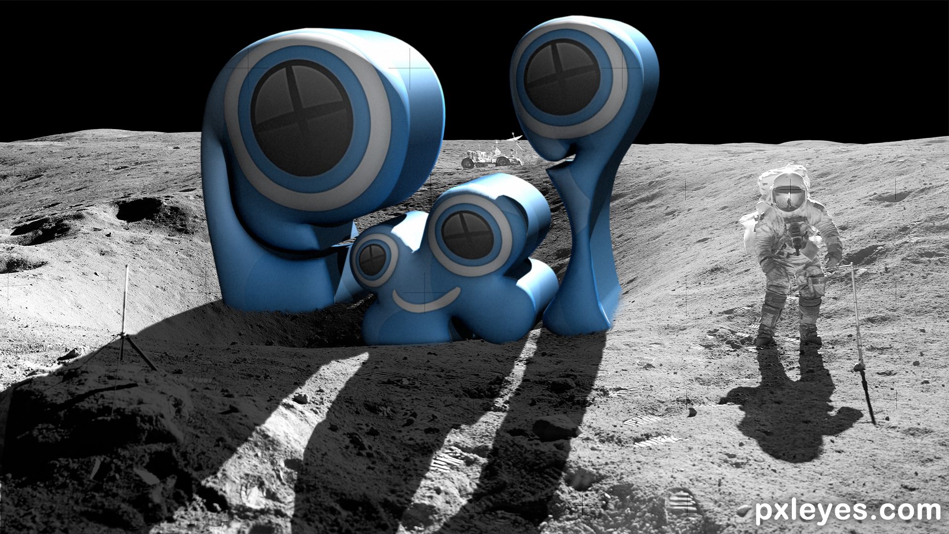
-copy and paste the "logo eyes" and put some in back wave. (5 years and 967 days ago)

avatar Drivenslush

Peek a BOO! hehehe.. really neat author.. good luck

no avatar

Fourth place , well done .. congrats

avatar Drivenslush

Congrats on 4th.. well done

Howdie stranger!
If you want to rate this picture or participate in this contest, just:

LOGIN HERE or REGISTER FOR FREE


PXLEYES Out of this World - created by rturnbow


PXLEYES Out of this World
Favs: 1SBS: 6Hi-resRank: 1/15Score: 60.4% (35)12344 views

(5 years and 979 days ago)

1 Source:

avatar CMYK46
CMYK46 says:

The shadow should conform to the irregularities of the moon surface. Look at the astronaut's shadow.

author says:

Agree, fixed.

(5 years and 979 days ago)


avatar Drivenslush

JUST AWESOME, though darkening the front of the astronaut would add to the feel (It's abstract I know). I would think his front would be as dramatic as the front of the Logo.. but that's just me... I love lovE loVE lOVE LOVE this!!!

author says:

So, about that. the reason I even added a second light source on the logo is it was WAY too dark without it. IMHO, the white Astronaut suit would indeed look lighter against the blue logo color. That's why I didn't change it. Thanks oh Slushy one!

(5 years and 978 days ago)


Slushy one? I don't do that anymore. I got tired of waking up on a futon in a room full of strangers.. giggle snort

(5 years and 974 days ago)


avatar robvdn
robvdn says:

LOL it's like the original moon photo's: either the lightning is wrong or the shadows should be different... I bet the PXL logo is fake as well, you must be part of some conspiracy theory author

author says:

I want to believe...

(5 years and 978 days ago)


avatar Ravindrav7

We can not change the Logo anymore... Have to put the original logo besides you have added.

author says:

huh?

(5 years and 964 days ago)


no avatar

CONGRATS another placement with a wonderful entry

author says:

Thanks Scrat!

(5 years and 964 days ago)


avatar madamemonty

Congrats Randy

author says:

Thank you!

(5 years and 964 days ago)


avatar Drivenslush

Congrats waka waka

author says:

Lol, yep...

(5 years and 963 days ago)


avatar George55
George55 says:

Congrats....

author says:

Thank you!

(5 years and 963 days ago)


avatar oana
oana says:

Congrats!

author says:

Thanks Oana!

(5 years and 963 days ago)


avatar filantrop
filantrop says:

Congrats!

author says:

Appreciated!

(5 years and 963 days ago)


avatar spaceranger

Congrats Randy!!

author says:

Thanks sir!

(5 years and 961 days ago)


Howdie stranger!
If you want to rate this picture or participate in this contest, just:

LOGIN HERE or REGISTER FOR FREE


Quake | Creating Islands since 2.000.000 BC - created by Miix


Quake | Creating Islands since 2.000.000 BC
Favs: 0SBS: 4Hi-resRank: 2/15Score: 67.1% (33)9535 views

After hearing the news about a new pakistanian? island off shore, i decided to privatize earthquakes. (5 years and 2039 days ago)

author says:

And of course i didn't think about the palm in Dubai..
With this company the production method is different, so it is still a non-existent business.

avatar CMYK46
CMYK46 says:

The island photo isn't a usable source. Please read http://www.pxleyes.com/blog/2009/06/how-and-where-to-find-legal-source-images/
The logo is good but I'd make it bigger.

author says:

Thanks, deleted the background!

(5 years and 2038 days ago)


avatar Drivenslush

neat thinking.. good luck

avatar red
red says:

congrats

avatar IDt8r
IDt8r says:

Congrats!

Howdie stranger!
If you want to rate this picture or participate in this contest, just:

LOGIN HERE or REGISTER FOR FREE


Staples - created by rturnbow


Staples
Favs: 1SBS: 1Hi-resRank: 1/15Score: 66.8% (37)16313 views

(5 years and 2105 days ago)

no avatar

Very good. Clean, simple and to the point. The integration of the paperclip design is a great touch.

author says:

Thanks, appreciate it!

(5 years and 2104 days ago)


avatar CMYK46
CMYK46 says:

Good idea & execution.

avatar George55
George55 says:

Good job! I like the change.

author says:

Thanks!

(5 years and 2100 days ago)


avatar cgartist
cgartist says:

Good job ...keep It up..

author says:

Thanks!

(5 years and 2098 days ago)


avatar spaceranger

Your design is elegant and easily recognizable, both important qualities of a good logo!!

author says:

Appreciate it!

(5 years and 2098 days ago)


no avatar

Congratulations......

author says:

Thank you!

(5 years and 2098 days ago)


avatar spaceranger

Congrats Randy!!

author says:

Thanks Rein!

(5 years and 2098 days ago)


Howdie stranger!
If you want to rate this picture or participate in this contest, just:

LOGIN HERE or REGISTER FOR FREE


Oreos - created by magicalfruittuts


Oreos
Favs: 1SBS: 14Hi-resRank: 3/15Score: 61.9% (25)12927 views

(5 years and 2105 days ago)

2 Sources:

avatar DanLundberg

The background ellipse is not working for me. The different spacing between each letter is also disturbing.

I do like the cookie-letter idea, however. Maybe a more-compact logo with overlapping letters on varying baselines would be more compelling.

author says:

Thanks for the input. I missed the letter spacing entirely, guess I couldn't see the forest for the trees. The background elipse was meant to roughly indicate a plate. The real Oreo logo uses the overlapping letters on varying baseline, so I don't want to make this too close to the real thing according to the contest theme.
Anyway a thoughtful comment by you. You do sound like you know your logo design. I reposted the picture with corrections to the letter spacing. Thanks

(5 years and 2105 days ago)


avatar UglyBOB
UglyBOB says:

The R is not easy to read... Looks like a mushroom.
But they all do look delicious!

avatar spaceranger

Congrats!!

author says:

thanks

(5 years and 2098 days ago)


Howdie stranger!
If you want to rate this picture or participate in this contest, just:

LOGIN HERE or REGISTER FOR FREE