
VRay and 3ds max. Simple 3d modelling using polygons, and flat reflective materials. Used blurry reflections. 3*Vray lights and 1*Direct light. (5 years and 3605 days ago)
Logo Nr.5!
Hehe okay now... this is the last logo! :)
_________________________________________________________
Check this out! (5 years and 3605 days ago)
Nice idea, good luck 
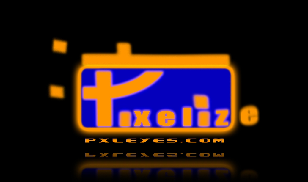
Mmm...it's a bit hard to read. Also, it's up to the viewer how to interpret PXLEyes, so I wouldnt write it there like "pixelize" already. Good luck!
Looks very low res...and almost as if trying too hard...
Looks very low res...and almost as if trying too hard...
Looks very low res...and almost as if trying too hard...
gl
gonna be very hard to read once squished to size
Can't read P clearly...and E seems left out... lol... Good Luck!!
GL!
Howdie stranger!
If you want to rate this picture or participate in this contest, just:
LOGIN HERE or REGISTER FOR FREE

(5 years and 3605 days ago)
Nice idea, good luck
Not bad...
gl
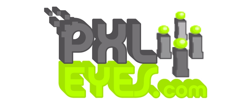
Spheres are a little pixelated, but other than that, it looks nice
I like the font use, have to get used to the colors...maybe aplay a bit more with that. Good luck!
Nice colors but the 2 blurred dots are hurting my eye...think they were better non-pixelated... Good Luck!!
Excellent concept and design
GL!
Howdie stranger!
If you want to rate this picture or participate in this contest, just:
LOGIN HERE or REGISTER FOR FREE
(5 years and 3605 days ago)
Nice idea, good luck
this has got a very 70s feel to it.. you need to sharpen the detail on the i's to work..they are really blurry, but the construction and composition of the piece is very good
to GolemAura, Thanks for your comments but the i's are supposed to be pixelated, maybe if I had not put as much it would have been better, Unfortunately I won't be able to change this piece before the deadline as it is on another computer. But retro 70's computer game was what I was going for (love retro) so am glad that someone has noticed that, thanks again for comments.
Too much going on for a logo...
gl
Nice typography, the green is a bit hard to read though. I agree with Golem, btw. The pixelated i's wont work in smaller version, maybe only in a way like it shouldnt supposed to work (like, irritation because it doesnt seem to look sharp). Good luck!
4 i's?? what the?? I like your P n the font used.. Good Luck!!
to nbaztec, the 4 i's mean pixeleyes as in plural & are supposed to represent a community but if you didn't get that then I guess my logo didn't really work.
those greens will burn a hole in my monitor ))))
Nice P ! 
Howdie stranger!
If you want to rate this picture or participate in this contest, just:
LOGIN HERE or REGISTER FOR FREE

acrylic logo (5 years and 3606 days ago)
OMG..this is so cute... good job... and good luck
simpe and nice
Nice idea good luck!
look nice
good one 
good luck..looks nice...
nice idea!! G/L
Thats cool.
If I came upon this cold, I would think the Web site is merely "eyes.com" and would wonder what the capital P, lambda, capital L sequence means.
cool one!
Try and stay away from blue/orange - very dated. Also, not sure of the purpose of the 'grapes' - from a branding point of view this isn't working yet.
gl ...good
very nice, and good colour choices
THis has something, certainly not bad. I guess it depends a bit on the background what color the dots will be (right now the yellow doesnt work with white). But pretty clean result (though Dan and mellow do have a point). Good luck!
Good!
Howdie stranger!
If you want to rate this picture or participate in this contest, just:
LOGIN HERE or REGISTER FOR FREE
Photography and photoshop contests
We are a community of people with
a passion for photography, graphics and art in general.
Every day new photoshop
and photography contests are posted to compete in. We also have one weekly drawing contest
and one weekly 3D contest!
Participation is 100% free!
Just
register and get
started!
Good luck!
© 2015 Pxleyes.com. All rights reserved.


Interesting idea but the yellow/text doesn't work...
Thats pretty rad.
gl
Mellow's been suffering from turrets all day LOL
Not sure about the color combination, in smaller version the url is barely visible anymore. Good luck!
X is closer to P than it is to L... Good Luck!!
GL!
Howdie stranger!
If you want to rate this picture or participate in this contest, just:
LOGIN HERE or REGISTER FOR FREE