photoshop only (5 years and 3604 days ago)
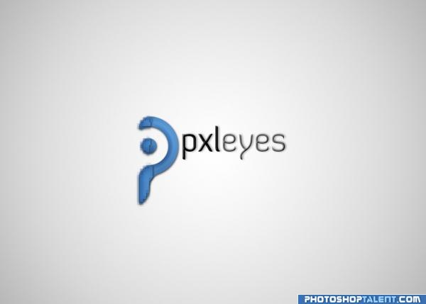
My logo design for PST's new website... i re-uploaded it with a smaller logo as i was suggested. does it really look like an ear? i was going for something like a letter P crossed with an abstract eye... and the right side of the P is meant to have a pixelated effect as Pxleyes also sounds like pixelize (5 years and 3604 days ago)
i really like the font you used, try to reduce the size of the emblem though, it's quite big compared to the logotype... nice idea  good luck
What Mike said and try to warp the big P a bit more.. it looks like an Ear.. though It could be the fact I've been looking at so many EYES in this contest that my mind immediately leaped to EAR when I saw your piece...very cool Idea.. good Luck
it's cool
Get glasses.
it looks kinda pixely, got a better version? Sure hope so because this is one of the better logo's in the contest
great ! GL
I agree with robvdn
Good Luck
yes it´s good idea the p with eye but u still hve to work on that try 2 take the blurr out of the p. g.l
I really like the simplicity of this but it's either too big, or not in the right place. Maybe try it in another colour than blue?
gl
I like the typo for pxleyes. I'd center the word with the cicrcle though (so a bit lower). And yes, I hope the P shape is not supposed to be pixeled, imo a smooth shape would work better. Good luck!
the blurry "P" takes the fun...  Good Luck!!
Funny P ! 
Howdie stranger!
If you want to rate this picture or participate in this contest, just:
LOGIN HERE or REGISTER FOR FREE

(5 years and 3604 days ago)
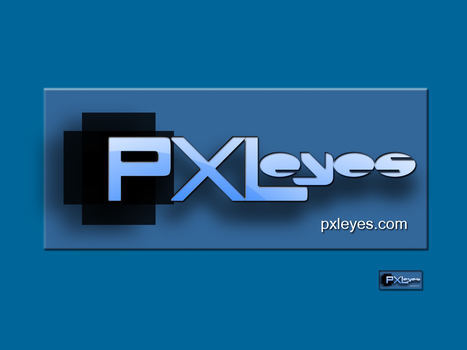
Excellent... the retention of proportions is always a solid choice... good luck
very simple yet with impact
Nice idea good luck!
It looks like the website is just "eyes.com"
Not very exciting imho and too like the current one. This is your chance to get creative!
gl
Simple n Serene... Good Luck!!
Great!
Howdie stranger!
If you want to rate this picture or participate in this contest, just:
LOGIN HERE or REGISTER FOR FREE
simple pxl logo (5 years and 3604 days ago)
Nice floating effect.. very different
cool type
Nice idea good luck!
I cannot read the smaller logo.
I think this is trying too hard...font isn't working
gl
looks like an arrow not a y ??
Not bad, but the smaller version (in high res) is hard to read, guess it's a combination of font type and size. The black pixel is a bit too big imo and asks too much attention. Good luck!
lolz "E"s look like Pacman...but nice use of colors.... Good Luck!!
Nice!
Howdie stranger!
If you want to rate this picture or participate in this contest, just:
LOGIN HERE or REGISTER FOR FREE
Just playing with gradients and warp...
I prefer to stick to a bluish hue and try a professional approach. I fashioned this logo to look like an eye even when shrunk to a teeny thumbnail. (5 years and 3604 days ago)
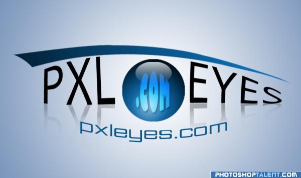
looks like a very stylized eye
not bad.. not bad... tough tough .. this is definately in the running.. good luck
wow! very cre8iv!!
Nice idea good luck!
interesting, but would be much better without .com in the ball imho 
Creative
Thats cool
To me, this looks too much like clipart and not very professional...the text is all over the place which doesn't help, tho I see what you're trying to get at...
gl
Nice colors. I see where you wanna go with the shape of the text, but I'm afraid it wont work positive for a clear image. Good luck!
Nice concept...could use a little work.. Good Luck!!
GL!
Howdie stranger!
If you want to rate this picture or participate in this contest, just:
LOGIN HERE or REGISTER FOR FREE
Photography and photoshop contests
We are a community of people with
a passion for photography, graphics and art in general.
Every day new photoshop
and photography contests are posted to compete in. We also have one weekly drawing contest
and one weekly 3D contest!
Participation is 100% free!
Just
register and get
started!
Good luck!
© 2015 Pxleyes.com. All rights reserved.


Nice idea good luck!
Thats cool
Nice -- straightforward and uncomplicated. I like it with the dark background better.
Not keen on the effects or the squashed text. Needs a lot of work.
gl
good work
Not bad. Quite much attention goes to eyes because of the yellow, maybe the yellow should come back somewhere else in the logo too. Good luck!
Nice one.. Good Luck!!
Nice one!
Howdie stranger!
If you want to rate this picture or participate in this contest, just:
LOGIN HERE or REGISTER FOR FREE