(5 years and 3148 days ago)
1 Source:
Used personal stash Image
on SBS (5 years and 3253 days ago)
Very eerie... good job.
good one!
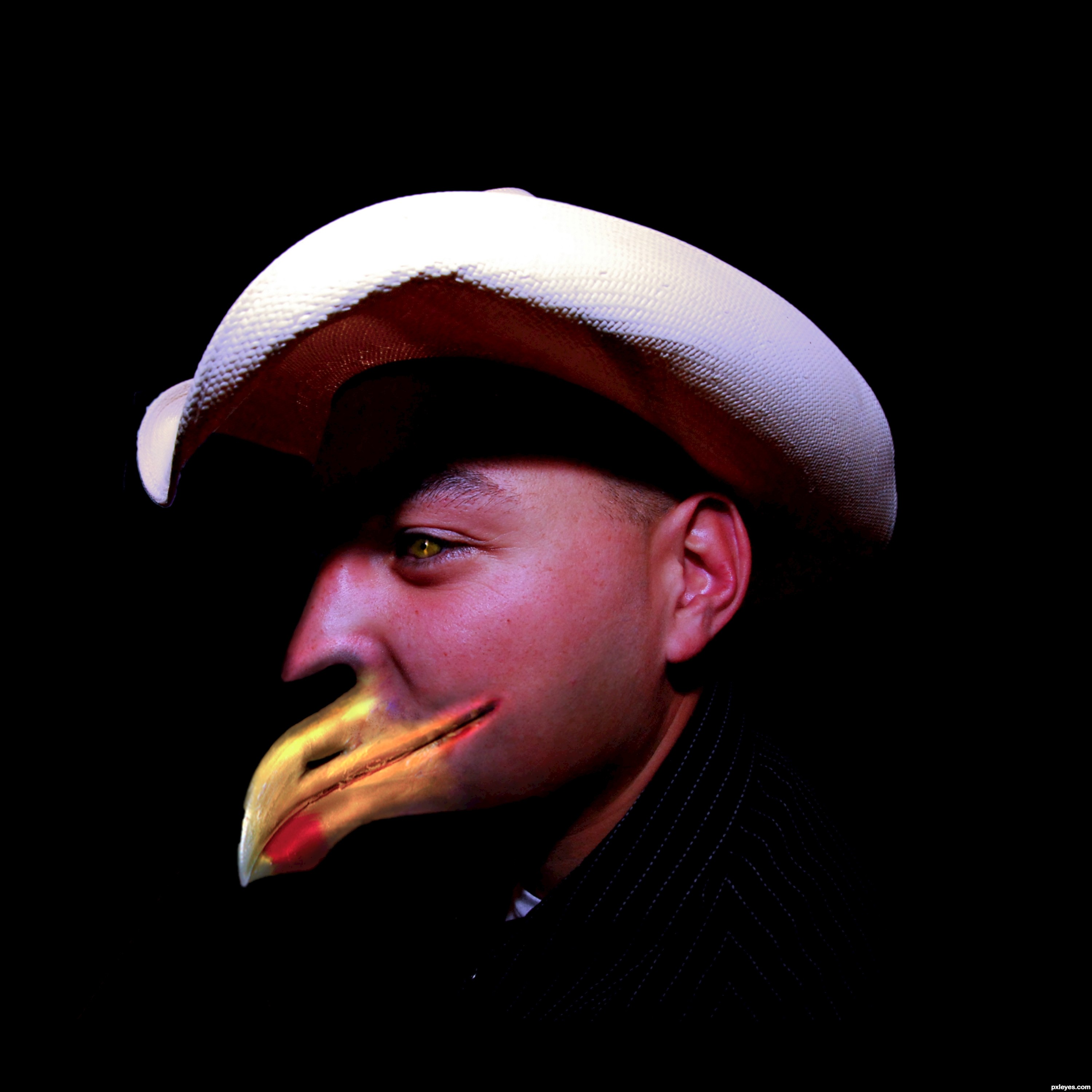
Creepy. I'm not familiar with this idiom, however, although I have heard people criticized for having a 'foul' mouth.
Your correct Dan, but this guy like's to curse at the birds for eating off
his berry bushes, sooooo he's a fowl mouth.
good luck
Howdie stranger!
If you want to rate this picture or participate in this contest, just:
LOGIN HERE or REGISTER FOR FREE
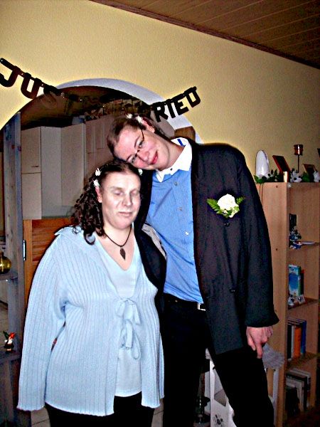
First wishing the couples a happy married life :)
@ the entry, Flipped the Faces. nothing more (5 years and 3269 days ago)
gud luck
 thanks author
I'm still happy, that we have the genders, we have 
Even though I look better as man, than Rob as woman
Thank you for this entry and for the congrats!
Good luck 

Well done author
Thank you again very much for this entry and the congrats, Vinshine!
Thanks so much for entering in this contest!
We've decided to make a photobook of all the entries as a memory!
Howdie stranger!
If you want to rate this picture or participate in this contest, just:
LOGIN HERE or REGISTER FOR FREE
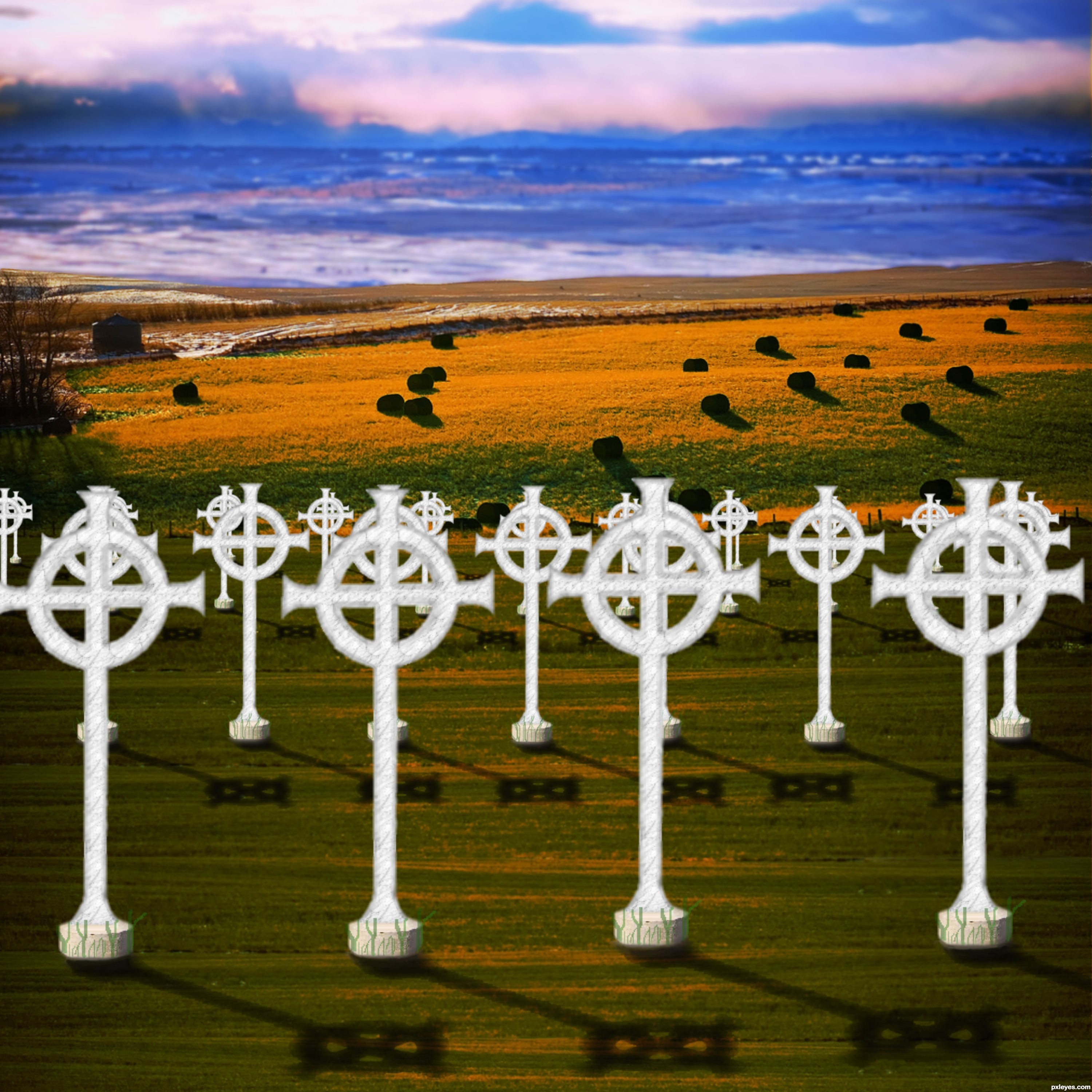
Spec Thanks to Thorinsise for use of this picture found on Flickr Photo Sharing and on thornisise photo stream.
(5 years and 3305 days ago)
place shadows under each cross, and try adjusting the brightness, the original source was a bit too bright.
Yes I agree too bright and a little shadow at the bottom of the crosses will help greatly. Also you could push the shorter grass onto the crosses just a bit to make it not float. Very easy fix for higher votes Good luck Author
Hay Thanks guys Thanks. How's this any better?
I think you should dim or fade the bluish background, maybe even som slight blur also.
better
Hey Thanks I darkened the blue a little more and added some blur to the blue what do you think?..if you look in sbs. the original flickr picture their day & night
This is a difficult background to work with. The view is looking down towards the lower far field with the foreground sloping away. However, you treated the foreground as flat [my eyes interpret the crosses as equal-sized and vertically true], but that's inconsistent with being able to see the tops of the hay bales in the far field. The light is from the upper left corner, so we should be looking at the shadowed side of the crosses and they should have long, strong shadows going south-southeast (like those of the hay bales). If the crosses are marking graves, they seem too close together. And then they don't seem to be organized in a cemetary-like grid (after adjusting for perspective, of course).
Crosses need some shadows...
lightings and shadows doesn't feel right. sky is too blue and dark and w/o any evidence where the light is coming from to cast such a strong shadow on the stones. like the others were saying, celtic crosses needed dark shadows too to match the stones'.
Ok Thanks I Here's a remake any better?
Better. The shadows need to be darker for more consistency with those in the background, need to be thicker (same width as the cross elements casting the shadow), and need to be skewed so the cross-piece's shadow is parallel to the cross piece. I still think having the top of each row noticeably lower than the top of the row in front of it would capture the falling away of the foreground for better linkage with the background.
Thanks for comments I have made some adjustments and added to sbs.
Much better, but you still need some work with the shadows. Blur them a bit with gaussian blur (not to much though) and then also maybe 80% opacity on them. I´d also think you should change the perspective, so that the shadows "leans" on the ground, I´m not sure how to explain that better, but if you look at a cemeteryphoto you might see how I mean. GL
I like the image, but the cross bars on the shadows need to run parallel ot the horizon just like the striations on the ground to make visual sense.
There you go!
fine work
Howdie stranger!
If you want to rate this picture or participate in this contest, just:
LOGIN HERE or REGISTER FOR FREE
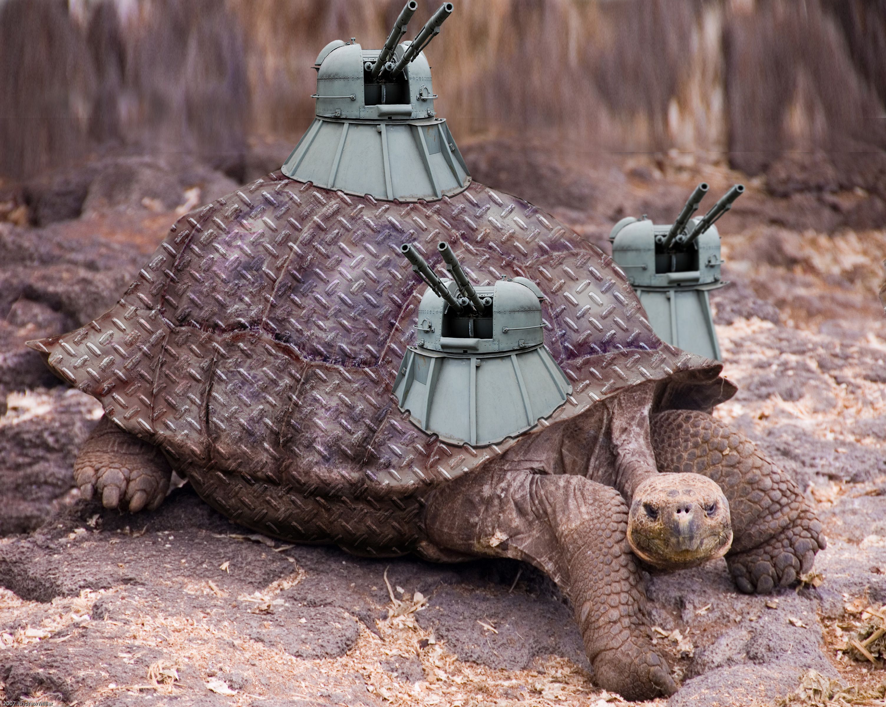
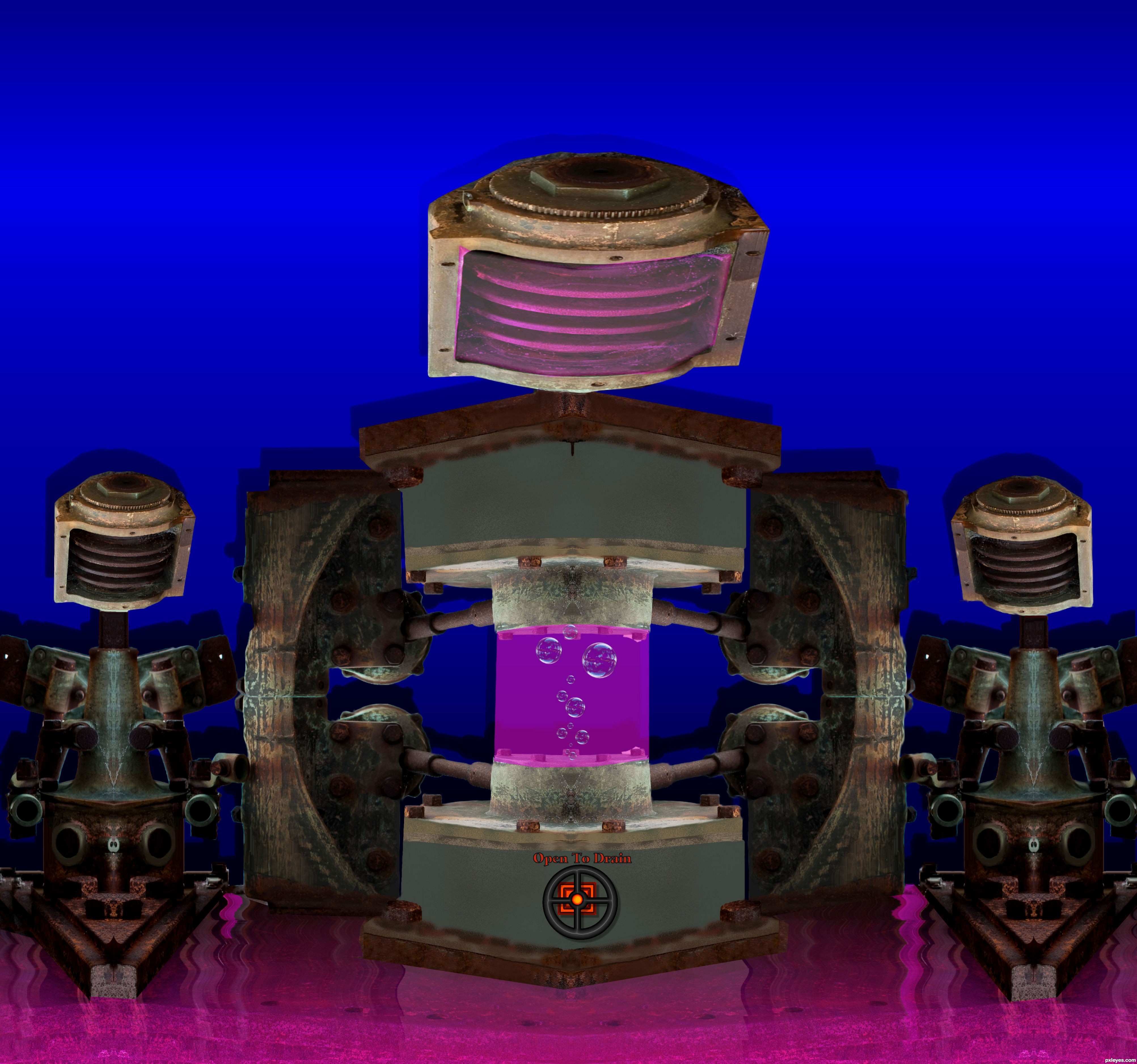
Thanks to hisks for the gun (Has been notified) and abmiller99 for the tortoise
source of Diamond plate is Alien skin plug in (5 years and 3324 days ago)
Nice job...also post the source for the metal texture, and good luck.
Oops, didn't look, sorry! Still like your pic...
nice work
cool texture you gave the shell, nice integration of the turrets.
Texture is perfect,but the nearest tower look a bit copy/pasted...try to fix that author,because this work have a lots of potential...gl
Image is quite ok, but I miss a certain roundness in the texture, that the texture is really wrapped around the shell. I understand you put a displacement map, but with that you dont cover the 3D look near the edges of the shell. Maybe you can use the transform tool or liquify to give the texture a more round feeling? GOod luck!
Agrees with Waz. If you iuse liquefy and push tool, you can push the outer edges in giving it more of a wrap around look, rather than just so flat . GL!
Nice job.....
GL!
Howdie stranger!
If you want to rate this picture or participate in this contest, just:
LOGIN HERE or REGISTER FOR FREE
Photography and photoshop contests
We are a community of people with
a passion for photography, graphics and art in general.
Every day new photoshop
and photography contests are posted to compete in. We also have one weekly drawing contest
and one weekly 3D contest!
Participation is 100% free!
Just
register and get
started!
Good luck!
© 2015 Pxleyes.com. All rights reserved.


Howdie stranger!
If you want to rate this picture or participate in this contest, just:
LOGIN HERE or REGISTER FOR FREE