(5 years and 3259 days ago)
Edit:
- Fixed some masking problems.
- Decided to go with a colder climate than the last image. (5 years and 3273 days ago)
Beautiful work... 
great great work
Pretty fast submitted entry! I like the idea, you may want to mask the top of the pawn a bit better (some white edges here and there). Good luck!
Pretty good, but room for improvement!
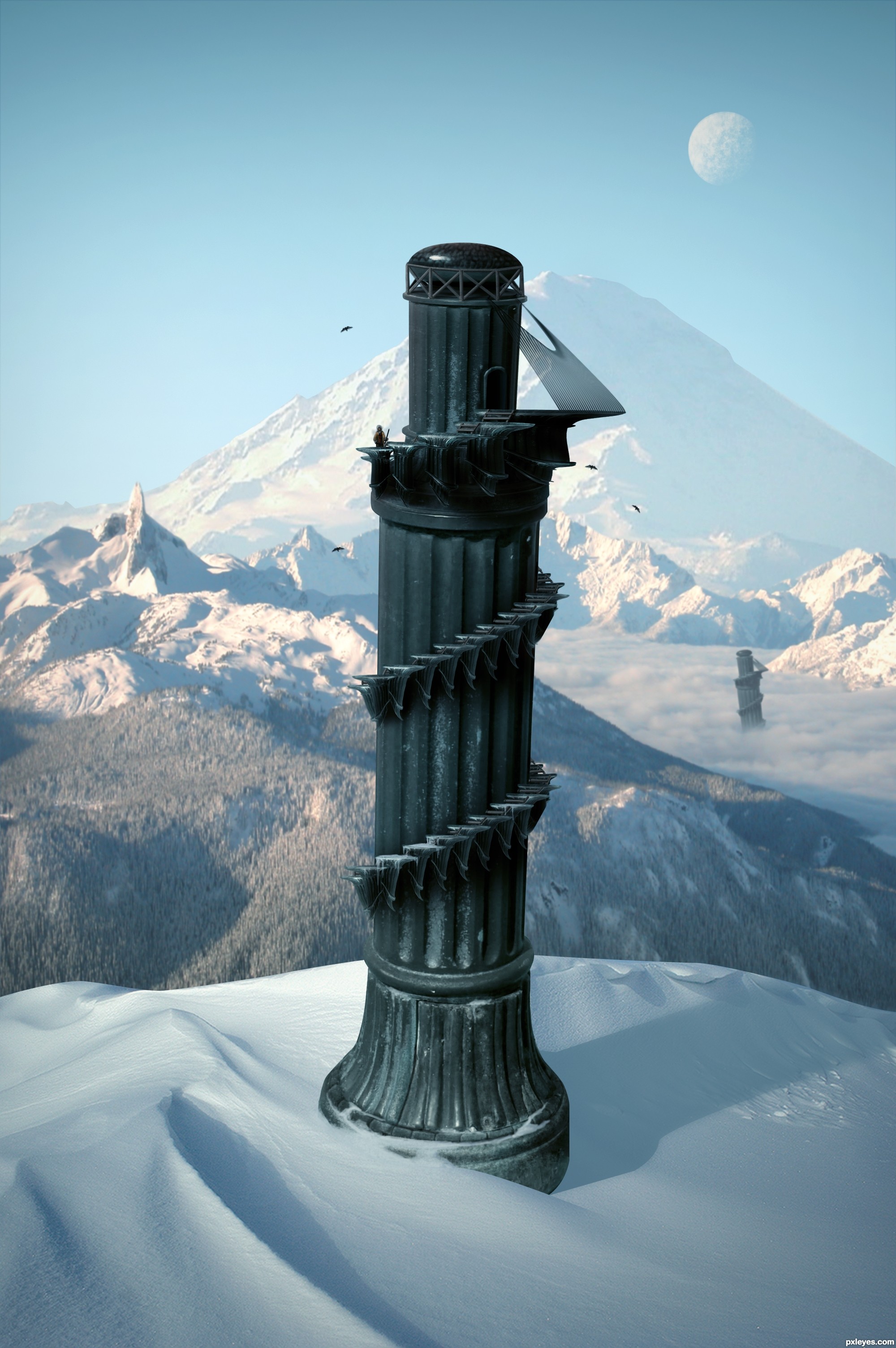
Im not entirely certain, but wouldn't the shadow be bent outwards over the slope rather than inwards? - the shadow from the furthest tower is too dark in relation to the closest - and - maybe a little addition to some shadows from the terrain would help place everything better - especially from the mound covering the foreground tower as it's casting nothing...
Oh and the glare fom the bottom of the 'tower' it's not true to where you're placing your shadows from, so maybe get rid of it and add some highlights to the relevant side
Thanks for the comments.
Cool over all. I personally don't think the duplicate background towers add anything, however. Also, the palm trees look fake. And the hi-res version highlights the white edge around the tower's top and the fakiness of the tower-bottom and sand-dune edges.
The top of the tower still remains sharp and white spots are there . but this is a good image... you have to make some touches there... good luck...
Great but as above you could just try the matting controls, use the "layer" / "matting" from the top drop down menus and remove white matt or defringe to get rid of them, Then quick select and feather those edages slightly.
nice creation ................ i like it ........ Gl to u ..........
Thanks for the helpful feedback. Image is now complete.
Very nice, like the Pizatower, but in the mountains 
I like it! GL!
yeah a much better image!?!... GL 
i like the colder climate version!! great job!
This is why I don't participate in this contest 
Nice work, and well done, gl
Very nice, good luck
Fantastic work author...IMHO u don't need other tower...any how this is great,high marks from me...best of luck
nice
Good.
GL
Thank you.
Super! It looks like the tower will fall out of the image at any moment
Howdie stranger!
If you want to rate this picture or participate in this contest, just:
LOGIN HERE or REGISTER FOR FREE
Ashlea-http://ashzstock.deviantart.com/
Elisabeth-http://lunanyxstock.deviantart.com/
James-http://fatalpoisonwhisper.deviantart.com/
Enzo Forciniti-http://www.sxc.hu/profile/pseudoxx
Thanks guys for the great resources
SBS coming soon
Look High Resolution before voting (5 years and 3368 days ago)
Cool image
cool stuff going on, GL!
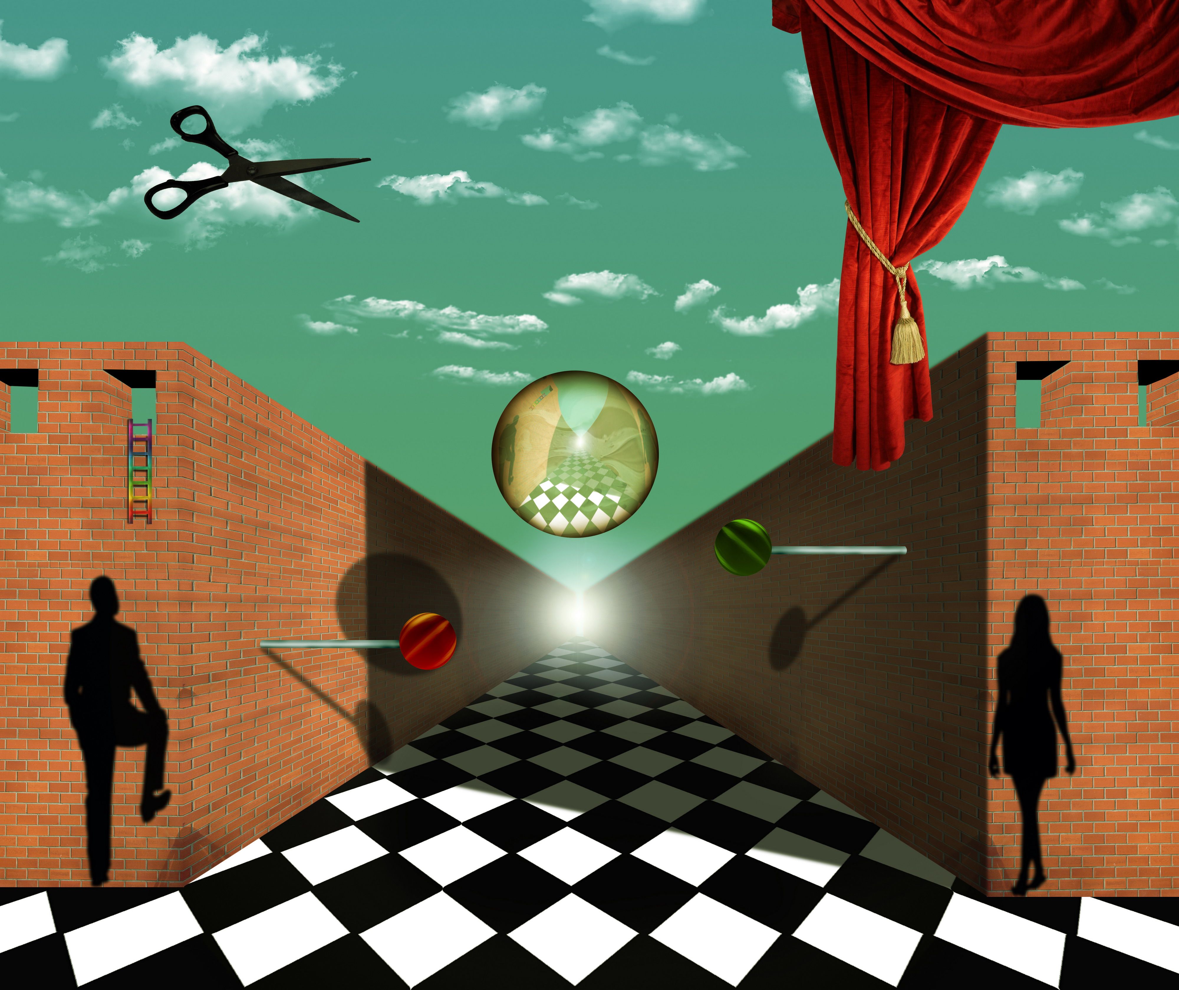
There's another image in this contest that uses a checkerboard floor. It's a great idea and you will find that the vast majority of renaissance paintings use some type of checkerboard pattern in the floor/ground to give the illusion of depth. Called an orthogonal grid. The problem with this image is that the angle of the checkerboard is such that you don't get that illusion because the vanishing points of the checkers is to the left and right of the vanishing point of the rest of the image. However, if this is your intention the image is fantastic. I am particularly fond of the lollypops.
In my art class professor of modern painting tell us this story about the some technique's.Salvador Dali was big fan of orthogonal shapes and that give's me inspiration for this entry.And because of Dali i wanted to create some distortion.At this all is in symmetry,ladders have curtain at opposite side,wall have wall,2 windows at left 2 at right,man at left,woman at right two lolly's,and sphere have scissors.Floor is only non fully symmetrical thing,and this was idea,to crash symmetry and to give some distortion.Thanks again for the fantastic comment.Its probably one of the best that i ever get.
Cool.....
THis could have been done by Magritte, though perhaps he wouldnt have used a lens flare and rainbow colored ladder. For the rest pretty good on theme. Good luck!
Author: Cool. I wasn't sure if you'd done it on purpose. I think that it's great! Good idea throwing off the symetry with that.
Howdie stranger!
If you want to rate this picture or participate in this contest, just:
LOGIN HERE or REGISTER FOR FREE
(5 years and 3397 days ago)
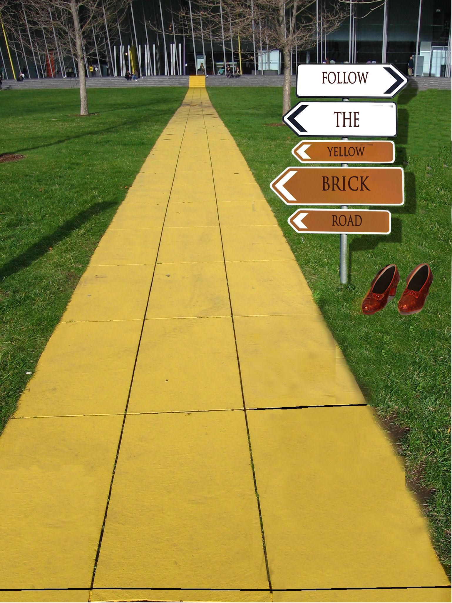
Good idea, but try to make the post look like it's actually in the road, not just pasted on top...it should have a shadow, too.
agrees with cmyk. You should also place the signs more off to the right.
Bravo, Wonderful, Fabulous, is there anymore to say?!?! 
Wow I get brozed but yet you used my suggestion. By the way, the shadows on the sign are wrong. They would be like the one on the left but try drop shadow, not whatever you did. Also shoes need a lot of work on the edges and a shadow too.
well honestly speaking i don see any logic in this..you've jus written one simple note in a direction board which is going all places..you could have used the source image in a much better way..
Don't take my comments on this as rough criticism, just constructive, well meant suggestions.Good imagination on this, but there are several things that you could do to improve on it. I think the shoes have been mentioned by others, and the cloning on the grass next to the pathway needs to be cleaned up a bit. Changing the signs to point all the same direction could really be a plus. Overall you did have a good concept, it's your execution that needs some improvement.
Those kids of yours must really be occupying your time but the sign shadow is not hard to create. I wish you at least tried,, 
Howdie stranger!
If you want to rate this picture or participate in this contest, just:
LOGIN HERE or REGISTER FOR FREE
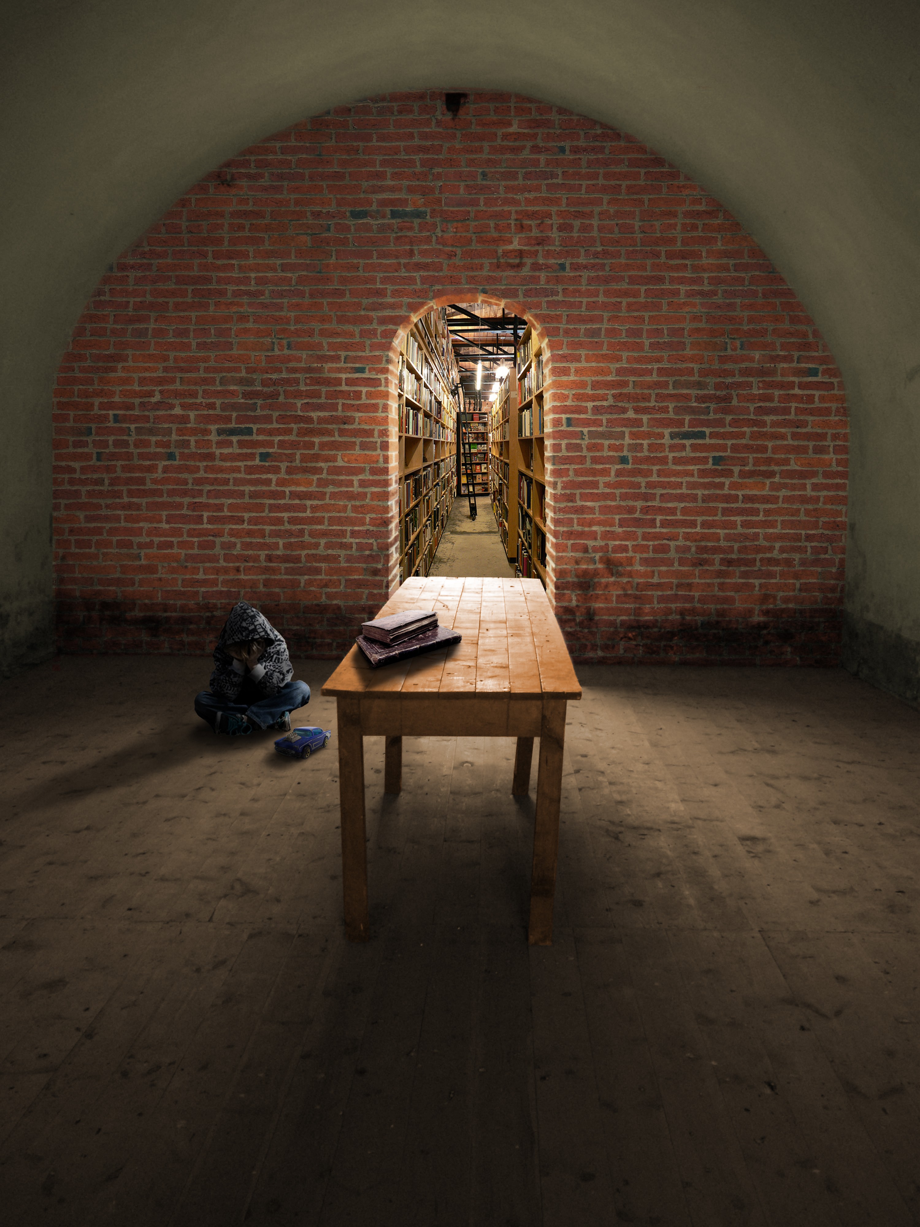
To explain the title, I picture this boy withdrawn in the dark room from some unknown sad event. That's just the situation I imagine from the scene.
I just tried to focus on believability and atmosphere. The brick wall photo is mine.Thanks for the other source photos from homero nuñez chapa (toy car), Lydiat (bookstore), Pamporoff (old Books), and Vincent Crivello (boy) (5 years and 3416 days ago)
Why what? It's a nicely done image, but I don't get the relevance of the title. The shadows of the boy & toy should rotate about 5 degrees counterclockwise.
very nice blend of sources, and excellent shadows. Great job!
I would adjust the shadows on the kid and car. Only noticable in high res but they kind of seem like the are floating. The books are a better match as far as correct shadow. I was confused by the title too. Perhaps you could include that in your description.
EDIT: It appears like you made the shadow adjustment. I didn't mention before but you did go a good job on the perception and felt I must give you props.
So far my favorite in this contest. The use of a vanishing point is outstanding. Few things are more satisfying than finding a nice quiet place to read, play with a car, or just be alone. I really like the feel of this peice.
very nice g.l
Very good work
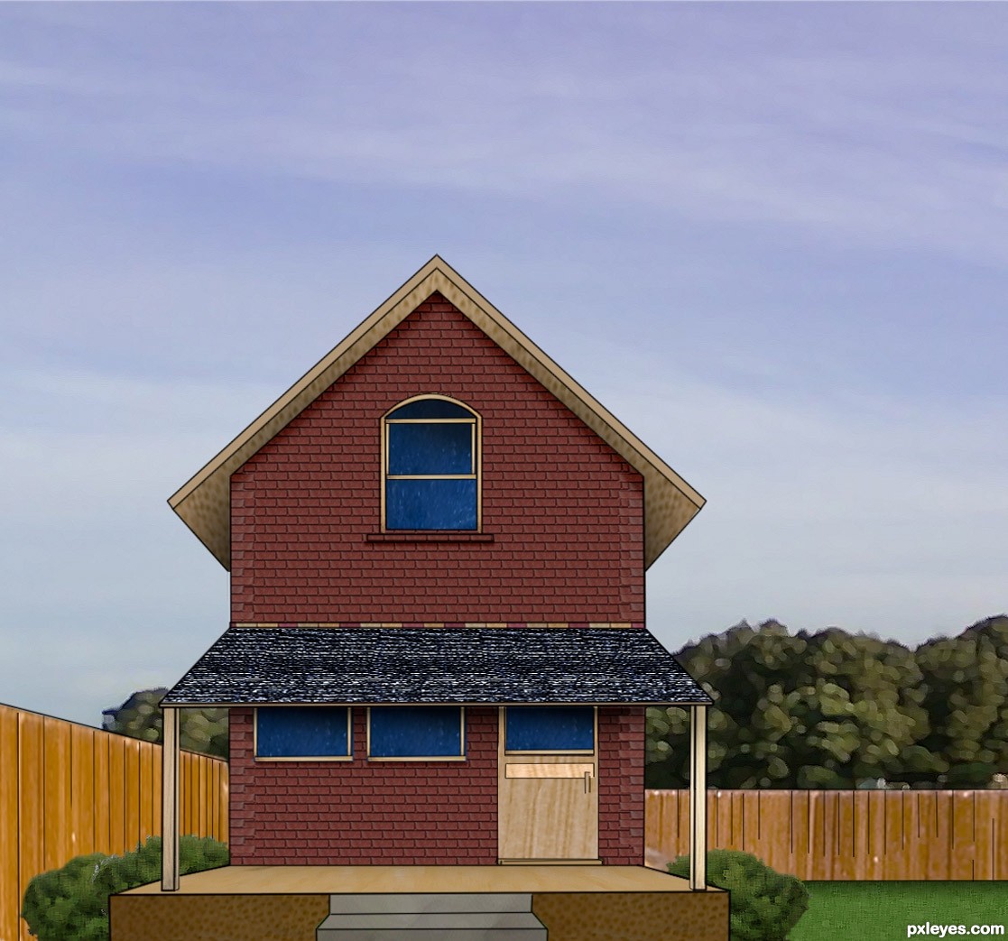
the doorway is off center
Thanks for the contructive comments. Yes I did adjust the shadows per CMYK46 about 2.5 degrees & tried to clarify the title. I also adjusted the shadow under the car(thanks jawshoewhaw) and trimmed the edges of the shadow because it had a bit of a curve to it. RickLaMesa, The source window was off center too. I just put the door where the window was, lol.
looks real nice...gl
nice blending of sources author... well done...
Nice work.
Personally I think it quite good, nice image and well done
I like this, great work
Howdie stranger!
If you want to rate this picture or participate in this contest, just:
LOGIN HERE or REGISTER FOR FREE
Photography and photoshop contests
We are a community of people with
a passion for photography, graphics and art in general.
Every day new photoshop
and photography contests are posted to compete in. We also have one weekly drawing contest
and one weekly 3D contest!
Participation is 100% free!
Just
register and get
started!
Good luck!
© 2015 Pxleyes.com. All rights reserved.


neat
Pretty house!
You really didn't need the source to make this. You barely used any of it. Honestly, you didn't even need it.
good luck
Howdie stranger!
If you want to rate this picture or participate in this contest, just:
LOGIN HERE or REGISTER FOR FREE