Fonts:
"K" Goudy Initial
"Label" Trajan Pro
"Headline" Goudy Old Style (5 years and 3595 days ago)
1 Source:
- 1: wine bottle
Fonts:
"K" Goudy Initial
"Label" Trajan Pro
"Headline" Goudy Old Style (5 years and 3595 days ago)
kabooza  by nanaris 8210 views - final score: 58.5% | Official artist's milk  by erathion 12298 views - final score: 57.8% | Kabooza COCO'  by genuine2009 12124 views - final score: 57.8% |
Kabooza Juice 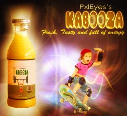 by nasirkhan 8664 views - final score: 57.8% | Disrespect Your Thirst! 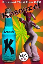 by blindscientist 12465 views - final score: 57.5% | Modern Twist!!  by AngeldustUK 6467 views - final score: 57.4% |
It's Peachy! 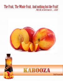 by AngeldustUK 4394 views - final score: 56.9% | The new power drink. 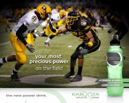 by Ressiv 6210 views - final score: 56.6% | Sophistication 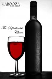 by Geexman 3901 views - final score: 56% |
Beer 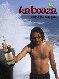 by filantrop 4964 views - final score: 54.1% | Wine 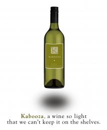 by Nator 4346 views - final score: 53.6% | grape lemon watermelon pepper 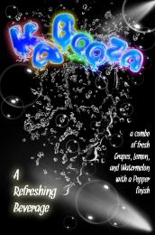 by Drivenslush 7801 views - final score: 52.6% |
That charms 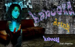 by filantrop 3963 views - final score: 51.6% | Convention Catalog Page 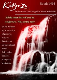 by Drivenslush 7350 views - final score: 49% |
Howdie Guest!
You need to be logged in to rate this entry and participate in the contests!
LOGIN HERE or REGISTER FOR FREE
Photography and photoshop contests
We are a community of people with
a passion for photography, graphics and art in general.
Every day new photoshop
and photography contests are posted to compete in. We also have one weekly drawing contest
and one weekly 3D contest!
Participation is 100% free!
Just
register and get
started!
Good luck!
© 2015 Pxleyes.com. All rights reserved.


NICE ad. Love it
Because everyboody would have drunk it all!

Nice and clean!
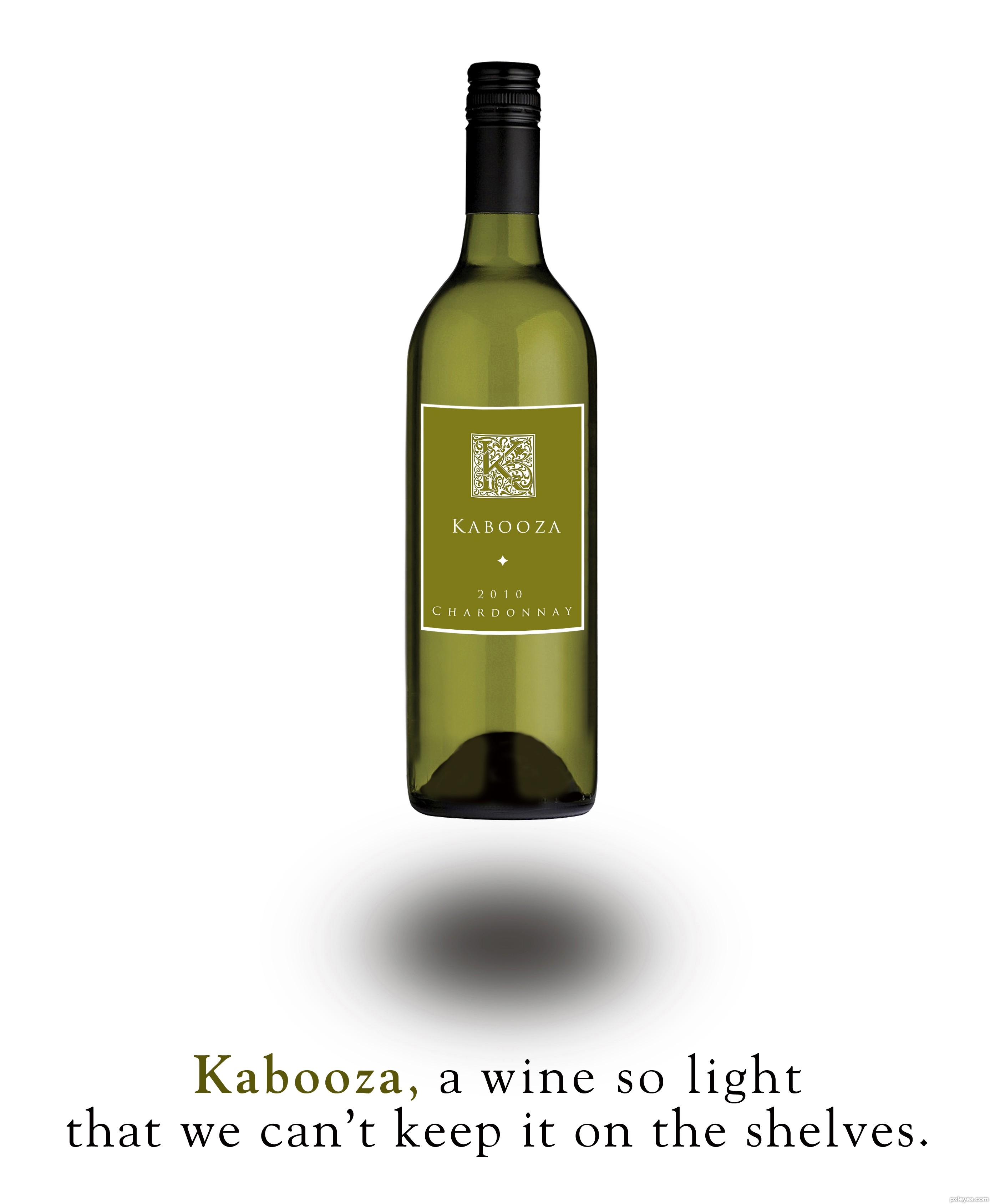
Crisp and clean. The image portrays the abstract notion of 'light,' but then your text introduces the concrete notion of a table that is nowhere to be seen. A simpler message along the lines of "Kabooza, the truly light wine" might work better. [An aside: Why is a 'light' wine a good thing? Is it especially appropriate for particular occasions or with particular foods?] The label is classy and sophisticated, but while its border matches the curve of the bottle exterior, the illuminated-K logo and text do not.
Bottle design is very good. shadow you should compress vertically at-least 50%.
Well, you just changed a table for a shelf, but the message is still the same...

Light is light, but not in excess!!!
@Dan: I don't understand about wines - I don't even drink - but I suppose that a difference of a white wine and a red wine is clear, at least for me; I think that the white one is lighter in taste than the red one. Soft and smooth... Am I wrong, author?
Shadow isn't too convincing... gotta agree it needs pulling in vertically... also just a nit pick but the shadow wouldn't be oval either... based on the light hitting the bottle...
oh one more thing... the message might be conveyed better if there was a bottle either side of your 'brand'... just to show the difference visually... ??? just an idea!?!...
I like the concept, and it looks like a real ad, so kudos for that. I will agree on a few minor technicalities: The shadow seems a bit off (perhaps the vertical compression suggestions will work) and if one looks closely, as DanLunberg suggests, the logo and text on the bottle don't match the curvature of the label itself. Perhaps a very slight warp on those elements would resolve. Either way, it's well done, conceptually, as well as execution. Good luck author.
Very nice work author with great slogan...best of luck
Howdie stranger!
If you want to rate this picture or participate in this contest, just:
LOGIN HERE or REGISTER FOR FREE