Logo and label design in Illustrator and remaining work in Photoshop (5 years and 3578 days ago)
3 Sources:
kabooza  by nanaris 8175 views - final score: 58.5% | Official artist's milk  by erathion 12243 views - final score: 57.8% | Kabooza COCO'  by genuine2009 12068 views - final score: 57.8% |
Kabooza Juice 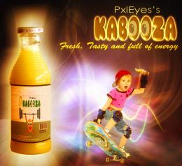 by nasirkhan 8627 views - final score: 57.8% | Disrespect Your Thirst!  by blindscientist 12377 views - final score: 57.5% | Modern Twist!!  by AngeldustUK 6431 views - final score: 57.4% |
It's Peachy! 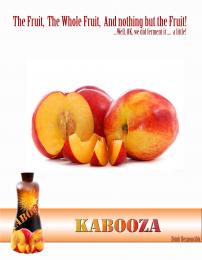 by AngeldustUK 4369 views - final score: 56.9% | The new power drink. 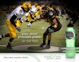 by Ressiv 6144 views - final score: 56.6% | Sophistication 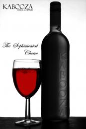 by Geexman 3878 views - final score: 56% |
Beer  by filantrop 4936 views - final score: 54.1% | Wine 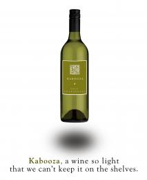 by Nator 4324 views - final score: 53.6% | grape lemon watermelon pepper 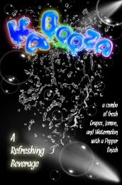 by Drivenslush 7748 views - final score: 52.6% |
That charms 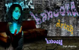 by filantrop 3929 views - final score: 51.6% | Convention Catalog Page 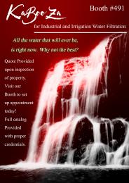 by Drivenslush 7306 views - final score: 49% |
Howdie Guest!
You need to be logged in to rate this entry and participate in the contests!
LOGIN HERE or REGISTER FOR FREE
Photography and photoshop contests
We are a community of people with
a passion for photography, graphics and art in general.
Every day new photoshop
and photography contests are posted to compete in. We also have one weekly drawing contest
and one weekly 3D contest!
Participation is 100% free!
Just
register and get
started!
Good luck!
© 2015 Pxleyes.com. All rights reserved.


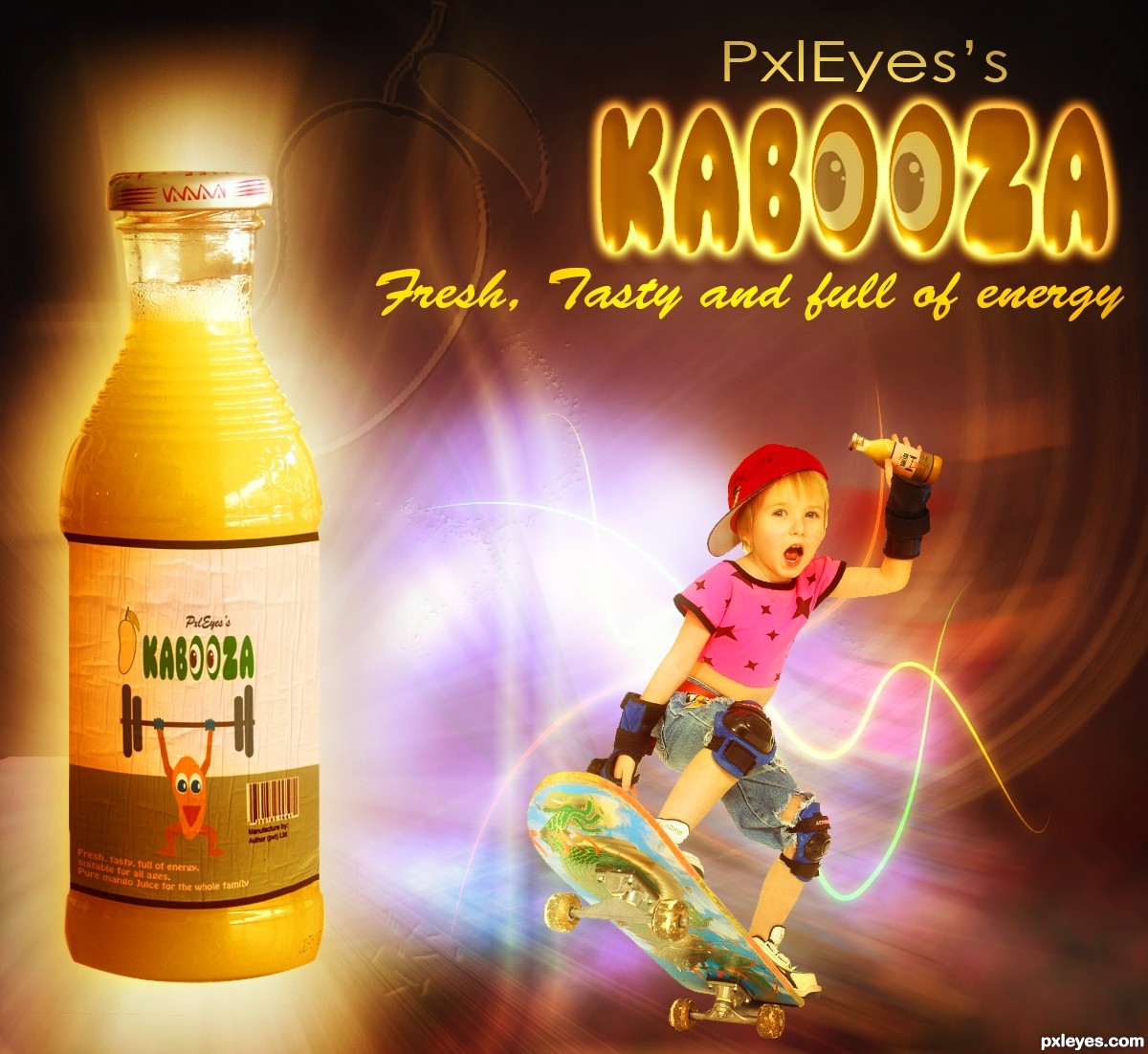
Mango Man is kind of cute. Distorting the source bottle was a nice idea, but the end result is a misshapened, asymmetric container with an ill-fitting label [label's horizon line has wrong curvature]. I don't get why the woman is chest-bumping the bottle while her less-energetic clone looks on in shocked amazement or what the guy in back is looking at/jumping over. All the different type fonts and styles makes for a very busy feel.
Very nice entry author...i like your view,whole image,is filled with brightness and positive energy...and i like to see that in this kind of contests...well done
Nice typo and very interesting color scheme. watermark of mango clipart (between the jumping people) is not jelling with the entire look & feel. good luck
@ DanLundberg. Thanks for your helpful suggesstions. I have made bottle normal shape as it was. Removed extra font. Removed jumping people and added another model

@ Gopan, I have removed mango clip from background
Thanks Erathion for your comment.
This is so much better. The skateboarding kid is consistent with the whimsical logo and cartoon Mango Man, plus being able to see the kid's face is much more involving for us viewers.
Very cute and naïve entry (among a lot of ethilic entries!) Nice...
Congrats for the 4th
Howdie stranger!
If you want to rate this picture or participate in this contest, just:
LOGIN HERE or REGISTER FOR FREE