"The Last Song I'm Wasting On You" by Evanescence
"Sparkling grey,
They're my own veins.
Any more than a whisper,
Any sudden movement of my heart.
And I know, I know I'll have to watch them pass away
Just get through this day
Give up your way, you could be anything,
Give up my way, and lose myself, not today
That's too much guilt to pay
Sickened in the sun
You dare tell me you love me
But you held me down and screamed you wanted me to die
Honey you know, you know I'd never hurt you that way
You're just so pretty in your pain
Give up my way, and I could be anything
I'll make my own way
Without your senseless hate... hate... hate... hate.
So run, run, run
And hate me, if it feels good.
I can't hear your screams anymore
You lied to me
But I'm older now
And I'm not buying baby
Demanding my response
Don't bother breaking the door down
I found my way out
And you'll never hurt me again. "
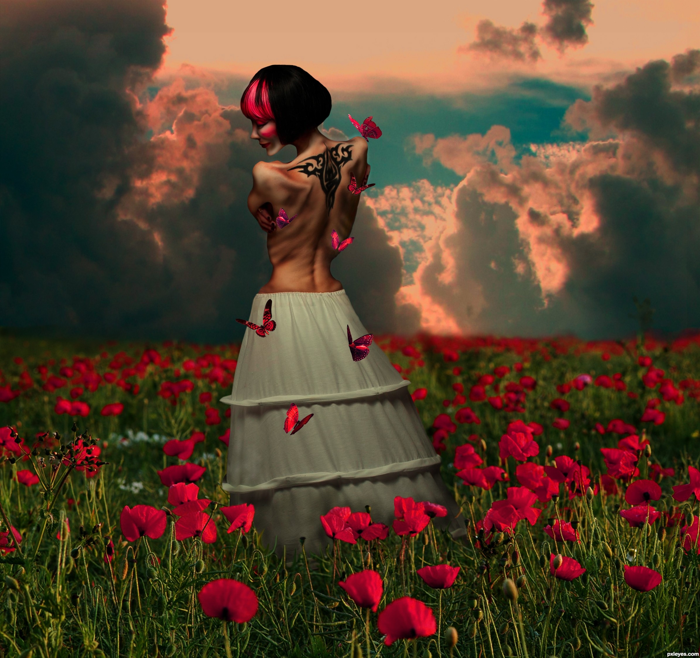
This piece isn't meant to be offensive. A while back, pxl held an anorexia contest, which i found to be incredibly underappreciated. There were so many avenues and possibilities around that contest. I decided to take that "theme" and add my personal touch to it. This is meant for all the SURVIVORS of anorexia. and the words of the song i chose seem to describe the feeling i was trying to portray with my image.
Comments are appreciated, however, i would appreciate constructive thoughts, not destructive opinions on the actual disease, as it is not consequential to the outcome of this piece.
**edit-fixed "blurred" flowers and brought girl forward a bit..hope its better** (5 years and 3135 days ago)


man.. I love it when an author takes a song and manipulates it into something like this (the hair is over the top)... just wonderful author.. keep up the great inspiring work... (and there isn't enough BEN GAY in the universe to calm those back muscles.. awesome visual )
WOO HOO!!!!
I truly love the positive aspect of this piece. It is a sad image but there is hope portrayed as well; not easy to get both in one image. Well thought out and lovely statement on a devastating illness. Well done author!
Stunning
Great idea and job. Especially very good work with making her skinny, looks very convincing. Her facial expression is also very good and I really like the colour scheme and that you adapted the colour from her strand of hair to the butterflies and the poppy field.

There is just one thing, that could be (in my opinion) improved. Where you placed her now is the field already very blurry, but the source from the woman is sharp. I think the blending there could be a bit better. The most drastic thing would be probably to replace the poppy field, but what you could try too is copying some of the flowers and the grass from the foreground (which are sharp) and paste them in front of her dress, so you have more or less the same sharpness. Or you could just put her a bit more in the foreground, where the grass and flowers are still sharp.
And another small thing: the cutout of the grass in front of her dress is good, but could maybe be a bit improved.
What you could try is picking the eraser and erase with the brush that looks like 3 blades of grass (it's a standard brush) and erase with different brush sizes in front of her dress. This way you get the grass structure and it looks more natural. Probably not the most professional way to do it, but that's how I always do it and it works good for me
But like I said, it's really a great entry and works very good with the song
Good luck!
Oh wow! This is gnarly work here! GL!
Ha! I should have known!
*faint*
wow. thank you for your input everyone.
Slushie...thank you for being a huge supporter of my work. and for the fav.
Arca, you see exactly what i was intending on with this piece. i'm so happy!
Geex, thank you. i think that one word means more to me than you could possibly imagine.
Lelaina, i really appreciate your taking the time to leave such a thoughtful and wonderful critique. i will mess around with the flowers a bit and see if i can't get it to look any better than this. I didn't like my results with the 3 blade grass brush that PS comes with, i tried it... it looked too "Uniform" so i tried just using the eraser and making my own grass blades with a bit of smudge to blend them into being "grass"..however, i don't think it helped much. I will definitely give it another go and see if it looks better. You are right though, the MOST drastic thing i can do is to change the poppy field, and after searching through literally thousands of not very good poppy fields, i was way happy to find this one! i'll see if i can't improve it a bit.
I am one of those people who hated that contest theme, because I wouldn't want to see so suffering and I'd know many people would play on it. Actually the human being is not as strong as he thinks he is. He's vulnerable...
But you really did a nice image of incentive, showing that things can be better when you believe. It's urgent to believe in life, in hope, in love, in God (or in a major strenght above us).
Great work and GL!
Okay...i came back and fixed the flower field. i hope i got it right this time. to me it looks lots better, but... :P sometimes you sit and stare at something soooo long you can't see the trees for the forest.
Oh you saw all the trees you could possibly see. This looks SO much better! And I'm happy, that it looks better for you too.
I know that feeling btw, that you search for a specific source forever and when you finally find one, you just want to keep it.
Good luck again!
Nice image with a good iagination..........i would suggest lowering the saturation a touch and adjusting the exposure levels.
Really good to see another Evanescence fan ! They are rare in my country. Great work here, my friend. Great facial expression ! Good luck !
Freejay, thank you for your opinion. I wanted then enhanced saturation levels in this piece so i don't think i'll be changing that. its a personal choice in that matter. the exposure was intended to be a bit dark, because i wanted not only the bright colors, but a bit of dark to bring the mood of the piece to what it is. for this is not meant to be "lovely" and all..its meant to have a dark side, as the concept of this artwork is dark.
 and the words from this song really put in place the feelings i was trying to portray. Thank you so much for your compliment
Lamantine..i've been a huge evanescence fan for a long time.
Hey....its your decision.....but i do think my advice would only improve the image.
You can still keep the picture dark with the proper exposure levels.
Very nice work,i like what u did with the body...colors are great...GL
Howdie stranger!
If you want to rate this picture or participate in this contest, just:
LOGIN HERE or REGISTER FOR FREE