(5 years and 2684 days ago)
(5 years and 2854 days ago)
Pretty creative adaptation of a difficult image. Looks convincing. 
Howdie stranger!
If you want to rate this picture or participate in this contest, just:
LOGIN HERE or REGISTER FOR FREE
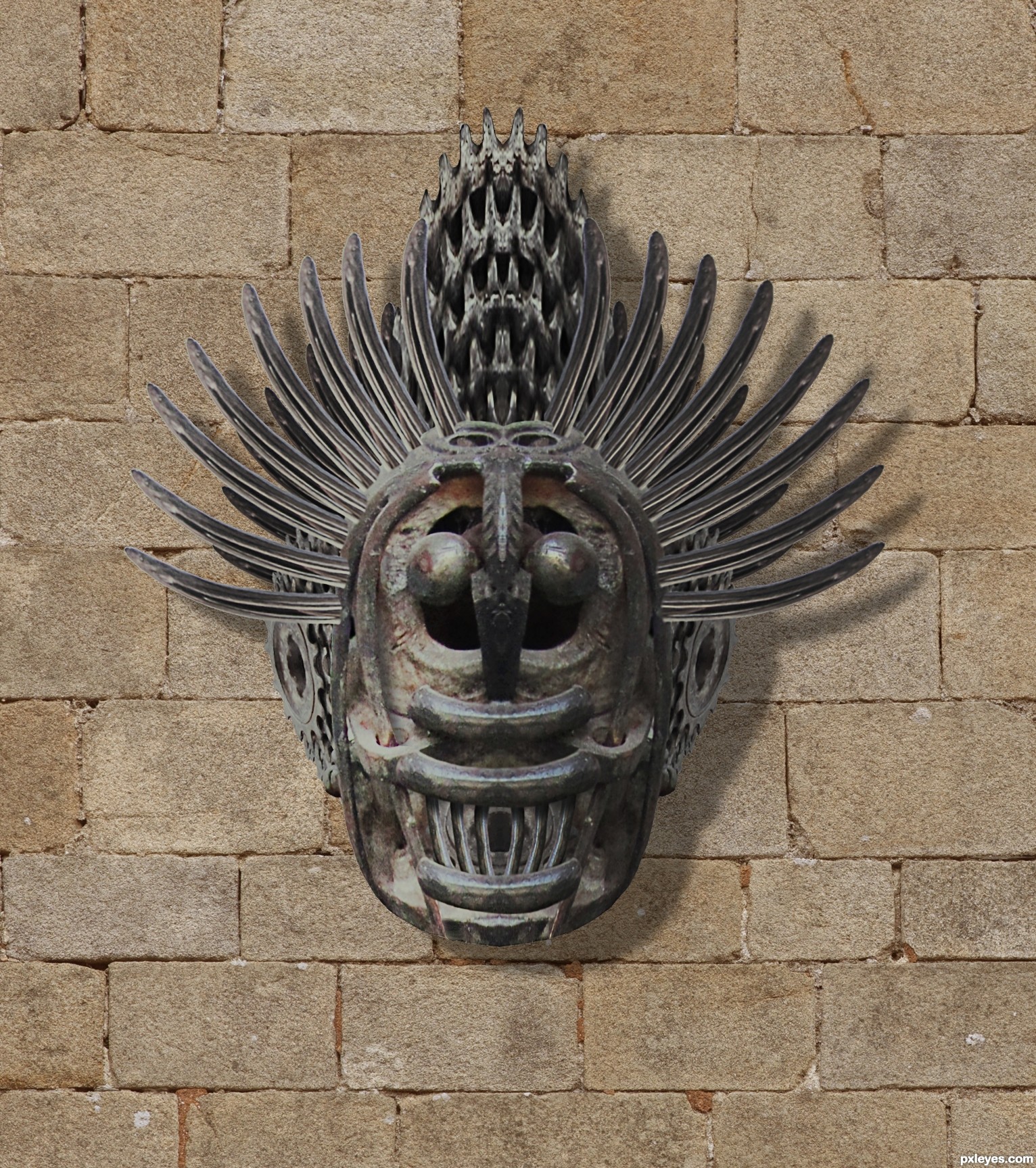
no external images used. cheers guys. (5 years and 3057 days ago)
This should be place in a museum..... nice pice of art, and good use of the source..... good luck!
thank's george
Howdie stranger!
If you want to rate this picture or participate in this contest, just:
LOGIN HERE or REGISTER FOR FREE
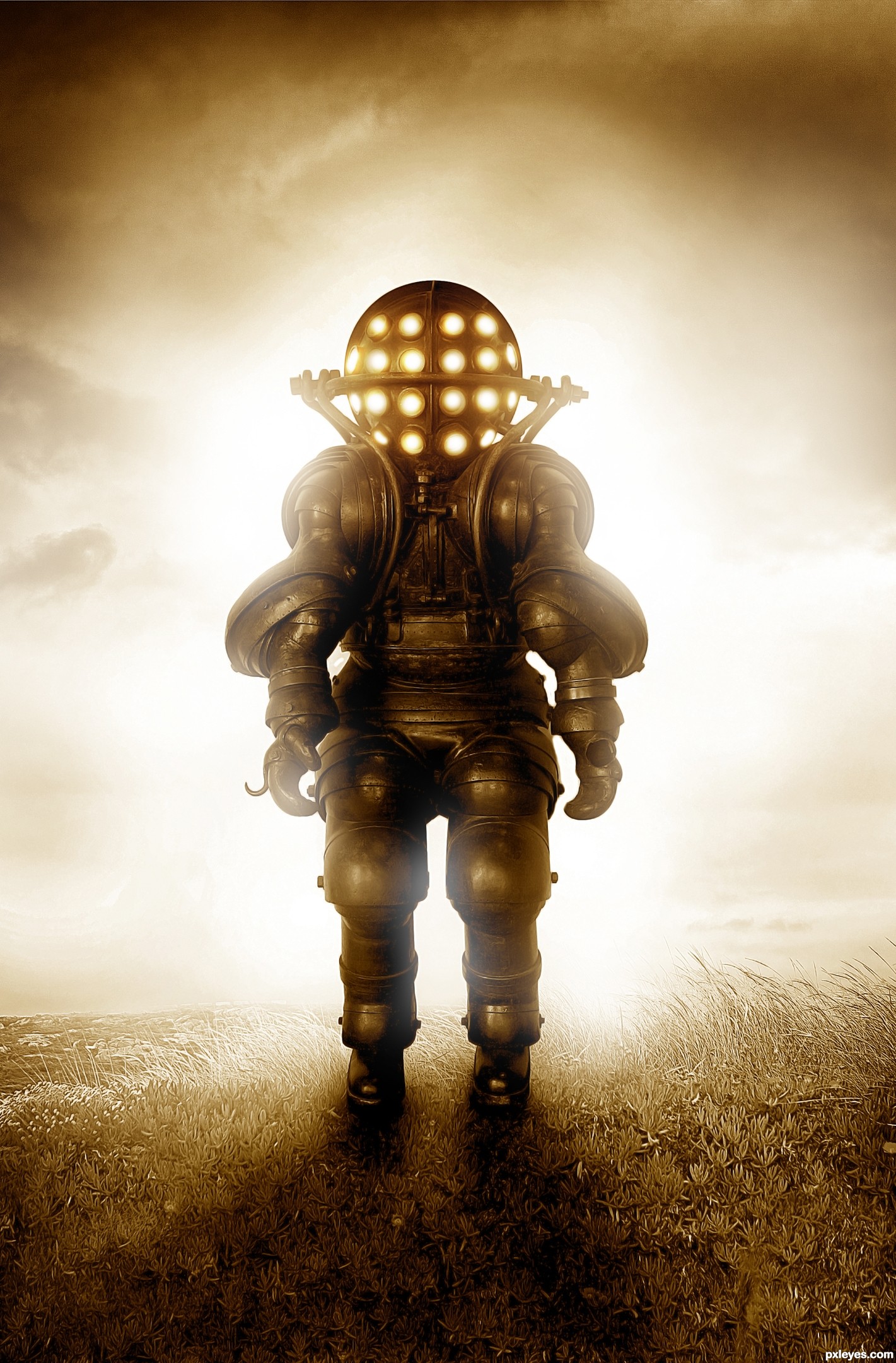
Thank You mjranum-stock on Deviant Art for the machine man image.
http://mjranum-stock.deviantart.com/
(5 years and 3123 days ago)
Great source find author..Nice Image! GL 
Congratulations!
Congratulations
Howdie stranger!
If you want to rate this picture or participate in this contest, just:
LOGIN HERE or REGISTER FOR FREE
(5 years and 3202 days ago)
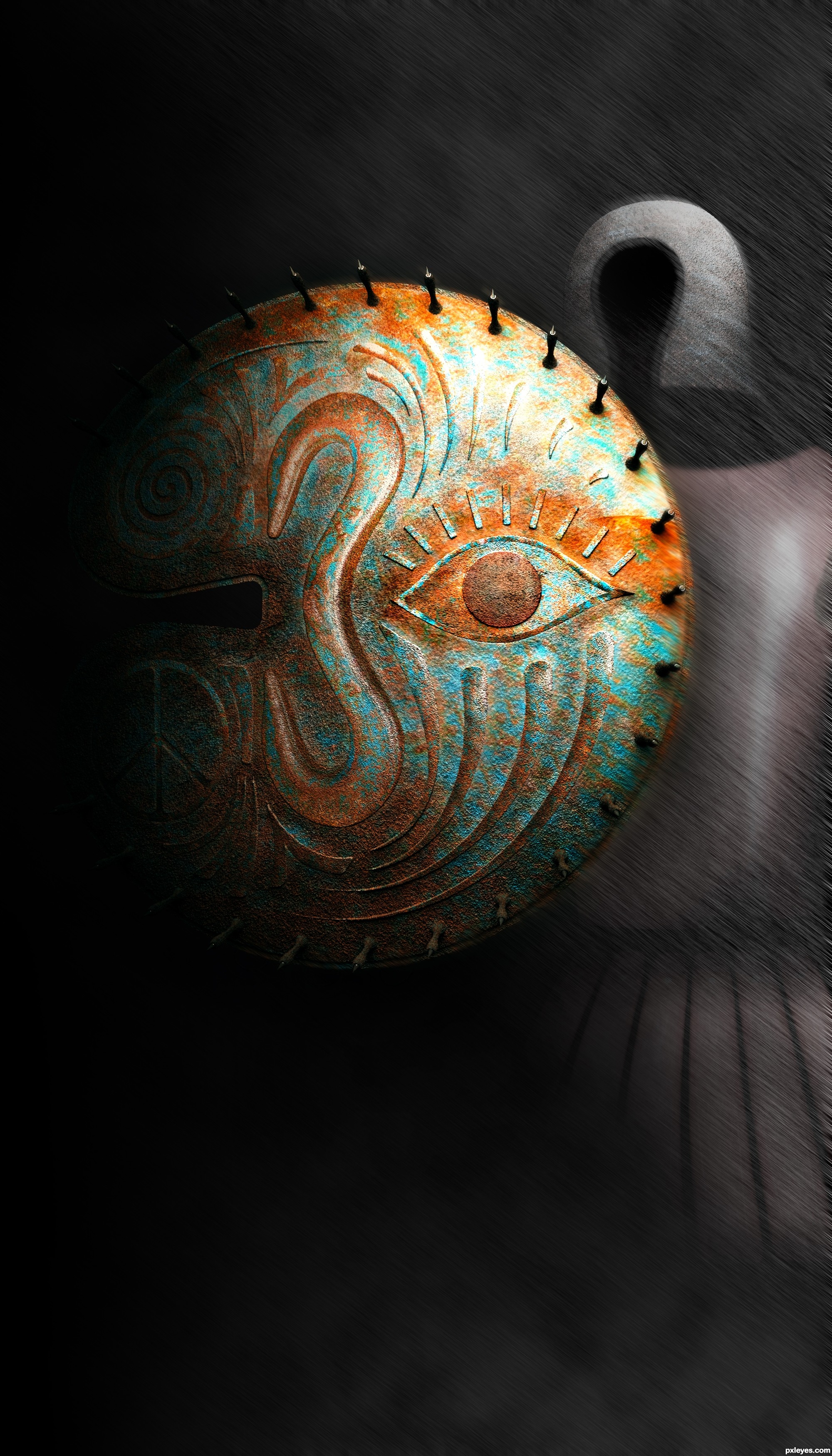
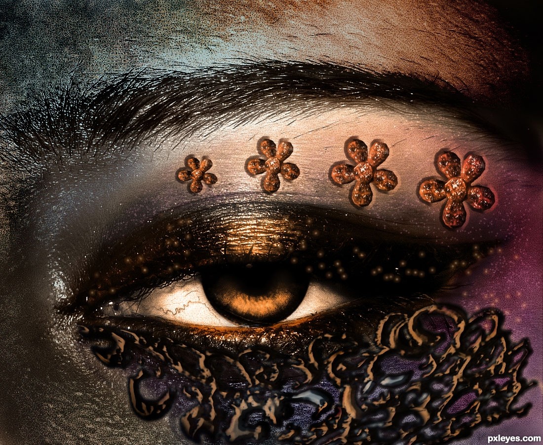
This was better before. Now you've "Burnt" the left hand side, which makes the decoration on the lower part of the eye look odd and out of place. A bit too extreme of a value adjustment. "Less is more."
The marks on the bottom look really saturated. Great skin coloring.
Mossyb I'll try to do what you suggested ..
Oh thanks AKassa ...
This looks so dreamy like! I love the tone and how you decorated the eye!
One thing I see and it might be wrong, if you put less flowers on the lower part of the eye? But all in all is great!
I have lighten some areas I hope it look better now?!.......
Well thank you so much JoeCacia .....About less the flowers!! amm it was my idea to make them like that when I first start to create this ...I don't know if I less them maybe it will be out of what I want it to be..
Now when lighting it up it looked much better and I can see your work! Wonderful author!
the work on skin and the eye itself is very good, but the interlaced decoration under the eye does not really belong there, here is a reference for the face decoration in case you want to improve:
http://www.flickr.com/photos/31078888@N03/4349125398/
good job overall and good luck
EDIT: .... It surely not a disaster if you leave it as it is, after all it's still a good piece of art, i was just trying to help
Hey thanks for the advice I appreciate it,amm i think that am gonna leave it just like it's,it's really okay if I didn't win after all...it's not the end of the world haha
Very Good!! GL
Howdie stranger!
If you want to rate this picture or participate in this contest, just:
LOGIN HERE or REGISTER FOR FREE
Photography and photoshop contests
We are a community of people with
a passion for photography, graphics and art in general.
Every day new photoshop
and photography contests are posted to compete in. We also have one weekly drawing contest
and one weekly 3D contest!
Participation is 100% free!
Just
register and get
started!
Good luck!
© 2015 Pxleyes.com. All rights reserved.


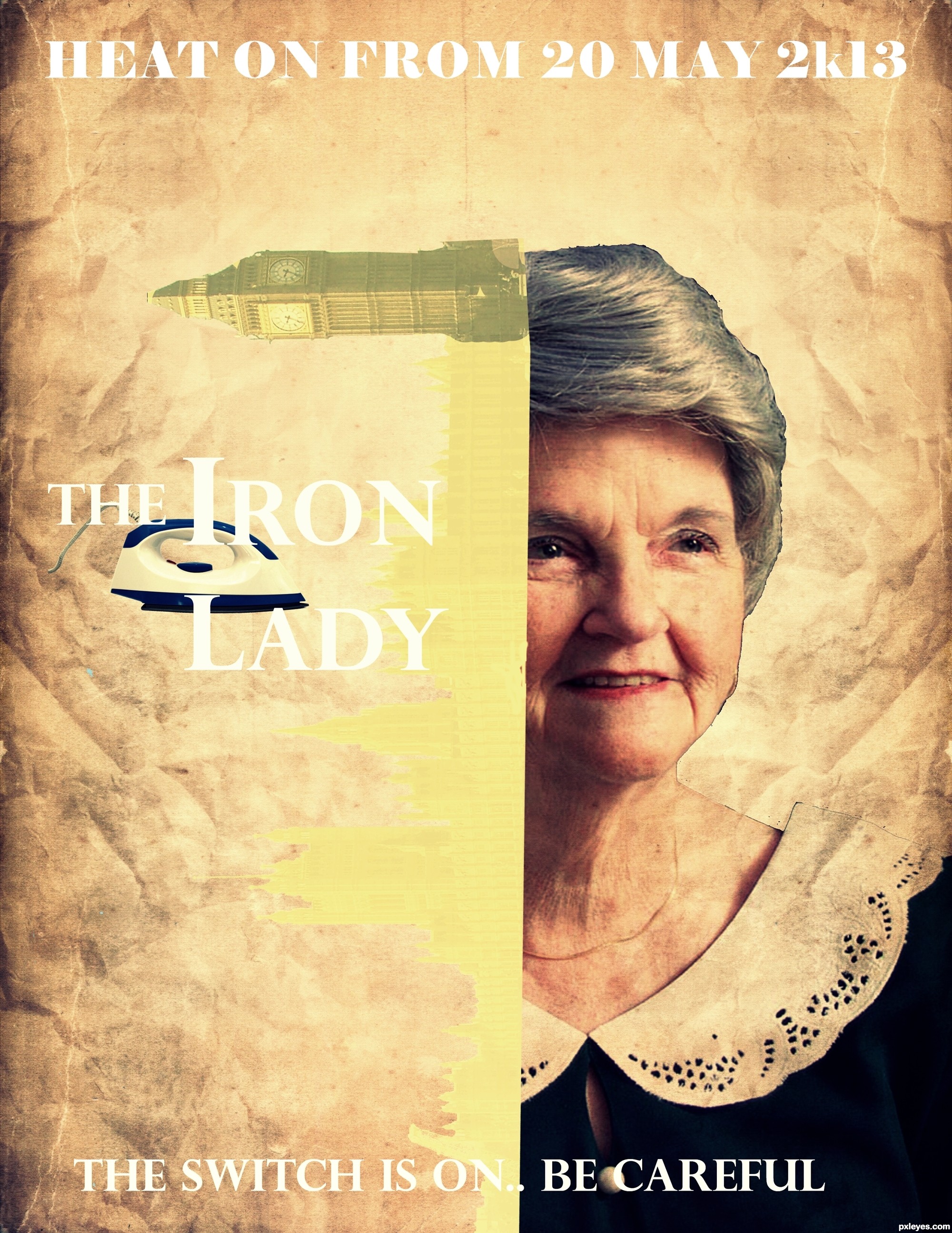
Try to fix the masking on the face.
Howdie stranger!
If you want to rate this picture or participate in this contest, just:
LOGIN HERE or REGISTER FOR FREE