(5 years and 3283 days ago)
2 Sources:
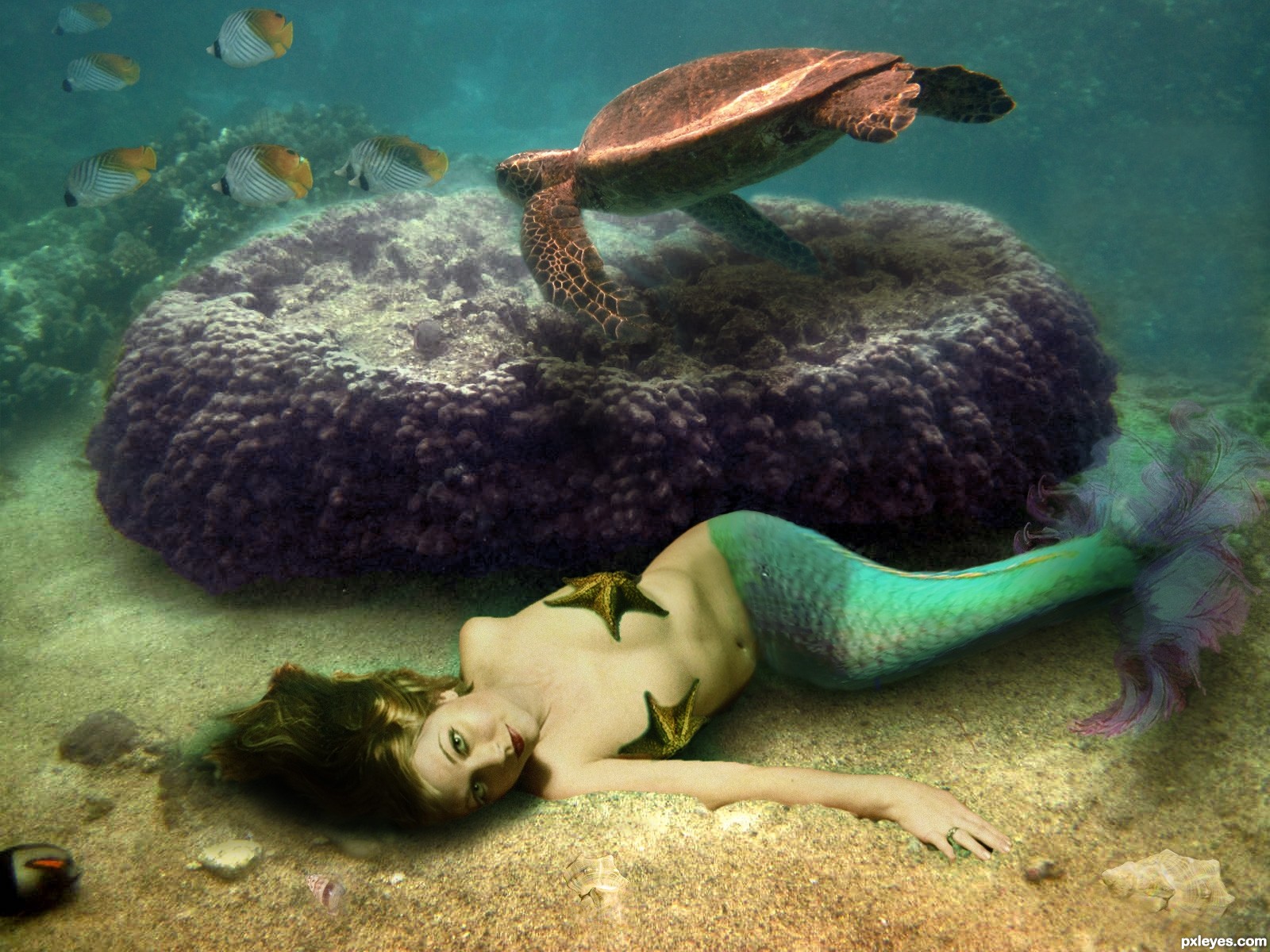
The only images I used that was not my own are the seashells which are credited to Emma-Frost-Stock and the Starfish provided by Pxleyes.
The other six images were mine. The end of her tail was a fractal I created in Apophysis.
*Update: I attempted to add adjustments offered by jawshoewah and greymval and Erathion.
I added several layers of colors to fix the overall feel of the image. Very curious to get more opinions. (5 years and 3476 days ago)
Nice chop! And kudos to using your own stock photos! My only nitpick would be maybe the edges around the starfish you turned into a bra. They just seem a little hard. Other than that, well done! 
Make a blue overlay over the model, so it blends better. ( create new layer of solid color - blue- right click on it create clipping mask so it only affects the model, Mode: Overlay Opacity-20%- more or less) You could make 2 clipping layers one blue on green so that you have a turquaz overlaying your model.
Your background also has some noise that should be present on the model, so you could either lower her opacity -95-98% or add a noise over.
There's also a masking problem on her hip, use some clone stamp to cover over her human skin :P
Thank you very much for the suggestions I'll start working on them right away.
Nice looks good ..gl.
Water is always hard to work with...This image have a great concept author and u could turn it in fabulous entry...I would like to give u few advices because i had similar problems when i created my underwater entry's...For better blending,solid color layers with different blend modes are always good thing to do. Val gave u advice to use blue overlay layer,and that is good thing to do. I would gave u advice to use dark blue overlay layer,with opacity set between 20-40%. Also in this case u have to make whole scene a bit slighter and for that dark brown layer with color blend mode and goldish layer also in color mode will done the work. Play with opacity of course. And now magic stars,add on top of these layers,dark green soft light layer,play with opacity and u will get crazy blue-green water color,and goldish layer will gave some nice mood.And finally u could add on top of these,blue/gray layer,blend mode set to color,with a low opacity max10%. And thats it,great underwater scene. And u could create some bubbles behind the purple thing to achieve better depth...Sorry for this novel author...
erathion.. if you make us have to do a report on your comment.. you will receive a severe beating.... (oh.. very nice chop by the way author... giggle snort) smooches erathion.. just kidding!!!
author.. you should be very proud of all the work you have done... I'm exhausted after looking through your sbs ... GOOD LUCK
His comment was very helpful an I hope I was able to create the mood and feeling the were helping me achieve. I'm glad you appreciate the work because it was a very lengthy process. Either way I was very pleased with the end result
Now, who wouldn't help a hot naked chick lying on the ocean's floor  . Glad you like the end result.
You'd be a fool not to help
Yes! that looks much better! One of the best entries! GL author!
Congratulations!
Congrats...
Congrats for 3rd, cool
Howdie stranger!
If you want to rate this picture or participate in this contest, just:
LOGIN HERE or REGISTER FOR FREE
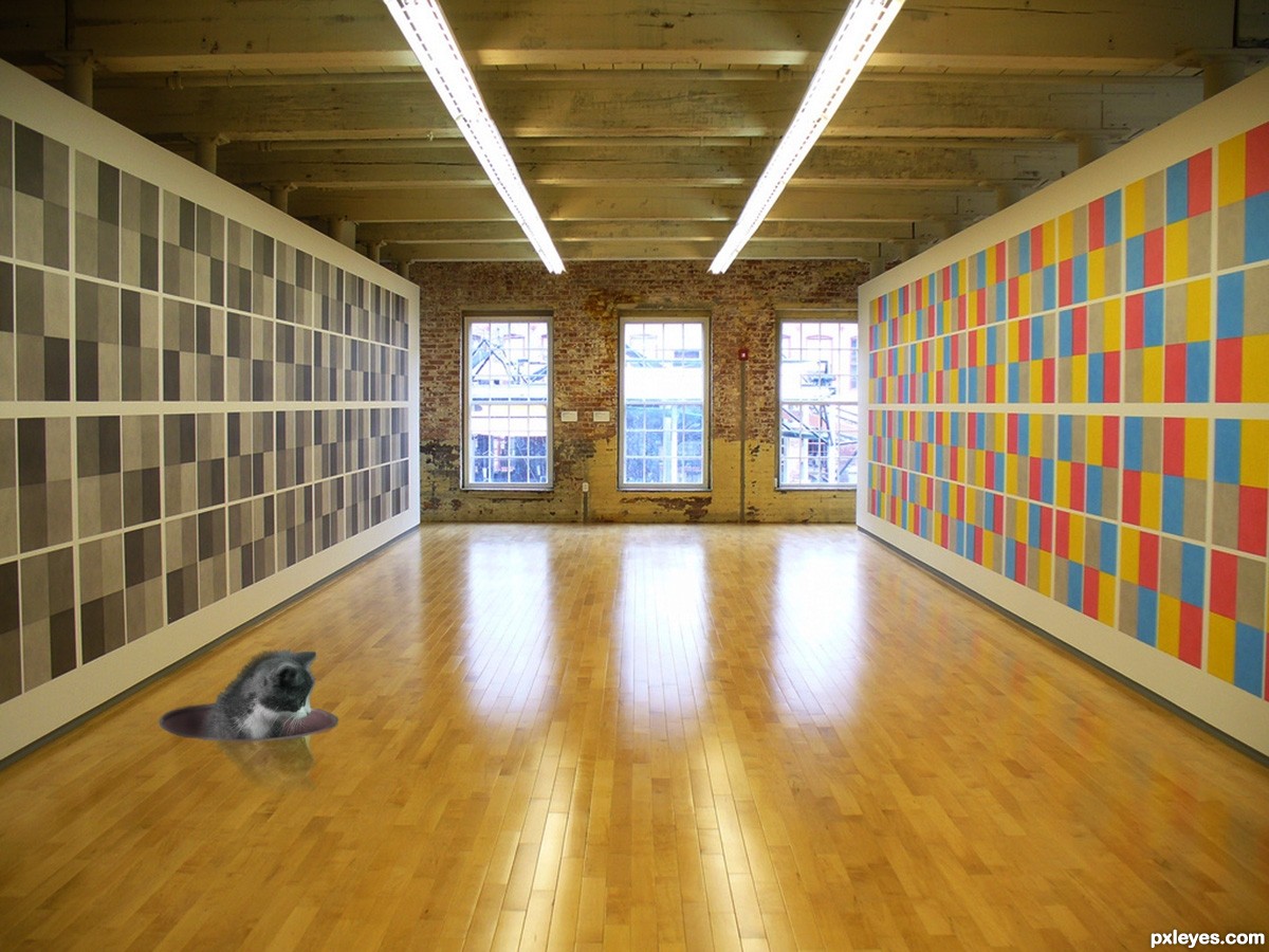
It could be a wall paper, a tiled floor, a series of fans... You name it. It is what it is depending on how your see it. (5 years and 3499 days ago)
but what it is??? lolz......  GL
GL
Nicely abstract
Howdie stranger!
If you want to rate this picture or participate in this contest, just:
LOGIN HERE or REGISTER FOR FREE
Hi All,
Here is submission for this contest.
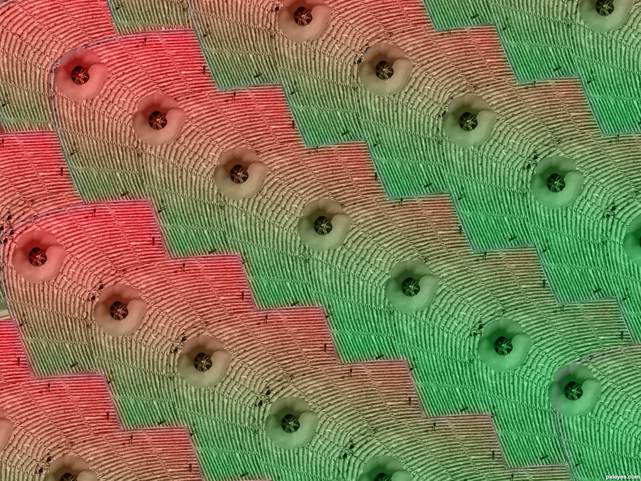
Use Photoshop custom tool and lots of Brush and blur...
Hope you like... I really love this! (5 years and 3741 days ago)
Thanks kevinice...
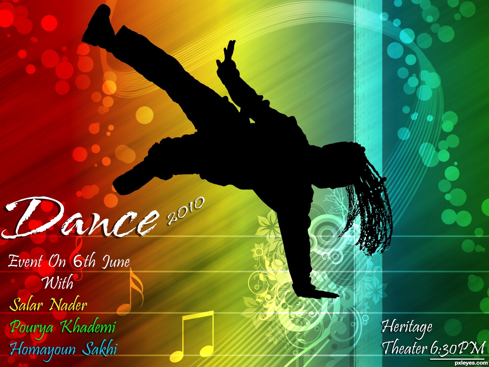
Pretty cool. If "2010" is not important, then I would move it down alongside "June" or even delete it. If it is important, then I would make the font size the same as "Dance." (I'd personally name the festival "Dance2010" [one word] and let the final zero go partially behind the silhouette if need be.) "Event On" is kind of unnecessary. Putting all the venue, date, and time info together in the lower right makes more sense to me. (I'd put "Heritage Theater" on one line and use the same font for both 6's.) "With" could be smaller (no initial cap?) as it's not that important a word.
I agree with Dan. Try to do the changes, see how final image gets, then decide if you upload it updated or not...
I tried that... but not looking top notch 
If you have any other suggestion, please let me know
Nice!
Very nice work.......love the whole feel of the entry. GL
I love it too! great colors and design
Howdie stranger!
If you want to rate this picture or participate in this contest, just:
LOGIN HERE or REGISTER FOR FREE
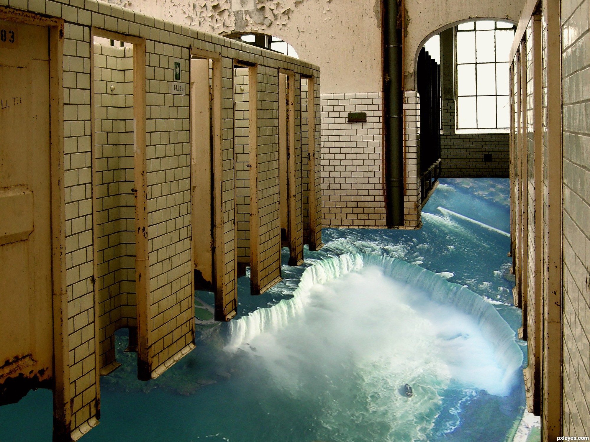
CS3 & Tablet
Thanks to TouTouke for the bathroom and MEJones for the falls
Mask to reveal falls Changed perspective on the falls with transform. Used brightness and multiply layer masks to adjust the lighting (5 years and 3748 days ago)
clean? Clean? CLEAN?.. this is disgustingly wonderful... LOLOLOL disturbing.. but still a great job.. now lets see if my dinner will revisit me.. (clever Idea.. good luck)
For me restroom is overflowing... 
impressive! nice one
Very nice, gl.
very good and a different one... very well done.. Good luck to you author...
I think the idea is very good and the work done well, the only thing entering my mind is that the floor seems to lean a little to much on the right side. Is it possible to straighten the floorimage a little?
I like this!
very nice...good luck
edit:my first comments stand,this is great work but rules says,use image of a street and give it a 3D illusion, similar to the ones that Mr. Mueller creates.
if the color of the water is yellowish...i'd be vomiting hahaha
Street or floor...are the rules that picky?
agree with sunzet it does seem to be off but good luck.
nice chop
Good blend.
GL
Howdie stranger!
If you want to rate this picture or participate in this contest, just:
LOGIN HERE or REGISTER FOR FREE
Photography and photoshop contests
We are a community of people with
a passion for photography, graphics and art in general.
Every day new photoshop
and photography contests are posted to compete in. We also have one weekly drawing contest
and one weekly 3D contest!
Participation is 100% free!
Just
register and get
started!
Good luck!
© 2015 Pxleyes.com. All rights reserved.


DORAEMON~!
OH MAN, what a great title! THANKS!
Howdie stranger!
If you want to rate this picture or participate in this contest, just:
LOGIN HERE or REGISTER FOR FREE