
the back could be the other side of the earth and people could mark their approx. location (5 years and 3246 days ago)
1 Source:
Yippee!! World Tour!!  by iquraishi 14249 views - final score: 67.5% | Around the World in 365 Days  by Majkman 12413 views - final score: 67% | On Tour  by Hayato 13523 views - final score: 64.3% |
PXL World Tour  by lchappell 10059 views - final score: 62.9% | Around the world in an year!  by iquraishi 10381 views - final score: 62.2% | on tour  by kushpatel 3557 views - final score: 62.1% |
Up up and away  by Milena 9483 views - final score: 61.6% | Around the world  by robvdn 6005 views - final score: 60.9% | On Tour  by robvdn 4004 views - final score: 60.8% |
PXLeyes On Tour  by solkee 5046 views - final score: 60.4% | Pxl On Tour  by jordyponce 6505 views - final score: 60.3% | ...simple T  by Drivenslush 3562 views - final score: 60.2% |
Aliquam in PXL  by lchappell 5235 views - final score: 59.7% | Luckiest person in the world  by steelclaw 8277 views - final score: 59.3% | we are family  by kushpatel 5978 views - final score: 59% |
simple  by kushpatel 4380 views - final score: 58.2% | world tour.. 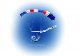 by mounirupa 6140 views - final score: 57.4% | PXL On tour  by mounirupa 6026 views - final score: 57% |
Pxleyes.com World Tour  by Chuck 6882 views - final score: 55% | Join Us On Our World Tour 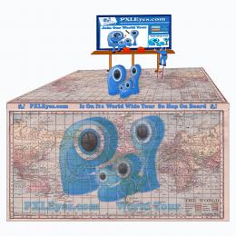 by Chuck 8699 views - final score: 54.2% | traveling SHIRT  by scratzilla1 6311 views - final score: 53% |
The Great World Wide Tour  by Chuck 8172 views - final score: 52.9% |
Howdie Guest!
You need to be logged in to rate this entry and participate in the contests!
LOGIN HERE or REGISTER FOR FREE
Photography and photoshop contests
We are a community of people with
a passion for photography, graphics and art in general.
Every day new photoshop
and photography contests are posted to compete in. We also have one weekly drawing contest
and one weekly 3D contest!
Participation is 100% free!
Just
register and get
started!
Good luck!
© 2015 Pxleyes.com. All rights reserved.


Really nice concept. Good manipulation!
Really great concept but you are missing a part of the description 'PXL ON TOUR' should be mentioned in the design

I like your idea of adding a print on the back.
Cool!
I am so inpressed with so many wonderful entries here and this is definitely one of the best!
Very good potential for a white T-shirt. I do feel more contrast (shadows?) between "PXL ON TOUR" and the background would be more striking when printed on the T-shirt.
The logos on the compass points seem repetitious and boring. Would it be too trite to dress them in parkas, sombreros, grass skirts, kimonos, etc. to add some variety? Or perhaps they could be deleted altogether for a simple, less-is-more approach.
lovely entry.. good context and usage of images for the shirt.
I like This, nice work !
I like your idea, but if you just make the words, "ON TOUR" a little bigger and separated from eachother, in this way they will be more readable. You have enough space between the edges of the world to make the change. This is just my opinion, the design is yours. Good luck.
I always received some great ideas and comments thank you all. The quandary I have is when to apply them? In this case I agree the letter could be larger and since this is a focus of the T shirt I have revised it.
..
ty you all for the kind and informative comments
great work...
lovely
One of the best..
Good work! congrats
Nice Congrats
Congrats..
Howdie stranger!
If you want to rate this picture or participate in this contest, just:
LOGIN HERE or REGISTER FOR FREE