
(5 years and 3249 days ago)
Yippee!! World Tour!!  by iquraishi 14256 views - final score: 67.5% | Around the World in 365 Days  by Majkman 12420 views - final score: 67% | On Tour  by Hayato 13528 views - final score: 64.3% |
PXL World Tour  by lchappell 10064 views - final score: 62.9% | Around the world in an year!  by iquraishi 10389 views - final score: 62.2% | on tour  by kushpatel 3559 views - final score: 62.1% |
Up up and away  by Milena 9484 views - final score: 61.6% | Around the world  by robvdn 6008 views - final score: 60.9% | On Tour  by robvdn 4007 views - final score: 60.8% |
PXLeyes On Tour  by solkee 5050 views - final score: 60.4% | Pxl On Tour  by jordyponce 6509 views - final score: 60.3% | ...simple T  by Drivenslush 3564 views - final score: 60.2% |
Aliquam in PXL  by lchappell 5237 views - final score: 59.7% | Luckiest person in the world  by steelclaw 8286 views - final score: 59.3% | we are family  by kushpatel 5982 views - final score: 59% |
simple  by kushpatel 4382 views - final score: 58.2% | world tour.. 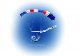 by mounirupa 6142 views - final score: 57.4% | PXL On tour  by mounirupa 6029 views - final score: 57% |
Pxleyes.com World Tour  by Chuck 6887 views - final score: 55% | Join Us On Our World Tour 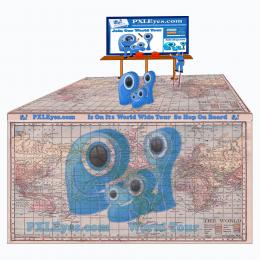 by Chuck 8706 views - final score: 54.2% | traveling SHIRT  by scratzilla1 6317 views - final score: 53% |
The Great World Wide Tour  by Chuck 8180 views - final score: 52.9% |
Howdie Guest!
You need to be logged in to rate this entry and participate in the contests!
LOGIN HERE or REGISTER FOR FREE
Photography and photoshop contests
We are a community of people with
a passion for photography, graphics and art in general.
Every day new photoshop
and photography contests are posted to compete in. We also have one weekly drawing contest
and one weekly 3D contest!
Participation is 100% free!
Just
register and get
started!
Good luck!
© 2015 Pxleyes.com. All rights reserved.


Great idea. Perfect displaying and message.
Can you make it a bit bigger within the space you have? we have an A4 space to print and there's a lot of wasted space this way, the logo can be bigger on the shirt
Maybe you can add "www." in front of the URL?
thanks for including Tasmania in your world map many don't
Love this concept for a T shirt.
It seems to me that the PXL logo should be clearly the biggest element and the "for addicts" is restrictive and possibly derogatory to those who regularly participate on this site. The background map seems redundant given the globe and distracting overall—I would delete it.
I love the way all of this is put together. I don't think it is derogatory and I don't think the map is redundant. I think this is the best one so far and would look great on a t-shirt. I like how you also put the web address so people can go to the site to see what the shirt is all about!
Thanks k5683..it's nice to see that u got my point of view on this contest.
The site's tagline is "For Pixel Addicts" why not use it in the design....Dan??? Good concept for this author , nice looking design.
Howdie stranger!
If you want to rate this picture or participate in this contest, just:
LOGIN HERE or REGISTER FOR FREE