(5 years and 2708 days ago)

(5 years and 2784 days ago)
Red sky by Emmanuel MARZIN
http://www.photoxpress.com/photos-red-sky-glowing-73238
great balls of fire !!
Congrats again Bob!!
congrats 
Howdie stranger!
If you want to rate this picture or participate in this contest, just:
LOGIN HERE or REGISTER FOR FREE
thanks Enchantedgal-Stock
insectualstock,senzostock (5 years and 2929 days ago)
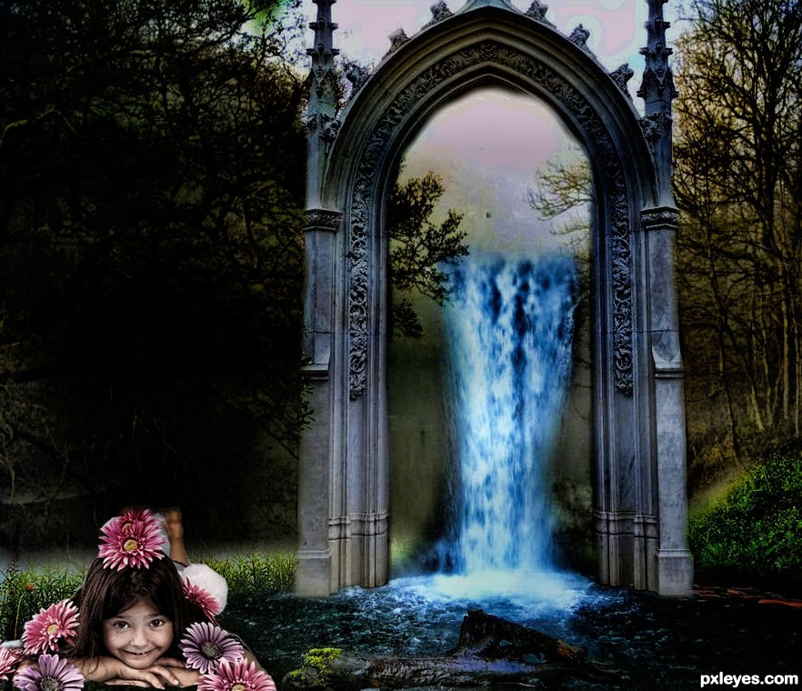
Try to improve the lights on the girl, trying to make her blending better with the environment. Just my opinion. Good luck
Howdie stranger!
If you want to rate this picture or participate in this contest, just:
LOGIN HERE or REGISTER FOR FREE
(5 years and 3133 days ago)
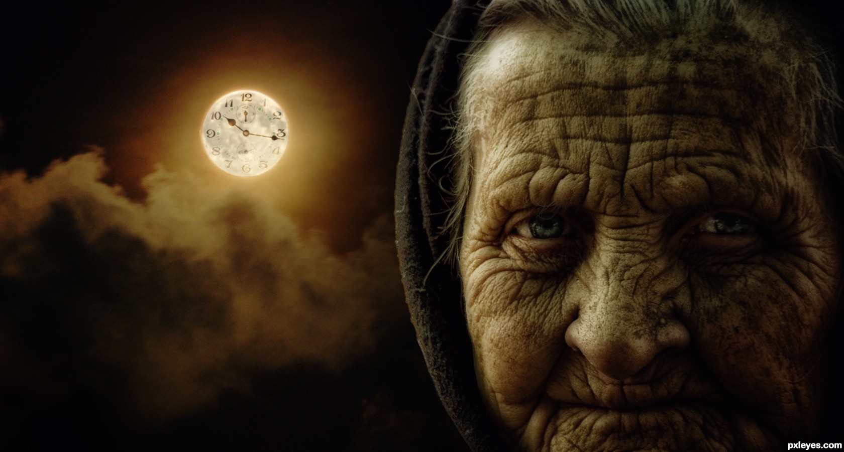
Very nice image. It all blends well and the colors look great.
Hey thanks TwilightMuse! ,I appreciate it
Wonderful work!! The highlights the levels and the shadows are perfectly balanced Gr8 work..
It would have been even better if the clock had more contrast.. But still this is very well done GL Author
Thank u very much Adityagrao !..
very nice -- like the choice of the old woman
Thanks Alan!..
I just love her face expression..
Excellent source pics used to make a really nice composition. Great job, author!
Thanks pixelkid!!
Thanks Nator!..
Congrats for third.....! Nice image.
Howdie stranger!
If you want to rate this picture or participate in this contest, just:
LOGIN HERE or REGISTER FOR FREE

the back could be the other side of the earth and people could mark their approx. location (5 years and 3238 days ago)
Really nice concept. Good manipulation!
Really great concept but you are missing a part of the description 'PXL ON TOUR' should be mentioned in the design 
I like your idea of adding a print on the back. 

Cool!
I am so inpressed with so many wonderful entries here and this is definitely one of the best!
Very good potential for a white T-shirt. I do feel more contrast (shadows?) between "PXL ON TOUR" and the background would be more striking when printed on the T-shirt.
The logos on the compass points seem repetitious and boring. Would it be too trite to dress them in parkas, sombreros, grass skirts, kimonos, etc. to add some variety? Or perhaps they could be deleted altogether for a simple, less-is-more approach.
lovely entry.. good context and usage of images for the shirt.
I like This, nice work !
I like your idea, but if you just make the words, "ON TOUR" a little bigger and separated from eachother, in this way they will be more readable. You have enough space between the edges of the world to make the change. This is just my opinion, the design is yours. Good luck.
I always received some great ideas and comments thank you all. The quandary I have is when to apply them? In this case I agree the letter could be larger and since this is a focus of the T shirt I have revised it.
..
ty you all for the kind and informative comments
great work...
lovely
One of the best..
Good work! congrats
Nice Congrats
Congrats..
Howdie stranger!
If you want to rate this picture or participate in this contest, just:
LOGIN HERE or REGISTER FOR FREE
Photography and photoshop contests
We are a community of people with
a passion for photography, graphics and art in general.
Every day new photoshop
and photography contests are posted to compete in. We also have one weekly drawing contest
and one weekly 3D contest!
Participation is 100% free!
Just
register and get
started!
Good luck!
© 2015 Pxleyes.com. All rights reserved.


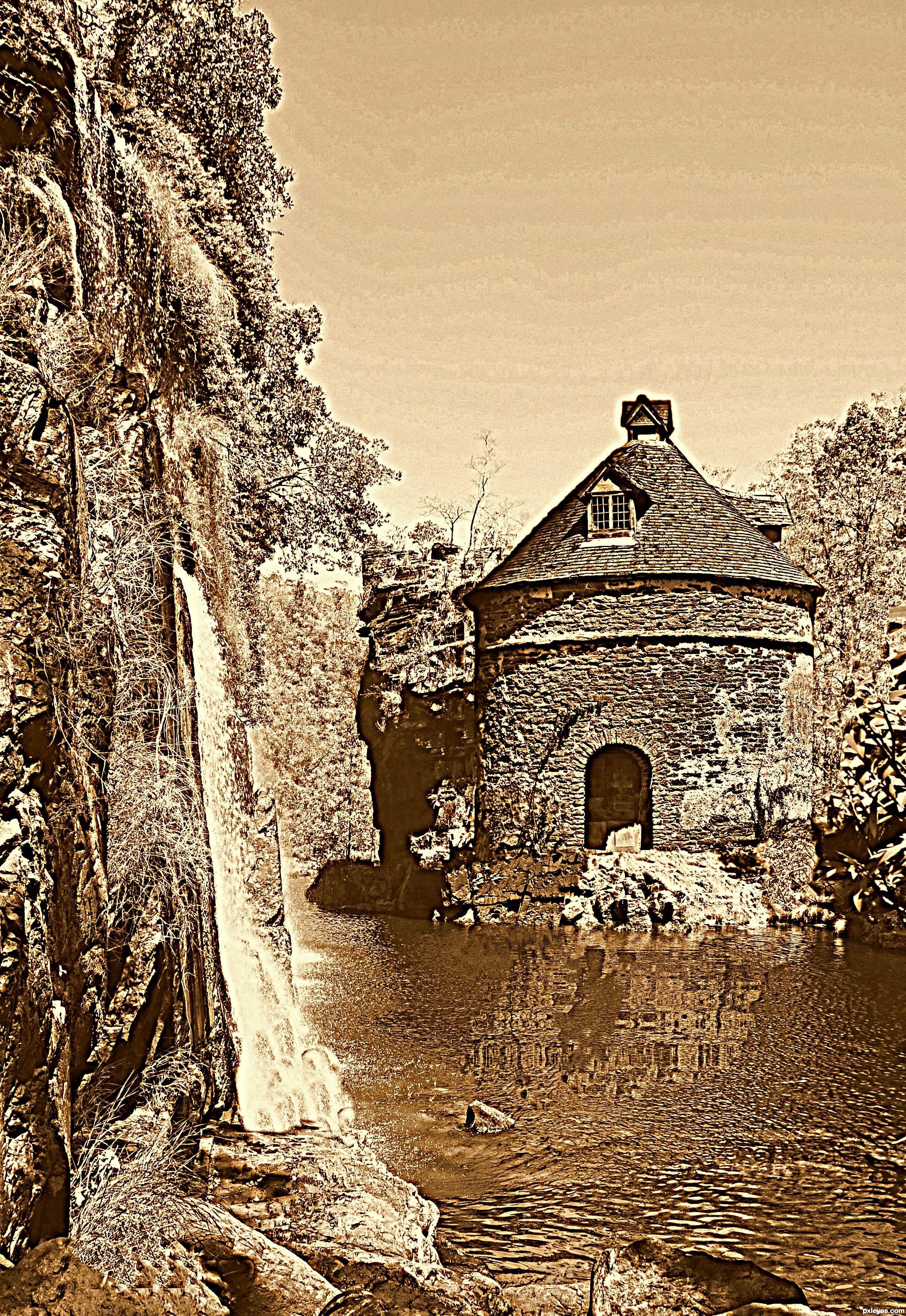
Too much HDR, but good color.
Tks for comment and giving me a support.
I like the color, and the whole composition.
Hate all that noise!!!
If this was done to hide hard edges it is defo not working. IMO
Its too bad because it has a nice flow...your next entry, will no doubt be much better.
You have a good eye but lack the knowledge of the tools. keep at it and don't give up.
Cheers!
Howdie stranger!
If you want to rate this picture or participate in this contest, just:
LOGIN HERE or REGISTER FOR FREE