 ))...ihaaaaa!
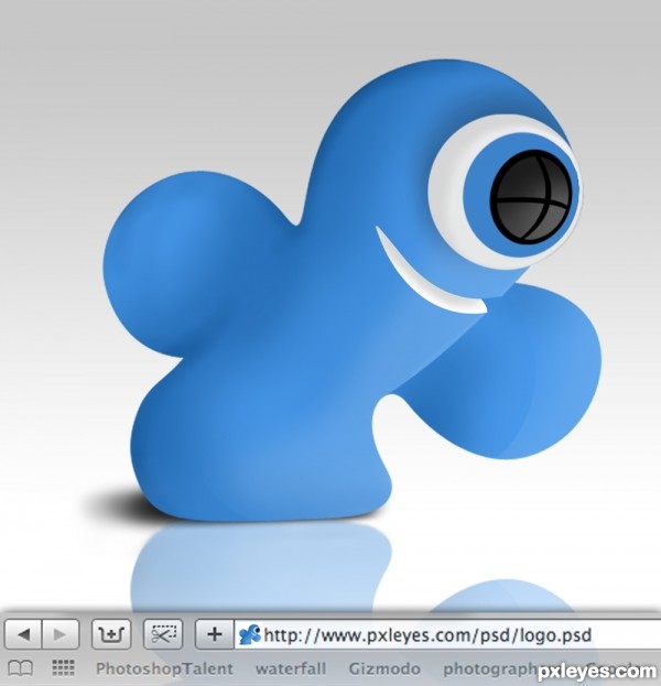
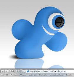
The challenge is to make something that represents Pxleyes without actually copying the original logo. Another challenge is to make something which is recognizable at a really low resolution. So I chose the x in the pxleyes logo first because it fills the most space within a square and second because it's easy to recognize at a smaller size. The design duplicates the same theme as the original logo with my own twist. It's supposed to be the x looking at the web address as the light source with a smile. The only thing I copied was the actual shape of the x because I wanted it to match the logo. The rest was remade with the selection and pen tool. (5 years and 3660 days ago)


It's cute, nice and funny! On my favorite sites list, it would be easy to find!
This one looks great! Fantastic work here.
Very cute. But I don't think it links to the logo enough: eye is somewhat minor while logo emphasizes eyes; has arms while all three logo figures are armless. I like this as a new character, except I don't see that as the theme of this contest.
Woah, nice job making it look 3d
Congratulations!
Congratulations for 1st
Congrats, nice work
Congrats for 1st
Congrats - got the favicon on the browser now. =) Nice!
hey... ur favicon on the browser now....................
superb yar...............
Howdie stranger!
If you want to rate this picture or participate in this contest, just:
LOGIN HERE or REGISTER FOR FREE