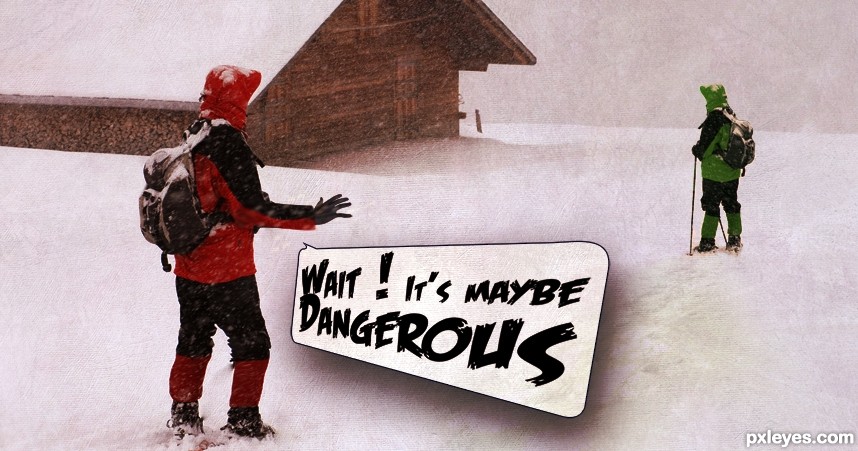
Two explorers are alone, they see the danger everywhere ... (5 years and 2921 days ago)
2 Sources:
(5 years and 2929 days ago)
Howdie stranger!
If you want to rate this picture or participate in this contest, just:
LOGIN HERE or REGISTER FOR FREE

(5 years and 2994 days ago)
I'll just turn around thank you very much LOL very neat Idea author.. good luck
very good idea and neat work author...mood is very very nice...IMHO this could be your best entry for now...best of luck
I suggest you have a look again at the traffic signs, the positioning and perspective is completely wrong. Not to hard to change that.
It's very nice, just fix some things, I think the size is too exaggerated, the screws lose the sense at this size, and I think that would give you center a little more plates to the base. GL
Wanna see the SBS too, i will hold my vote 
very good concept.. good luck
Agree with above, especially the perspective.
There's no difference between "GOD" and "?"...just a matter of perception. But please try to revise the image as per the suggestions above.
I like it and the idea is great.You got my vote.
@erathion Wow...thanks mate. @petersheep You're right about screw. It fixed.
Thanks everyone for your words. And to point out mistakes about perspective. Can you clearly describe .. ?
Hi author, i see the modification...nice!!! about the perspective, I think if you centralize the center of the plate with the base would be perfect.......nice Job GL!
Hi author, i see the modification...nice!!! about the perspective, I think if you centralize the center of the plate with the base would be perfect.......nice Job GL!


great image!!!
Excellent work, loved the lighting! Dramatic and expressive! My fav!
Love the idea and the lighting. Would have loved it even better if the source was a finger post and not a warning sign. But since it is, I find this just great. 
congratulations...
Congrats!!
congratulations...
very nice.., congrats
Howdie stranger!
If you want to rate this picture or participate in this contest, just:
LOGIN HERE or REGISTER FOR FREE

(5 years and 2996 days ago)
Howdie stranger!
If you want to rate this picture or participate in this contest, just:
LOGIN HERE or REGISTER FOR FREE
(5 years and 3008 days ago)
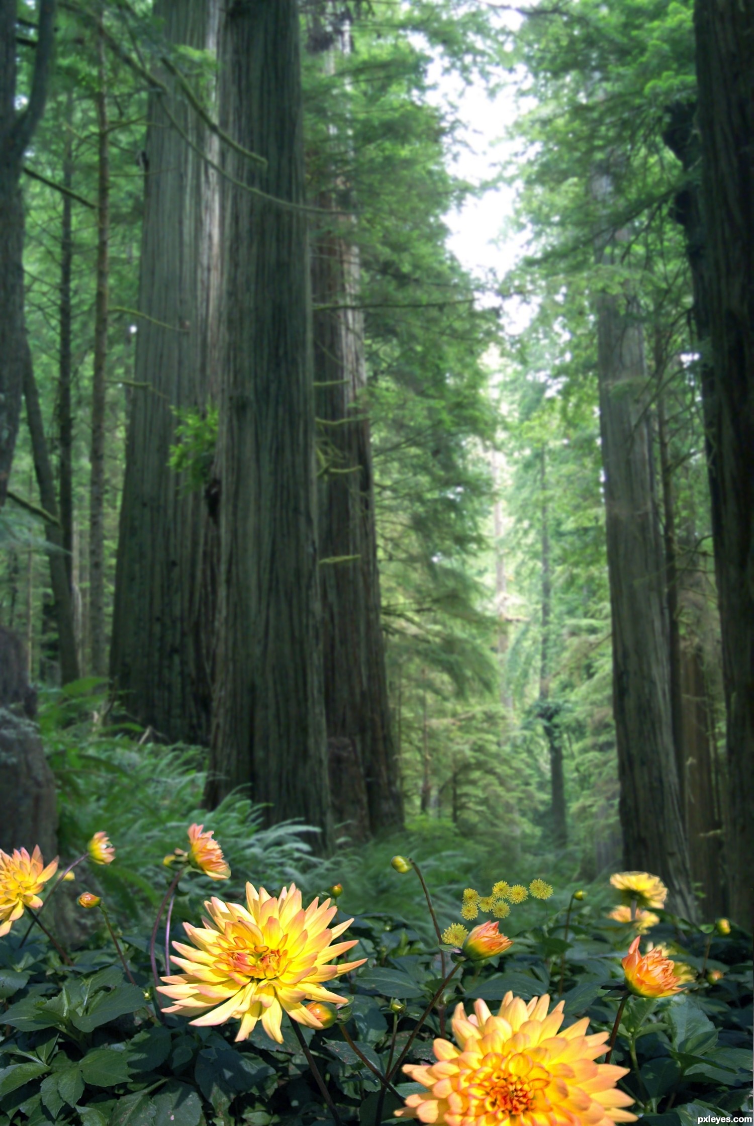
Nice. Add some more blur to the flowers in the back and -if needed- also a little bit of blur in your background, so that the DoF works better and the flowers in the foreground will pop out more. Good luck!
Thanks wazowski, played with your suggestions and reposted after modification.
Nice chopping! Good work.
Lots of work in there. Nice blending. The lightings and trees lead to the bright flowers. The flower bunch IMO could be sharper and counts lesser. The grass behind bunch needs bit sharpness. Overall, good compilation. GL
Thanks locale, redone again... I shot for a mix between wazowski's and your suggestions. I have to admit, it looks better having listened to you both!
Howdie stranger!
If you want to rate this picture or participate in this contest, just:
LOGIN HERE or REGISTER FOR FREE
Photography and photoshop contests
We are a community of people with
a passion for photography, graphics and art in general.
Every day new photoshop
and photography contests are posted to compete in. We also have one weekly drawing contest
and one weekly 3D contest!
Participation is 100% free!
Just
register and get
started!
Good luck!
© 2015 Pxleyes.com. All rights reserved.


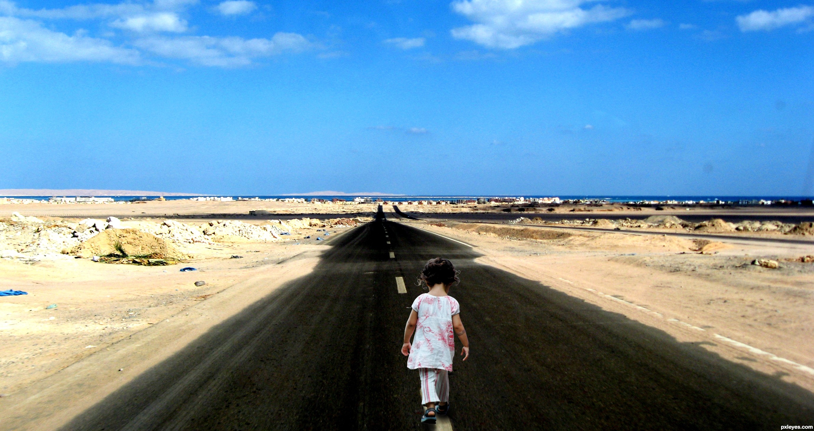
Hi ! The links seem not correctly appear.
I used this picture :
http://www.flickr.com/photos/bob_august/5457559652/sizes/l/in/photostream/
and this font :
http://www.dafont.com/search.php?psize=m&q=Feast+of+Flesh+BB
sorry :/
Yeah, maybe you posted the link in the anchor text window, instead of the source. But you can edit them again!
^^' hum, how can you edit them please ?
go to MY STUFF>MY CONTEST ENTRIES...
oh ok thanks that's too late now but I'll know it to the next contest. Thanks a lot
Howdie stranger!
If you want to rate this picture or participate in this contest, just:
LOGIN HERE or REGISTER FOR FREE