(5 years and 2685 days ago)
(5 years and 2841 days ago)
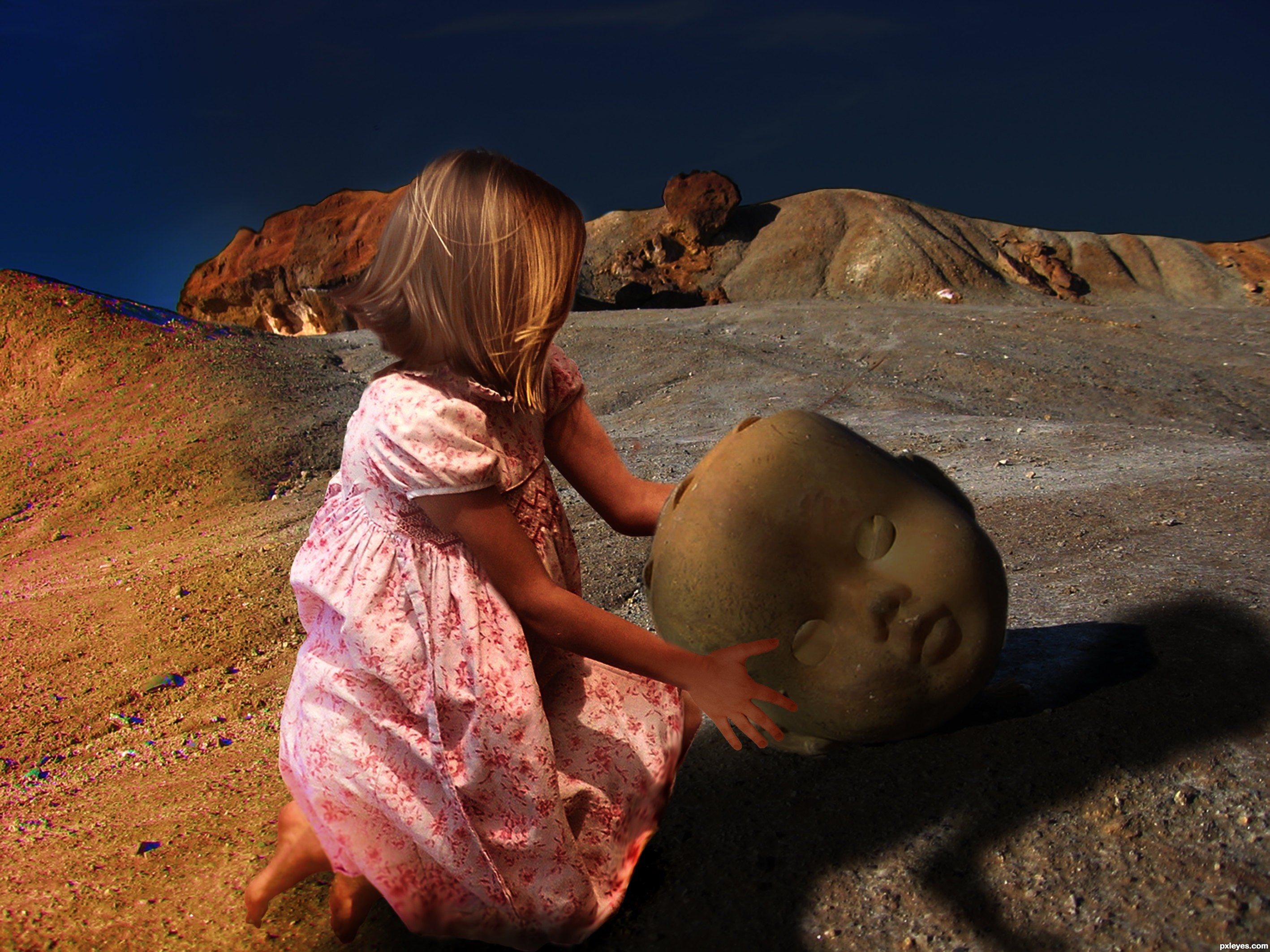
You might want to give a slight blur to the sharp edges of the background rocks, and remove the unnecessary shadow to the left of her feet...otherwise it's pretty good. 
Thank you, I never saw it.
It appears to me that the ground shadow does not quite match the girl. We see one of her arms but not the toy head or her other arm. What am I missing? I can't mentally picture how that shadow could be cast...
Howdie stranger!
If you want to rate this picture or participate in this contest, just:
LOGIN HERE or REGISTER FOR FREE
Thank you
mr blackdoomy
&
mr
absurdus
(5 years and 2918 days ago)
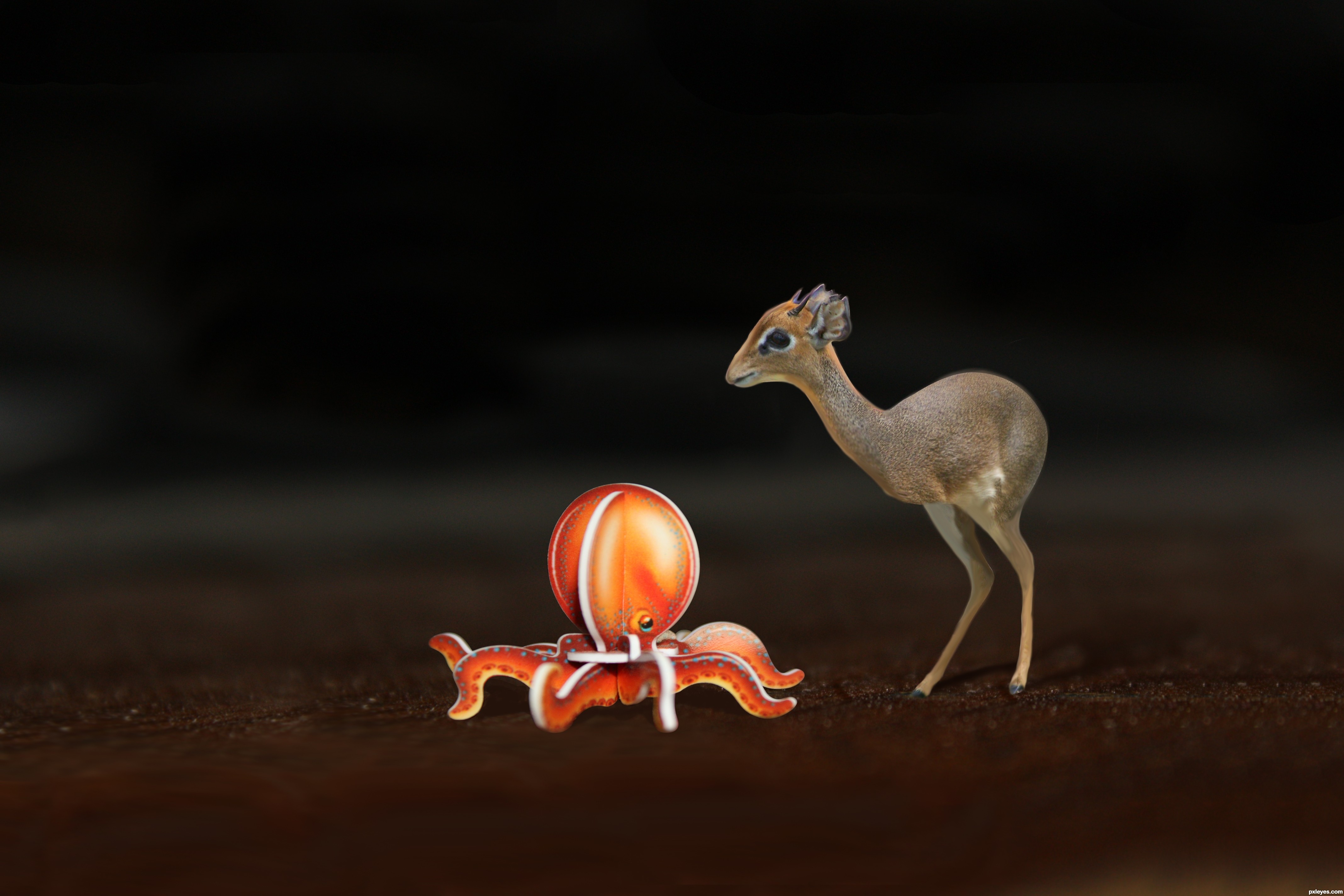
That is cute. He/She (do not know gender) looks so inocent. Good job. Good luck!
Thanks George55
fine atmosphere and colours, bravo
Really ?????????? is this that Bad ????????? 
Don't be disheartened by the ranking as a lot of these entries finished with very similar scores. Also, when there are many entries in a contest, I suspect some people get voting fatigue, and just vote quickly to get through them.
Mr. NiceHotCupOfTea i am not talking about the votes, i am talking about the entry i have created for this contest. i am upset because the work i have created and the overall composition i have created is definitely not belongs to the bottom 3 ......and i bet you if minimum 3 ppl say that this is well deserve to be on bottom 3 i will Quit Pxleyes.com right after that .....
Howdie stranger!
If you want to rate this picture or participate in this contest, just:
LOGIN HERE or REGISTER FOR FREE
(5 years and 3083 days ago)
very Cute!
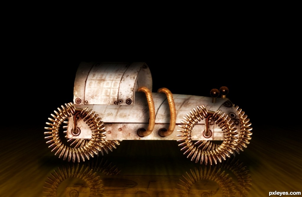
Icame back to this entry because its so cute and if you use a large soft black brush on the roof of the car to add more shading then the roof looks more rounded first selct the roof tho so you dont have to erase all arround
Thanx a lot coming back was the best way to compliment some1s work....
I made a lil change with the roof hope it's fine now.. :P
looks more rounded now and its still very cute, it made me think about toycars that kids make from tin cans in poor countries
This is a pretty good looking piece of work, I like your creativity and color choices. I think you might want to check the perspective though. Try using the free transform/skew tool. I'm going to hold my vote for the time being. Great effort, try adjusting the perspective a little, I believe that will put it over the top. 
Hi author nice idea.
Just a few suggestions.
I think im missing out some shadows.
The "tires" should also cast a shadow onto the vehicle.
Same for the things wich are standing at the front of the vehicle.
I also think the tires wich are on the back side ( photowise; aka the side we dont see ) should be placed more to the front. If you draw the lines you can easely messure out where it should be placed.
Also the reflection could use some work. The tires reflection of the tires wich are on the back side ( photowise; aka the side we dont see ) should be touching the real ones.
to be continued
To do this reflection. You could simply cut the image into a few pieces, use free transform with all the options aviable, to make it look right. The side we as the viewers see, can be one piece, as long as there is no depth. So thepart where u are looking into the vehicle should be another piece, and transformed again. Then you can place them together to make it look good.
It's a pretty difficult task to get it perfect.
I hope it helped you make this image even better.
Good luck.
Thank you all for the valuable comments... they did help me learn a few new things...
i tried making all the changes possible.. hope it's fine now
do let me know if it still needs some change cheers
Cute is right....I just have a (hopefully) helpful criticism.
The perspective issues are being created by the floor being at a different angle than the car. The car persp. is actually 'shallow' while the floor is 'deep'.
If you draw a straight line from the close rear wheel to the same spot on the far rear wheel, then compare it with the line of the floor board you will see what I mean. The floor can be adjusted by either using the perspective transform tool, or by simply squashing it with the transform tool... You know which one is best once you try each....
I hope you take this only as a positive comment and not anything negative.
Here's a pic of that may explain it better....hope I'm not breaking any rules with this.... it just helps explain it better than words..
http://imageshack.us/f/192/toycarcomparison.jpg/
cheers
Your (hopefully) helpful criticism was actually (very) helpful... lol...
Thanx for not only commenting but also taking the time to edit n show me where i went wrong.. I've made the changes, hope it's better now
It just keeps looking better and better
Thanx a lot!!!
The perspective is looking way better.
Looks much more grounded now.... more than happy to help.
The pic I added saved me a thousand words...hahaha.
It does, however, look a bit floaty with the reflection slightly off. May I suggest you move the reflection just up and to the right a tad... it's only a matter of pixels, but it may help; and maybe experiment with reducing the opacity just a little bit... (The degree of opacity will actually be the thing that dictates how shiny your floor is..)
cheers
This "prototype" is looking better and better xD.
thanx again every1 .... iv been lil buzy so couldnt get back in time...
n galian: thanx for tat comment.. i noticed my fault now... but cant edit the entry ..iv made the change here on my file though 
cheers
Good luck in the voting author.
I find this a bit cute..nice job author!!
my fav by the way. GL
thanx a lot
Sweet little vehicle
Congrats!!
Congratulations on your SILVER trevordsouza7... keep it up!
cheers.
thanx a lot ppl
Howdie stranger!
If you want to rate this picture or participate in this contest, just:
LOGIN HERE or REGISTER FOR FREE
(5 years and 3094 days ago)
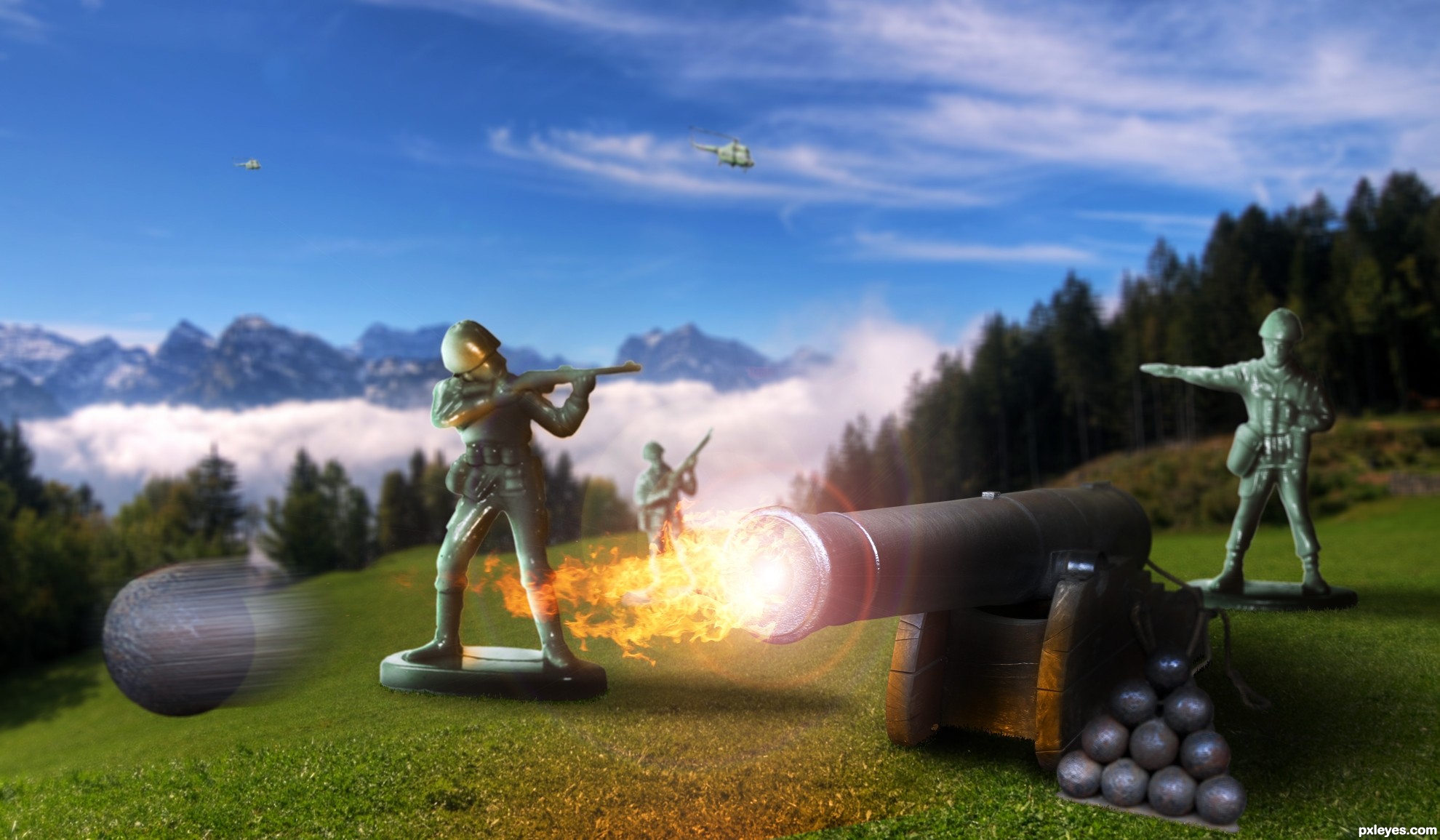
I like it.
The soldier firing the rifle should be flipped horizontally. As it is, he's firing at his own men.
Fav!...
CMYK, I meant for the soldier shooting to look like he was covering the left side of the cannon in case of a flank.
great! lurve it nice effects
Nice job on the canon blast.
Howdie stranger!
If you want to rate this picture or participate in this contest, just:
LOGIN HERE or REGISTER FOR FREE
Photography and photoshop contests
We are a community of people with
a passion for photography, graphics and art in general.
Every day new photoshop
and photography contests are posted to compete in. We also have one weekly drawing contest
and one weekly 3D contest!
Participation is 100% free!
Just
register and get
started!
Good luck!
© 2015 Pxleyes.com. All rights reserved.


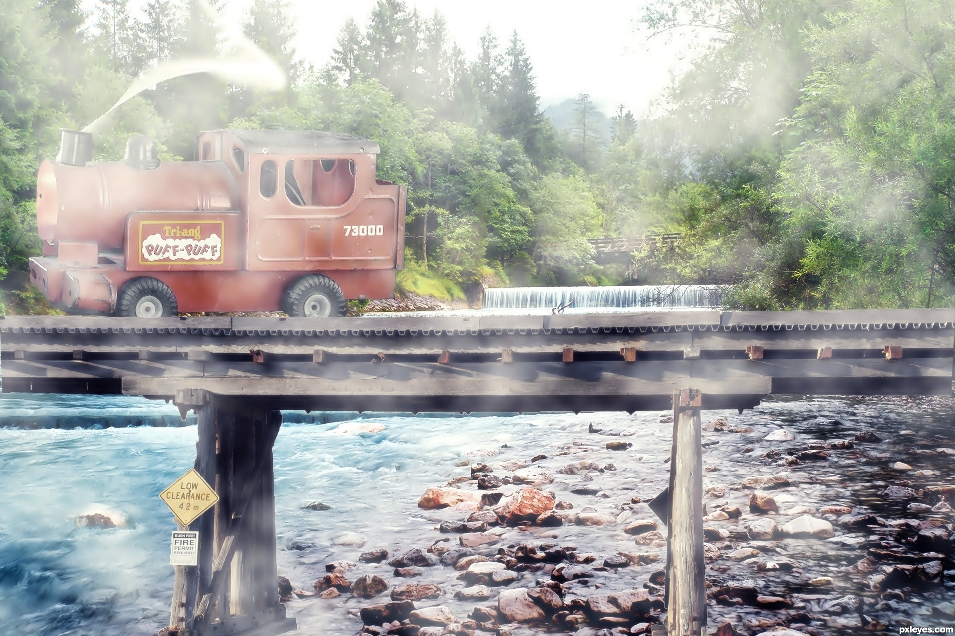
Nice but imo the added smoke/fog all over the image is a bit distracting. Good luck!
Howdie stranger!
If you want to rate this picture or participate in this contest, just:
LOGIN HERE or REGISTER FOR FREE