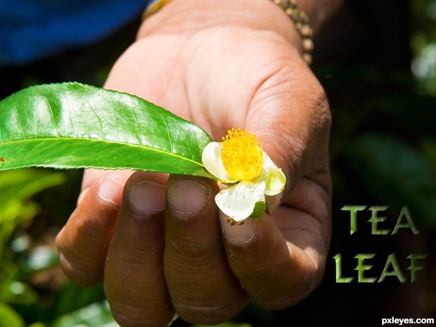
Thanks for the image of leaf and hand by minglespy. (5 years and 3154 days ago)
1 Source:
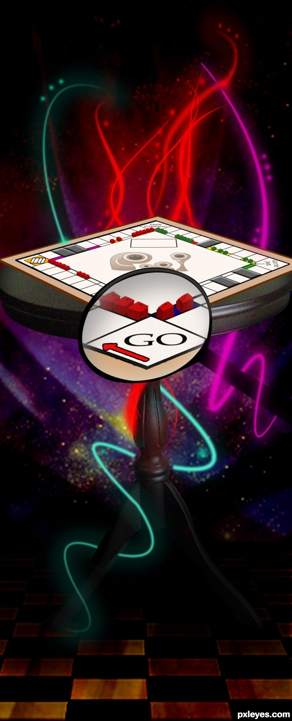
EDIT: i attempted to take into consideration the houses being too small.
The source image reminded me of the little monopoly houses so i created this image.
Please vote/comment
Hope you like.
Credits to "Temari 09"
for the background and "NefletStock"
for the table (5 years and 3212 days ago)
sorry to ask this out...
i maybe wrong but you have not used the source anywhere... you just made them of different color but never used them in the final image
correct me if i am wrong
Very creative! Good work 
you are wrong im afraid the whole concept is a monpooly board where the source of a house has become the houses and hotels on the board
ohh...silly me...
but the houses and hotels are too small to see.... i mean it is going according to the size of image... but its really hard to see... thats why i missed it....
good idea i have to say...
lol no worries ankit, i wos worried about it being too small however, i had to keep it in perspective so it was unavoidable, that's why i uploaded it in hi-res, thanks anyway
Well thought idea! But the source house isn't visible on the board, you've created all kinds of perspectives of the house but I can't see the source house in them anymore. It's probably a lot better if you take the original house, make it red/green, place it on the board without changing any perspectives. But for the left and right far sides of the board you could just remove the windows and reposition the chimney and maybe horizontal flip it. Good luck!
You should definitely zoom into the board and show more of the houses..
Thanks guys for your comments however, it's a monopoly board so there isn't alot i can do about the size issue.
and "Ressiv" your right about the perspective but the board is done at a different angle to which the source is and thats why the distortion of the perspective has arose.
also i wanted my idea to be presented in a more interesting manor and that can't be done with a zoomed in monopoly board im afraid 
great idea...maybe u could show only part of the board with a bigger house...just an idea...gl
Great idea, I think you need a tight shadow under the board.
Nice! Once I've played it with some friends and we've broken the bank! 
Ok, the buildings are tiny but the whole image is great. As erathion said, the question is solved if you create a detail of the board, but it's up to ya... GL! 
Using the magnifying glass to make the houses more visible was very clever. Nice addition.
Quite a clever take on the theme!!! Good job!
great
NIce!
great take on the theme, gd idea with the magnifying glass too!
Congrats for your second place, Tinkerbell!
Congrats!
Congratulations for 2nd place
thanks to everyne for your comments/votes much appreciated
Howdie stranger!
If you want to rate this picture or participate in this contest, just:
LOGIN HERE or REGISTER FOR FREE

(5 years and 3454 days ago)
Not bad. The subtitle kind of ruins it. Try messing with the effects a little bit more.
yeah gud work
nice work,gl
nice
Howdie stranger!
If you want to rate this picture or participate in this contest, just:
LOGIN HERE or REGISTER FOR FREE

Please don't consider this one look in the step by step thank you. (5 years and 3608 days ago)
AHhh! *sigh of relief* I love this one! Like the blue the best!
absoulutely different one... Lovely...!! Good Luck..
LOVE IT LOVE IT LOVE IT LOVE IT
(favorite part is that you have broken every rule in logo making and it works.. just like Bjork is to music LOL)
soory but i think that logo have to pass messege, and this one only people who know´s pxleyes will know what is about,(my opinion) but i think u did a very good work like BRUNO MUNARY ( italian designer) sad´s " one thing born from one other so very goood tip u gave
cute
just briliant..
I LOOOOVE IT! author, you;re a genius!  I think that you should add the link, pxleyes dot com under it, though my favourite so far, anyway :x
 ......nice change of pace.....
 ........
LOL thanks my friends!!!!! I thought it was a crap hahah!! Giulia look the sbs the link is visible there
@Mario: you're right buddy but it's quite hard to design a logo wich tells "we make PS contests, share opinions and bla bla.." I tried to say that we're an eterogeneous group with adults (left) kids (center) and teenagers (right). That's just impossible to be understanded by a casual visitor but...that's my idea
this is wonderful author, seems like we finally had a winner in this contest, i love the blue the most, i think all of us find PXLeyes familiar and fits more in blue, we won't find any other color comforting before long time passes seeing the different color, besides blue looks so cute, you did very well, no wonder a smiling personality brings out a smiling design
hey i knew it was you love the characters :-P totally different approach although i bend over a more "serious" design for a logo identity... but it's a subjective matter... GL
Very cute! It may not be wholly intelligible on a stand-alone basis, but in application with the site name/URL under it (see SBS), it all becomes clear. I think whimsical works well for a site that promotes creativity. A little personality is a good thing.
the logo of the future
very nice!
This is a great logo... It really shows how much fun we have here! Well done! High marks from me. GL
but but but this logo is beatiful
My favorit,different and funny
Same as everyone else, I do really like this, but I am a little worried that its not clear it says pxl
Interesting but it needs something obvious to say what it's about...I can see that it is PXL but it's not obvious...while the characters are fun, I don't think they are logo/brand material.
gl
Thank you very much again!!!! Please take a look at the SBS the final logo will have the url below and it's clear thanks
while it is interesting and creative, i don't think it is professional enough for a site like this no offence.
Lol, they look so cute gj
very original one of the best
Funny creatures for sure ( I like the blue version the most too), but I'm afraid it wont work as logo. At least not as it is right now, because funny creatures còuld work pretty well (see also all the Olympic games designs). The examples in the SBS are not big enough to have a good idea how it would look like. What I see for now is that the X could do with a bit more X-shape, just as that the mouths from all 3 creatures could be a bit stronger and more visible (be aware that in the small version it wouldnt be as visible as you might think). But well...funny for sure . Good luck!
Nice n cute...nt sure would work for a Logo...but Cute... Good Luck!!
Sorry folks but where's written that the logo has to be readable text?? The title says it: STOP BORING TEXT And how can you say this is a serious website LOL we make Photoshop contest we don't do business or sth @ Waz yeah the sbs is not in the right size but then it works fine when it's at 100% and with the url below the logo 
This is GREAT!!
cute and clever !!!
COOOOLLLL!!!! i love it!! briliant!! great job author!!
ahaha, very nice ))) cheery
Greaat!
Congrats G-Man!Way to go!
congrats
Sorry, doesn't work for me...
Congrats! With your "Please don't consider this one" 
looks good- makes sense!
YEAHHHHHHHHHHHHHHHHHHHHHHHHHHHHHHHHHH.. I was right.. it was all me.. JUST KIDDING.. I was hoping.. YIPPPPEEEEEE
Congratulations, see? nothing brings bad luck but bad work
Good job, congrats
congratulations G-man, great, fun design
Congrats Giallo, well done
congrats 
Congrats for the win. But I am not convinced, as a logo it's not conveying anything. This may be suitable for a toy company or for child products. This is my view, it may not be correct.
hey giallo U cutie u won WOW  Congrats
Congrats!!!!!
CONGRAAATS!!!!!
Congrats!
we got a great logo! yay! congrats
Way to go you done good!
Congrats, Giallo!!! Benissimo!
I'm so happy you won! Don't listen to the haters... Great job! Congratulations!
I'm late due to my entries and have not cheque this contest. Anyway Congrats, great logo design,
Congrats ! GREAT work !! 

Thank you very much for choosing my logo I'm really happy to made a logo wich fits with most of you
This one is your legacy to pxleyes.com .
a legacy like that is forever..after 2 years looking at this work reminds me a lot the old nice times
woot!! go get em Bubba "G"
Howdie stranger!
If you want to rate this picture or participate in this contest, just:
LOGIN HERE or REGISTER FOR FREE
(5 years and 3609 days ago)
It's PXLeyes...
nice idea shame you've spelt it wrong
its PXLEeye, you used T by mistake, easy mistake I do it all the time
as others mentioned... it's PXL... like the style though!
Now I wanted to say that the "T" should be an "L", but I see I wasnt fast enough...Style is nice yes, not sure if in just black/white. Good luck!
hehehe..I had made a PST reflection and the T got left over..LOL..sorry about that.. too much stress at home..hehehe.. easy fix
nice job with the change ;]
gl
Good Luck
Nice idea good luck!
Nice and clean good one
Good work
Nice entry...Good Luck!!
GL!
Looks too much like PXLE yes...
Howdie stranger!
If you want to rate this picture or participate in this contest, just:
LOGIN HERE or REGISTER FOR FREE
Photography and photoshop contests
We are a community of people with
a passion for photography, graphics and art in general.
Every day new photoshop
and photography contests are posted to compete in. We also have one weekly drawing contest
and one weekly 3D contest!
Participation is 100% free!
Just
register and get
started!
Good luck!
© 2015 Pxleyes.com. All rights reserved.


Very CBR.
Oh dear, sorry you think that Lamantine, quite a bit of work went into it, and I've seen a LOT worse! (See SBS)
I have to agree with Lamantine!
You only used the source in the text?
...and a 9 step sbs to show it.
i think you could have made the source more relevant to the piece. such as making a background for the hand to be over instead of the original sources background. would have brought more attention to the source image of the contest.
No CMYK46, I also used it for the leaf in the persons hand and used overlay and a few other things - it's all in the sbs. I think jadedink has viewed them, if so - thanks!
Ah jadedink, I used the whole of the background image because it was a tea plantation and that was the whole point of my pic - making the single leaf into a tea leaf. I really don't want to say this: but tea comes from leaves...... THAT'S the point I was making.
my point still is, you can't really SEE the source being used. i mean, i HAD to look at the 9 step sbs just to see if you'd tried to use the source in any other way.
Don't take all of this the wrong way, its just, there are SOOOO many entries in different contests in which the source is minimal, or...barely seen at all. I was just trying to be helpful in suggesting using it in a way which people could see without having to look through 9 steps on how to make a leafy text.
I don't get it...except for being lighter, the leaf is the same as in the source pic.
CKYM46, that's a compliment really although I appreciate that you didn' mean it to be. Well - the leaf is taken from the source image as shown in step 6 of sbs and then I used overlay. So in all the source image is used roughtly nine times in all to create this picture. That's 8 times to make the text and once for the leaf. Now I'm leaving the building!
like the font. good luck Author
It's hard to deny the author's observation that "I've seen a LOT worse!" Nevertheless, this still seems rather slight. Making the text a lot more prominent, and perhaps more of an advertising message instead of just a label, might help.
Seriously, not much use of the source here. I don't need to go to your SBS to see where you used it.
This isn't CBR'd. It's minimal use and you COULD have used more of the source.
Yes, seriously jawshoewhah, you're right!
Howdie stranger!
If you want to rate this picture or participate in this contest, just:
LOGIN HERE or REGISTER FOR FREE