(5 years and 3224 days ago)
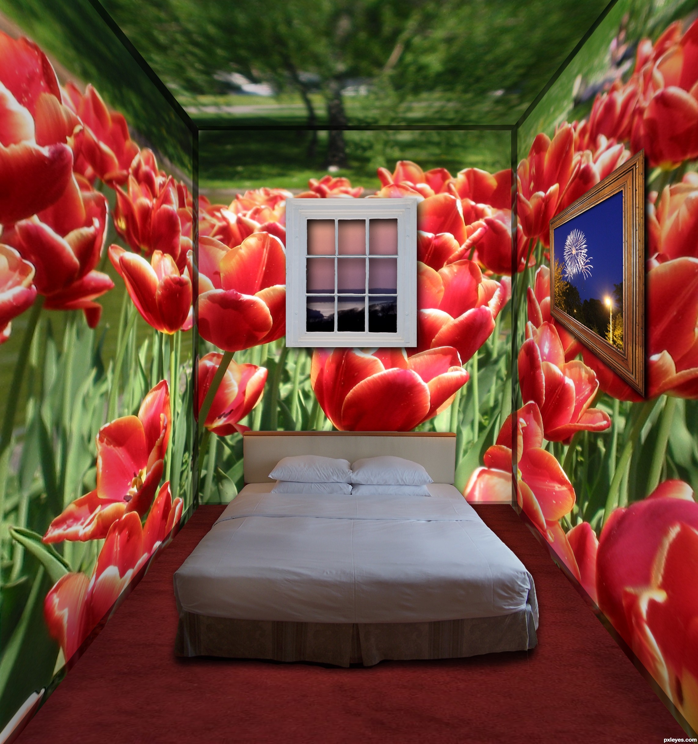
Fireworks photo on the wall - my own - will attach in StepByStep (5 years and 3274 days ago)
The angle of the bed is tilted a bit too much, you'd slide off the bottom. Your corners are also a bit too thick and don't meet up quite right in the upper RH corner.
It would be nice to see something outside that pitch black window. Even the darkest night isn't quite that opaque...
Beautiful color scheme, though!
Thank you very much for your help  I've tried to fix up a few things.
Looking better, but who puts a window curtain or blind on the OUTSIDE of the window??? 
MossyB perhaps the idea was to show the outdoor picture as a room so it stands to reason the indoor view should be outside? ;D
Howdie stranger!
If you want to rate this picture or participate in this contest, just:
LOGIN HERE or REGISTER FOR FREE
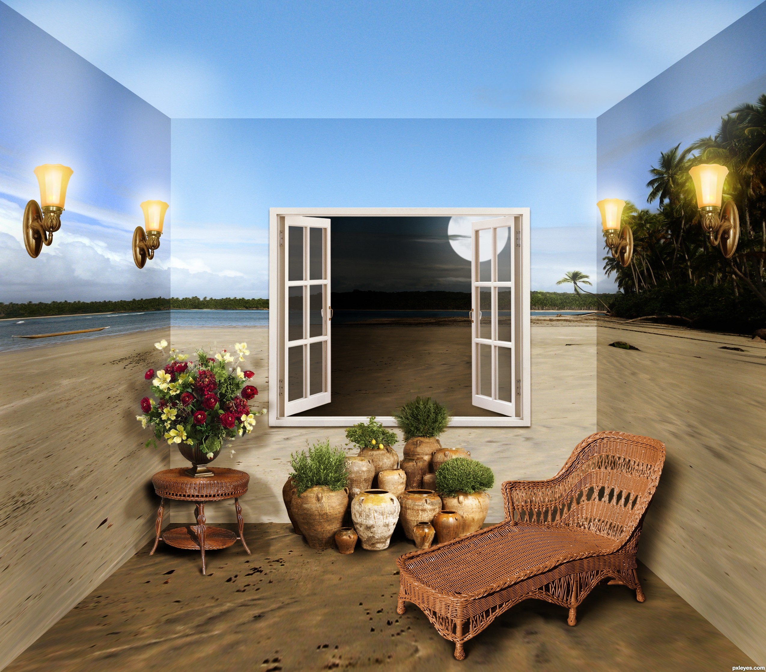
Thanks to Lieven Verbelen for the perfect background.
Special thanks to these photographers for their painstaking work in preparing their stock:
AbsurdWordPreferred for the window, and
JinxMim for the light fixtures, wicker, and garden pieces.
I made the moon by drawing a circle (ellipse tool) filled with white, then using the eraser, set to chalk brush at a low opacity, to create three "craters," varying the brush size each time.
Shadow/color variations for the walls and floor were achieved with Brightness/Contrast adjustment layers. Furniture and object shadows employed some Drop Shadow and mostly black painted layers with low opacity.
Night scene through the window was achieved using a duplicate background layer (using the window as a size guide) set behind the window, applying an Exposure layer mask, and painting selective light back in. Glass panes are white rectangles set to low opacity.
Two color adjustment layers were applied over the entire scene: one with greens made more vibrant, and one with an overall golden brown, set to soft light.
If I missed explaining anything, please just ask. (5 years and 3280 days ago)
Amazing!
I like the shadows, and perfect combination with the background. And i like it the idea for the floor. Well done.
Wow!!!
I'd never want to leave a room like this! Excellent work, and one of the best examples of this concept I have ever seen. Instant Fav!
Very elegant!
This is so much better than the tutorial. But there didn't seem to be any corners showing in the tutorial Guess that doesn't matter. Also, I love the sand on the floor. Tutorial had baseboard around floor which wasn't in very good perspective. Great job!
I'd think the back wall would be darker than the walls lit by the lamps. Otherwise I love this...GL author!
Thank you, all!
I didn't care much for the tutorial either, artgirl1935 - lots of sizzle but no steak (I couldn't tell or couldn't appreciate the difference before and after all those additional adjustment and shading layers, LOL). But it sure is an interesting concept.
CMYK, what you say makes perfect sense logically. However, as I sit here and look at the walls, the one that faces me reflects light more and is brighter than the perpendicular side walls, even though the light is physically on the side wall. Weird. (The immediate area of the light is brighter, otherwise side wall is darker in comparison.)
MossyB, all opinions and critiques are welcome and appreciated, but as the contest proposer, your opinion is very special. I'm glad you like the result!
The night exterior with the day interior is genius. The sconces are a creative way to convey greater solidity to the side walls, but the light they emit is apparently irrelevant to the illumination of the room. (They shine light up while their solid bases would cast shadows down.)
Very good work, GL!
very very nice but i think there are some premade work , thats not allowed , like thr garden set
Pre-made? I don't understand. They are real objects in a layered psd. It's not a photo manipulation. Is that what you mean, andi?

Agree with Dan about the interior and exterior shot lighting difference. I'd never want to leave this room - and the use of wicker is perfect for this relaxing 'atmosphere'! Great job. 
congrats! well deserved 1st place!
Congrats Elemare wonderful room, I'd like it at my place
Great work and congrats!
Thanks, everyone!
Howdie stranger!
If you want to rate this picture or participate in this contest, just:
LOGIN HERE or REGISTER FOR FREE
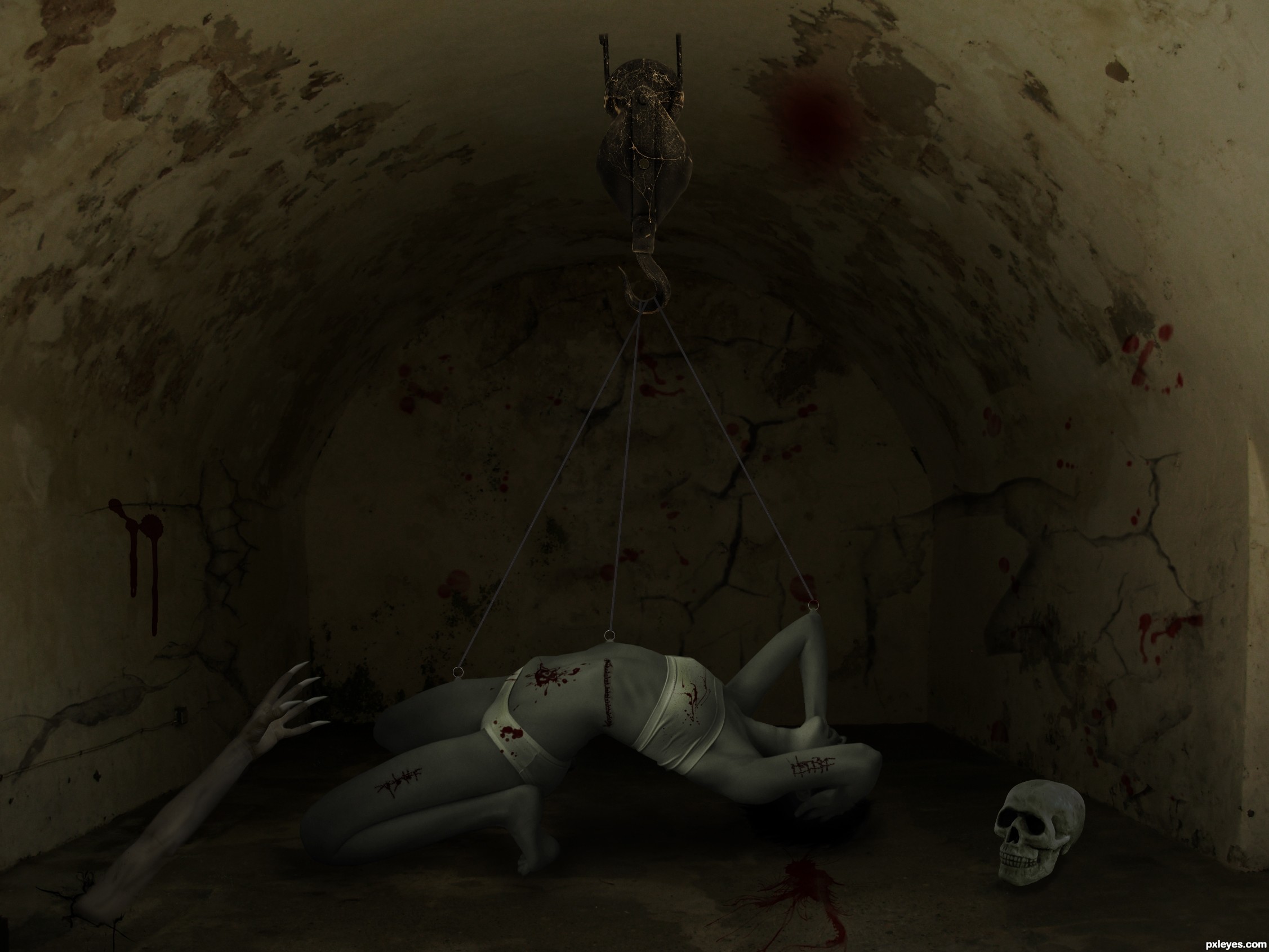
http://pureromance88.ucoz.com/news/the_prisoner_dark_and_surreal_photo_manipulation/2011-04-29-117 (5 years and 3309 days ago)
i remember Silet Hill! lol
Good luck author!
http://pureromance88.ucoz.com/news/the_prisoner_dark_and_surreal_photo_manipulation/2011-04-29-117 looks similar to this... I think u should credit the author of the tutorial...
It gives me chill... GL
Dark and scary, very well done
Howdie stranger!
If you want to rate this picture or participate in this contest, just:
LOGIN HERE or REGISTER FOR FREE
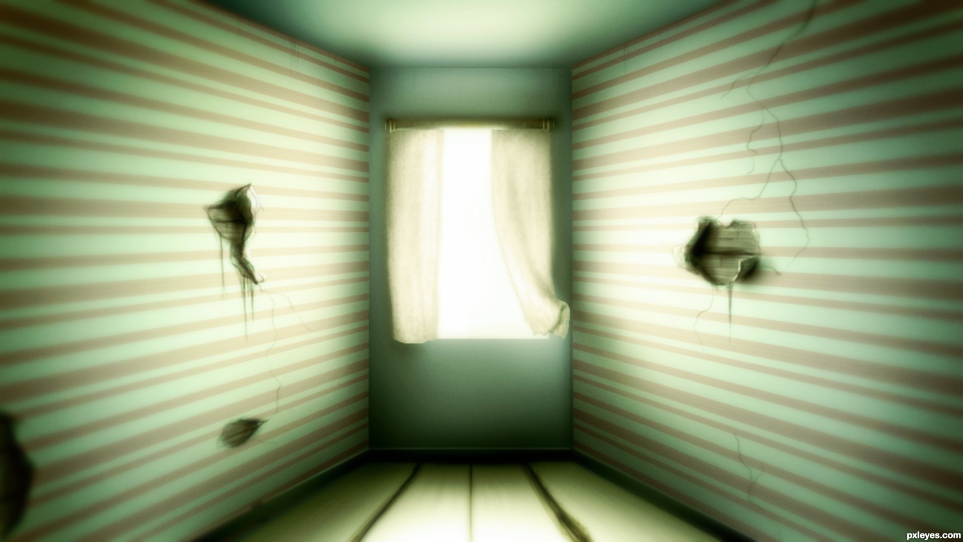
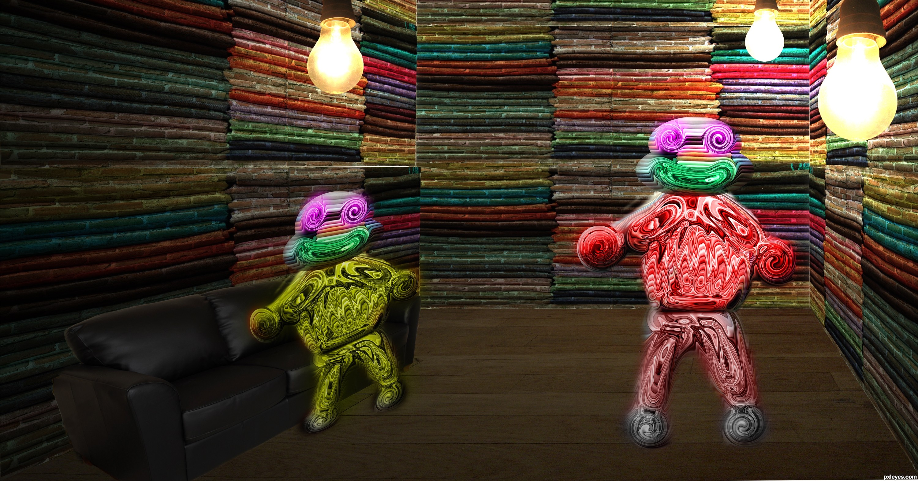
Created everything from scratch. No references/sources were used. (5 years and 3372 days ago)
wow beautiful work
awesome!!!!!!!!!!!!!!!!!!!!!!!!!!!!!!!!!!!!!!!!!!!!!!
hehe.. right out of the Matrix.. good luck author
Very nice! Simple yet very effective!
Super cool work author...GL
I like the glow effect in the room =)
Howdie stranger!
If you want to rate this picture or participate in this contest, just:
LOGIN HERE or REGISTER FOR FREE
Photography and photoshop contests
We are a community of people with
a passion for photography, graphics and art in general.
Every day new photoshop
and photography contests are posted to compete in. We also have one weekly drawing contest
and one weekly 3D contest!
Participation is 100% free!
Just
register and get
started!
Good luck!
© 2015 Pxleyes.com. All rights reserved.


Without and SBS there is really know way to tell you how to fix the distortion issues on the sitting person. Distort/Warp/Puppet could help correct the odd body angles(his faded outline edges are a bit weird compared to the rest of the realism in the room.. also the lack of shadows cast by the standing figure makes him float...
While the concept (love the room walls) is quite good, the execution is a bit muddled. A little tender care might help this image a lot. (Good Luck)
at Level 10.. we would expect a little more... u didn't do shadows, juzt cut-n-paste.. it will be difficult gain votes

I know it doesn't sound good to hear, but just a frank comment, hope u not angry
Howdie stranger!
If you want to rate this picture or participate in this contest, just:
LOGIN HERE or REGISTER FOR FREE