(5 years and 3042 days ago)
6 Sources:
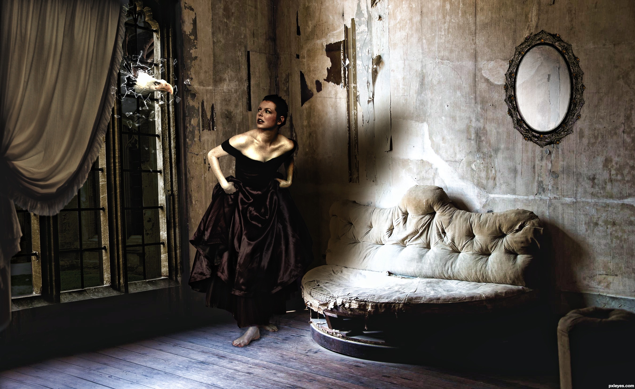
- 1: room
- 2: window thanks to Stephanie
- 3: mirror
- 4: girl
- 5: curtain
- 6: thanks for the great eagle
(5 years and 3042 days ago)
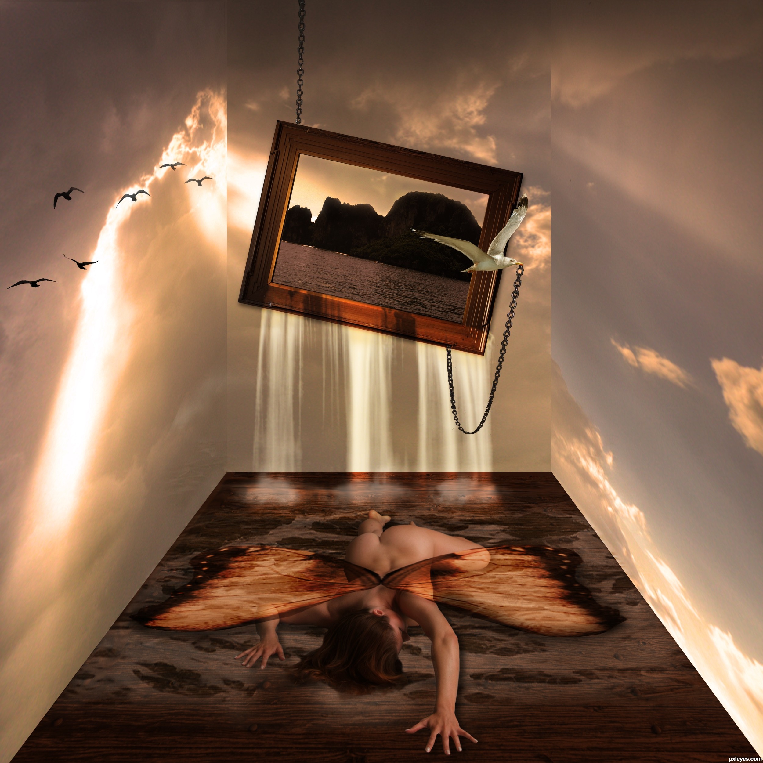
made the room from the sky stock, with retangular tool, and disort it
link for watersplash:
http://www.brusheezy.com/brushes/2289-water-splatter-brushes
link to butterfly wings:
http://www.morguefile.com/archive/display/781632 (5 years and 3053 days ago)
Wow! Very nice! The only thing....the color of her wings. They are a bit distracting. I think a more transluscent effect woudl have been better; maybe more like the glow of the clouds. But that's just me! Excellent work, though!
thx for ur photogirl, the wings were indeed a little distracting, changed the color 
Nice work, but the angel has no shadow...she looks painted on the floor.
removed the wings, didnt like them, and gave her a shadow 
well ok nator, specially for u, their back lol
You're almost there...now the wings need shadows too.
Very nice image... maybe if you use spherize filter and dodge and burn tool on the wings to make them look less ¨flat¨, it would be nice. But the picture is very good as it is now
thx all for ur comments and tips, try to make the wings less flat and added some shadow to them, hope it looks better now
Congrats!!
congrats
Howdie stranger!
If you want to rate this picture or participate in this contest, just:
LOGIN HERE or REGISTER FOR FREE
(5 years and 3054 days ago)
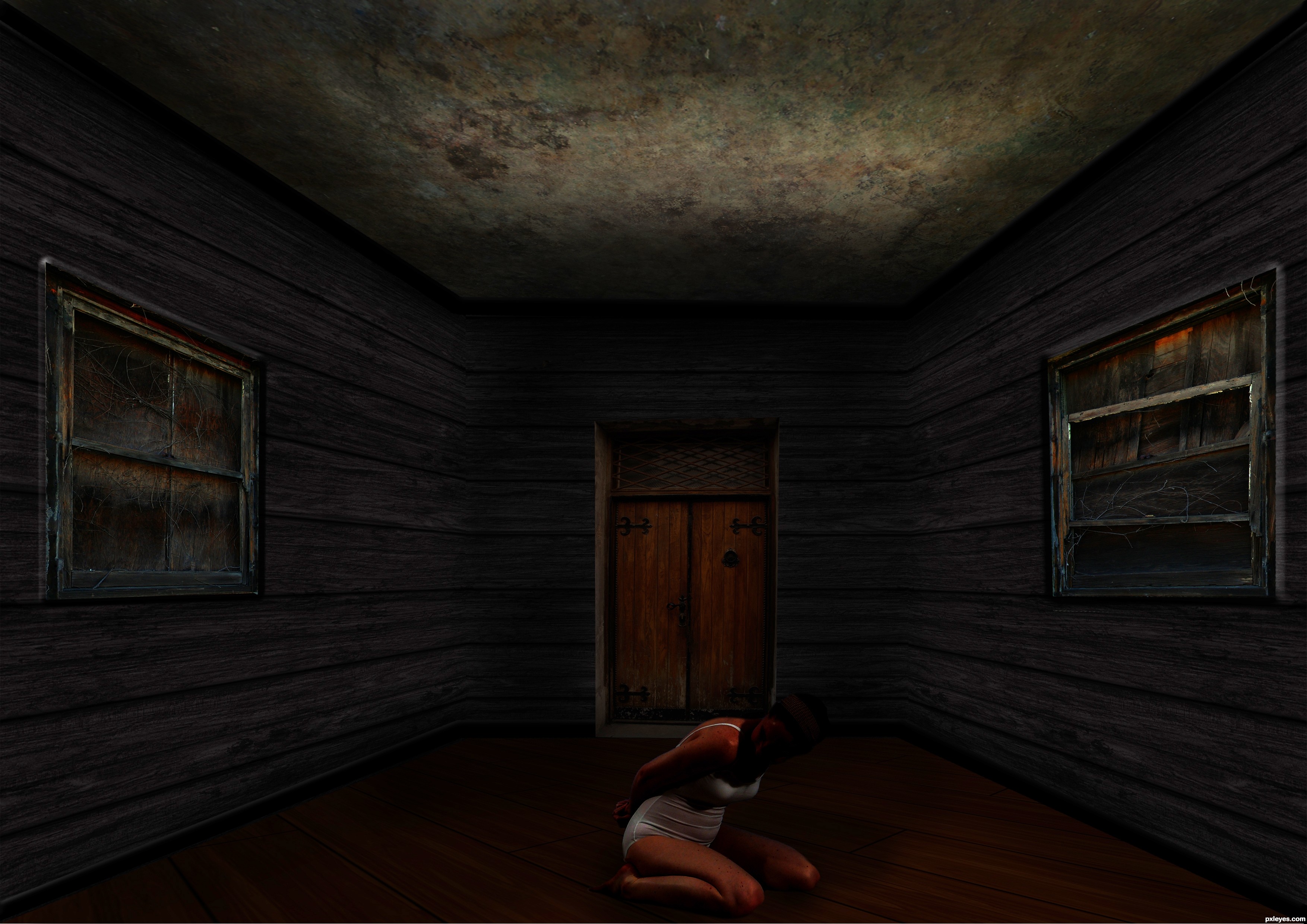
very dark, but once my eyes adjusted to the image i thought it was really good
Howdie stranger!
If you want to rate this picture or participate in this contest, just:
LOGIN HERE or REGISTER FOR FREE
(5 years and 3069 days ago)
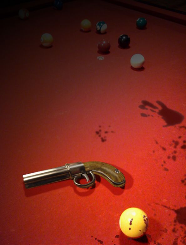
nice composition... some of the execution needs work though. The pool table is abruptly cut off at the top. I can tell that you were attempting to have the image fade out by that point, but it didn't quite make it. I can still see a very hard line at the top, and it slices right through the middle of the corner pocket of the pool table. just crop your image to this line and you should be good. Keep practicing with your lighting and fading...
I can't see a line, other than the angular line at the far right corner of the table. I'm on a small monitor at the moment, so I'll look when I get home. My biggest reservation during work was that the quality of the pool table source photo was shaky, so I left the finished product at low resolution, which I rarely do, because when I see low res. I usually suspect it's being used to cover up sub-par craftsmanship. Thanks for your constructive comment and suggestion!
right above the top pocket the picture gets cut off and above that its pitch black ill make you a sample.
http://img406.imageshack.us/img406/7109/cutoffi.jpg
on my sample, the red line shows excactly where the picture is cut off. everythign above the red line is black
Amazing. I had to change the brightness of the picture to see what you were talking about. The scary thing is whether its my eyes or is my monitor that bad? Anyway, it is now cropped. Thank you both.
I dont know if this is of any help to you :
http://www.lagom.nl/lcd-test/
http://ludens.cl/photo/montest.html
http://peripherals.about.com/od/monitorsdisplayscreens/a/TestMonitor.htm
Great site links Eladine, thank you!
Howdie stranger!
If you want to rate this picture or participate in this contest, just:
LOGIN HERE or REGISTER FOR FREE
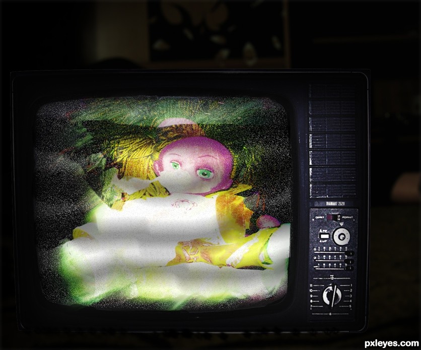
I used light effects and blending layers. Copy and paste it so many times..
Thanx to http://browse.deviantart.com/resources/?qh=§ion=&q=old+screen#/d19ash8 (5 years and 3088 days ago)
I paste wrong the tv link :http://ro-stock.deviantart.com/art/Vintage-TV-76086188
Howdie stranger!
If you want to rate this picture or participate in this contest, just:
LOGIN HERE or REGISTER FOR FREE
Photography and photoshop contests
We are a community of people with
a passion for photography, graphics and art in general.
Every day new photoshop
and photography contests are posted to compete in. We also have one weekly drawing contest
and one weekly 3D contest!
Participation is 100% free!
Just
register and get
started!
Good luck!
© 2015 Pxleyes.com. All rights reserved.


beautiful
looks great author, good choice of model
good blending and selection of images........ nice output.., But, in my opinion you must change the title or add a description (a small intro ) to show what is actually happening there.. good job and good luck

Thanks, all comments are more than welcome. Since this is my first composite I've ever made I'm not quite sure what is good and bad about it so I appreciate any advice
Howdie stranger!
If you want to rate this picture or participate in this contest, just:
LOGIN HERE or REGISTER FOR FREE