(5 years and 3305 days ago)
5 Sources:
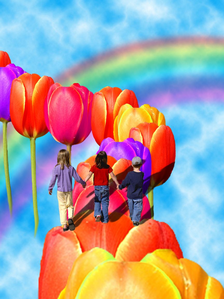
Our children's road must be colorful and light, full of hope for a better world!... (5 years and 3314 days ago)
Appealing sentiment, but it's hard to imagine anyone would illustrate it with this image if they weren't forced to use the source. (What parents want their kids to leap between blossoms far up in the sky?) That said, the intense colors of the blossoms overwhelm the kids. And their shadows are distractingly intense and don't follow the contours of the blossoms they fall on. I think moving the kids more to the foreground (i.e., bottom of the image) would be more effective. [Alternative concept: regular road lined by giant tulips on either side.]
Sorry, I don't think it's hard, when we're talking about fantasy... 
The shadows could use some work, but the author's right..it is a fantasy and i dont think wondering wether or not a kids parents are going to let them on this road is what this image is about..lol..and about the color, i think the image intensity is on purpose describing the quote the author has given..GL author
Lovely colours, reflects the childlike fantasy
fun image!

Howdie stranger!
If you want to rate this picture or participate in this contest, just:
LOGIN HERE or REGISTER FOR FREE
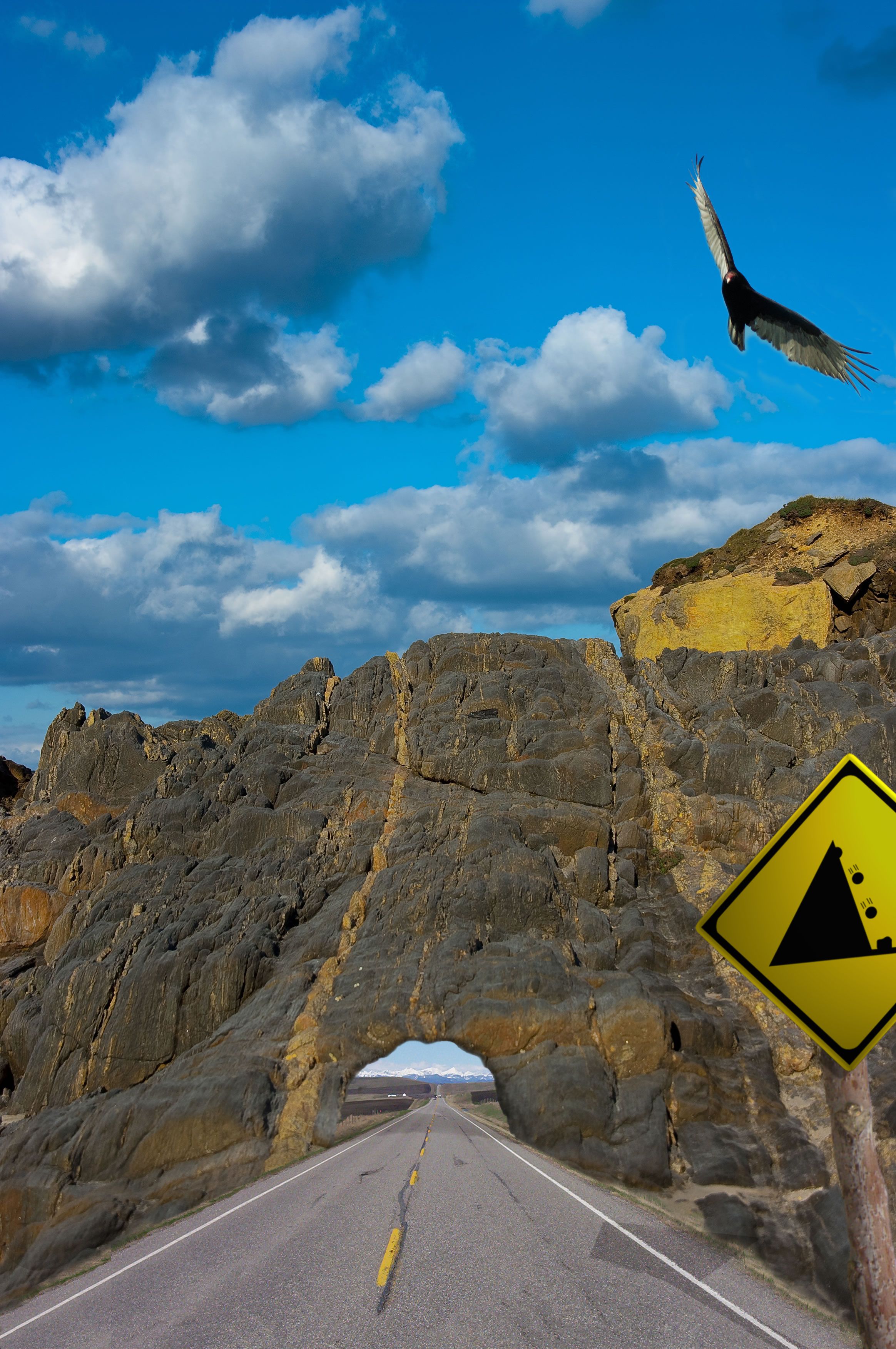
simple comp using 3 external sources and sign illustration (that I couldn't get to look any more realistic) (5 years and 3344 days ago)
Good! But I think underpass is a little low... 
Good idea but you need more depth and heigth on the tunnel. ; )
Thanks guys, quite right! I`ve changed the height to let those big trucks through 
fantastic work...good luck author
Look out for the boulders. Nice one
Nice idea ... like it... it reminds me of the old 'Road Runner' cartoons !! lol
Good Idea but could be made a lot better by making the tunnel look longer (looks a bit 2D)
Howdie stranger!
If you want to rate this picture or participate in this contest, just:
LOGIN HERE or REGISTER FOR FREE
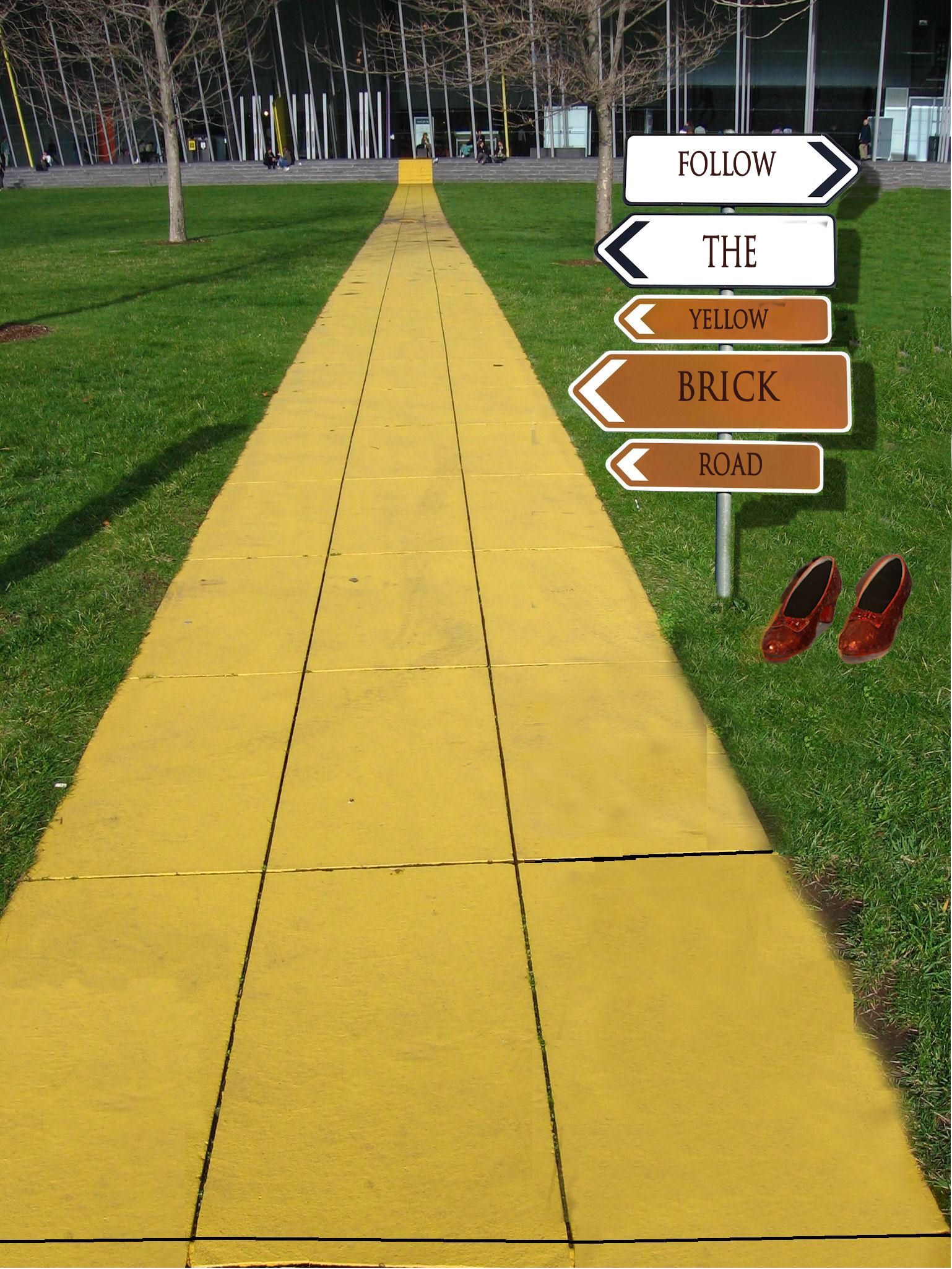
(5 years and 3393 days ago)
Good idea, but try to make the post look like it's actually in the road, not just pasted on top...it should have a shadow, too.
agrees with cmyk. You should also place the signs more off to the right.
Bravo, Wonderful, Fabulous, is there anymore to say?!?! 
Wow I get brozed but yet you used my suggestion. By the way, the shadows on the sign are wrong. They would be like the one on the left but try drop shadow, not whatever you did. Also shoes need a lot of work on the edges and a shadow too.
well honestly speaking i don see any logic in this..you've jus written one simple note in a direction board which is going all places..you could have used the source image in a much better way..
Don't take my comments on this as rough criticism, just constructive, well meant suggestions.Good imagination on this, but there are several things that you could do to improve on it. I think the shoes have been mentioned by others, and the cloning on the grass next to the pathway needs to be cleaned up a bit. Changing the signs to point all the same direction could really be a plus. Overall you did have a good concept, it's your execution that needs some improvement.
Those kids of yours must really be occupying your time but the sign shadow is not hard to create. I wish you at least tried,, 
Howdie stranger!
If you want to rate this picture or participate in this contest, just:
LOGIN HERE or REGISTER FOR FREE
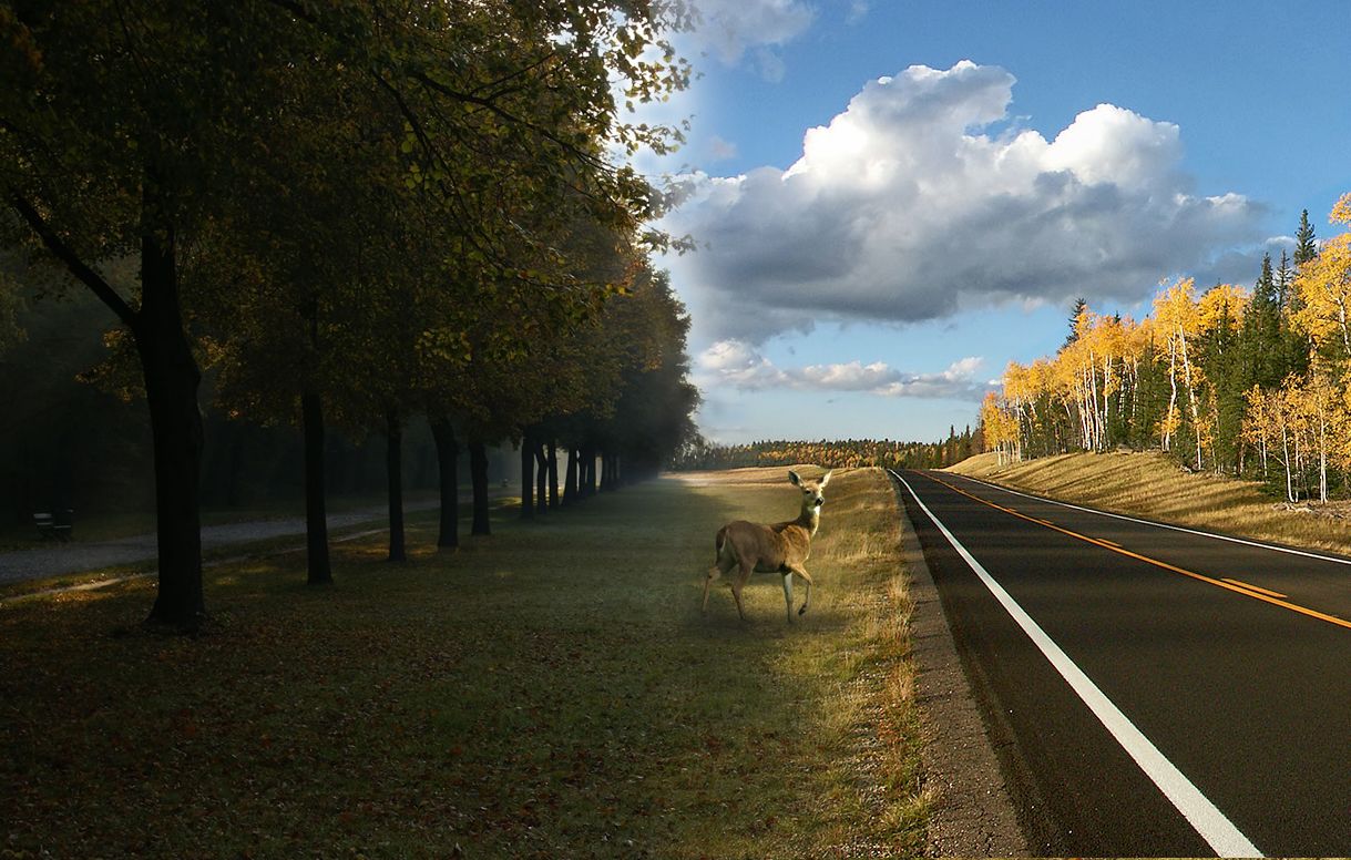
(5 years and 3397 days ago)
Light sources are opposite...
nice, but contrast is not good
It's looks very realistic, so good luck to you! 
The shadows on the road are odd. Conflicting light sources.
You could;ve worked a bit more on masking out the leaves on the left, but still, a very nice image. Good luck.
good idea!
Howdie stranger!
If you want to rate this picture or participate in this contest, just:
LOGIN HERE or REGISTER FOR FREE
Photography and photoshop contests
We are a community of people with
a passion for photography, graphics and art in general.
Every day new photoshop
and photography contests are posted to compete in. We also have one weekly drawing contest
and one weekly 3D contest!
Participation is 100% free!
Just
register and get
started!
Good luck!
© 2015 Pxleyes.com. All rights reserved.


nice chop
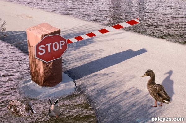
Lol excellent idea! However, the duck's shadow looks really unnaturally warped, and the same goes for the stop sign. Also, the brick's shadow is too long--it should be only about half the size of the bar. Great job on the pond, I must say.
I agree with Game. And with this sun, I think ducks need a lighting from the left side... The ducks in the pond need a shadow too, and stop bar seems a bit flat.
nice !
Howdie stranger!
If you want to rate this picture or participate in this contest, just:
LOGIN HERE or REGISTER FOR FREE