It was easier to put Granny in a home when we could decorate it the way she wanted... (5 years and 3437 days ago)
3 Sources:
(5 years and 3530 days ago)
Very pretty work. Love the tones. :0
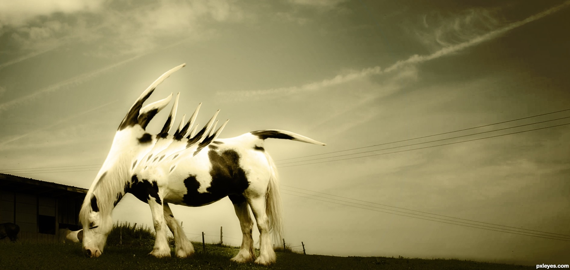
The nose horn gets lost in the dark background. Perhaps lightening the barn just a bit to better emphasize the contrast?
Ummm...I don't see a nose horn. 
@ Mossy, I can see what you think is a horn, but if you look at the high res, it's actually part of the background, not atached to the horse.
Nice original job here author. GL!
actually there is no nose horn..thanks for your comments (:
For such a hardcore picture its also very soft. I really like the mood of this, and very cool horse! 
nice work...gl
Howdie stranger!
If you want to rate this picture or participate in this contest, just:
LOGIN HERE or REGISTER FOR FREE
No outside sources used. (5 years and 3531 days ago)
beautiful!
Wow! What a wonderful creation. What an amazing imagination went into envisioning this beauty.
Great ! 
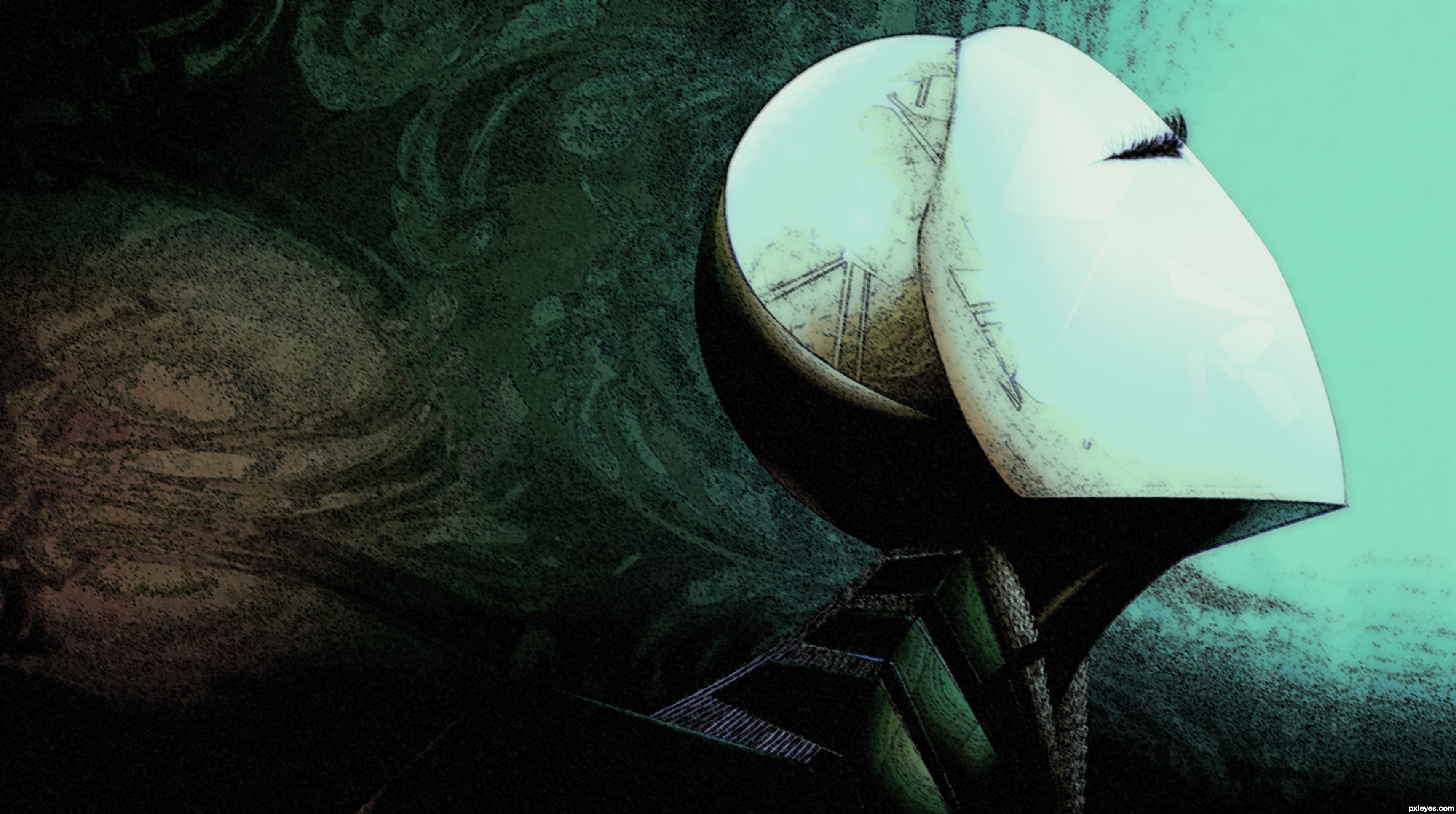
I love the mask :O
GL 
Absolutely gorgeous, nice idea and result.
cool 
Its a beautifully created piece! Love the color tones and the texture! Good luck!
Dainty and elegant!
Smoken!!!! nice emotion content!
That's why you're artist, love your style
Howdie stranger!
If you want to rate this picture or participate in this contest, just:
LOGIN HERE or REGISTER FOR FREE
(5 years and 3544 days ago)
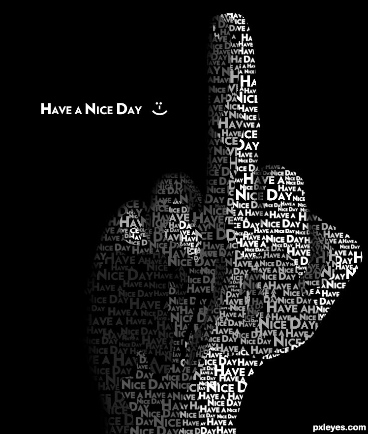
no onz gonna have a NICE DAY seein this fav-finger 
gud job n sbs btw
gl auth
Thanks jamespaul. Thanks for the fav nishagandhi!
But Seriously Author.. tell us how you really feel.. WOO HOO!!!
HAHA I just want everyone to have a nice day. Thanks for the favs BTW
I want to increase the points on your comment jamespaul, but it will not let me. +1 points for you.
Go for it, author!!!!
I think this is what is called an oxymoron I think I recognise the finger oops.
oopps... forgot one smiley after the fume " :p " ...
gosh!! dont take me wrong auth
some ppl takin me wrong for all sorts of things :p... he he ..lol@`em
i really like ur work
gud luck
ty for the thumzup
good and nice work
Thanks Hazem!
Very entertaining. Repeating "Have a Nice Day " on the image apart from on the hand seems unnecessary when that's the title. Some shadow between the forefinger and the middle finger would seem to be appropriate. Having the text curve like it were actually on the hand might be even more compelling.
I placed shadow between the index finger and the middle finger DanLundberg. Thanks for pointing that out.
More than likey I would say you gonna winn this and I think you deserve it, good work author
I actually hope you win if I don't not becuase of the subject but the way you have pulled this off.
i am too reluctant to fav this coz of the theme but i really appreciate the quality n effort behind it .. gonna get max frm me
gl auth
o by the way HAVE A NICE DAY auth 
very well constructed
Very good.
Very clever.
very interesting...best of luck...
It's all how you look at it = ) You have a nice day too, and you're number 1 in my book too, lol.
Congratulations for 1st place
Thanks everyone!
Congrats well done
congrats
Congratz! Well deserved!!
Congrats!!! love it!!
Congrats!!!
Congrats! great entry
deserved victory - congrats
excelent
Congrats - great idea and execution!
Howdie stranger!
If you want to rate this picture or participate in this contest, just:
LOGIN HERE or REGISTER FOR FREE
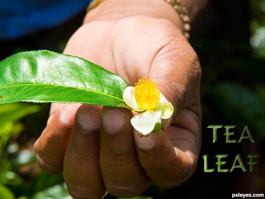
Thanks for the image of leaf and hand by minglespy. (5 years and 3590 days ago)
Very CBR.
Oh dear, sorry you think that Lamantine, quite a bit of work went into it, and I've seen a LOT worse!  (See SBS)
I have to agree with Lamantine!
You only used the source in the text? 
...and a 9 step sbs to show it.
i think you could have made the source more relevant to the piece. such as making a background for the hand to be over instead of the original sources background. would have brought more attention to the source image of the contest.
No CMYK46, I also used it for the leaf in the persons hand and used overlay and a few other things - it's all in the sbs. I think jadedink has viewed them, if so - thanks!
Ah jadedink, I used the whole of the background image because it was a tea plantation and that was the whole point of my pic - making the single leaf into a tea leaf. I really don't want to say this: but tea comes from leaves...... THAT'S the point I was making.
my point still is, you can't really SEE the source being used. i mean, i HAD to look at the 9 step sbs just to see if you'd tried to use the source in any other way.
Don't take all of this the wrong way, its just, there are SOOOO many entries in different contests in which the source is minimal, or...barely seen at all. I was just trying to be helpful in suggesting using it in a way which people could see without having to look through 9 steps on how to make a leafy text.
I don't get it...except for being lighter, the leaf is the same as in the source pic.
CKYM46, that's a compliment really although I appreciate that you didn' mean it to be. Well - the leaf is taken from the source image as shown in step 6 of sbs and then I used overlay. So in all the source image is used roughtly nine times in all to create this picture. That's 8 times to make the text and once for the leaf. Now I'm leaving the building!
like the font. good luck Author
It's hard to deny the author's observation that "I've seen a LOT worse!" Nevertheless, this still seems rather slight. Making the text a lot more prominent, and perhaps more of an advertising message instead of just a label, might help.
Seriously, not much use of the source here. I don't need to go to your SBS to see where you used it.
This isn't CBR'd. It's minimal use and you COULD have used more of the source.
Yes, seriously jawshoewhah, you're right!
Howdie stranger!
If you want to rate this picture or participate in this contest, just:
LOGIN HERE or REGISTER FOR FREE
Photography and photoshop contests
We are a community of people with
a passion for photography, graphics and art in general.
Every day new photoshop
and photography contests are posted to compete in. We also have one weekly drawing contest
and one weekly 3D contest!
Participation is 100% free!
Just
register and get
started!
Good luck!
© 2015 Pxleyes.com. All rights reserved.


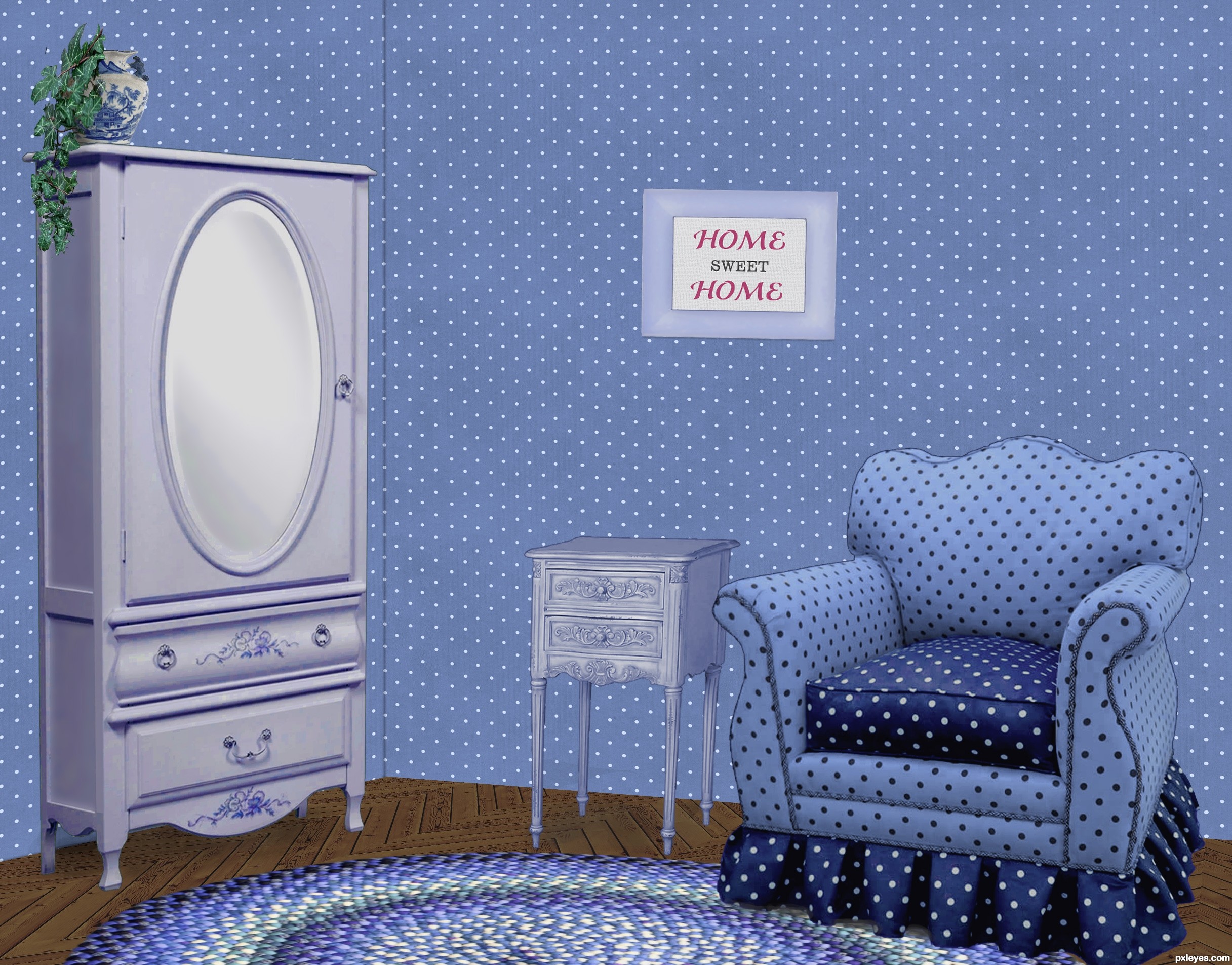
Nice work on the floor. Wall at left should be darker, as both planes would not receive the same light.
I wondered about that, since the light is striking the armoire from the right, I figured the wall behind it should be illuminated, though. If there was a corner by the armoire, it would be darker once you turn the corner, just as the LH side of the armoire is darker. The surface of the wall behind it is like the front, illuminated.
Thanks about the floor. It was fun making that part!
Agree with CMYK. It also would improve the image greatly if you tried to darken the inside areas of the cushions on the arms of the chair...it might help give some variance to the 'blue look' of the shot. Just a thought. Good job!
I agree, some variations in light around the walls would;ve been nice. It would eliminate the whole 'pasted in' feel.
The shadows the objects are casting look great and your floor pattern is crazy good!
Lovely blue room
Howdie stranger!
If you want to rate this picture or participate in this contest, just:
LOGIN HERE or REGISTER FOR FREE