It was easier to put Granny in a home when we could decorate it the way she wanted... (5 years and 3441 days ago)
3 Sources:
Time For A Change  by pixelkid 10288 views - final score: 64.3% | Invoking Evil  by Geexman 9797 views - final score: 59.8% | A Room in Wonderland  by artgirl1935 12698 views - final score: 59% |
ROOM SERVICE 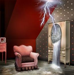 by lolu 8615 views - final score: 58.3% | Supernatural  by eclipsy 11622 views - final score: 57.1% | The goal to make a nice room. 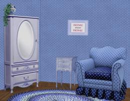 by MossyB 10619 views - final score: 55.6% |
Cozy  by sgc 6469 views - final score: 55.3% | Black Hole 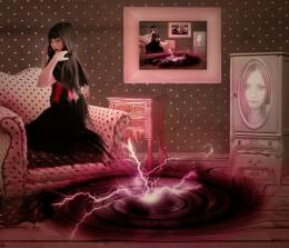 by Jacklopes 7638 views - final score: 55.1% | quiet refuge 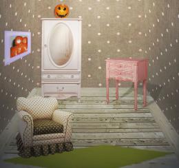 by noelia 7168 views - final score: 50.7% |
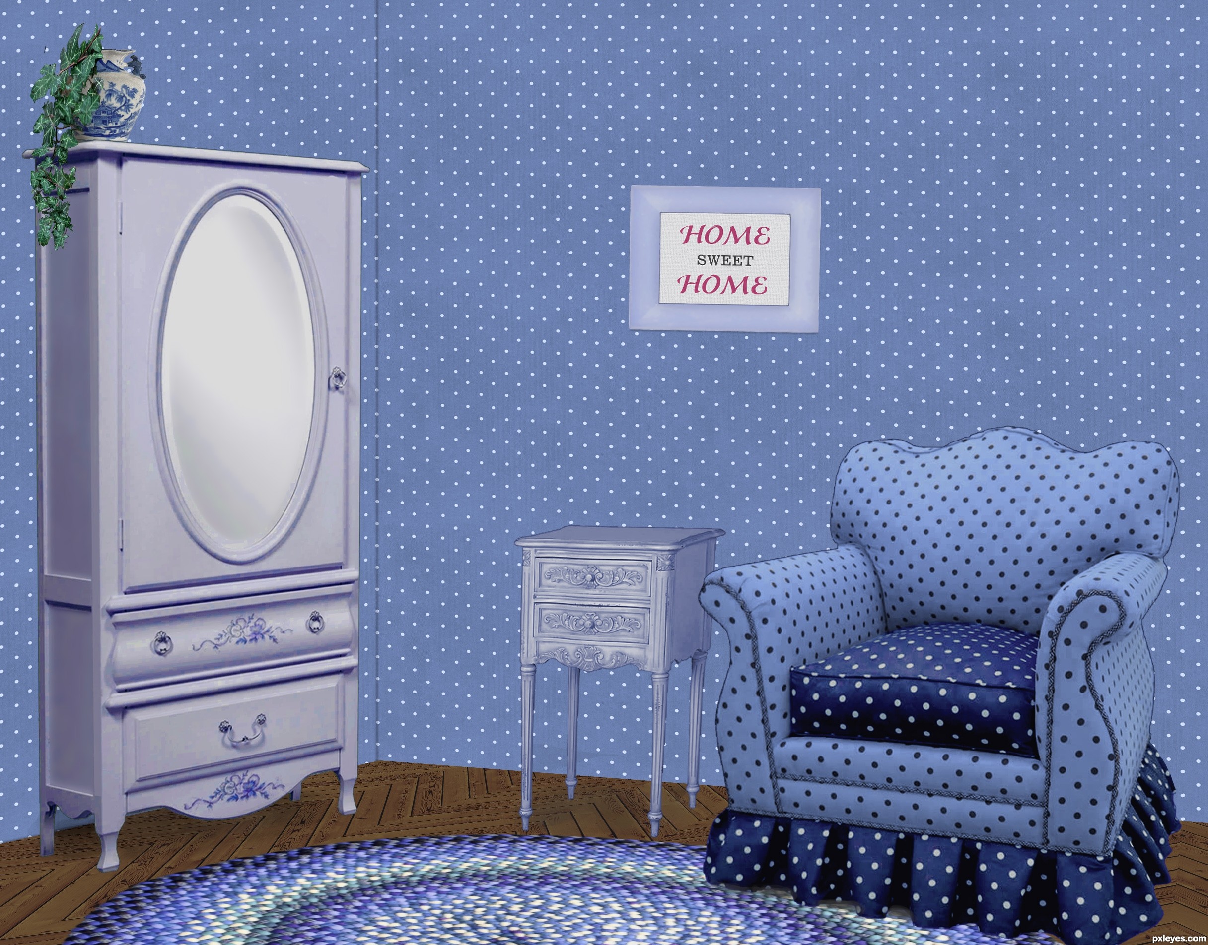
Home Sweet Home 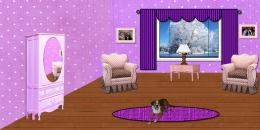 by Chuck 4929 views - final score: 50.4% |
Howdie Guest!
You need to be logged in to rate this entry and participate in the contests!
LOGIN HERE or REGISTER FOR FREE
Photography and photoshop contests
We are a community of people with
a passion for photography, graphics and art in general.
Every day new photoshop
and photography contests are posted to compete in. We also have one weekly drawing contest
and one weekly 3D contest!
Participation is 100% free!
Just
register and get
started!
Good luck!
© 2015 Pxleyes.com. All rights reserved.


Nice work on the floor. Wall at left should be darker, as both planes would not receive the same light.
I wondered about that, since the light is striking the armoire from the right, I figured the wall behind it should be illuminated, though. If there was a corner by the armoire, it would be darker once you turn the corner, just as the LH side of the armoire is darker. The surface of the wall behind it is like the front, illuminated.
Thanks about the floor. It was fun making that part!
Agree with CMYK. It also would improve the image greatly if you tried to darken the inside areas of the cushions on the arms of the chair...it might help give some variance to the 'blue look' of the shot. Just a thought. Good job!
I agree, some variations in light around the walls would;ve been nice. It would eliminate the whole 'pasted in' feel.
The shadows the objects are casting look great and your floor pattern is crazy good!
Lovely blue room
Howdie stranger!
If you want to rate this picture or participate in this contest, just:
LOGIN HERE or REGISTER FOR FREE