(5 years and 3246 days ago)
(5 years and 3247 days ago)
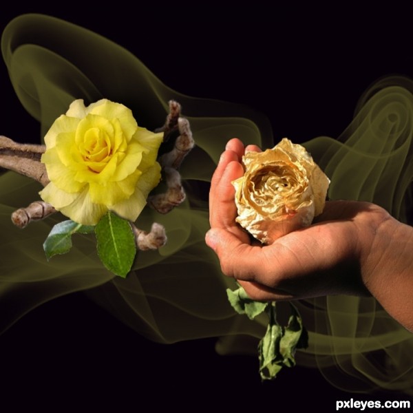
You get your influence from the Misfits? http://lyricsmusic.name/img/posters/54/51466.jpg
no actually. :P never was a fan of the missfits.
HA! Josh, I thought the same thing! Either way interesting idea 
nice idea .......... 
Very nice idea author...good luck

Still one of the best entries! GL!
Nice and catchy image
Wonderful entry, You did a wonderful job with this. Best of luck to you!!
Howdie stranger!
If you want to rate this picture or participate in this contest, just:
LOGIN HERE or REGISTER FOR FREE
This is my very first entry so be honest with your comments but try not to be to mean. Thanks (5 years and 3282 days ago)
Great idea, nicely done! Skeleton hand seems blurry, though.
Great ! I like the idea!
very nice work author
Very touching and creative!
nice idea... gl
Nice idea.gl
nice
Congrats!!!!
Howdie stranger!
If you want to rate this picture or participate in this contest, just:
LOGIN HERE or REGISTER FOR FREE
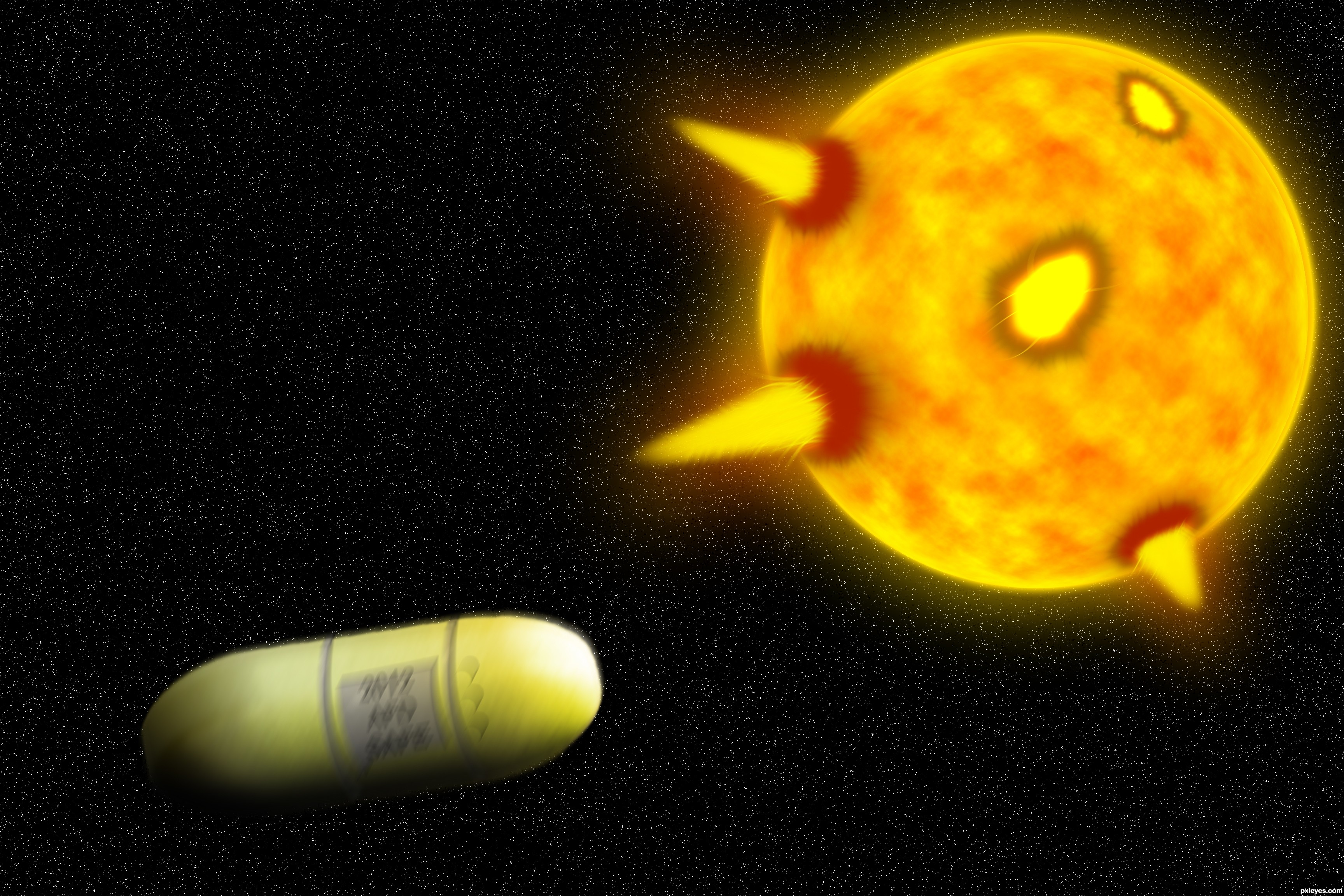
I took a pill and escaped from death. (5 years and 3293 days ago)
I like the idea, but i feel like the whole image could;ve been executed a little better. You could try smaller stars at full opacity, and also try experimenting with different colours and blend modes for the solar flares. Good luck!
Haha, thanks for help, I'm lucky I saved the psd so I can re-edit it... Thanks again.
I confess I don't really understand this. I completely agree with ponti55, however. I would also observe that your gray additions to the pill assume that it's a cylindrical sausage when in fact it has a much more interesting shape with a flat band encircling it. A solar flare or two on the right side of the sun might add some balance.
To make it look more realistic, I would add some motion blur to the capsule (not too much though or you would distort the capsule too much) 
I like it! I think it's pretty good! Nice job!
I would agree to the fact of giving a bit motion blur to the capsule...Also the opacity is kept higher for the stars is better as it gives a feel of DOF of the capsule and the stars and sun...Overall a nice effort.....
nice idea , gl author
There, It's fixed, if you would like something else added, leave a comment. Thanks for comments.
The solar flares still look extremely unconvincing, if you can't make them look more realistic, maybe remove them all together and simply have the capsule and the sun.
It's not the sun it's planet Earth in lava and fire! And those are not solar flares, those are powerful explosions, witch are dragging in!
nice effort.good luck.
hopefully......good luck
Howdie stranger!
If you want to rate this picture or participate in this contest, just:
LOGIN HERE or REGISTER FOR FREE
(5 years and 3302 days ago)
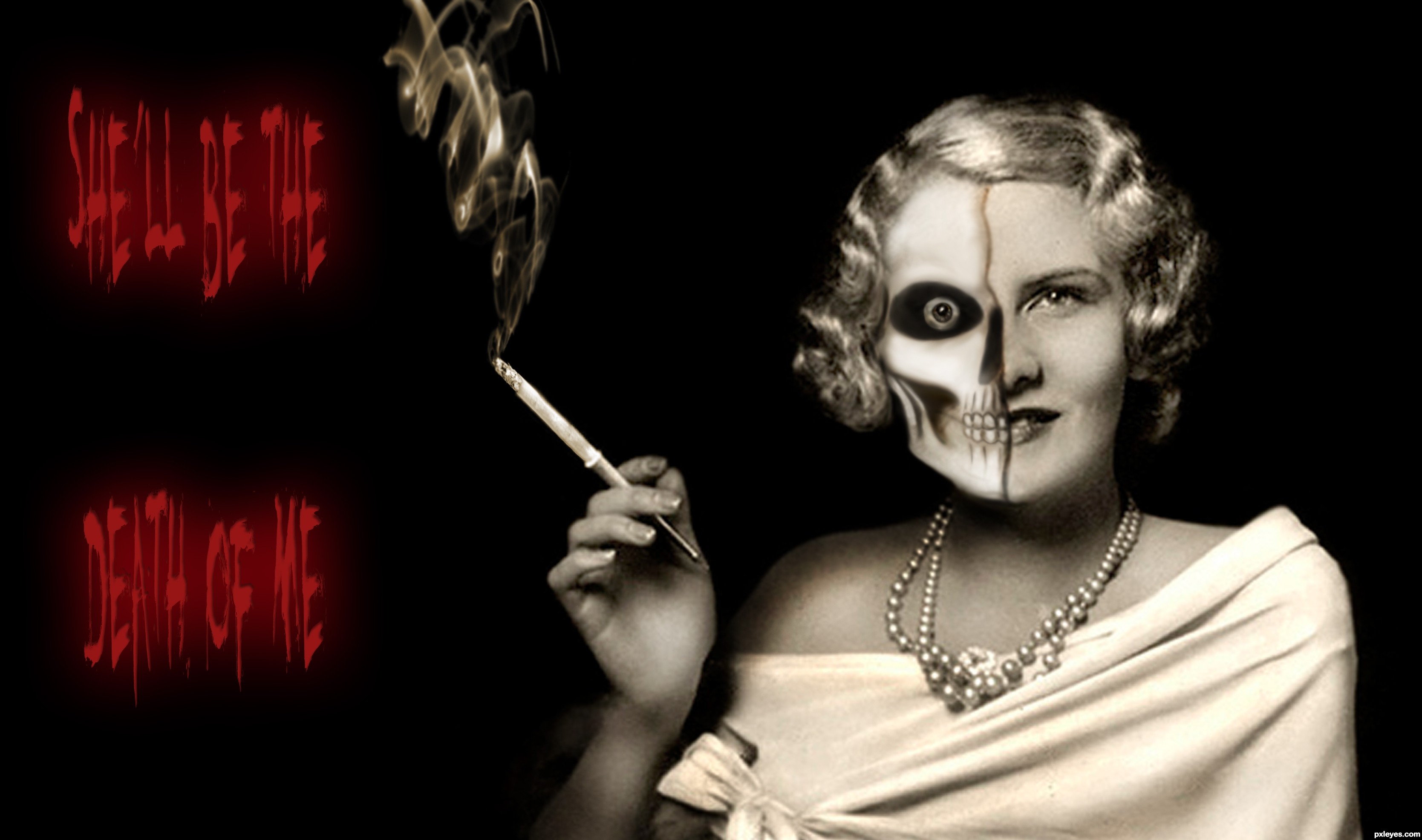
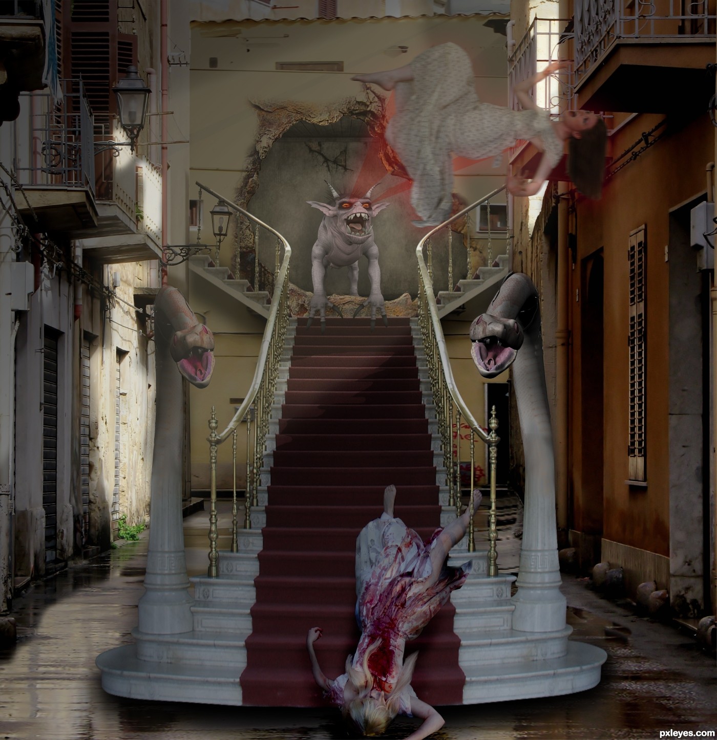
Good Lord...this picture is disturbing beyond compare. O.O
Thanks, I aim to please
Lol, well I don't particularily like the image, but you've done a fair job. Two of my most imminent complains I suppose are that the staircase looks like it's hovering, rather than flat on the ground (the shadow is a bit thick at the front), and that the floating woman doesn't seem to match the lighting and sharpness as the rest of the image. Try playing around with curves a bit and see if it can be remidied. Good luck, author.
Okies, i'll see what I can do wiht the stair, but the girl has a motion blur on pupose
Good idea, very dramatic. The snake in shadow is more distinct than the one that's lit...left one needs more contrast/saturation. To me it seems like less of the wall at left would be in shadow, judging from the light source. The left arm of the girl in foreground is distorted. You didn't show how you made the opening in the wall. There, is that enough nitpicking? I still like your basic concept, author, just give it a few tweaks. (y0
I love details and this has many. I would have liked both snakes to have the same contrast though.
You should have thanked PKVstock source 5 and chamberstock source 1 at deviant Art for the use of their images. Make sure you credit authors when it's required. It's really best to always credit source authors, it's a nice gesture and you'll never miss a required credit. Also don't use the download URL for your links, use the link to the page with the image information and the image. That way we can see more of that authors work as well. The correct link for image 3 is: http://stocked-n-loaded.deviantart.com/art/Halloween-07-3-68700616
God , that's really creepy !
Thanks for the tip Spaceranger, If you look at my other entries you will see that I always thank.
Needs the blending work as already suggested, not a bad effort though
Interesting entry......GL!
cool idea
No, it's not cool... it's freezing!!!
Now you can't edit the work anymore; but I think you forgot the reflection of the stairs (and nobody noticed it...) Don't forget it next time, my friend!
Howdie stranger!
If you want to rate this picture or participate in this contest, just:
LOGIN HERE or REGISTER FOR FREE
Photography and photoshop contests
We are a community of people with
a passion for photography, graphics and art in general.
Every day new photoshop
and photography contests are posted to compete in. We also have one weekly drawing contest
and one weekly 3D contest!
Participation is 100% free!
Just
register and get
started!
Good luck!
© 2015 Pxleyes.com. All rights reserved.


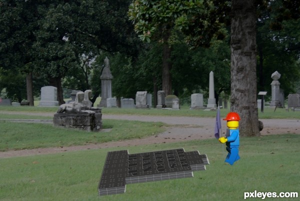
nice idea but shadows are missing here, try to add some
Yes it does look very 'cut and paste'. Have a go at putting in some depth/shadows and I'll hold my vote for now.
yup, match the colors too
gud luck author .................
Howdie stranger!
If you want to rate this picture or participate in this contest, just:
LOGIN HERE or REGISTER FOR FREE