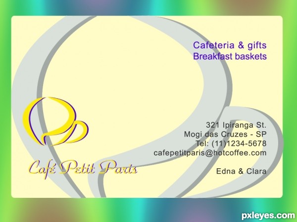
I made one like this when I was learning to use CorelDraw, and in my language. Now I remade it in Photoshop. It's about a (fictitious) cafeteria; observe the logo... (5 years and 3701 days ago)
electronic b.card  by closedeyes 12274 views - final score: 61.6% | Platinum  by CorneliaMladenova 7556 views - final score: 60.2% | painter  by sawan911 13473 views - final score: 57% |
Bomb Disposal 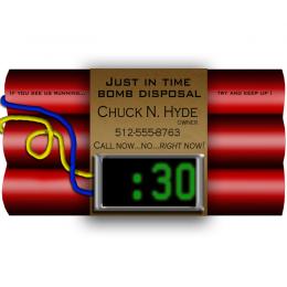 by Irse 10635 views - final score: 56.9% | Guano Distribution  by Drivenslush 7572 views - final score: 56.1% | Antique Business 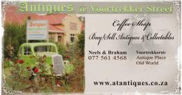 by Tip2Top 6502 views - final score: 55.6% |
francesco carola 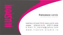 by dandesign05 5063 views - final score: 55.4% | BRUNNO'S 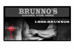 by migue1ito 3181 views - final score: 55.3% | "Take me to your COO." 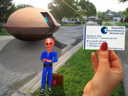 by DanLundberg 6124 views - final score: 55.2% |
Plastic 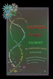 by CorneliaMladenova 3118 views - final score: 55% | Higher Learnin' 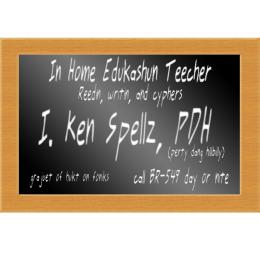 by Irse 4793 views - final score: 54.8% | Guitar Lessons 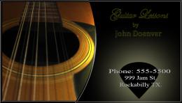 by westfall 7739 views - final score: 54.6% |
Chopsticks as Business Card 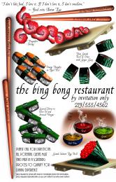 by Drivenslush 7010 views - final score: 54.5% | Go Fast Aviation  by lchappell 4523 views - final score: 54.4% | R.I.P. 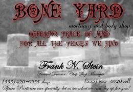 by jadedink 2521 views - final score: 53.9% |
Bad idea... 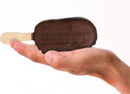 by KingRafox 5236 views - final score: 53.6% | Corn Hole Mortgage  by donh 6207 views - final score: 53.4% | Bookmark  by Disco 2950 views - final score: 53.2% |
JERRY'S MEAT  by migue1ito 5044 views - final score: 52.7% | Fire Fighter  by tnaggar 4121 views - final score: 52.3% | Cafeteria Café Petit Paris  by erikuri 9100 views - final score: 52% |
Crayon Business Card  by Drivenslush 6344 views - final score: 51.6% | Wings  by Tip2Top 3723 views - final score: 51.3% | Lover - Sailor - Gourmet  by pearlie 7719 views - final score: 50.9% |
Doodle Designs  by HeinrichB 4487 views - final score: 50.4% | Island Hopper  by Alan2641 4577 views - final score: 50.4% | Treasure Seeker  by kevinice95 4111 views - final score: 45.4% |
Howdie Guest!
You need to be logged in to rate this entry and participate in the contests!
LOGIN HERE or REGISTER FOR FREE
this is a very pretty card.. really well thought out
Too much empty space. The logo and associated type should be larger. CPP is very hard to make out.
This is very nice in its simplicity. Once you look at all the elements, the CPP initials are very easy to see, I did something like that with my initials for my very first card. These are done well, very artistic. A little 'white space' is a good thing, it gives the eye a rest between elements. Nicely done, author.
@CMYK: it's your oppinion, I respect it. You know, I did the first version in Corel at school; when teacher said "create a business card, the first thing we do is fill it with a lot of info and images for background. But he said the card must be clean, with the main info and the logo only. Just like Pearlie said! All right, let's change everything... so this one was born. For logo, I vectorized a picture of a cup...
There's nothing wrong with this card at all it's very appealing. Your sbs is good too!
here here.. pearlie and lchappell
Very nice work author...Best of luck
cool
well done........ all the best ........
Howdie stranger!
If you want to rate this picture or participate in this contest, just:
LOGIN HERE or REGISTER FOR FREE