it's a simulation of a flyer (5 years and 3727 days ago)
New world  by itsdesign 8266 views - final score: 59.2% | Treasure Cave Of Doom  by HeinrichB 14543 views - final score: 56.1% | my pleasure  by sawan911 8015 views - final score: 54.9% |
conga 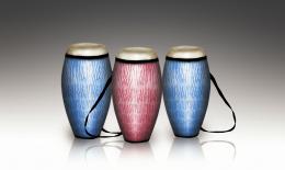 by itsdesign 7362 views - final score: 54.6% | The blues... 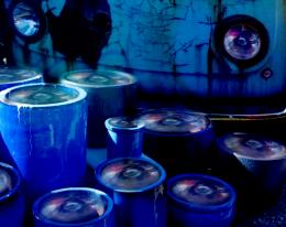 by Tip2Top 11375 views - final score: 54.2% | Magic Night  by Lamantine 4879 views - final score: 53.4% |
flower pots 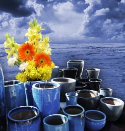 by ddanimal94 6386 views - final score: 52.7% | lights  by dandesign05 4543 views - final score: 52% | Blue pot 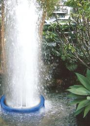 by Disco 5193 views - final score: 50.7% |
Light 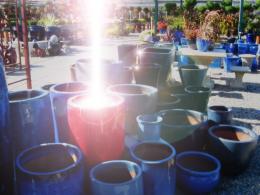 by danyal90 3524 views - final score: 50.4% | Waterfall Woman 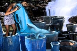 by HeinrichB 6244 views - final score: 47.9% | Pretty pot(updated) 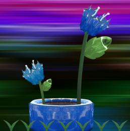 by kevinice95 4610 views - final score: 47.8% |
Howdie Guest!
You need to be logged in to rate this entry and participate in the contests!
LOGIN HERE or REGISTER FOR FREE
Photography and photoshop contests
We are a community of people with
a passion for photography, graphics and art in general.
Every day new photoshop
and photography contests are posted to compete in. We also have one weekly drawing contest
and one weekly 3D contest!
Participation is 100% free!
Just
register and get
started!
Good luck!
© 2015 Pxleyes.com. All rights reserved.


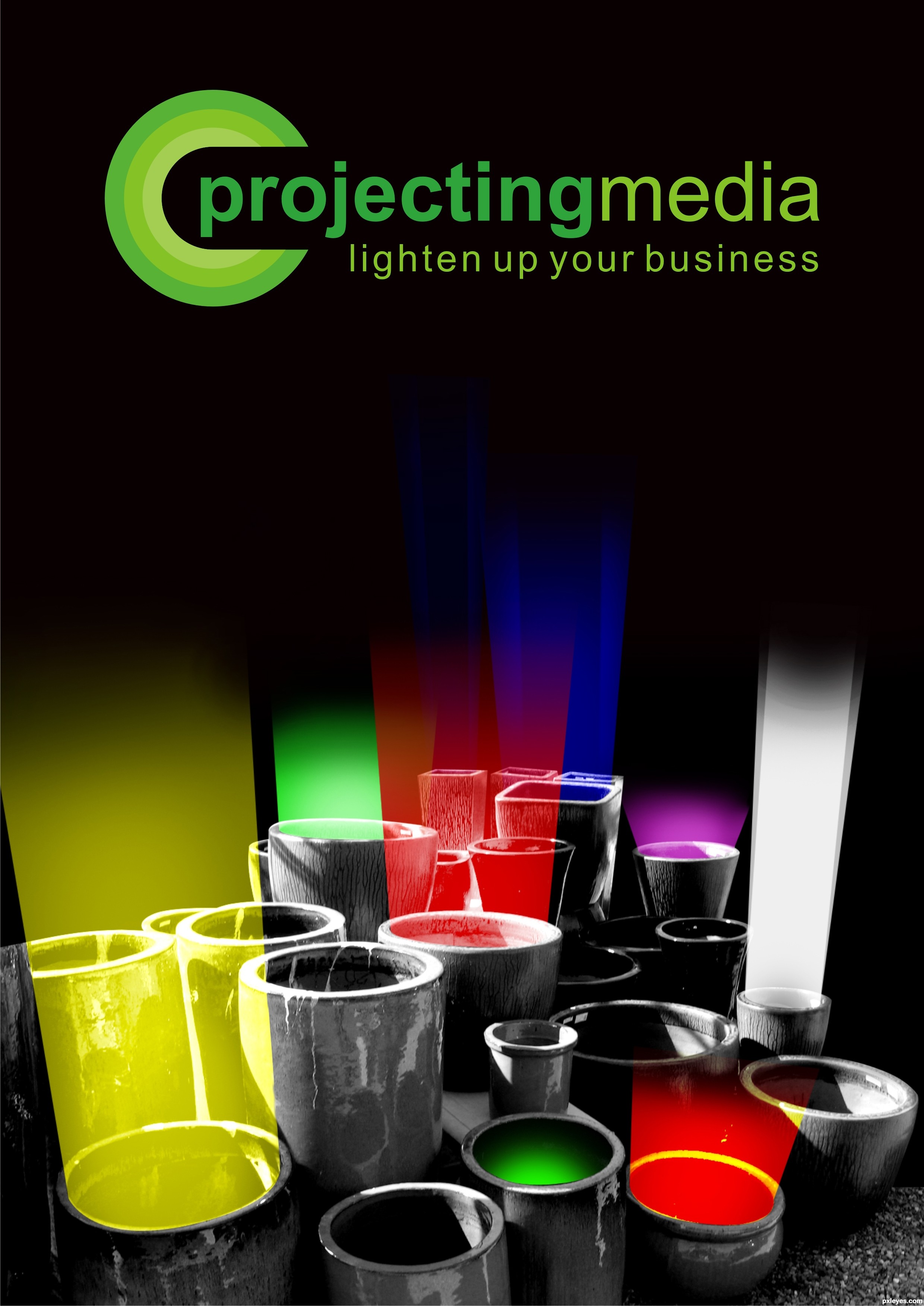
You're showing you're really good in design!
Creative. I personally feel all the black space in the middle is excessive and starts to work against the "lighten up your business" slogan. I find it curious that the green glow in the front is the only light without rays going towards the sky. The yellow and red foreground lights need their bottom edges cut back so that it doesn't look like the front rims of their pots are emitting light (all the light should be coming from inside the pots). On the other hand, the right edges of the yellow and purple lights need to be a bit wider so they come right up to the edge of the pot rim.
i edited it after ur suggestions, dan. Thanks alot, you help always ... and the green that doesn't have rays... well that's the cookie :P
some of the light over laps the edge of the pots. just thought I'd let you know. otherwise a great idea and an an equally great job of turning it into an image.
nice idea
gud work....... a different thought ........ GL ...............
very cool design - compared to your other colours, the white light looks a bit strong to me - I would have made it a tad more transparent. But hey, thats just my opinion
Nice idea for this unusual source image. GL
Howdie stranger!
If you want to rate this picture or participate in this contest, just:
LOGIN HERE or REGISTER FOR FREE