
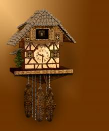
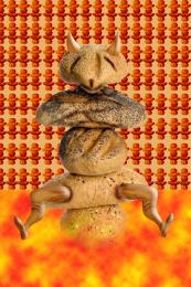
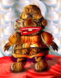
this is my first source only creation.
no other images were used to create this clock.
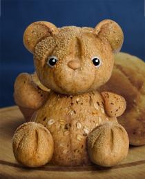
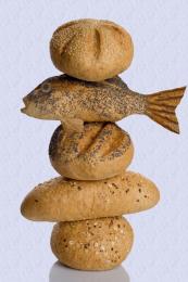
image-adjustments-brightness/contrast. to darken bread settings.-35 -70-100.. to lighten+35+70+100
I used custom shapes for fancy work -link provided for shapes( i was given this set as a gift ,however, i managed to be emailed the link )
to colour bread i used hue /saturation- flowers and tree
to cut shapes i mainly used pen tool. only because i am learning how to extend my use of that particular tool.
i will provide a basic SBS when i can put one together. there are a large amount of steps used to create this picture. (5 years and 4038 days ago)
1 Source:

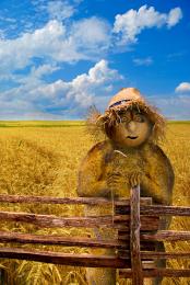


NOW put that writing ability in an SBS.. hehehe.. It's Okay.. we get the point.. though I can see some perspective issues..(The fencing decor accross the face goes a little to far and the roof follows) not a horrible thing.. but something you'd like to fix so it doesn't mess up the balance of the fun creation you have here.. very IMAGINATIVE
SBS?
good work. SBS need to be more detailed
very nice! good job
well done
very very impressive loved it, it's a fave!!
great well done
Very good, excellent
you have an eye for details
Very creative idea. Cuckoo looks flat. More shadow agains the wall would be good. I would have only two weights (with more burning/dodging to convey their cylindrical nature) and then position the pendulum so it can be seen. Traditionally cuckoo clocks are symmetrical so the upper half is disconcerting. The left-side eaves have a different vanishing point than the (correct) base. (The right eave could tilt down just a tad.)
very nice
wow
Howdie stranger!
If you want to rate this picture or participate in this contest, just:
LOGIN HERE or REGISTER FOR FREE