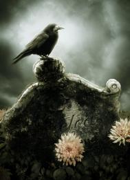
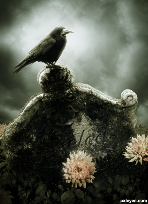
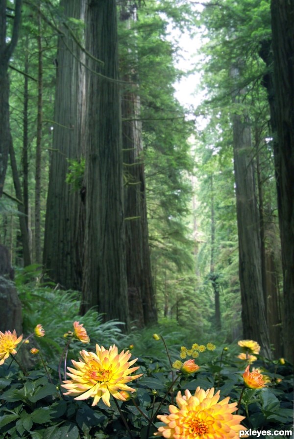
Thanks to CSnyder for the sky stock. (5 years and 3467 days ago)

Howdie stranger!
If you want to participate in this contest, just:
LOGIN HERE or REGISTER FOR FREE
Photography and photoshop contests
We are a community of people with
a passion for photography, graphics and art in general.
Every day new photoshop
and photography contests are posted to compete in. We also have one weekly drawing contest
and one weekly 3D contest!
Participation is 100% free!
Just
register and get
started!
Good luck!
© 2015 Pxleyes.com. All rights reserved.
 well done!


nice work!
I like this very much ! good luck author !
Great mood in this picture.. Like it! GL author!
VERY nice composition.
Thank you very much everyone
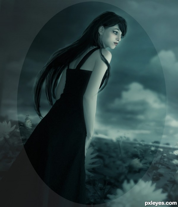
That Raven gives me shiversss. Reminds me of horror movies. Effective and chilling,
You have a definite style, author. Very nice mood indeed.
Great mood for sure!
so reminiscent of the crow. my favorite movie of all time. i love the tones you chose...like..the desaturation to the yellow so it all fits together so nicely.
well done on the darker feel...Its definitely my fav!
Great work author...very nice mood...gl
Congrats for 1st
Congrats!!
Congrats.. Looking forward to more wonderful work from you.
Congrats again Matteo terrific work
congratulations...
congrats again Matteo
Congratulations on first!
nice image... congrats...
congrats
Thank you all
Congrats from me too! Lovely work!
Howdie stranger!
If you want to rate this picture or participate in this contest, just:
LOGIN HERE or REGISTER FOR FREE