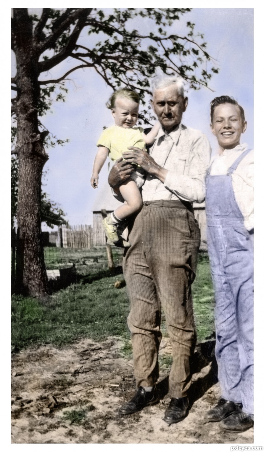
Grub - created by madamemonty
My own photo. (2 years and 232 days ago)
lchappell
Good image choice, nice crop! Background might be just a tad lighter...

PS: Author, it's a caterpillar, not a grub, and if you don't mind, could you PM me and tell me what it's feeding on, if you know? I don't think I've ever seen that plant, and I'm sort of an amateur plant/insect freak.
Reply »
(2 years and 232 days ago)
Thanks everyone, CMYK I don't know what it was feeding on, the plant looked like a weed to me and yes, it's a caterpillar from a Monarch butterfly
EDIT: I just found this for you CMYK, it's commonly called a swan bush or balloon cotton bush or a heap of other things.
http://www.ubcbotanicalgarden.org/potd/2007/11/gomphocarpus_physocarpus.php Reply »
(2 years and 232 days ago)
mine..mine..mine... - created by madamemonty
A reworked old pst entry. Both photos are mine. Please view high res. (1 year and 210 days ago)
Celtic Knot - created by madamemonty
Years ago I started learning how to draw traditional celtic knots, doing it in photoshop wasn't as easy as I anticipated. I liked the pattern dividing the building, and thought the letters could make a good knot. Only source image used. (2 years and 312 days ago)
hehehe.. just a wonderful use of source
looks so simple but I know the effort and love put behind it.. GOOD WORK.. love it (and celtic knots are beautiful but NO PICNIC to create.. the reason they are so wonderful) good luck author.. AWESOME (You'd love ZUNI Native American Jewelry, especially the Sun they ask every morning to rise) Reply »
(2 years and 312 days ago)
Daughter of the forest - created by madamemonty
Book is my own image and is in the sbs. (1 year and 230 days ago)
Pretty image. I like the mood of it, kind of dark but warm around the stump.
The girls head and her arm in the background look distorted. You could remove the arm in the background, or move it into a downward position. Reply »
(1 year and 229 days ago)
Thanks Tina, I have removed the arm in the background and I think it does look better.
Reply »
(1 year and 229 days ago)
missed a bit..... did not... - created by madamemonty
bud, flower, seed pods. - created by madamemonty
Life... to be born, to live, and to die! This is the lot of all of creation.
This is a banksia from my garden.
Please view High Res (2 years and 333 days ago)
What ever way you can improve your entry is upto your imagination and ability. If there is a mistake, I can point out that. I am not telling the idea is wrong. The finihing, colors an all not impressive.If you want you can refer some staingalss pictures and improve your entry. Mr. Warlock, you are stopping her from good works. Reply »
(2 years and 333 days ago)
Well, gopankarichal , I was quite happy with this, I like helpful comments but "needs to improve" doesn't help much Reply »
(2 years and 333 days ago)
AH GOPAN.. they got you on that one... Your second comment was a BILLION times better then the hit run comment... You must never assume that the reciever of your comment knows what you are thinking..and vice versa.. Always make a statement with the YOU as the reciever and you will find that your comments are very much appreciated..and you have great INSIGHT so peeps llike to know exactly what you mean.. Oh author.. this is just the bees knees.. I'd love this above my door.. say around saturday.. My sisters going to be in town and I'd really like to knock her socks off with a new door LOL Reply »
(2 years and 333 days ago)
Sorry Mr. gopankarichal I compleley deagree I whole point of this website is to show you work& for other to critique it so the author can improve there skill set & grow as an artist
just leveling the author to there own devices will not help…..
am sure you would prefer to have some helpful comments on you work in stead of “need to improve”
Reply »
(2 years and 333 days ago)
Ory, it is the same plant, pictured in my garden, it is an Australian native banksia 
Edit: there are lots of different banksia, you can see some of them on wikipedia
http://en.wikipedia.org/wiki/Banksia Reply »
(2 years and 332 days ago)
Glenelg - created by madamemonty
My own photo, there are 10 differences, some are obvious and some are not. (2 years and 171 days ago)
| No comments yet... | Glenelg |
weeeeeee.... what fun... - created by madamemonty
Is 50 cents enough????? - created by madamemonty
Coin made totally in Photoshop, please see sbs. I can't believe that I flattened my psd.... grrrr..... I haven't done that for years.... how silly can you be....
Please view the high res. (1 year and 109 days ago)
Thanks Erathion and Derdevil, I have added a bit of noise to the coin and it does look better partricularly in high res
Reply »
(1 year and 108 days ago)
go to madamemonty's profile


...GL 


I like this….very nice work great attention to details…colored light on the walls is a great touch! 


Super interesting work author....work on a feather is fabulous...well done Reply »
(285 days ago)
Beautiful wood grain! I expected the "Dear John" letter to be sadder than it was
...
Really lovely image, great work! Reply »
(285 days ago)
Very nice take on the theme
Reply »
(285 days ago)
Everything made from scratch deserves a well done !
Reply »
(284 days ago)
IMO one of the planes should be lighter, otherwise well made.
Reply »
(284 days ago)
Thanks CMYK46 for your comment, I thought about it and agreed that the writing area should be a little lighter than the back. So I lightened that area, but I didn't like the color, so I did the reverse and darkened the wood at the back behind the drawers slightly, I think it has improved and it makes the drawers stand out more too. Reply »
(284 days ago)
super nice look here great use of the tools Reply »
(281 days ago)
Very neat work
Reply »
(281 days ago)