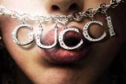
This was a very meticulous job, so working under a huge zoom most of the time was very helpful. I selected all letters using the pen tool. I added them onto the face close up (source 1), after removing the initial pendant by using the clone stamp tool. I made letters more shinny and silverish by changing blending mode to screen, selected a diamond from initial close up. Covered letters in diamonds, made them shinny. Selected the little dangler on top of the initial pendant, duplicated it and added it on top of letters to make them connect to the whole necklace. Added shadows, gradients and lens flare to the whole image. A huge thank you to "xstockx" on deviantart for a great image which actually inspired me. You can visit an amazing stock at: http://xstockx.deviantart.com/.
awesome work, great idea
very sexy
Sexy indeed great work on light & shadows!
great idea. sexy image
very nice
cool
Fantastic! Nothing negative to say at all!!
Good work!
great blend
Would love to see the meticulous SBS...
congrats!!
Congratulations for 1st
Congrats! Well done! Nicely done!
Herzlichen Glückwunsch! Well, that's german... I didn't want to write "congrats" again for one of your entries
Congrats, really nice work
Congrats for 1st
Congratulations!!!!
Thank you so much for everybody's congrats! It means a lot to me! Sooooooooo happy!
It's a meat market! All source. Please see high resolution. EDIT: Continued glass tube neon in the word 'Gucci'.
Really nice job with the sign.
awesome image author !
great looks so real and great sbs
Author..this really should be made into a TUTORIAL.. excellent work.. good luck
lol good work
Looks Good......G/J Author....G/L.
eheh funny one!!!! May be some noise on the glow?
Neon signs are all one length of glass tubing. I don't get what's making the red glow at top...Other than that, it's pretty good, especially the glows.
Thanks for all comments. CMYK: Thanks for your insight. You are indeed right about neon. I continued the neon glass tubing. Red glows atop is yellowish lighting above small ledge directed upward.
nice neon effect
good idea and good job
Congratulations for 2nd, nice one.
Congrats!
Congratulations on 2nd!
Years ago I started learning how to draw traditional celtic knots, doing it in photoshop wasn't as easy as I anticipated. I liked the pattern dividing the building, and thought the letters could make a good knot. Only source image used.
hehehe.. just a wonderful use of source looks so simple but I know the effort and love put behind it.. GOOD WORK.. love it (and celtic knots are beautiful but NO PICNIC to create.. the reason they are so wonderful) good luck author.. AWESOME (You'd love ZUNI Native American Jewelry, especially the Sun they ask every morning to rise)
good. nice usage of source
awesome blending...........GL
Wow different and confusing :P
nice!!
Great work.
Nicely done indeed! In a few places at intersections there are shadows where there should be highlights, but still a great job.
that would make an awesome arm band!
Congratulations for 3rd
Congrats! Well done!
Congratulations!
Congratulations
Another famous name...
great job with the letters really good
lol very nice
good ideea
ahah funny one bravo. I want one near home 
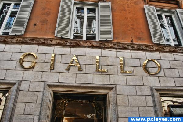
You did a very good job on the texture of letters Some silly suggestions: try to set the drop shadow to "Color Burn" instead of multiply and try to reproduce the gold reflections on the wall as the "G" letter Try also this one: duplicate the letters (exept the "G" merge them, desaturate, auto contrast, Filter -> High Pass -> set to "Overlay" or "Hard Light" it should give some more shiny effect
In his wildest dreams good work author
very good!
@ Giallo: I'd love to play with this some more, but I flattened it...
ahahah....
good
You fool now I want to know why!! Tell me that you're lazy I prefer!! kiddin but NEVER flatten your image still good kob
Congrats for your 4th place
Oh it's you Bob!! you're a fool NEVER flatten your .psd file it's silly!!!
well., its too late to comment, but still its not fair to flatten ur PSD file, at least till the contest ends., And congrats on ur "4th place"
Lots of clone stamp, cut, paste, burn tool, and patience.
Great job, and the way things are going this could come true. Let's face it, Gucci deserves it
How 'bout a high resolution version...Really like this! Nice job! EDIT:Thanks for the high res. Looks great!
An aftermath of a riot... Nice transition... And yeah patience is needed in creating good chops...
Looks really good! One small thing: I would have put the orange graffiti lower down...nobody could reach that high! Nice job.
cool!
good work