(5 years and 2979 days ago)
credits and thanks:
http://chop-stock.deviantart.com
http://www.cgtextures.com
http://z-stock.deviantart.com
http://fantasystock.deviantart.com
http://shooting-people.deviantart.com
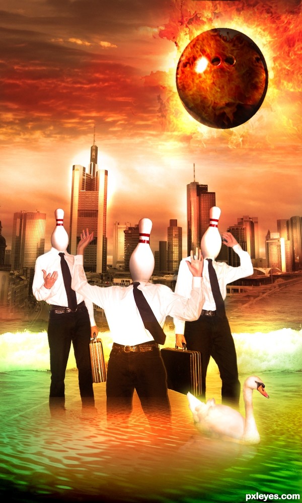
Created the bowling ball in Photoshop, using a round shape tool. The holes in the ball were made ng the same tool and with a bleinding option of inner shadows so that suggest the depth. Than I've overlayed the fire texture in order to make a fireball effect. (5 years and 2982 days ago)
pinheads being attacked by a huge bowling ball ahhhh!! lol very funny and amazing concept
Nice surrealist picture, good luck!
Love the idea author! good luck
hahahahahaha....so cool concept...gl
Howdie stranger!
If you want to rate this picture or participate in this contest, just:
LOGIN HERE or REGISTER FOR FREE
I lack fantasy, or so I think so.. I pushed myself making something that in first (or last) glance does not make sence. I worked on it way to long and therefor I stare myself blind on it. I think it's missing something, mabye you guys can comment? (5 years and 3027 days ago)
Great job, love it 
Nice result. Appreciate your imagination. I liked the bubbles and Jellies. I as a designer has met with the same staring and blindness problem. The solution what I found good is; Get away from PC, Do somthing else for sometime, Give a gap. Color perception get wavered as you keep stairing at the image for long. You end up giving lesser color than needed. Keep going..GL
I think its beautiful!
I think its very nice author I would just leave it as it is
Thank you all for your nice comments!
Nice one! My fav! GL!
very cool work author...gl
Thanx for the nice comments and fav's offcourse 
Howdie stranger!
If you want to rate this picture or participate in this contest, just:
LOGIN HERE or REGISTER FOR FREE
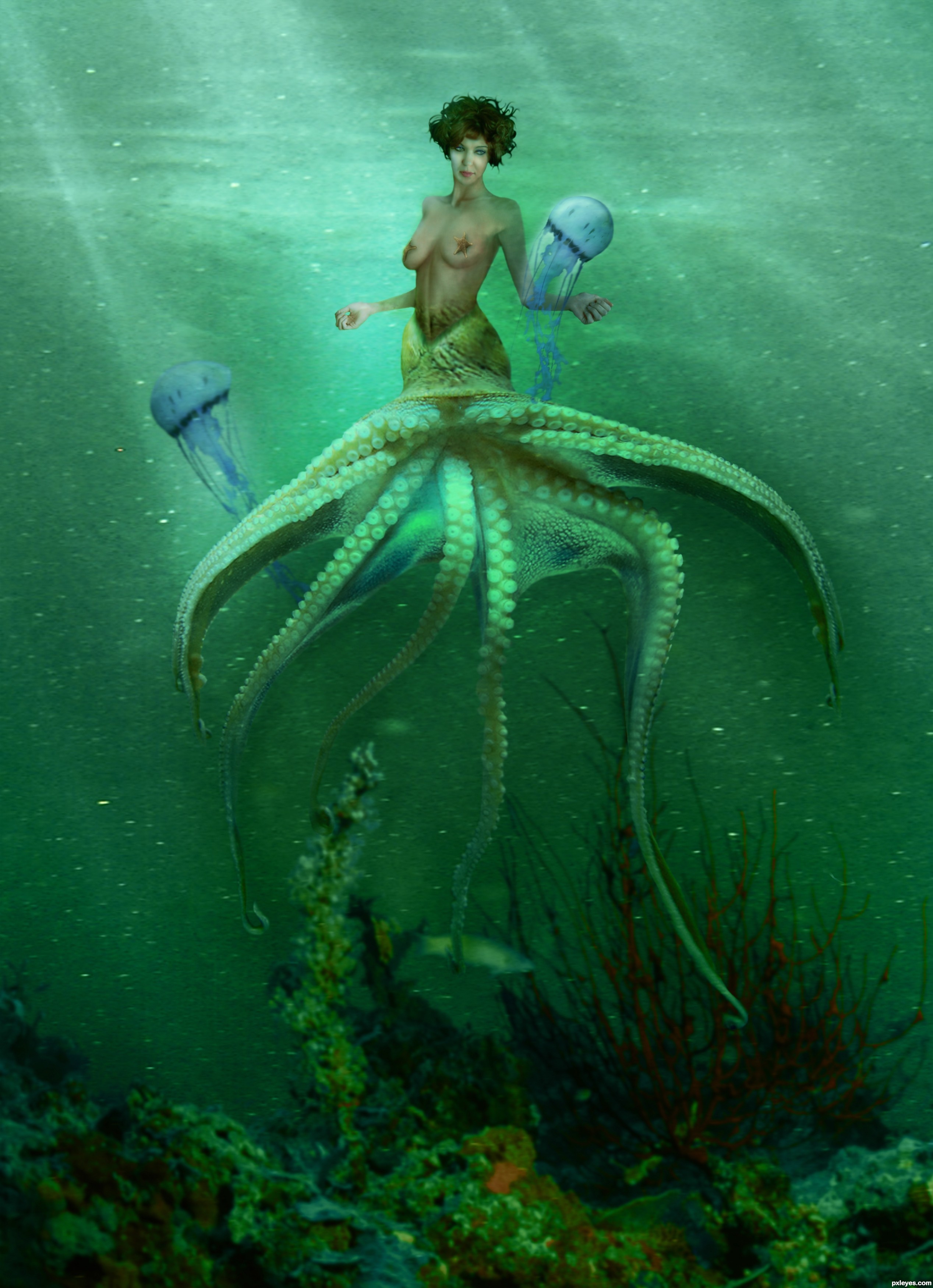
my favorite character from the little mermaid was Ursula, the sea witch...This little lady may not be the vision Disney had for their witch, but....I think its more suiting to what i'd envision.
According to wikipedia, the octopus person is known as a cecaelia. Read more on this here: http://en.wikipedia.org/wiki/Octopus_person
and here
http://en.wikipedia.org/wiki/Sea_witch
***and now the censored version, in hopes to make it more acceptable to the masses***
Thanks for viewing and please comment, it helps me grow as an artist. (5 years and 3082 days ago)
Maybe if the center of the legs lined up with the line going down the center of her torso and if the legs were horizontally flipped or else rotated clockwise so her near-side legs are lower than her far-side legs (i.e., have legs conform more to the diagonal angle of her gaze). More feeling of front-to-back depth would also add interest; everything seems to be mid-ground with no truly foreground or background elements. For example, fish brushes creating a small school of fish at 11 o'clock plus a bigger jelly fish at 4 o'clock would enhance the diagonality. I also think a tad (1 or 2 pixels, I imagine) more shadow beneath the starfish pasties is needed to make it clear that they are on top of her breasts.
I feel like without the jellyfish you could make your creature a little larger, which would really make her the main focus, especially because the colour of the tentacles is very similar to the hue of the water.
Good luck
I think we really need an instruction on how to leave a constructive comment instead of just giving nit picks. It seems to me that this is the artists vision and deserves the respect from all of us. The artist might take the suggestions to heart if there were more positive comments prior to making such strong suggestions on how to improve upon the piece. Ideas presented the way Nator has done could be a lesson to us all.
Personally, I think this shows allot of imagination and the artist evidently spent allot of time in it's creation. Art is subjective and means something different to all of us
*blush* thank you, dollmommy. I do appreciate your comment most of all. Critiques should be constructive, i do agree.
now the story behind the jellyfish....If any of you have seen the little mermaid (disney's version), Ursula the sea witch had two morel eels as her minions. They were mischevious creatures that set out to do dark deeds during the movie, as part of the antagonist side of the story.
The Jelly Fish in this piece were done as my witch's familiars, like a black cat to other sorts of witches. Notice, however, my main character is not dark, so therefore i decided that her familiars needed to be of a lighter nature. which is where the jelly fish in the light shade of blue (taken from the blue tones in the octopus tentacles) came into play.
Dan, i had thought about doing more in the background, but i didn't want to detract too much from my main focus point. i do appreciate your comment and critique, and you taking the time to do so.
Ponti, the jelly fish are a part of the story, obviously, so maybe now you know why after much debate, i decided to leave them in the picture.
Nator, thank you for your comment and your support. it is nice to hear some good things about the hard work i did. extracting tentacles isn't the easiest task. CS2 doesn't have that lovely "magic select" that newer versions do.
I did go in and add a bit more shadow under the starfish to blend them a bit better, but i'm afraid thats all the more edit i have time for before contest end, because i'm at work now. It was a fun piece. Perhaps i'll come back and do more adjustments in time. However, i am quite happy with my final results for this contest.
Perhaps a bit of free transform skewing on the body to "angle" her back a bit would help the perspective. I like the concept, but agree about the jellyfish, more because as compared to morey (morels are mushrooms) eels, a jellyfish has no real brain or personality, and those tendrils sting, no matter who they touch, friend or foe...
@DollMommy ~ While comments can be kudos and back pats, here they also serve the purpose of pointing out visual inconsistencies and technical flaws and errors to *theoretically* help the artist become better at chopping an image. Hence, what you term "nit picks" are quite often merely observations of flaws that prevent the image from visually communicating the artist's vision. Not every creation is a "masterpiece," and just because it was made does not excuse it from critical commentary.
Perspective, Lighting, and Edges are the three most important compositional parts of a good Chop. When they are flawed, it brings the entire image down, regardless the author's subjective intent.
excuse my poor little typo up there MossyB. I'm not perfect. and its MORAY EEL. Obviously, my results of this piece show that i'm far from it considering the sorts of "critiques" i've gotten thus far.
Yes, i have got alot to work on to be the "Master" of photoshop, but from the looks of your portfolio, i'm not alone in that matter.
In a fantasy light, jelly fish can have any sort of personality i choose to give them. its my creation. I've seen plenty of cartoons giving life and personality to otherwise mindless creatures. I've yet to see a starfish that acted like Patrick from Spongebob. Have you? and as far as i'm concerned, starfish in general have no "Personality"
I think you are confusing reality from fantasy. Yes, jelly fish sting. BUT...This is a witch. a sea witch. with all the "magick" that comes with a witch. so if she is immune to the sting of her dear companions then so be it.
honestly, i think arguing a point of fantasy is moot. its like arguing over whether some food tastes good. it might to you, but it certainly doesn't to me. you see where i'm coming from?
anyway...thanks for hoping in the boat of long winded comments. is there one tiny piece of this you actually like? if not, then i guess thats why they call it ART. not everyone is going to like it. Hell, i know people with mad respect for Picasso, but can't stand his execution of his works. and who's to critique a master such as that? i wouldn't. but then again, i have respect for all sorts of art.
when i'm perfect, i suppose i'll have no need to compete anymore. Until then, i enjoy it. and i wouldn't turn off the commenting because it does help me grow. every piece i do is a learning experience and i take it as such.
I do believe that you, MossyB, need to go back and reread my first comment. I see no problem with CONSTRUCTIVE criticism, it is just the way it has been approached lately on this site.I am sure that something positive can be found in every creation PRIOR to making suggestions on how to improve upon it. There is just a kinder way to go about it.
There are other pieces in this competition alone that very well could have received critiques to help improve upon them,though nobody even started in on them. Were they not worthy of the same consideration? My whole point from my first comment was to enforce the fact that, while no piece of artwork is perfect, no piece of artwork should be considered exempt from a good word before being harshly criticized otherwise how it the artist to know that the piece is even worth their time to even bother.
As an end to my comment, just remember, if it is worth your time to judge an artists weak points, it should also be worth your time to enforce the positive aspects of the piece as well.
Really original idea!
Looks great to me author!
Dont worry too much about taking certain peoples advice, especially about underwater scenes - http://www.pxleyes.com/photoshop-picture/4ccb15f987e8c/Missed-Me-.html ......I think some people might want to get their own portfolio up to scratch before handing out critique.
Good Luck Author !
thank you cornelia and geexman. your opinions are important to me, and although i do agree with your statement, geex, i tend not to point out other peoples flaws so easily. i just remind them kindly that no one is perfect.
we all learn from our mistakes, and perhaps some of us need to make ALOT of them before they learn. and perhaps thats why some of them choose to disable the commenting.
I could wrote same as others author,lots and lots of text lines...but i will say only that i like your creation very much...and of course hers upper body is hot,but i can only imagine what she can do with lower part...
*giggle* her upper body.  and yes, she is hot.
and thank you for your support also erathion. always very appreciated.
 Geexman


Good luck Author nice chop indeed.
My intention wasn't to insult the author, i know them and love them like a sibling, and i know they prefer receiving comments that help them improve their images, over simple "Nice work!" comments. The author knows i like their work, but when commenting on their images, i try to find nit picks to help them out.
Positives usually outweigh the negatives.. for example the selections, the sources the author chose, the blending and the overall idea.. these are all really good.
Still, i have to agree, negative points should be highlighted with respect.
Good luck author.
I did not think you were trying to insult me in any way, ponti. I do appreciate your comments and although I do enjoy hearing things to help me grow as an artist (critiques are always welcome) I also like hearing what things are good about the image as well. No matter, as this is not the place to debate such things...
Just know I thank everyone for taking the time to look, and more importantly, the time to comment. It may not be the best entry in the contest, but I am proud of it anyway.
it is a beautiful image..... yes, you should be proud...even if you do not win.... I think that us, artists, have to deal with problems of trying to figure out the outcome of our work. IMHO I would say, that some people would like to see a "perfect work", with shadows and highlights, textures, forms, colors, shapes, perspective...etc..etc... These people should realize that we are working with photos to make a combination or photo manipulation, just putting them together, takes time and effort. Our minds get tired, some of us do not want to compete, as we know, there are better artist than us. We, just want to accomplish something that is in our minds... Be creative is the main thing. You did a good job! It is your work! I am also proud of what you have done.... leave negative criticism and comments behind. Your heart will always tell you when you do right. Good luck!!!!
thank you so much george. your comment has really made me smile today. i appreciate it very much!
Howdie stranger!
If you want to rate this picture or participate in this contest, just:
LOGIN HERE or REGISTER FOR FREE
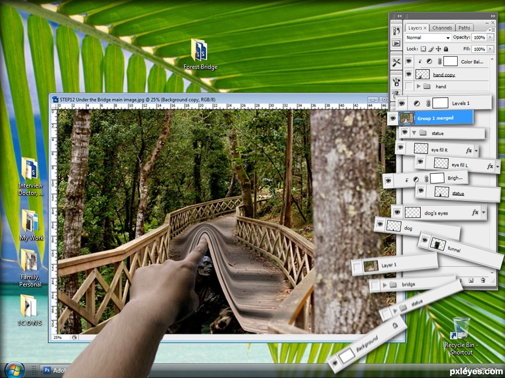
This is a project I've wanted to try, something different. Saw it done a few years ago, see sbs.
At first I was thinking that a troll would be interesting to find under the bridge, then came across the statue that seemed to me like a homeless man, and after that I found 'his' dog. (5 years and 3122 days ago)
wauw! different approach but I like it !!
Gl author !!
WOW!!! super different.. great job author.. good LUCK
great
unusual thinking....gr8!!
Extra points for your different approach on this chop. Very ingenious. I like the color of the palm leaf B/G a lot. Your SBS is top notch, good luck author.
Nice imagination..Congrats
Out of the box thinking for sure - excellent entry!
Love the ingenuity! Very clever and well done ... I agree extra points for originality!
This is amazing!!! I am so jealous! GREAT SHOT AND GL AUTHOR!!
wowzers author..... must have taken some serious time putting that together 
Original, unique and very clever one ! love it don't know why....
ha ha
great idea.., very well done
nicely done ........ 
What everyone before me said. GL!
Hahahahahahaha fantastic idea and execution author...best of luck
Clever = )
CONGRATS ON 3rd... great job!!!
Brillilant entry - congrats!
I loved it when I first saw it and I still do! Congratulations!
nice job corngrats
for a brilliant idea, CONGRATS
Great work! congrats!!
Very creative.... congrats!
Congrats!!
congrats!!
Howdie stranger!
If you want to rate this picture or participate in this contest, just:
LOGIN HERE or REGISTER FOR FREE
Photography and photoshop contests
We are a community of people with
a passion for photography, graphics and art in general.
Every day new photoshop
and photography contests are posted to compete in. We also have one weekly drawing contest
and one weekly 3D contest!
Participation is 100% free!
Just
register and get
started!
Good luck!
© 2015 Pxleyes.com. All rights reserved.


don't u need the sbs?
sorry...
i added the procedures...
thank you.. and more power to pxleyes
lol, what a great imagination = )
hahahahahaha...very cleaver thinking....gl author
Nice thinking outside the box. That always gets a good score from me.
Howdie stranger!
If you want to rate this picture or participate in this contest, just:
LOGIN HERE or REGISTER FOR FREE