source (5 years and 3297 days ago)
(5 years and 3346 days ago)
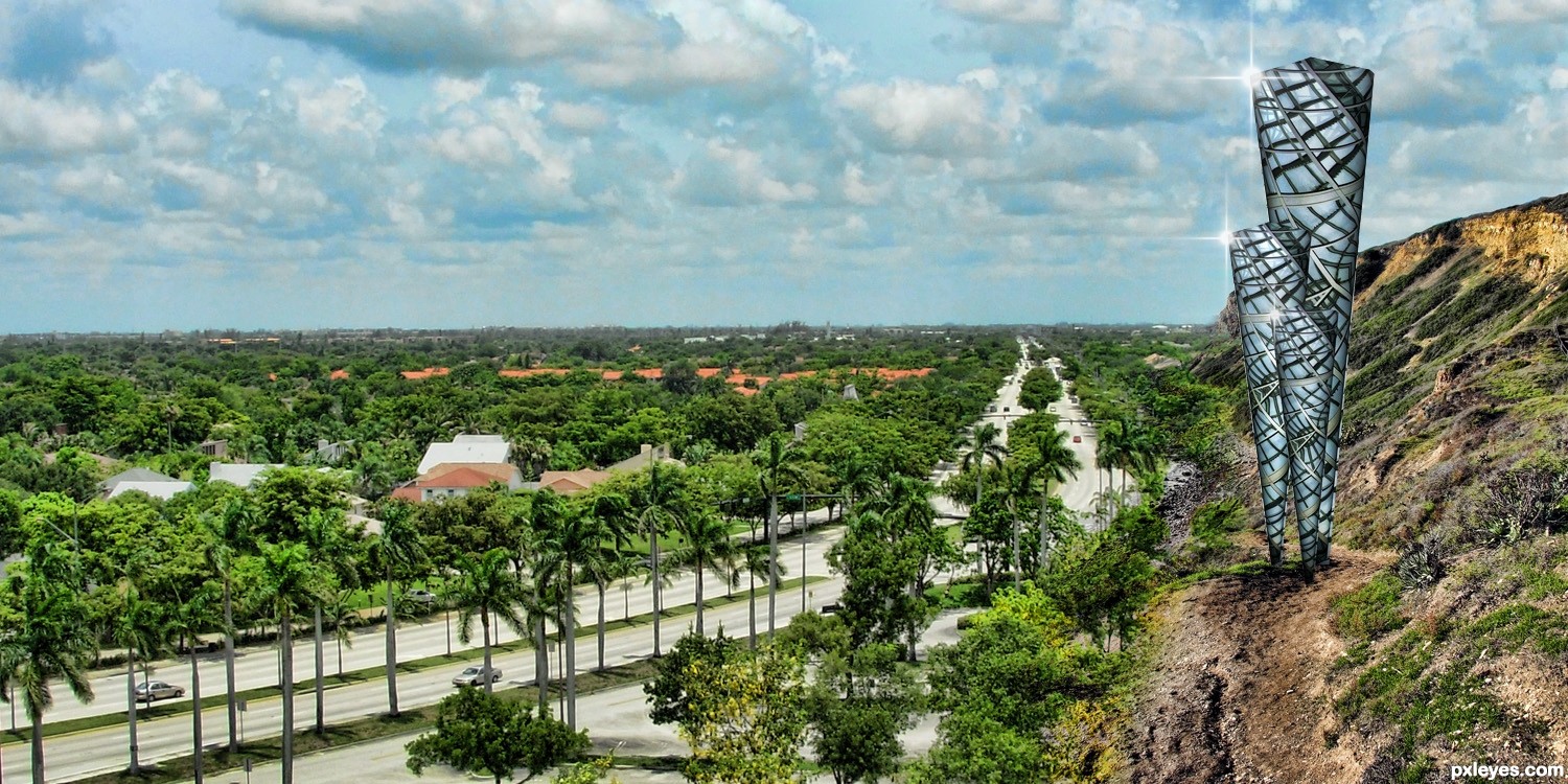
nice entry...... try removing or moving the cones to maybe near the houses on the left.... looks a little unrealistic here,
the shine and shadows of the cones are better in opposite directions.........
GL author
well prepared..!gl author
Howdie stranger!
If you want to rate this picture or participate in this contest, just:
LOGIN HERE or REGISTER FOR FREE
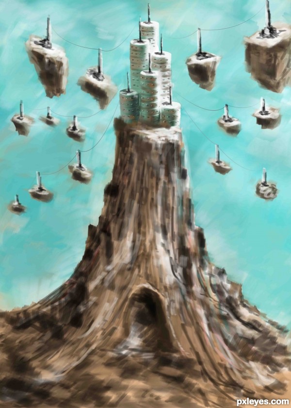
prison towers in a fantasy landscape (5 years and 3370 days ago)
love the effect author, GOOD LUCK!!!!
Beautifully done..You did an amazing job author..GL
thank you
very cool!
thnx
I like that you did this in digital drawing style = )
Congrats!!
Congrats
thanx
Howdie stranger!
If you want to rate this picture or participate in this contest, just:
LOGIN HERE or REGISTER FOR FREE
Source image used to create two towers. (5 years and 3454 days ago)
this is a pretty neat idea author.. way out of the box.... you may want to try and get rid of that orangy red stroke line around the top... it defeats the realism a bit (IMHO).. you may also want to reverse the burn dodge on one of the towers so that the shading matches the angle of light (it's not really that important, but I've noticed if you don't correct the lighting on a subject many members have a snit)
Good luck.. and great idea.. 
Thanks Drivenslush. Think, I should get rid of the orange outline.
Yeah, I appreciate your view about lighting. It took 15 hours work to reach here. Maybe, my eyes got color saturated.  Will work on it. Your advice is to the point. Thanks again.
very interesting concept...construction is well made and as Ernest sad i will to remove orange stroke...best of luck
Excellent tenacity .. wish you major luck
Thanks Drivenslush !!
As Drivenslush has already pointed out, the lighting on half of your image is wrong. When considering making a realistic style image such as this, lighting is important. Check out this valuable tutorial: http://www.psdbox.com/tutorials/manipulation-secrets-3-shading-and-lighting/
Thanks CMYK46. Link is truly eyeopener.
Not sure if it's intentional or not, but you have a brown outline at the top of each building. If you remove those and soften the edge a bit it would help. Nice image and great imagination too.
Thanks pixelkid for the suggestion.
Cool idea, somehow reminds me of the architecture in Dubai.
Corrected the picture aided by suggested expert comment from Drivenslush about red line. Hatss offf.
CMYK46, I like your critically hurting yet actual comments. I tried to correct the lightings. Hope you think it is ok now.
pixelkid, the red line came through copy layer styles, think now, it wasn't appropriate, so removed it.
Thanks erathion, sweetest and in my opinion, a very creative person in my pxleyes world.
Thanks pearlie, you always shows way to do the better way in a very honest and unhurtingly factual way, you did to me and I also read many of your comments to other pictures
Howdie stranger!
If you want to rate this picture or participate in this contest, just:
LOGIN HERE or REGISTER FOR FREE
Thanks to Tilemahos Efthimiadis, Joyrex, Dave Hamster, Scallop Holden, Zeusandhera, Night_fate, Thomasje, Iversonic and Mimiliz for the lovely stock images ;-)
I found the inspiration for this work in a photoshop magazine of a friend. The name of the artist who describes a tutorial of something similar to this one is Adam Smith. Thx ;-)
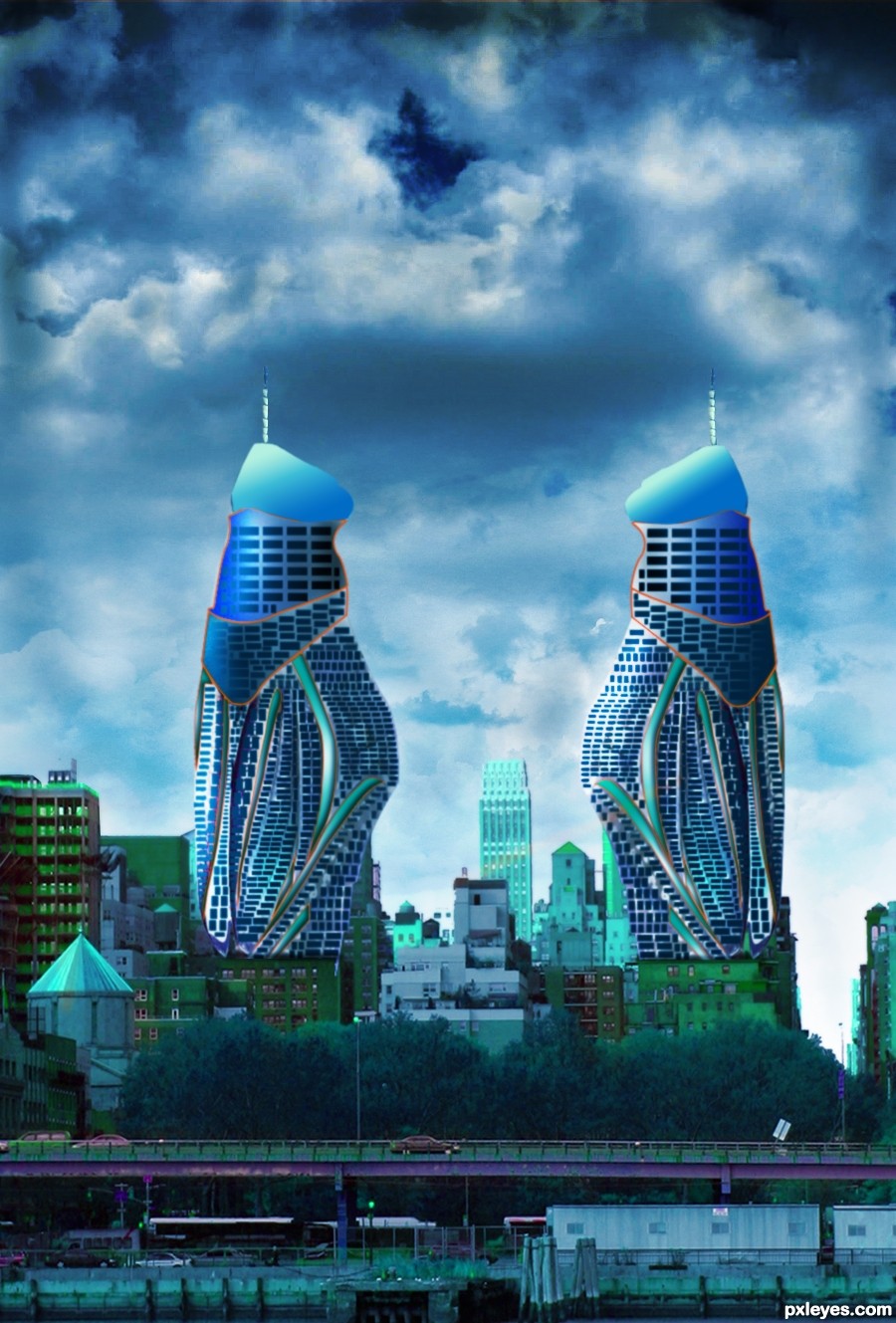
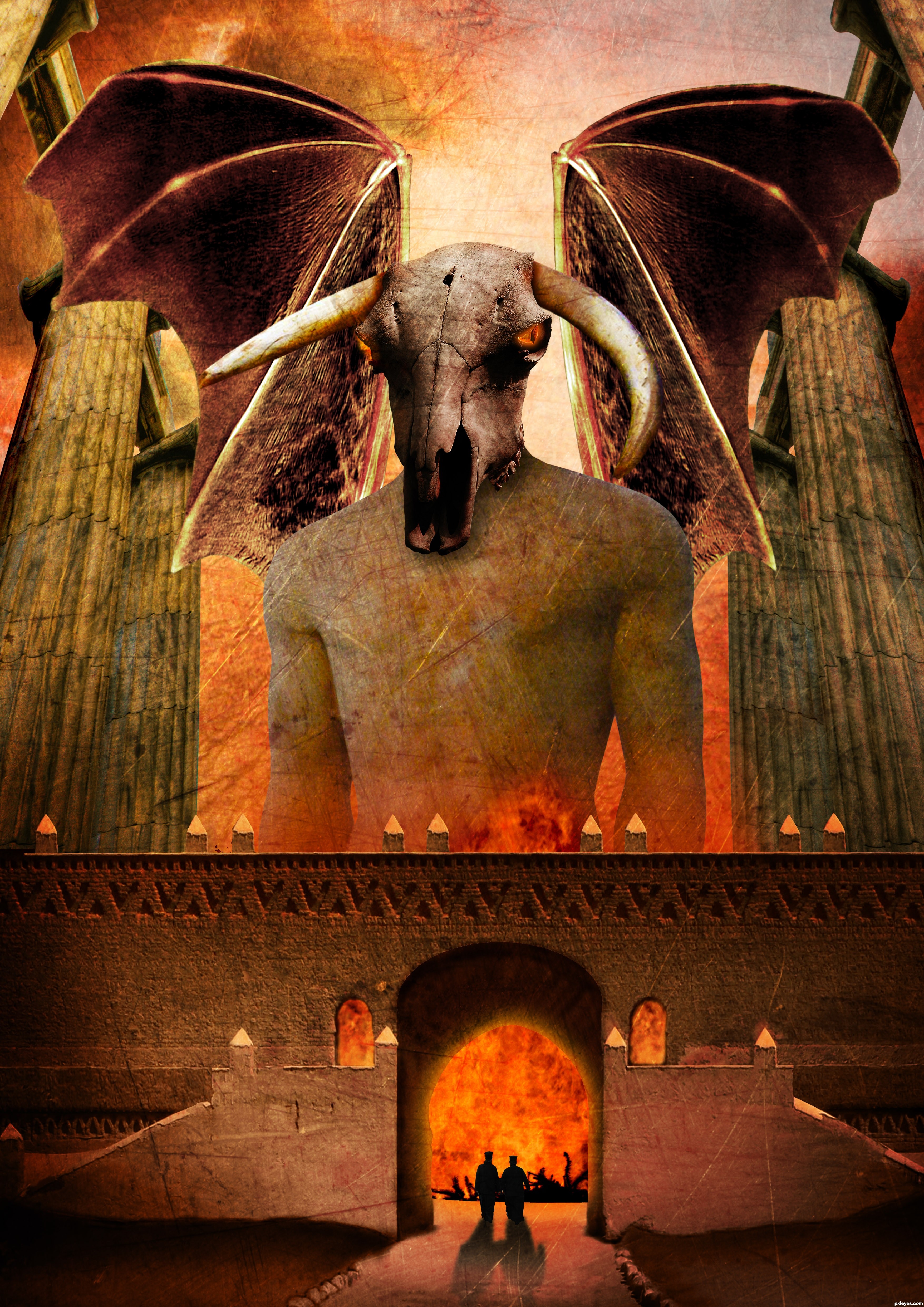
comments are most welcome... (5 years and 3645 days ago)
Dunno why the wings are transparent, but it's a good idea & mood. IMO a bit texture heavy, but that's just me...good luck.
Thx Cmyk46, i'm going to leave it like that for now but like i said, comments are welcome. I spend a lot of time on this one
woohoo, love it author its out there for sure :p
The scale is fantastic.. you can really tell you spent a while working with this one. I personally don;t like using textures much but i think you used them very well on this occasion. The silhouettes are a nice touch, but the building should cast the same strong shadows as they do.
Great overall work Good luck!
Pretty nice scale on the things. But I would make the wings a lot bigger and work with the edges of the wings, as well as making them non-transparent. Could add some bones/veins or something on them to make them more realistic. They look pretty much cut/copy/paste/too big pencil when cleaning the edges now. Or you could try inner shadow effect for the wings. There are also some bit careless masking of the edges. Work with the windows and there is a major left-over from a colour mask on the right edge of middle part.. some dark trash there. Nice colours and eye sockets, worth working a bit more..
Very nice entry, that reminds me an illustration about mythic creatures. GL!
wow, awesome!
Thx Widiar, i will do something about those problems
Good job with the wings, looking so much better now..
Thx for the nice comments
great concept author...good luck
Thx
Wish nobody to get to that gates
Yep, it won't be a lot of fun
Howdie stranger!
If you want to rate this picture or participate in this contest, just:
LOGIN HERE or REGISTER FOR FREE
Photography and photoshop contests
We are a community of people with
a passion for photography, graphics and art in general.
Every day new photoshop
and photography contests are posted to compete in. We also have one weekly drawing contest
and one weekly 3D contest!
Participation is 100% free!
Just
register and get
started!
Good luck!
© 2015 Pxleyes.com. All rights reserved.


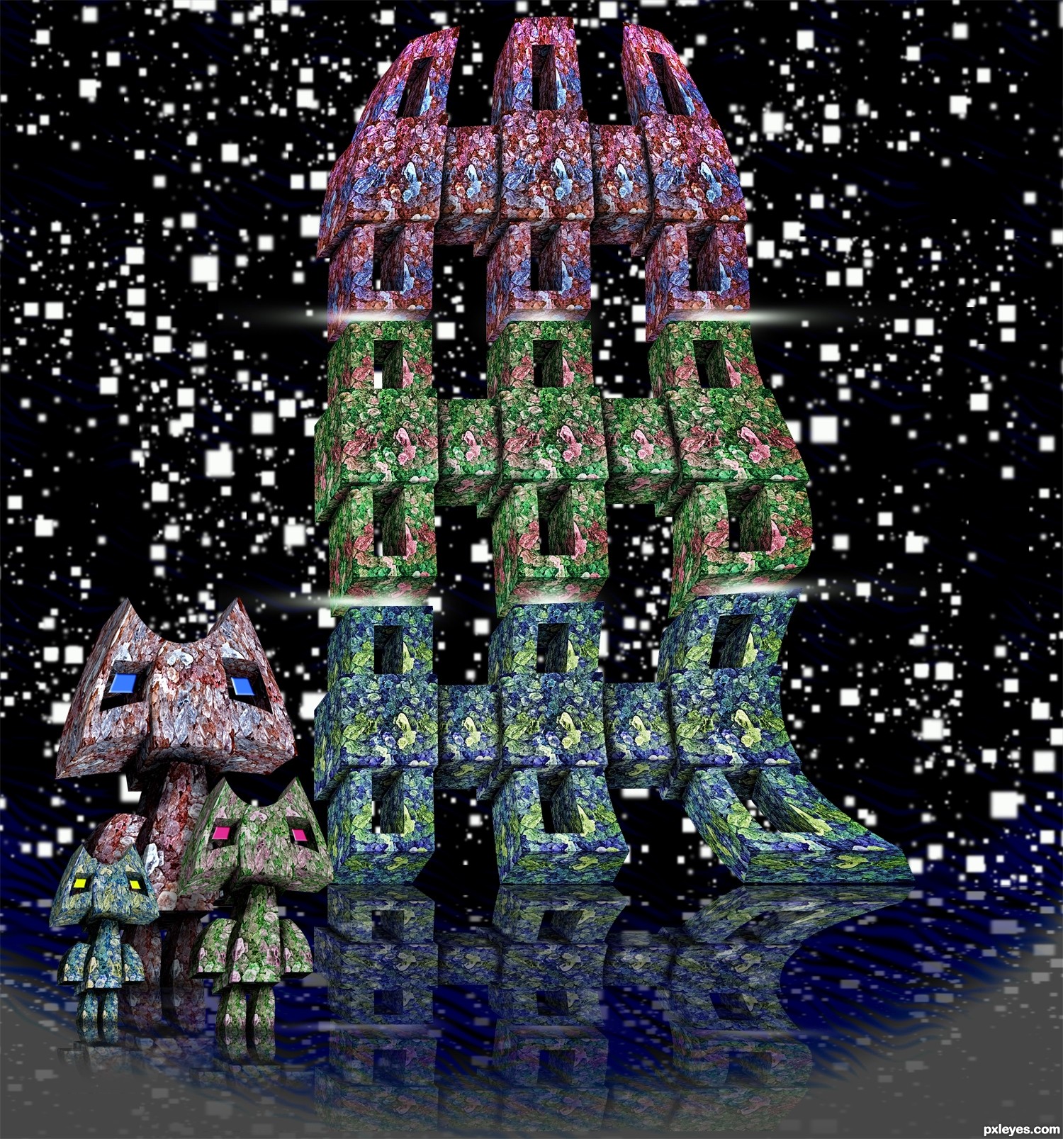
very creative.. There is no single element that i like the best in this work. cute people
great creation
Nicely done...
no doubt great work... but ice are all multi-colored?
Good luck.... limitless creativity... and a beautiful work..... gl.....
Is this a pun on Fawlty Towers ...mmmmmmm ...if so, which one is Basil? Either way it is great!!!
Cute, well explanation (sbs)
Very nice!
LOL@Faulty Towers! Very clever architecture, author!
Howdie stranger!
If you want to rate this picture or participate in this contest, just:
LOGIN HERE or REGISTER FOR FREE