Thanks to Paul Brentnall and Evgeni Dinev. (5 years and 3199 days ago)
Edit:
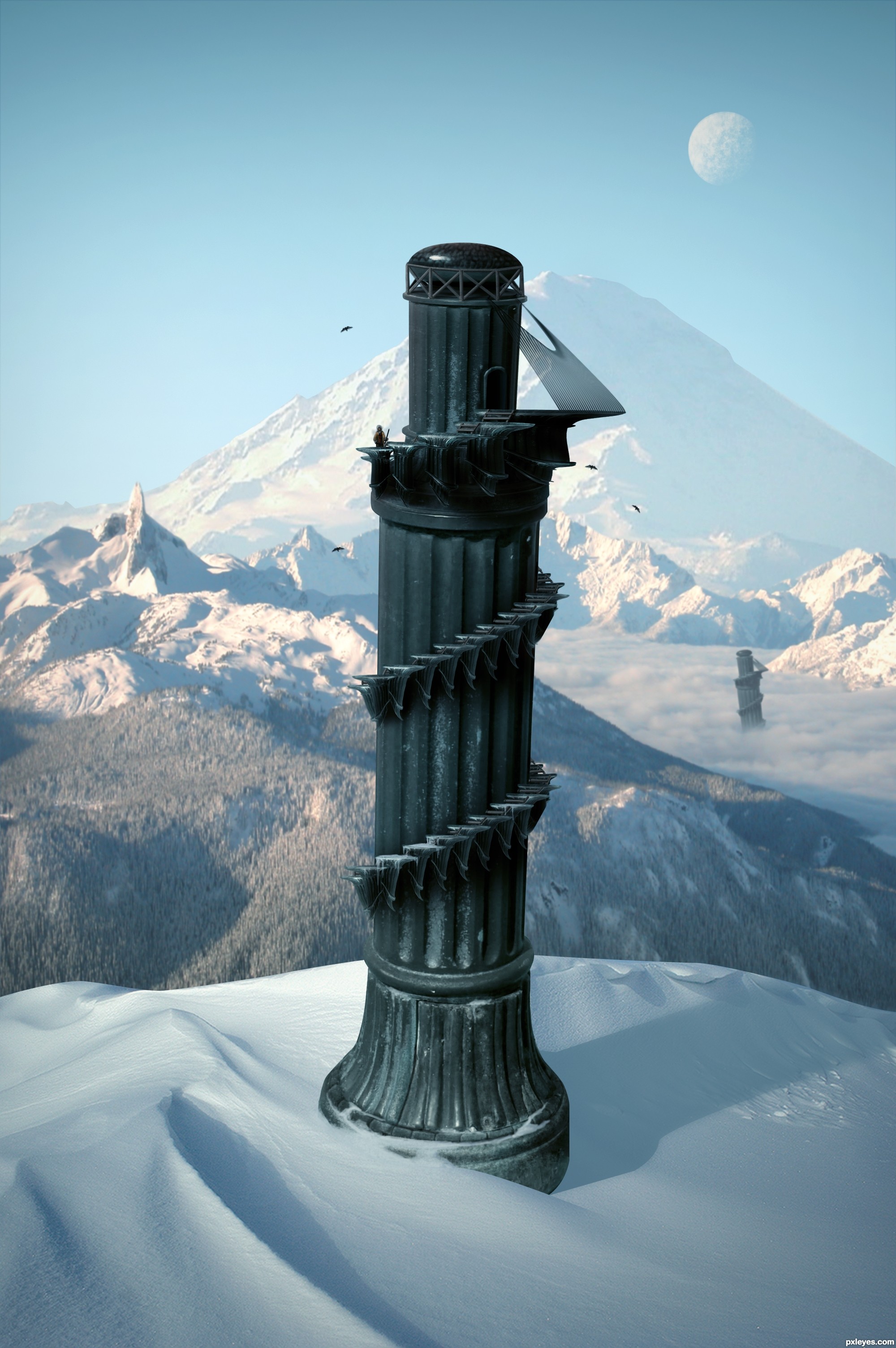
- Fixed some masking problems.
- Decided to go with a colder climate than the last image. (5 years and 3263 days ago)
Beautiful work... 
great great work
Pretty fast submitted entry! I like the idea, you may want to mask the top of the pawn a bit better (some white edges here and there). Good luck!
Pretty good, but room for improvement!
Im not entirely certain, but wouldn't the shadow be bent outwards over the slope rather than inwards? - the shadow from the furthest tower is too dark in relation to the closest - and - maybe a little addition to some shadows from the terrain would help place everything better - especially from the mound covering the foreground tower as it's casting nothing...
Oh and the glare fom the bottom of the 'tower' it's not true to where you're placing your shadows from, so maybe get rid of it and add some highlights to the relevant side
Thanks for the comments.
Cool over all. I personally don't think the duplicate background towers add anything, however. Also, the palm trees look fake. And the hi-res version highlights the white edge around the tower's top and the fakiness of the tower-bottom and sand-dune edges.
The top of the tower still remains sharp and white spots are there . but this is a good image... you have to make some touches there... good luck...
Great but as above you could just try the matting controls, use the "layer" / "matting" from the top drop down menus and remove white matt or defringe to get rid of them, Then quick select and feather those edages slightly.
nice creation ................ i like it ........ Gl to u ..........
Thanks for the helpful feedback. Image is now complete.
Very nice, like the Pizatower, but in the mountains 
I like it! GL!
yeah a much better image!?!... GL 
i like the colder climate version!! great job!
This is why I don't participate in this contest 
Nice work, and well done, gl
Very nice, good luck
Fantastic work author...IMHO u don't need other tower...any how this is great,high marks from me...best of luck
nice
Good.
GL
Thank you.
Super! It looks like the tower will fall out of the image at any moment
Howdie stranger!
If you want to rate this picture or participate in this contest, just:
LOGIN HERE or REGISTER FOR FREE
no outside sources were used other than the given source and my photo (5 years and 3270 days ago)
good work
nice
GL
Howdie stranger!
If you want to rate this picture or participate in this contest, just:
LOGIN HERE or REGISTER FOR FREE
Nick -http://nara6200.deviantart.com/
Andreea's and Dianora's stock-http://ro-stock.deviantart.com/
dA's Best Kept Secret-http://peace-of-art.deviantart.com/
Laura-http://lausanne.deviantart.com/
Gift Giver -http://sammykaye1sstamps.deviantart.com/
Thanks guys for the great images and brushes.
Guys check the high resolution (5 years and 3440 days ago)
Good concept and choice of images. It would be nice if the clouds at the bottom would be more like the clouds at the top. Some gaussian or motion blurr would help.
i like these photo manipulating, all this staff i like it GOOD and EVIL!!!!
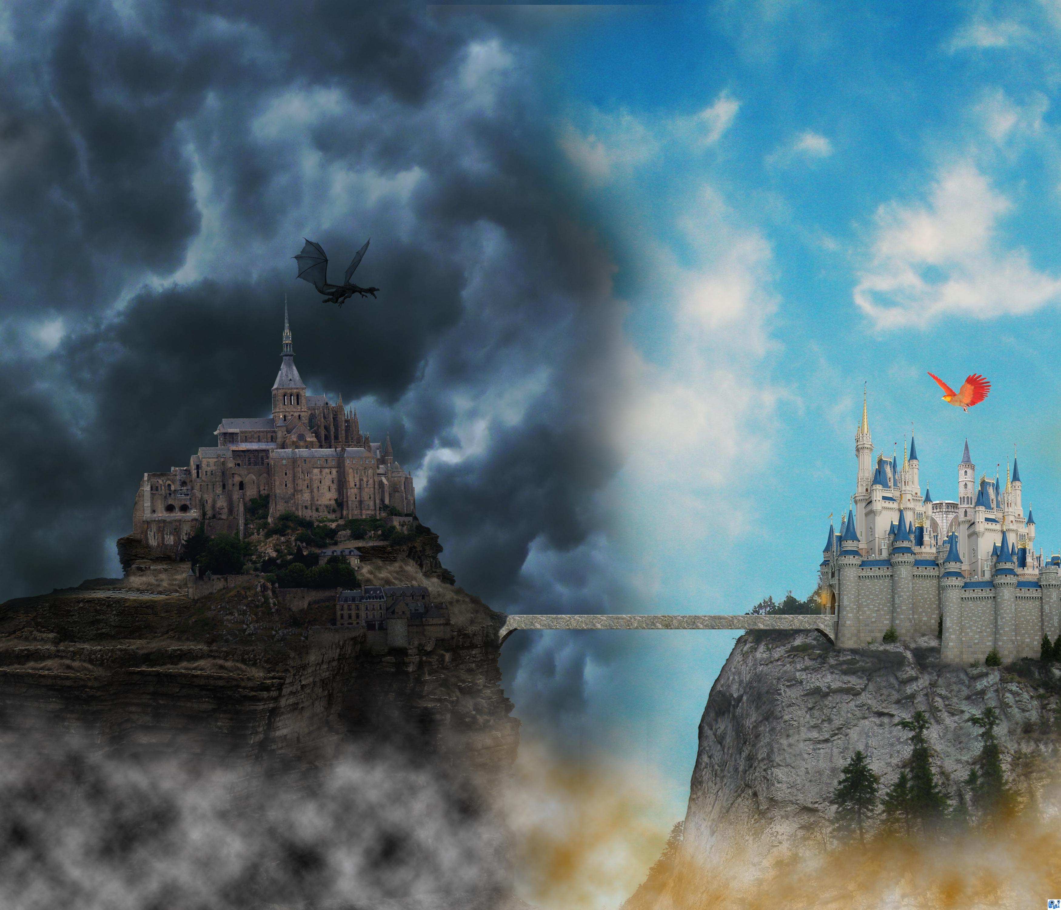
Thanks guys....a lot...Nator i had the same idea about the bridge but someone tell me,dont change the bridge,bridge is neutral...lol
Good idea and well done! But I think I kinda agree with Nator about the bridge
Nice
one castle for your good days and one for your bad days? THis is a wonderful image . I like the dark dragon balanced with the red/yellow bird on the right. they provide an interesting focus in this image. GL
Howdie stranger!
If you want to rate this picture or participate in this contest, just:
LOGIN HERE or REGISTER FOR FREE
Photography and photoshop contests
We are a community of people with
a passion for photography, graphics and art in general.
Every day new photoshop
and photography contests are posted to compete in. We also have one weekly drawing contest
and one weekly 3D contest!
Participation is 100% free!
Just
register and get
started!
Good luck!
© 2015 Pxleyes.com. All rights reserved.


nice... and very well done...
please upload a high resolution i think the cut could be a bit better
and correct your second source...
wow maan...gud job...luv it... ...
...
luks like a 8s exposd pic
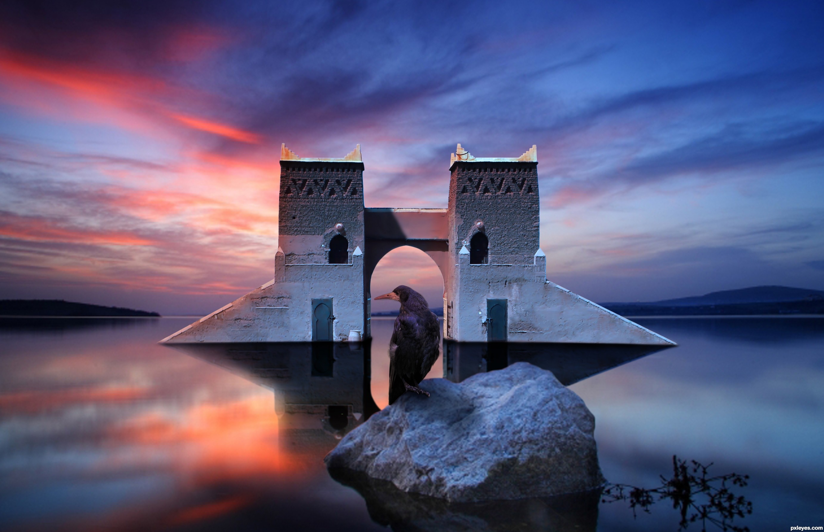
Nice. Towers reflection should more closely match the color of the actual towers just as all the other reflections match their sources.
wow, this is awesome! maybe lower lower reflection opacity a tad though
wow wow wow........
Beautiful entry!
Howdie stranger!
If you want to rate this picture or participate in this contest, just:
LOGIN HERE or REGISTER FOR FREE