Photoshop Pictures: Sadness


results 1 - 5 of 11

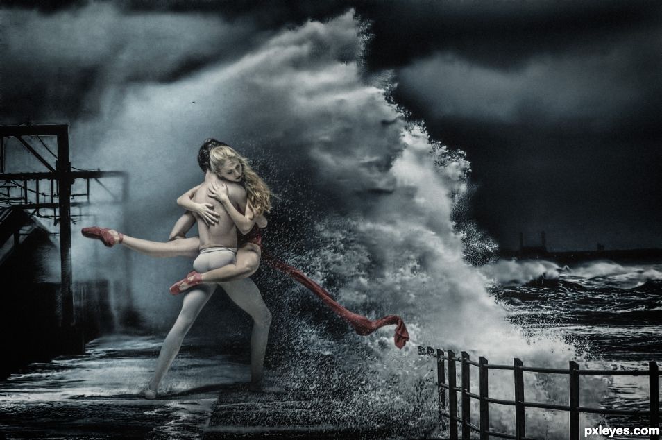
Against All Odds - created by nanaris


Against All Odds
Favs: 0SBS: n/aHi-resRank: 1/4Score: 57.6% (35)16418 views

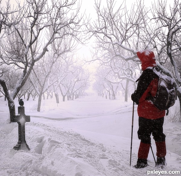
"Take a good look at me now
'Cause I'll still be standing here
And you coming back to me is against all odds
It's the chance I've got to take
Take a look at me now."


Songwriters: Phil Collins
Against All Odds lyrics © Imagem Music Inc (5 years and 533 days ago)

1 Source:

avatar Zizounai
Zizounai says:

Very good! I would have taken off the little black spot over the man's head

author says:

Oh yes sorry I was in rush
Thank you dear.

avatar madamemonty

Congrats Ana-Maria, well done

author says:

Thank you😊

(5 years and 520 days ago)


avatar George55
George55 says:

Congratulations....

author says:

Thank you 😊

(5 years and 519 days ago)


avatar filantrop
filantrop says:

Congratulations!

author says:

Thanks 😊

(5 years and 519 days ago)


Howdie stranger!
If you want to rate this picture or participate in this contest, just:

LOGIN HERE or REGISTER FOR FREE


Sadness - created by ruppelman


Sadness
Favs: 0SBS: n/aHi-resRank: 4/4Score: 61% (0)7811 views

(5 years and 2380 days ago)

5 Sources:

avatar lvstealth
lvstealth says:

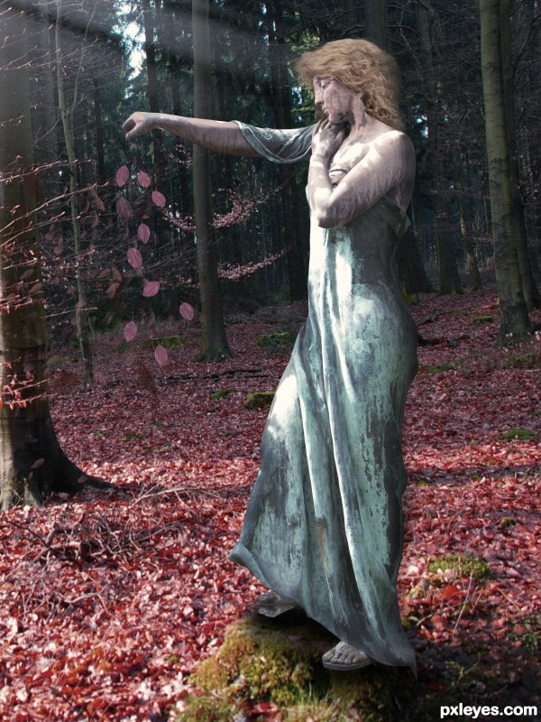
nice idea, looks good. imo, her arm stretched out there is a bit off.

no avatar

I like the idea which you have used

GL

Howdie stranger!
If you want to rate this picture or participate in this contest, just:

LOGIN HERE or REGISTER FOR FREE


Sadness - created by DanielaOwergoor


Sadness
Favs: 2SBS: n/aHi-resRank: 3/4Score: 60.1% (25)10331 views

Thanks toTerri Heisele: http://www.sxc.hu/profile/madmaven

For crow.

&

Thanks to Sven Golz: http://www.sxc.hu/profile/svenic

For snow. (5 years and 2926 days ago)

4 Sources:

avatar CMYK46
CMYK46 says:

Nice blend! The man looks a bit big, but maybe that's just me...

author says:

Thank you guys!

avatar erathion
erathion says:

very nice realistic work...best of luck author

avatar Androla
Androla says:

awesome blend!!!

author says:

Thank you guys!

avatar Drivenslush

Excellent Blend, Now where is the vampire ?.. giggle snort !!! (sorry author, just had to LOL) awesome job

avatar itsdesign
itsdesign says:

nice job

avatar George55
George55 says:

Congrats for third Daniela.

avatar spaceranger

Congrats!!

avatar hereisanoop

Congrats

author says:

Thank you!!!!

avatar Chuck
Chuck says:

Congrats

Howdie stranger!
If you want to rate this picture or participate in this contest, just:

LOGIN HERE or REGISTER FOR FREE


Dear Edward - created by eclipsy


Dear Edward
Favs: 17SBS: 1Hi-resRank: 1/4Score: 63% (35)23201 views

(5 years and 2994 days ago)

7 Sources:

avatar MossyB
MossyB says:

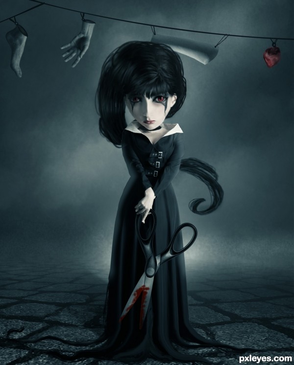
The neck area looks kind of wonky - The really dark shape beneath the head makes it look like the head is floating, and it doesn't look at all like a shadow...Nice job on the background!

avatar Brunheroti

Very good

avatar wazowski
wazowski says:

The general mood, the colors and theme is nice, it's some details which could make the entry more finished. That's imo mostly the hair, that looks a bit too roughly drawn compared to the more clean rest of the images. Pay a bit longer attention to it, perhaps you can add a blending layer (with mode multiply) to make the dark parts a bit darker so the hair looks somewhat more smooth. Or just use a tinier brush to get thát detail which make the image more like a whole. Same story would be for the strings. Perhaps here and there the edges from the suit can be a bit softer too. But for the rest I'd think that Tim Burton would like this .
@Mossy: not sure, but maybe the dark shape you mention is not necessarely a shadow but some kind of necklace?
Author, good luck!

avatar jawshoewhah
jawshoewhah [banned] says:

Other than maybe make the right side of the head the same shape of the left (since she's staring strait out) it looks like her head is deformed but other than that, this is still one of the best entries I've seen. Fix that and I think you just might have a winner. GL!

author says:

I tried to fix the most critical parts, really thanks for you guys for making me know.

avatar fatz8016
fatz8016 says:

with few little adjustments this could be a fantastic image(mostly the hair)..but having said that, i really like it..the mood is great..goes to my fav's..good luck!

avatar Chalty669
Chalty669 says:

I really like this image! I couldn't really tell what was on the right side of her untill about the 5th look. Also not sure why you added an sbs with just one background image?

avatar hereisanoop

like the concept very much..., good luck author

avatar nanaris
nanaris says:

love this, good luck!!!

avatar arca
arca says:

Gruesome little thing isn't she. Has a very doll-like quality to her which makes it more impressive considering the scissors and the clothsline! Love the concept!

avatar RickLaMesa

congrats on a well deserved 1st place

avatar lolu
lolu says:

Congrats for the first place !

avatar madamemonty

Congrats, this is really creepy

avatar Glockman
Glockman says:

congrats very nice work.

avatar locxoul
locxoul says:

congratulations...

avatar spaceranger

Congrats!!

avatar ramesan
ramesan says:

congratulations...

avatar DanielaOwergoor

Congratulations darling, you deserve it!

Howdie stranger!
If you want to rate this picture or participate in this contest, just:

LOGIN HERE or REGISTER FOR FREE


And then there were 8 - created by stevey666


And then there were 8
Favs: 4SBS: n/aHi-resRank: 4/4Score: 57% (0)20220 views

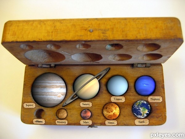
A little piece of my childhood died making this, 9 just seemed like a perfect number. Now the rhyme is "My Very Easy Method Just Speeds Up Naming". Naming what?

The idea I had was this to be a high school scientific resource from the 50s/60s, now updated to remove Pluto

Anyway, made with copying, resizing, burning, bluring, cloning. The usual suspects, nothing fancy.

Edit: I cleaned it up a little and removed the text as I felt the Pluto message to be stronger this way. (5 years and 3127 days ago)

9 Sources:

avatar jamespaul
jamespaul says:

like ur concept....

gud job

avatar DanLundberg

Clever and amusing. The planets need more shading to appear less flat and more like 'marbles' in the box. The back half of Saturn's rings should be inside the box bottom. (I like the slits in the box cover for the front half of the rings.) The labeling on the cover side is extremely bland [euphemism for 'boring']. Something shorter like "The Planets in a Box" spread across the entire front in colored, kid-friendly type would be more appealing.

avatar MossyB
MossyB says:

LOVE IT! Especially the crossed out "Pluto."
Simply Excellent. I hope you win with this one!

avatar itgik
itgik says:

Great work author.
My only suggestion would be that Uranus has rings too.

Pluto should still be a planet IMO

no avatar

Love it! Did you consider taking the balck out from the centre of Saturn's ring? s oyou could see the box behind it instead of space?

avatar hazem
hazem says:

it is very nice and new good luck

author says:

Edited a little (hope thats okay!), thanks everybody for your crits and comments. I need to work on my ability to shade.

itgik, I hated Uranus for having rings after I did Saturn, but they are comparitivly mild so I decided not to include them . I agree with Pluto, keeping it for old times sake, but damn I didn't know how many other Pluto sized objects there are: http://en.wikipedia.org/wiki/File:EightTNOs.png

avatar cabldawg71

nice idea and good chop Author I want one.

avatar jawshoewhah
jawshoewhah [banned] says:

Nice 1! GL!

avatar erathion
erathion says:

Great concept author...And i like Pluto idea so much...LOL...best of luck

avatar arca
arca says:

Very clever and original ... Poor Pluto!

Howdie stranger!
If you want to rate this picture or participate in this contest, just:

LOGIN HERE or REGISTER FOR FREE