(5 years and 3269 days ago)
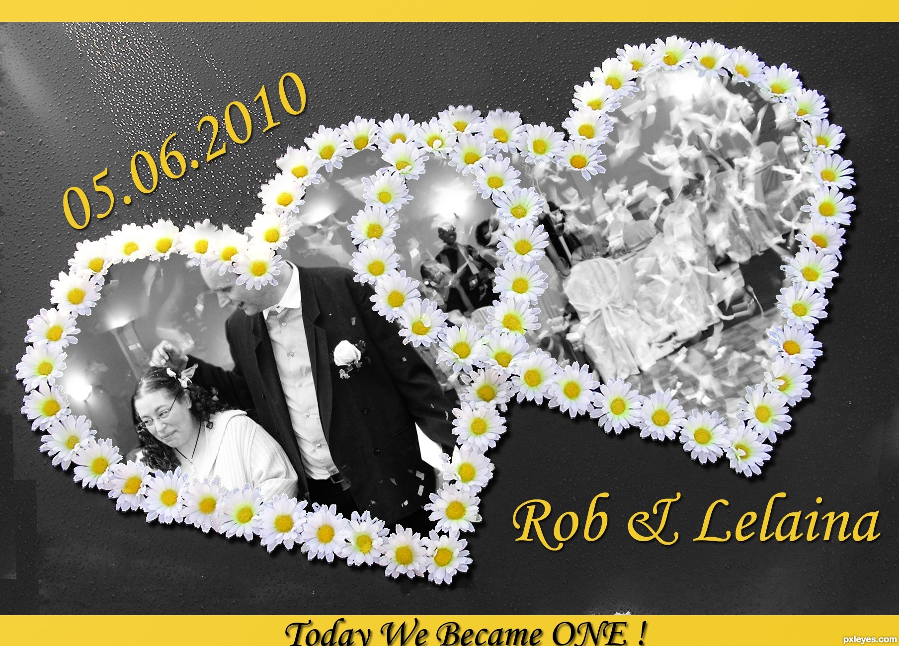
today is the day, we join hands together.
Today is the day, we become
one forever.
our souls hand in hand, the love that we lend.
will keep us together forever
to the end! (5 years and 3278 days ago)
What a lovely entry! I love the flower hearts and the whole black and white look with yellow as only colour.
Also the poem is great!
Thank you very much for this entry and the poem!
Good luck 
nice job
Just one thing: Rob could appear more in the image... 
Sucha sweet entry and great poem, thanks!
nice entry ...... GL .........
Thank you again very much for this beautiful entry, Glamourgirl!
Thanks so much for entering in this contest!
We've decided to make a photobook of all the entries as a memory!
Howdie stranger!
If you want to rate this picture or participate in this contest, just:
LOGIN HERE or REGISTER FOR FREE
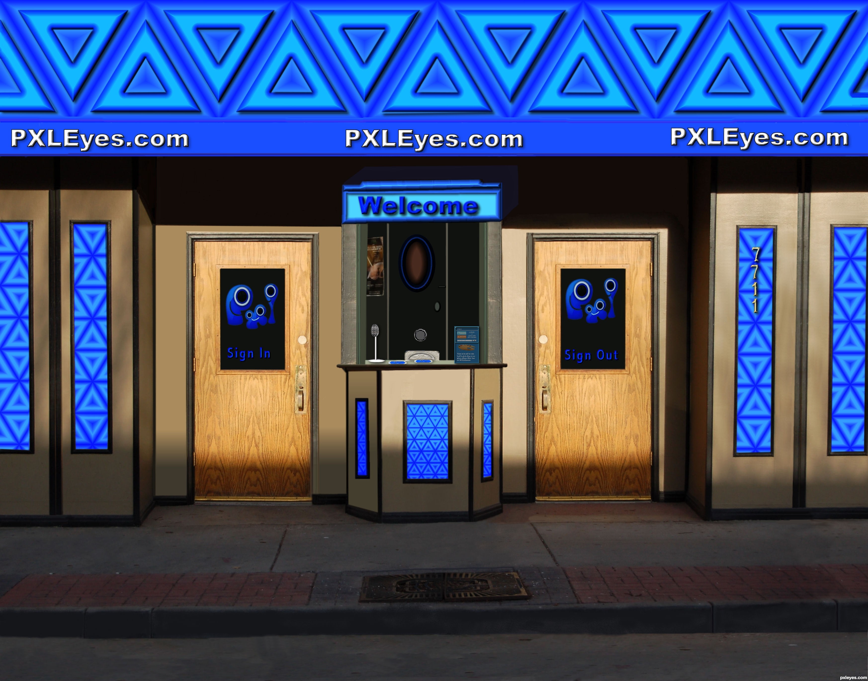
Spec Thanks to PXLEyes.com for use of their logo & sign in picture box used in this project on PXLEyes web site.
The art pallette used in remake of picture in tellers booth was from photo impact images (5 years and 3279 days ago)
Very bright and nice! 
nice idea.. but the blue mirrors or pattern on the counter needs the shadow as the rest of the image.. burn those areas a little and u can get the effect..
Thanks I took care of check it out I added a couple more things to it also
to the right and left of the sign in door the shadow at the bottom of the strips is off a bit should fade but is too sharp. good luck author
Hey Thanks I played with it I think its a little better Thanks
wow ........ i like the idea ........ all the best to u .................
Howdie stranger!
If you want to rate this picture or participate in this contest, just:
LOGIN HERE or REGISTER FOR FREE
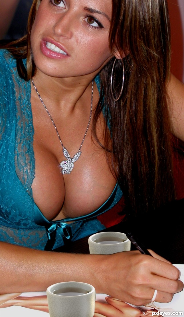
http://www.everystockphoto.com/photo.php?imageId=4312301 (5 years and 3280 days ago)
haha i was thinking along those lines but you beat me too it 
i think to make it better you could change the light sources on the cups...
Still looking for the source....... OH there it is! Was a little distracted. I'm just glad she not pooping in them
But seriously, the cups are still showing the same brighter light source than the busty gal you chopped them into. Try adjusting the contrast levels on the cups layer or even dodge and burn. It would look more realistic. But hey, props to keeping me distracted
hey.. where is the source image..? this should be off theme isn't it.. I swear I looked everywhere in the entry for source image.. btw jawshs is right.. take care of that..
I see I was not the only one distracted :P
I want to comment but that means scrolling away from the picture!
they look like collage... the luminosity and the contrasts are totally opposite. and being a free photoshop editing, i won't say the main subject of the creation is the center of attention, but i think it should be. Good luck
Two cups? Which cups? G cups? 
Sorry... Japanese tea cups are a bit small (or the boobs are a "bit" big...) and the backward one must be a slightly darker for shadows...
thanks for the comments everyone, very helpful but seriously, who's looking that far down in the picture...i mean, come on now......
yea author.. nice picture.. and well said barracuda and erikuri..
Imagine whole set of cups...then no one could find source image parts...Good luck author,great cups,mistake idea,idea...lol
gud luck
luckily, being a female, and not breast obsessed, i can look past the image used for this one and see two chopped cups plopped down on a picture. There is so much more that could have been done with this idea. i get what you were attempting and all, but really, just because there is a pair of breasts in there, doesn't mean that its a decent chop.
work more on the execution of it. add dimension to those cups, shadowing to give them more "believable" standings in that picture. she is signing autographs, she'd have knocked over those tiny cups with her arm..or the obnoxious fake ta-tas.
don't know about all that but nice pair Author
giggle! look at the varicose veins on the breast! she needs some "touch" up... hehe. and i firmly agree with jadedink, you just plopped the cups in. you guys really like that? hm...
not realy, just thought it'd be funny...
i dont know about vericose.
Howdie stranger!
If you want to rate this picture or participate in this contest, just:
LOGIN HERE or REGISTER FOR FREE
thanks to http://piratedpictures.deviantart.com/
and
http://kikxsuk-stock.deviantart.com/
stocks (5 years and 3306 days ago)
very lovely work
very lovely work
very lovely work
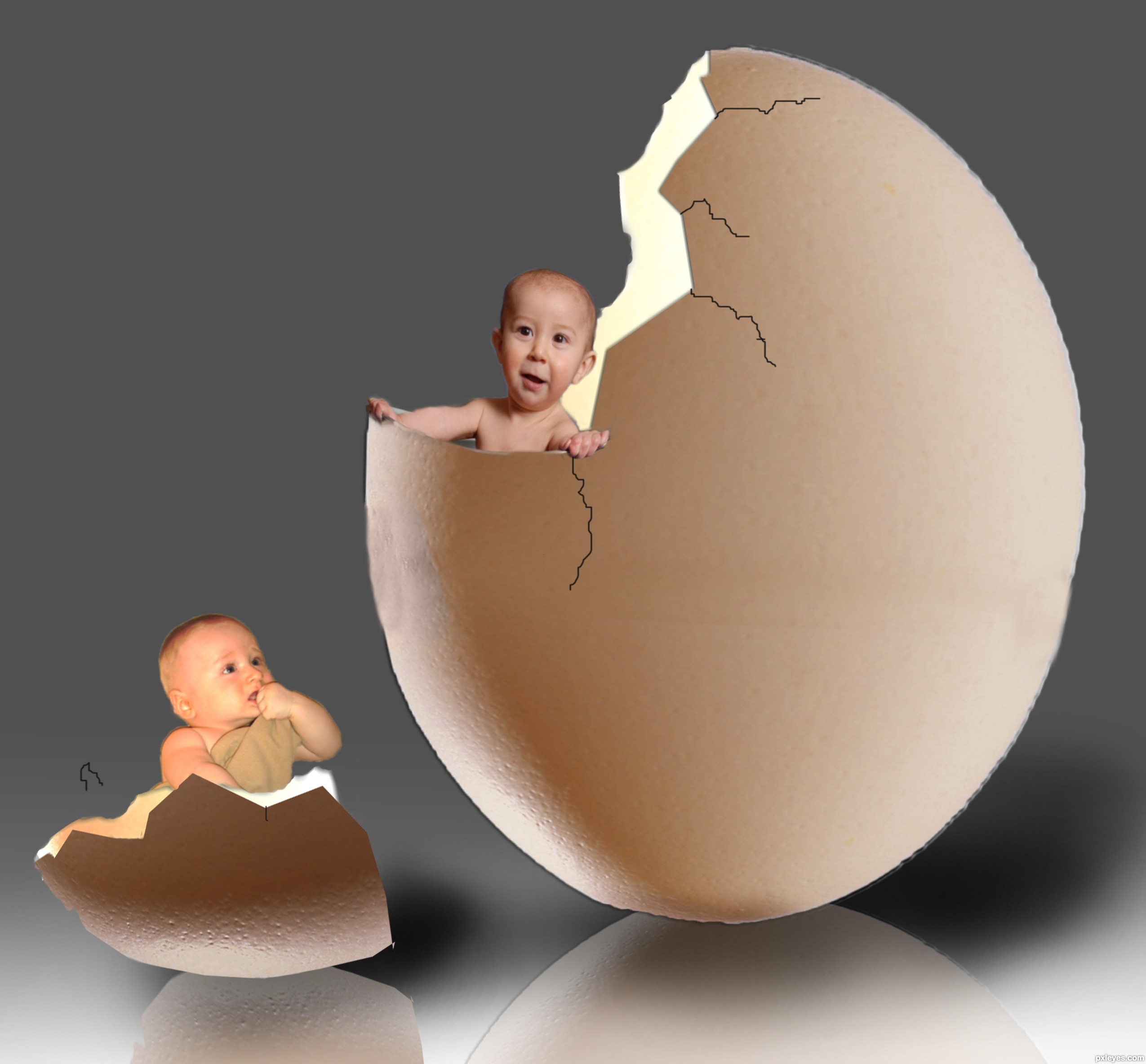
Nice work with the egg, but I´d like to have a bigger baby coming out - or something else than a baby.
it's cool good luck
Baby inside the egg is a bit distorted.
And you need to fix both sides of the shell (blurred).
the baby inside the egg is ok.its not distorted please view in high resulation.
I have to agree with erikuri...and looking at it in hi-res did not help. Also there are some issues with where the egg is joined with some dents in the side.
yeah i noticed the dents..but i think the baby is ok there
i removed the blurry part and fixed the dents...thanks for suggestion
The egg shells look like they are floating. The reflection needs to touch. In high res, there's a black line outlined on the egg and I agree the baby looks really distorted. I'd work on the cracks too.
cool one...gl
Author, do you wanna know why we all think the baby inside the egg looks distorted? It's because a baby used to be more plump, and he's a bit stretched...
u should use the pentool to cut your images... (with feather .5 to 1.5) now it looks like over feathered babies are not a good cut...and need to have a good look at fingers where he holds the egg... and the shadow under the egg need to be more closer down the egg. .. now the eggs are floating....... try to fix it.. this will be an awesome entry ( you can try with enlarging the baby (the second one) too... (only my opinion)) Good luck ...
thank you all for your comments ...I know this entry needs lot of work with the baby,the cracks,and the reflections, but unfortunately some of my psd files are been deleted .Thats why I can't fix the baby ,but I tried to fix the reflection.. so many thanks to hereisanoop,erikuri,Irse and jawshoewhah...for your kind comments and suggestions.
Haha, good !
Howdie stranger!
If you want to rate this picture or participate in this contest, just:
LOGIN HERE or REGISTER FOR FREE
Photography and photoshop contests
We are a community of people with
a passion for photography, graphics and art in general.
Every day new photoshop
and photography contests are posted to compete in. We also have one weekly drawing contest
and one weekly 3D contest!
Participation is 100% free!
Just
register and get
started!
Good luck!
© 2015 Pxleyes.com. All rights reserved.


Well done!
Thanks
beautiful entry .......... gud luck to u author ...........
Great! I got confused...
Nice one, GL
nice job....
spot on and right on theme.. good luck!!!
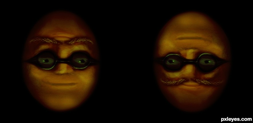
nice illusion
nice illusion
nice one, good luck !
Great work...gl
Thanks for the comments
Funny and right on theme!
Howdie stranger!
If you want to rate this picture or participate in this contest, just:
LOGIN HERE or REGISTER FOR FREE