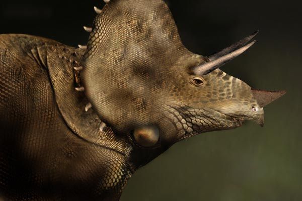
no sources...bt il show you how to do it... (5 years and 3785 days ago)
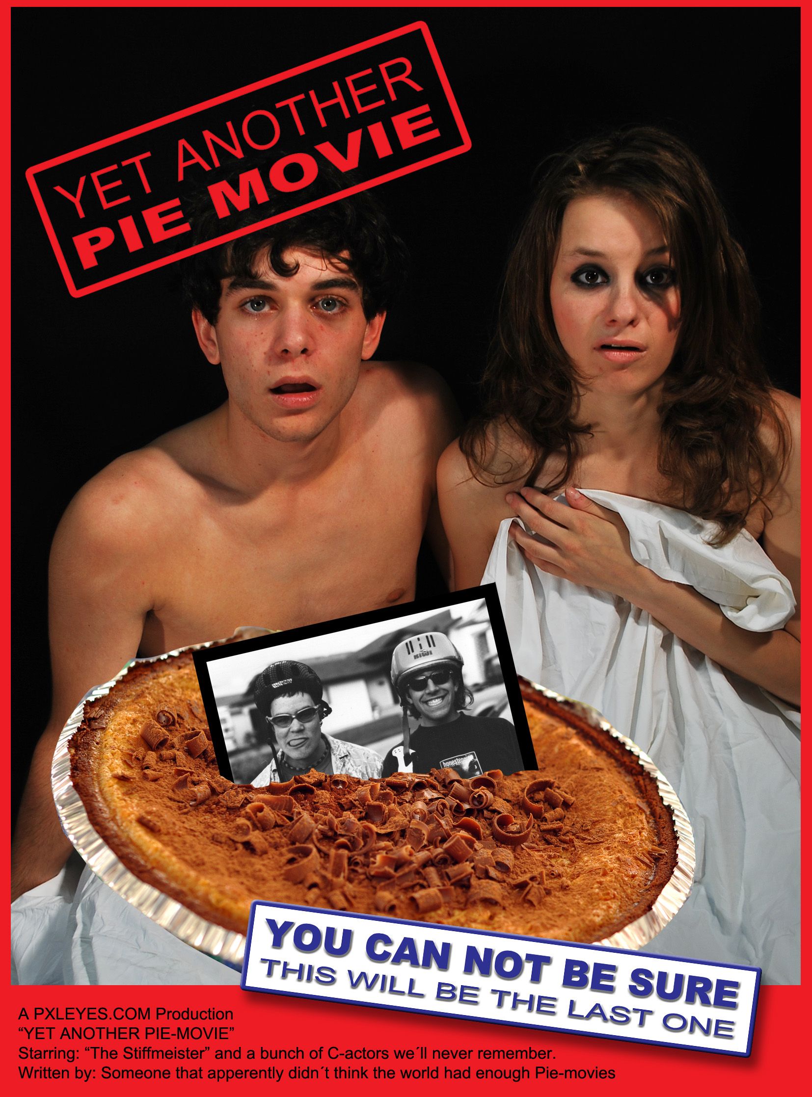
I am not totaly sure if I got the meaning of the contest, but I think it was to make a movieposter or scene kind of, that would be voted as the worst of the year on an academy award.
So I figured - what have we seen over and over again, and does not ever get better...
Hope I didn´t cross any copyrightlines when I wrote the titel of the movie.
Thank you "Binababy12" at stock.xchng for the source 2-pic. (5 years and 3792 days ago)
Love the "Yet Another Pie Movie" concept, but "The Space Rocket" is lame, with the lameness accentuated by the unrealistic glass dome and rocket exhaust. (Certainly a movie as bad as this image would warrant a Rasberry Award, but I guess I would prefer the winner in this contest to be more clever over all.)
Thank you for the comment, now I took all the spacetheme away. Agreed with you but got a little stuck there...  Anyway, now it´s more posterlike, hope that is better.
yeah its better now !! But I know what you mean if you say that your not totaly sure tha tyou got the meaning of this contest :P because I dont get the meaning either.. I hope it will not be removed or something :O!!! But well done and good luck !!
Well, there's no intelligent humor movies as formerly... ;p
I really like this now for its blatant recognition that it is yet another totally superficial sequel trying to cash in on the success of the original "American Pie" movie -- and thus a very strong contender for a Razzie! (Even though I myself misspelled 'raspberry' in my initial comment, I can't help but observe that 'cannot' is one word, 'Stifmeister' has one F, and 'apparently' has two A's. And I would say 'C-list actors.' Plus 'someone who' is viewed as more respectful of personhood than 'someone that.' [But I'm being overly pedantic. ] BTW no hyphen in 'Pie movies.')
DanL: Yea, well, english is not my native language - I´ll just blame it on that, and the fact that texting in Photoshop sucks when you don´t let it fade into the picture. I´d rather do the pic in PS and then text it in InD. and export it into a jpg, but it´s probably not allowed to use any other program than PS, so... Thanks for the spellingtips...may come handy in another contest. :P
That pie is actually a cheesecake!
Howdie stranger!
If you want to rate this picture or participate in this contest, just:
LOGIN HERE or REGISTER FOR FREE
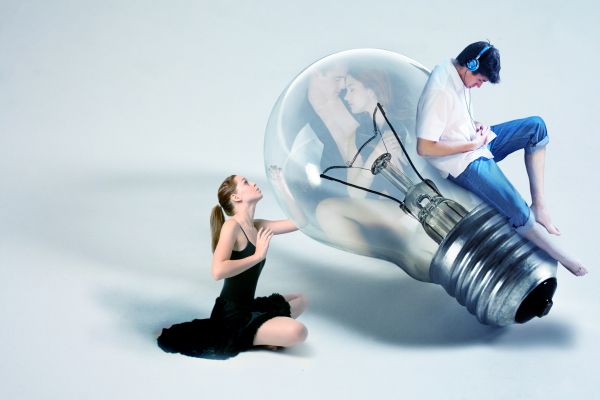
This is very concept-y, so hope you can see the story... the guy's doesn't have time anymore for his love anymore...
I'm very greatfull for the artists who let me used their stock! (5 years and 3792 days ago)
Sad...
the source 1..."If you use this stock, please credit me and show me the finished piece. For offsite use, you need to ask me first."
genuine2009: I did ask the artist first.
omg that
Reality might be shocking!! It's well blended in and nicely done IMO.
I do not know if you asked ... i guess you did that!!!
The girl needs a shadow that matches the bulb shadow...
Great work....and a good concept....
Howdie stranger!
If you want to rate this picture or participate in this contest, just:
LOGIN HERE or REGISTER FOR FREE
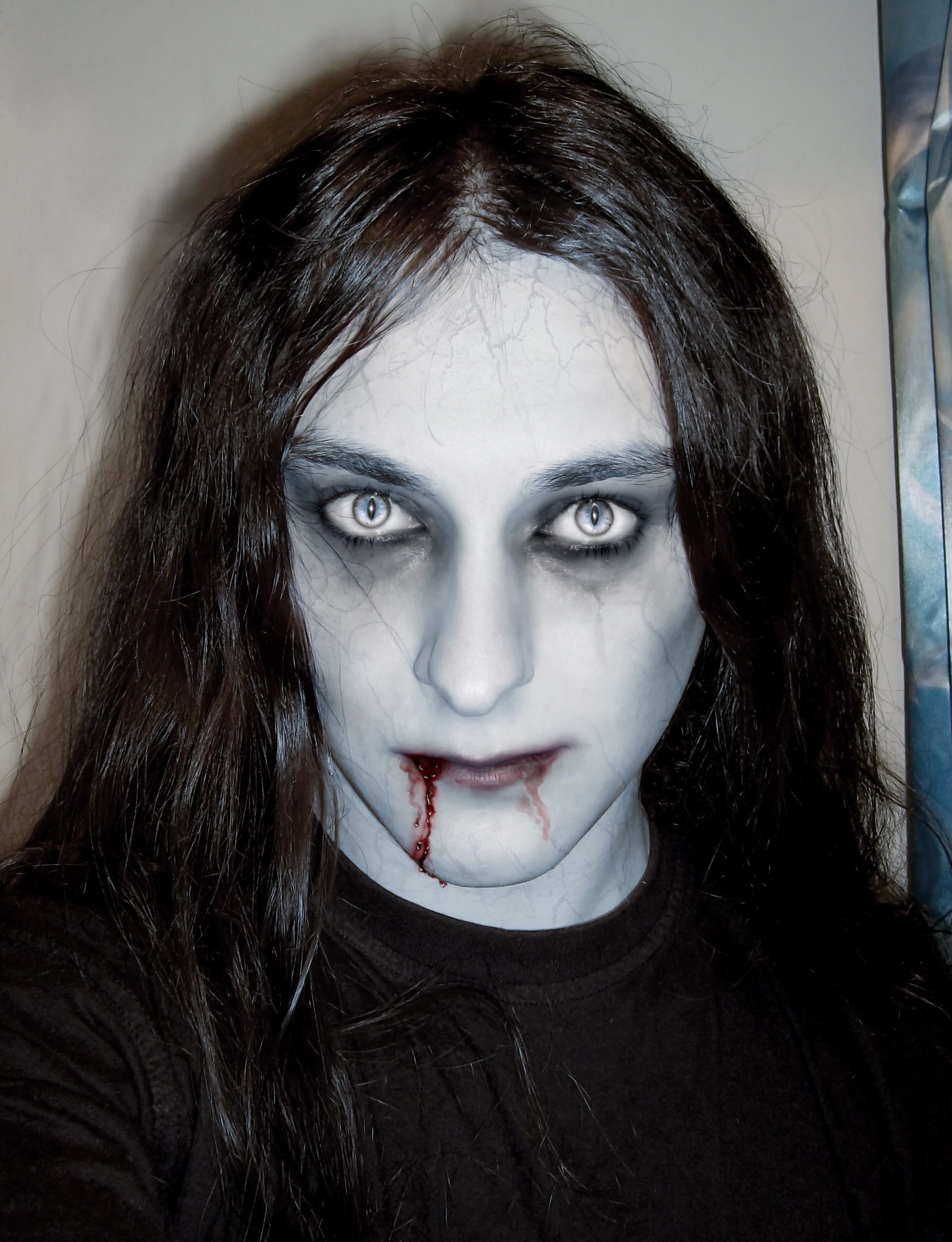
back when i was immortal... (5 years and 3807 days ago)
Cool ...
whats Conte ? lol sounds familiar
great work, nice blood too.
Great job with eyes...good luck
thank you all.
Cool eyes
Nice work...Nice blend...Scary one...
Very successfully done The siamese cat eyes are really cool
thank you. i'm glad ypu like it.
Howdie stranger!
If you want to rate this picture or participate in this contest, just:
LOGIN HERE or REGISTER FOR FREE
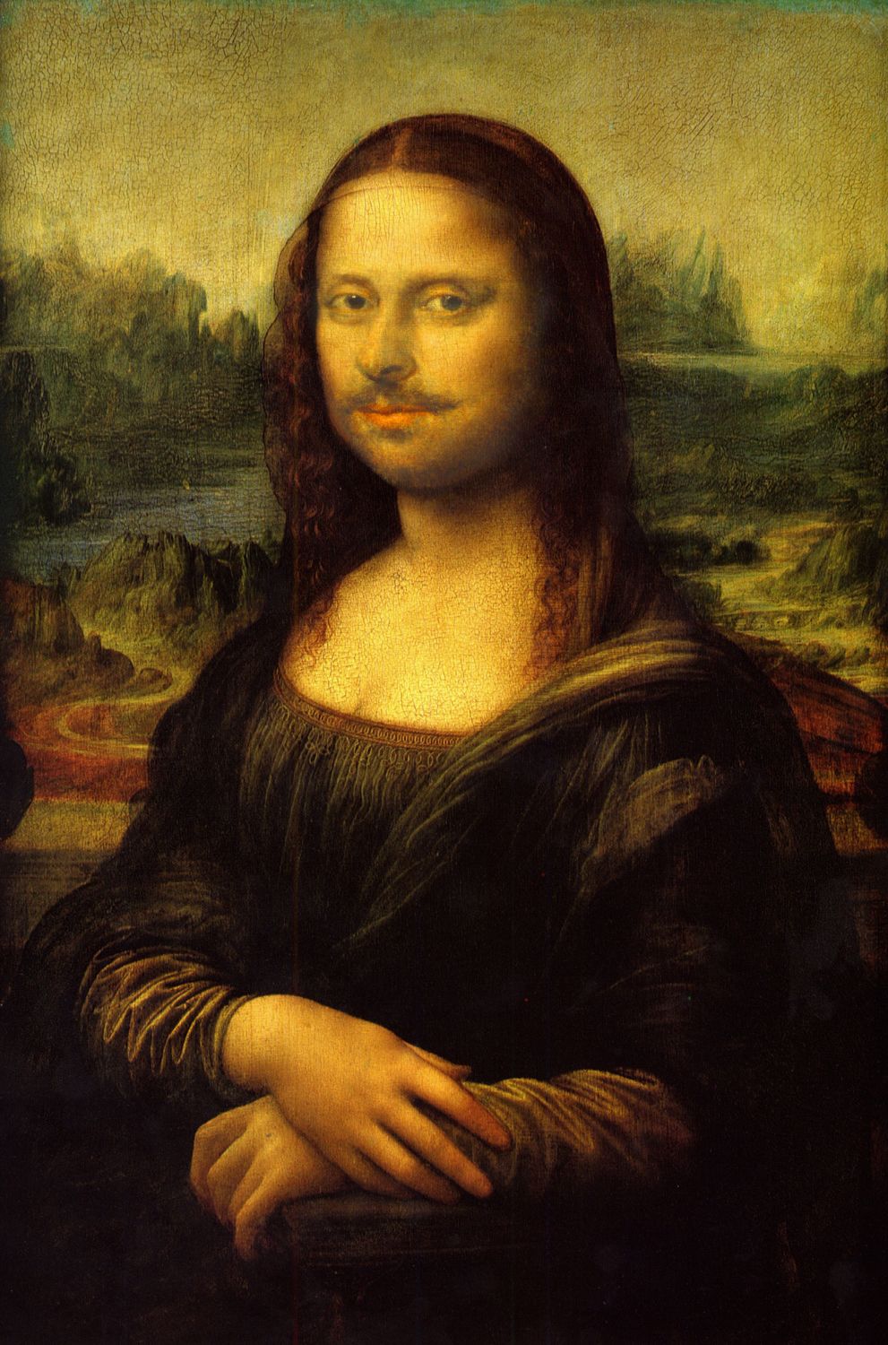
My expression of William shakespearse quotation of "To be or not to be" Mona Lisa by William Shakespeare (5 years and 3814 days ago)
it is beautifull. whatever it is :P
I guess it's my way of expressing william shakspears "to be or not to be" mona lisa lol
You should blend more his face, it should be more yellow
ok took your advise and blended it in better hope it looks better oh and thanks
The face is not perfectly blend with the pic....
I'm crackin up...but can you use these sources?
ok i tried the hugh and saturation this time please let me know how it looks ..oh and the pics are free to use ...wikipedia usually has a lot of them
Now the blending is good as far as the colour is concerned....Its looks really nice now....
HEHEHE.. I. H. O. O. Q.
Thanks I appreciated the comments and help
Not sure what I.H.O.O.Q stands for but i hope its good lol
In the days of the DaDa... an artist took a replication of the Mona Lisa and drew a mustache and beard on her face.. and wrote the letters I.H.O.O.Q. in the white margin around the poster... when the letters are said out loud.. they sound sorta like I have a Hot Ass in French.. though much more insulting.. hehehe FYI
awe ok gotchya lol
Hahahaha 
Howdie stranger!
If you want to rate this picture or participate in this contest, just:
LOGIN HERE or REGISTER FOR FREE
Photography and photoshop contests
We are a community of people with
a passion for photography, graphics and art in general.
Every day new photoshop
and photography contests are posted to compete in. We also have one weekly drawing contest
and one weekly 3D contest!
Participation is 100% free!
Just
register and get
started!
Good luck!
© 2015 Pxleyes.com. All rights reserved.


too obvious clone stamp tool marks.
as there is no sources you must add SBS guide
Work have potential...but clone stamps are to obvious...Author,work a bit on this and u will get great entry...good luck
must've put a lot of work in this....good job and good luck!
Thanks for the comments now I know where I missd..I'll work for the clone stamp..thanks!
everything is ok except the horn..
nice!
Good idea but bad cloning, and blurry.
Howdie stranger!
If you want to rate this picture or participate in this contest, just:
LOGIN HERE or REGISTER FOR FREE