(5 years and 2181 days ago)
5 Sources:
The planet Mars, crimson and bright, filling our telescopes with vague intimations of almost-familiar landforms.
Using NASA Imagery
http://www.nasa.gov/audience/formedia/features/MP_Photo_Guidelines.html
(5 years and 2921 days ago)
Link 1 doesn't work.
Thank you! It should work now.
Fixed now.
would be nice to see a SBS or hi-res
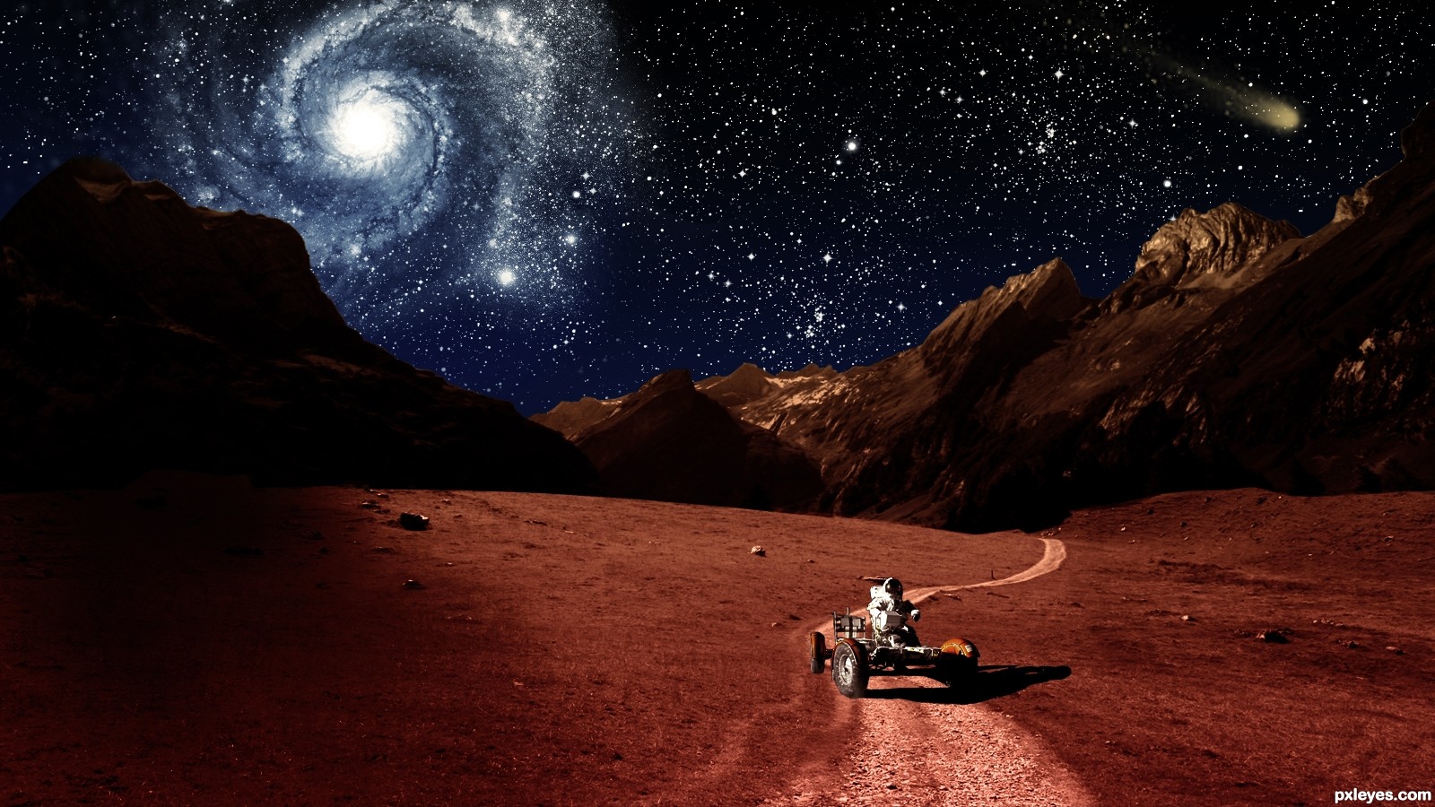
Author this is cool work with a lots of potential and just few tweaks are needed to become awesome...First thing, Nebula is closer to the left side of the mountains but they are in the dark, light them just and u gonna get more realistic and effective image...also u have to blur just a bit edges of the mountain between them and the sky because now is to sharp and look a bit copy/paste...U could tone down a bit brightness of the stars because now IMHO they are to bright and they create small distraction from the main part...Sorry for the nit picks and best of luck...
I love criticism of my work. It's the only way i can improve my work. 
Thank you. I'll let you know when I have made some changes.
I think your lighting is just fine the way it is.
I think it looked better before you darkened the sky. The thin atmosphere of Mars would offer spectacular night skies.
i agree it looked much better before
Version 1 back!

Thank you!
Howdie stranger!
If you want to rate this picture or participate in this contest, just:
LOGIN HERE or REGISTER FOR FREE
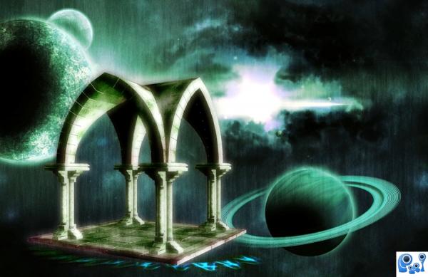
Meditate.... (:
Credit:
http://unholy-stock.deviantart.com/art/Gothic-stock-01-50460102
http://jwjjjoj.deviantart.com/art/JJames-Rock-Texture-3-81273814 (5 years and 3435 days ago)
Minimal use of the source.
i know 
Howdie stranger!
If you want to rate this picture or participate in this contest, just:
LOGIN HERE or REGISTER FOR FREE
NASA (5 years and 3461 days ago)
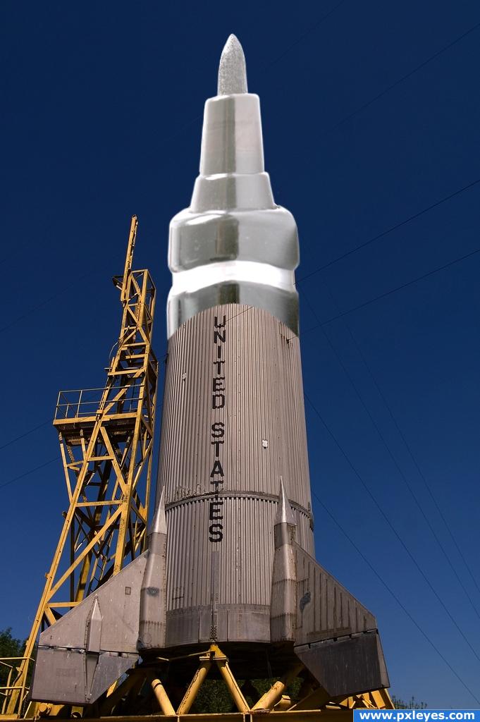
Try using the perspective tool to put the marker inline. (select the layer with marker > edit > transform > perspective) Then use the warp tool to correct the round edges of the marker.
Good luck!
What Rob says. Or try (carefully) with liquify to bring more curve in the marker, so it looks more in the same perspective as the rocket. Good luck!
Don't think the marker nds brightned quite as much
gud luck
Try an overlay
Try using the blending modes author it might help you. : D
very creative.
Nice.
perspective is bad,top is to bright and over blured....
Agrees with the blending techniques used but very unique entry.
nice
Howdie stranger!
If you want to rate this picture or participate in this contest, just:
LOGIN HERE or REGISTER FOR FREE
Photography and photoshop contests
We are a community of people with
a passion for photography, graphics and art in general.
Every day new photoshop
and photography contests are posted to compete in. We also have one weekly drawing contest
and one weekly 3D contest!
Participation is 100% free!
Just
register and get
started!
Good luck!
© 2015 Pxleyes.com. All rights reserved.


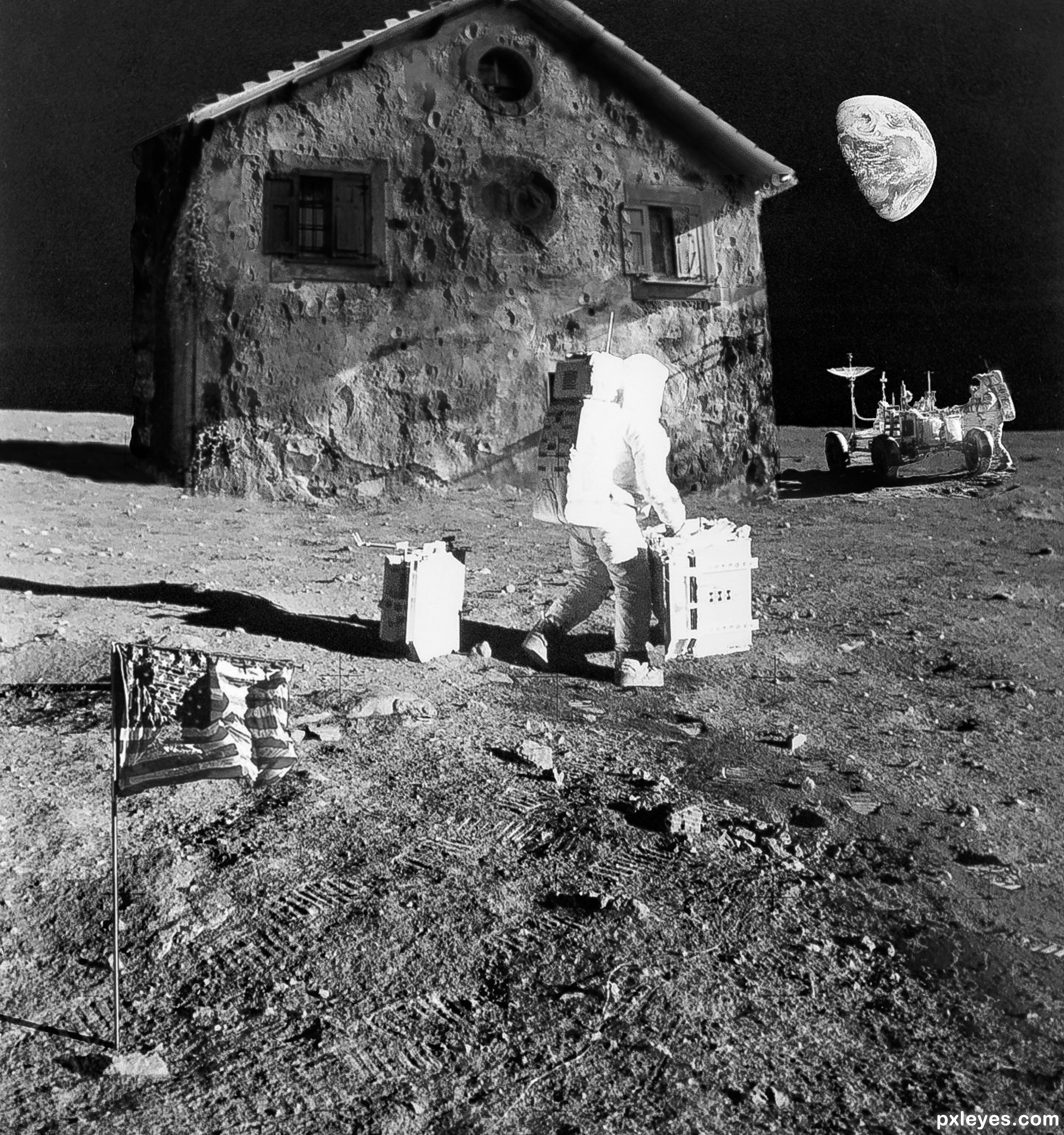
Shadows of craters on house don't match light source.
Thanks, fixed.
There should be more contrast between the light and dark areas on the house to match the other elements.
The house is made of moon substance and note that the moon doesn't reflect light the same way that man-made substance does, not as much contrast.
Congrats on this 3rd spot
Thanks!
Congrats once again Randy!!
Thanks!
Congrats>
Thanks!
Congrats......!
Thanks!
Howdie stranger!
If you want to rate this picture or participate in this contest, just:
LOGIN HERE or REGISTER FOR FREE