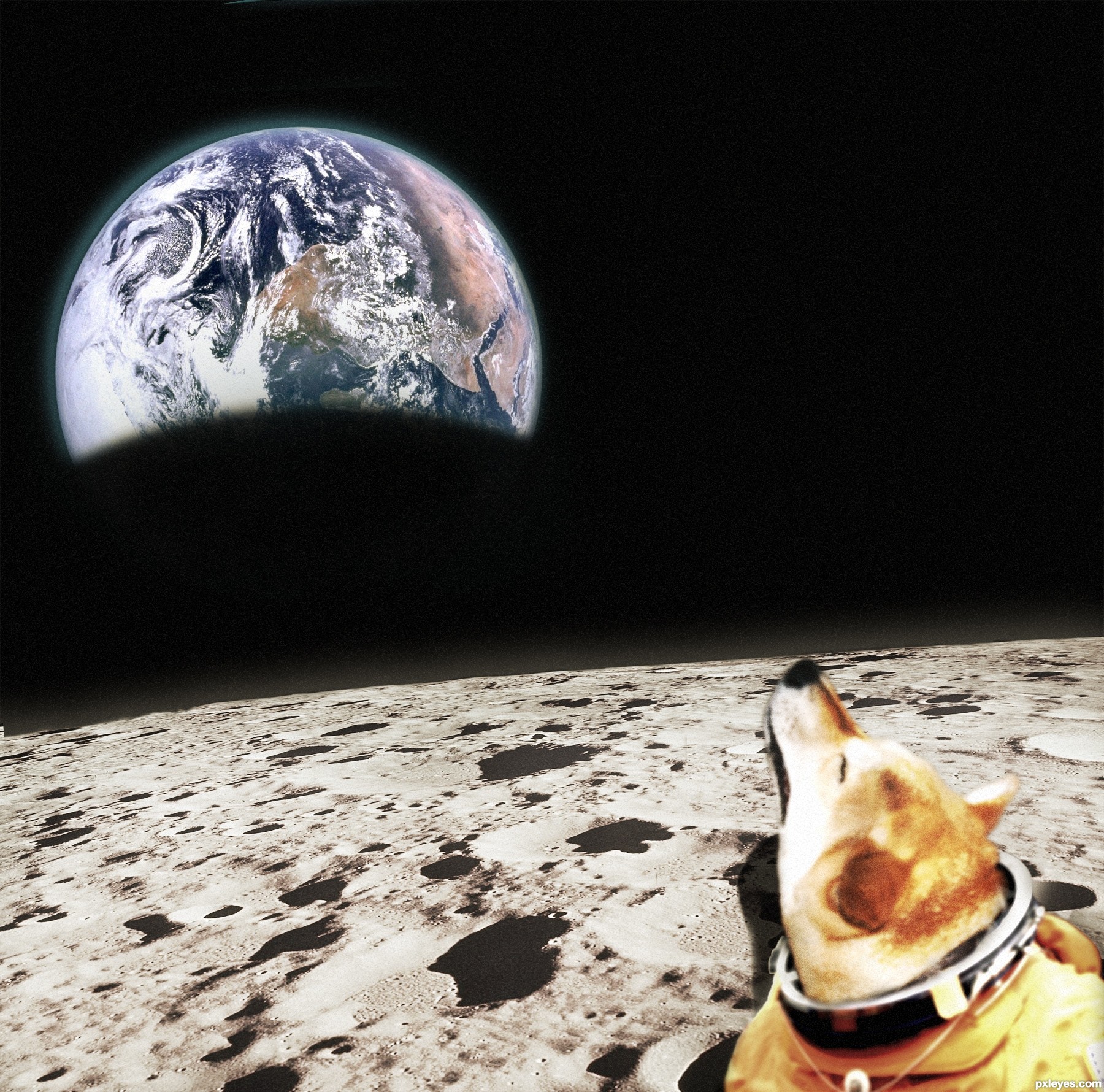
blaine2nd: "How many dogs howling at the moon will we see?"
Decided to try the other way around :) (5 years and 2625 days ago)
3 Sources:
(5 years and 2696 days ago)
Very nice image. It all blends well and the colors look great.
Hey thanks TwilightMuse! ,I appreciate it
Wonderful work!! The highlights the levels and the shadows are perfectly balanced Gr8 work..
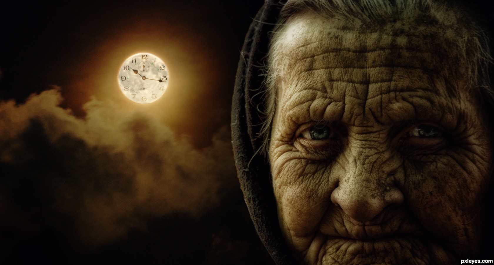
It would have been even better if the clock had more contrast.. But still this is very well done GL Author
Thank u very much Adityagrao !..
very nice -- like the choice of the old woman
Thanks Alan!..
I just love her face expression..
Excellent source pics used to make a really nice composition. Great job, author!
Thanks pixelkid!!
Thanks Nator!..
Congrats for third.....! Nice image.
Howdie stranger!
If you want to rate this picture or participate in this contest, just:
LOGIN HERE or REGISTER FOR FREE
pics capture with Tripod (5 years and 2700 days ago)
Nice work...................
good luck...................
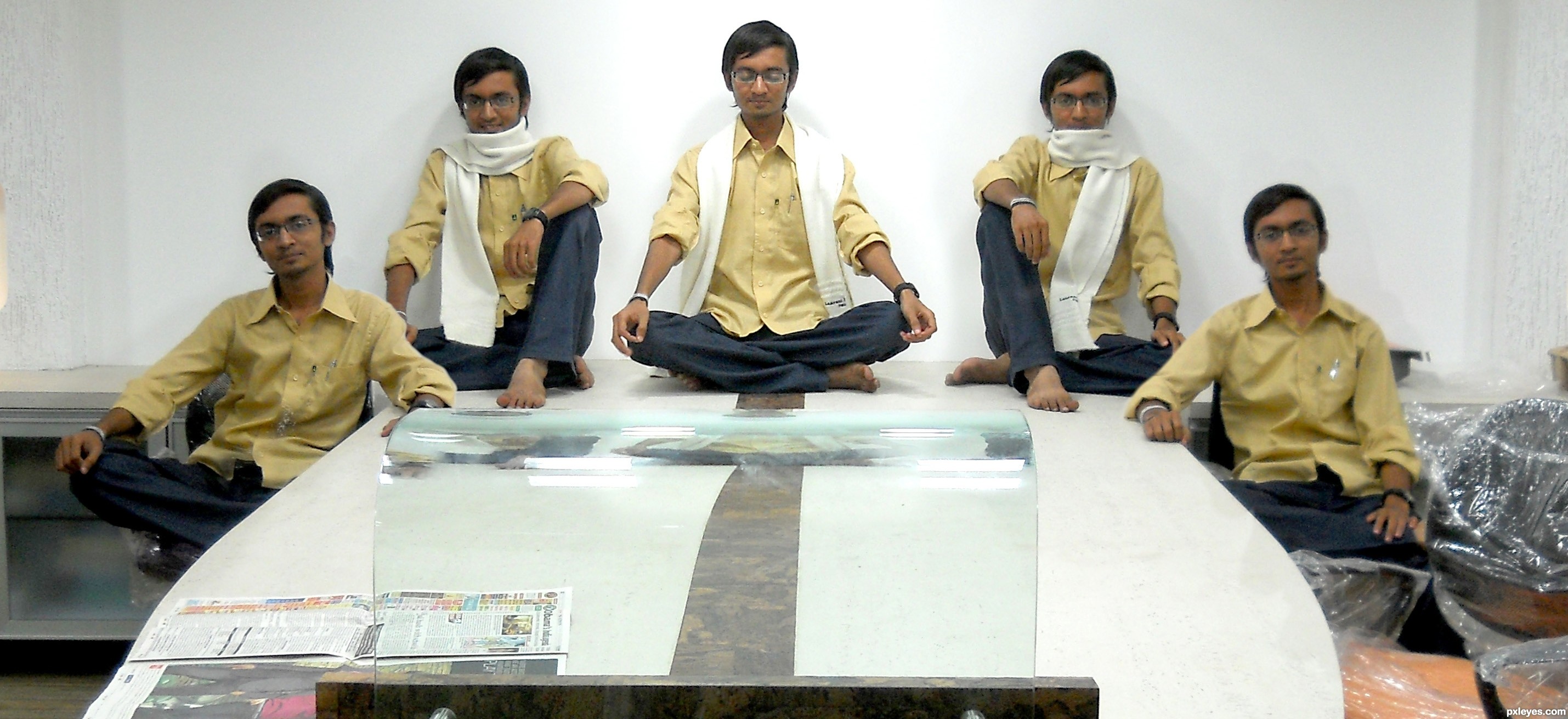
nice symmetry done....
Great capture, well done!
almost looks like he's sitting on a monster surfboard, fun thinking.. GOOD LUCK!!!
thanks mossyB... thanks Drivenslush
Howdie stranger!
If you want to rate this picture or participate in this contest, just:
LOGIN HERE or REGISTER FOR FREE

i removed the light reflections on the honey as asked by some viewers.
tks for the tip guys (5 years and 2721 days ago)
Absolutely fantastic.
its n ice but the light reflections on the honey you should try to remove
it's good idea, but i agree with Eladine
Creative and very well done.
Good luck author!
there you go made it way more realictic ! good job
Congrats on the bronze!!!
Congrats!!
Congrats !!!
Howdie stranger!
If you want to rate this picture or participate in this contest, just:
LOGIN HERE or REGISTER FOR FREE
illustrator (5 years and 2740 days ago)
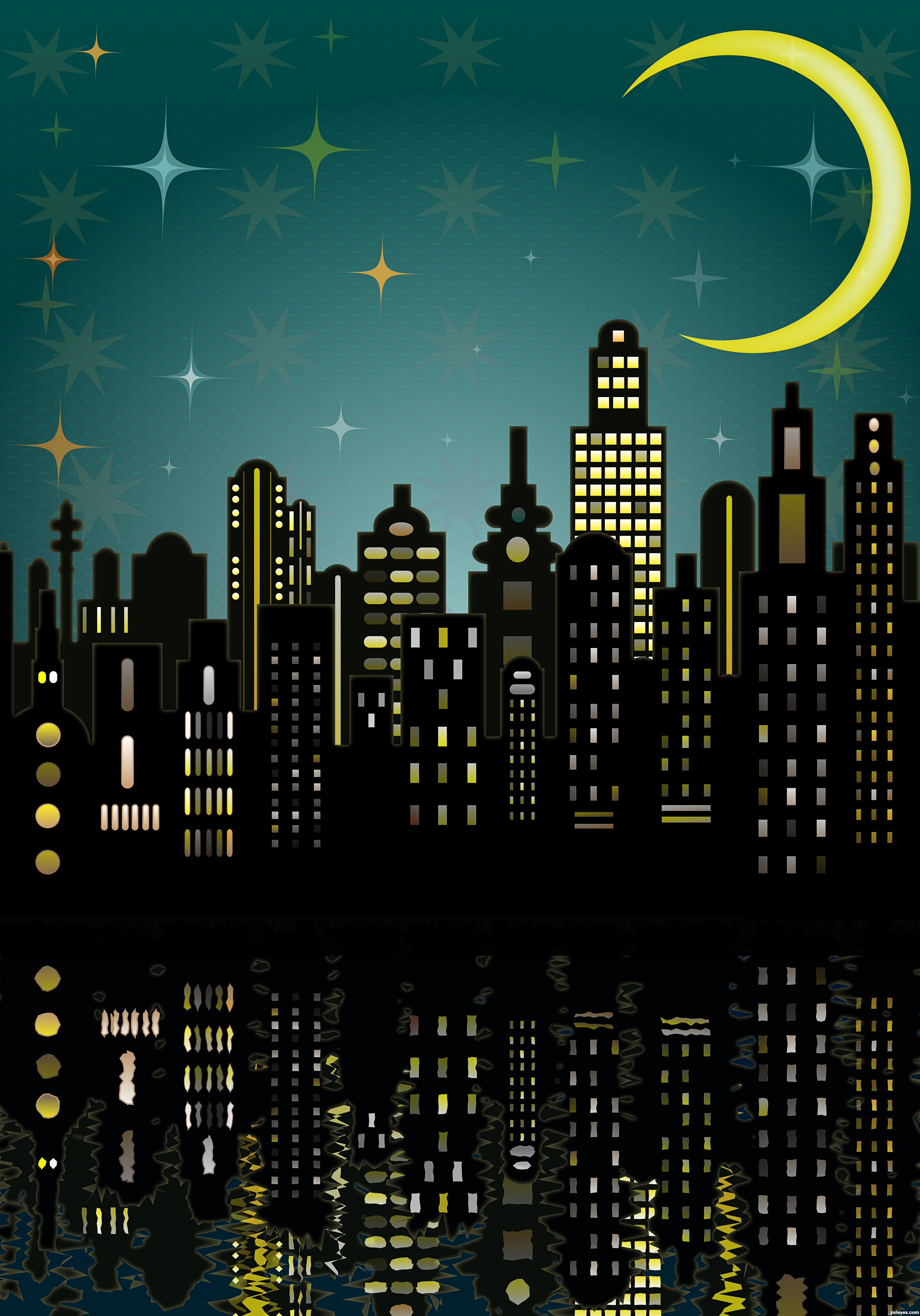
Really clean design, but too much color variation in the window lights.
The water reflections on the bottom are too rough and inconsistent with the clean graphic look of the top. They would look better with a more stylized, "illustrator" effect, rather than the jagged, inconsistent "shimmer" randomly applied.
You need a bit of a gradient fade, with an opacity mask.
You might also want to check out this Photoshop Wave Displacement tutorial - It might help your water reflections look cleaner than the ocean wave effect.
http://www.photoshopessentials.com/photo-effects/water-reflection/
Mossy, not only the reflections are rough and the window lights unrealistic, the moon also looks strange and such blueish, orange and greenish four pointed stars simply don't exist. There are no such flat buildings with glowing edges too and you can never see a sky textured with Petals Three Color.
Have you ever tried to paint like a child? It's difficult. Only children can do it perfectly...
I know that effect called displacement water, and have used it plenty of times. There is a plugin too. Can you imagine me applying a realistic looking water reflection on a cartoon style image?
Bravo Author!
 Nice
Nice
I like the clean crisp shapes of the top part in contrast with the rougher shapes below. Nice work, author.
Howdie stranger!
If you want to rate this picture or participate in this contest, just:
LOGIN HERE or REGISTER FOR FREE
Photography and photoshop contests
We are a community of people with
a passion for photography, graphics and art in general.
Every day new photoshop
and photography contests are posted to compete in. We also have one weekly drawing contest
and one weekly 3D contest!
Participation is 100% free!
Just
register and get
started!
Good luck!
© 2015 Pxleyes.com. All rights reserved.


This is a good study in proportioning. I'm kind liking it.
The light source is from the right, so the Earth should be flipped accordingly.
I know the Earth looks way too big and the craters way too small but it was not meant to be realistic. More of a, Dog in a space suit standing in front of a wallpaper, thing. But as CMYK46 mentioned, I messed up the lighting and positioning a bit

Thank you for the comments! I'll try and fix it ASAP
if we can see the curvature of the moon then we should see the same shadow on the earth (easy fix)
good luck
Howdie stranger!
If you want to rate this picture or participate in this contest, just:
LOGIN HERE or REGISTER FOR FREE