(5 years and 3137 days ago)
(5 years and 3413 days ago)
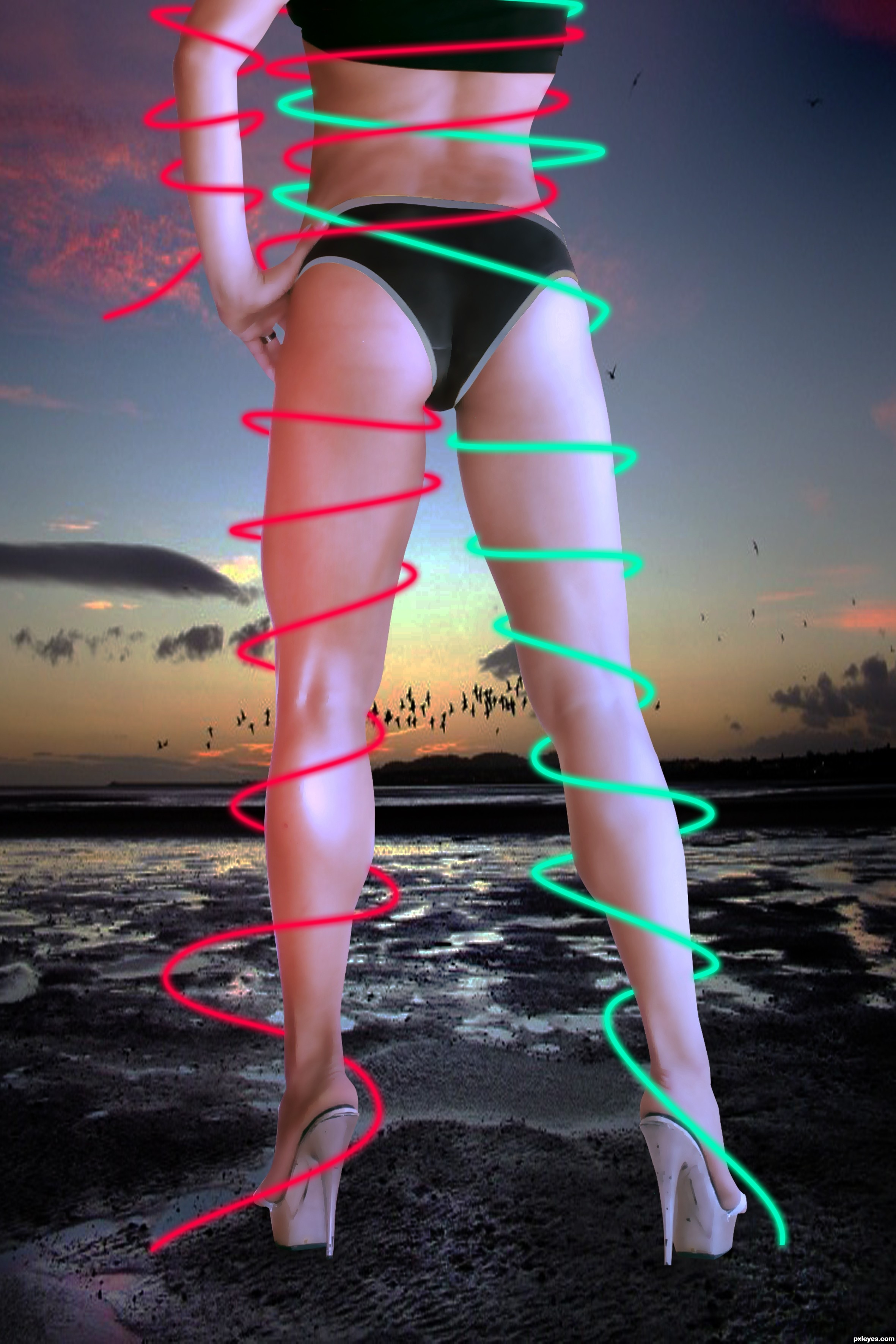
nice ass
i agree 
Nice view indead !
you forgot a space between her fingers when you were doing the masking! there is a tiny bit of white between them.
(sometimes it takes a little intelligence to get past the "assets" displayed.  )
)
 Jade you do have valid observation, distractions galore though.
  Oh yeah great legs too.
Oh ! it's true! Thanks jadedink
Howdie stranger!
If you want to rate this picture or participate in this contest, just:
LOGIN HERE or REGISTER FOR FREE
mods., Remove this.,
Even i don like this one ., so removing it., :D
(5 years and 4023 days ago)
oooookayyyyy .. err umm Author.. slowly back away from all the sharp objects in the room..slowly.... slowly... no sudden moves LOL..
Gives new meaning to 
good add
good luck
good marketing idea
While I applaud your originality and apparently great knowledge of puns I must say that there are quite a few issues with this piece that could be improved upon. For one, the hammer's perspective is a bit off (the way you have it makes everything above the onions appear to be in the background and not on the burger). The white confetti banners at the top of the screen are a bit odd as well. I would either lose them or add more with different colors/shapes. Also, your typography at the bottom of the screen needs some improvement. The font choice is wrong for an "ad" and the grammar is quite...
...bad. I would rewrite it so it read more like this: "Call 911 and say "I Killed Adam" to get your free burger today!" There really is no need for three exclamation marks  at the end of any sentence. Also, put "911" in red instead of green as red is a color of intensity and emergency. Other than that, the words "Just Free!!!" confuse me a bit. If you are trying to create a special giveaway for this product I would phrase it differently so that it was easier to understand (just the word "Free" would even suffice). All in all I think you have a lot of potential with this entry if you choose
to give it another look. But whatever you do, don't give up! Every comp you do will get better and better and you'll eventually realize that what you are making is really incredible. All the best!
i'm sad i didn't saw this...
Howdie stranger!
If you want to rate this picture or participate in this contest, just:
LOGIN HERE or REGISTER FOR FREE
Photography and photoshop contests
We are a community of people with
a passion for photography, graphics and art in general.
Every day new photoshop
and photography contests are posted to compete in. We also have one weekly drawing contest
and one weekly 3D contest!
Participation is 100% free!
Just
register and get
started!
Good luck!
© 2015 Pxleyes.com. All rights reserved.


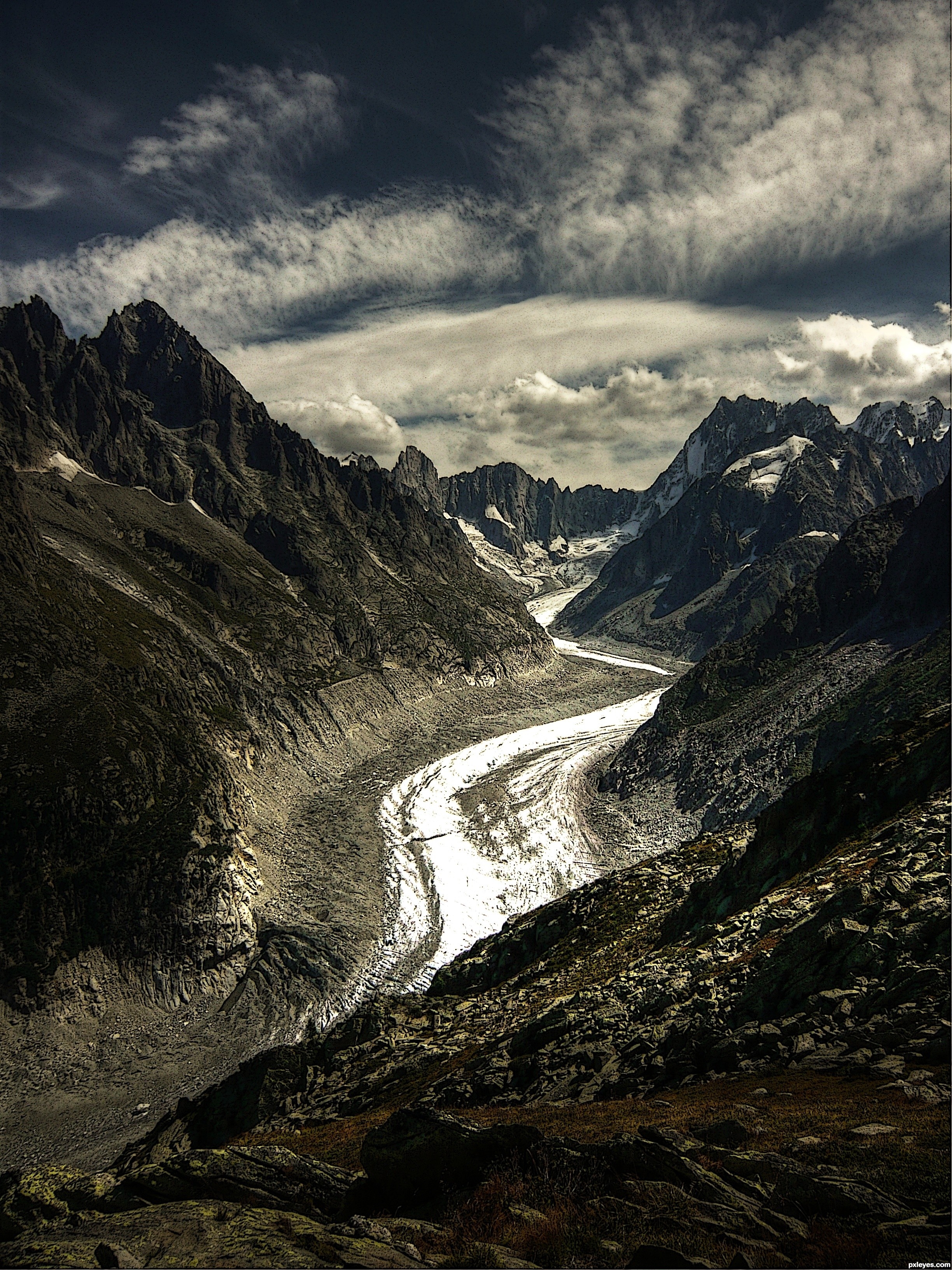
Dramatic result—and a demonstration that it helps to start with a picture with dramatic elements if you're not going to be adding elements from other photos.
How u did Cartoon book effect....?
Howdie stranger!
If you want to rate this picture or participate in this contest, just:
LOGIN HERE or REGISTER FOR FREE