(5 years and 2271 days ago)
4 Sources:
(5 years and 2495 days ago)
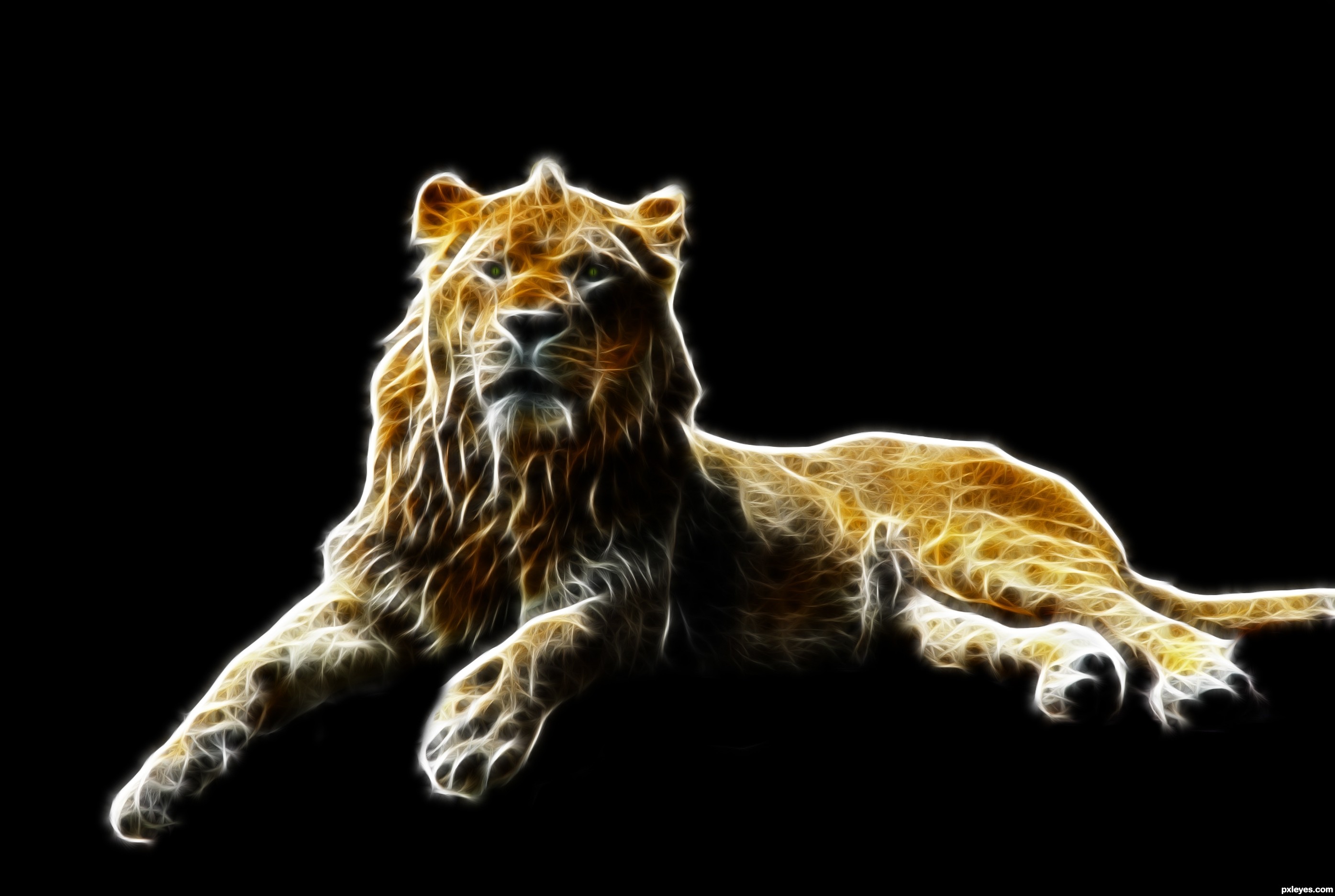
fractillious (sp?) is an awesome filter! ;]
Very nice outcome author, I like it. Good luck!
Howdie stranger!
If you want to rate this picture or participate in this contest, just:
LOGIN HERE or REGISTER FOR FREE
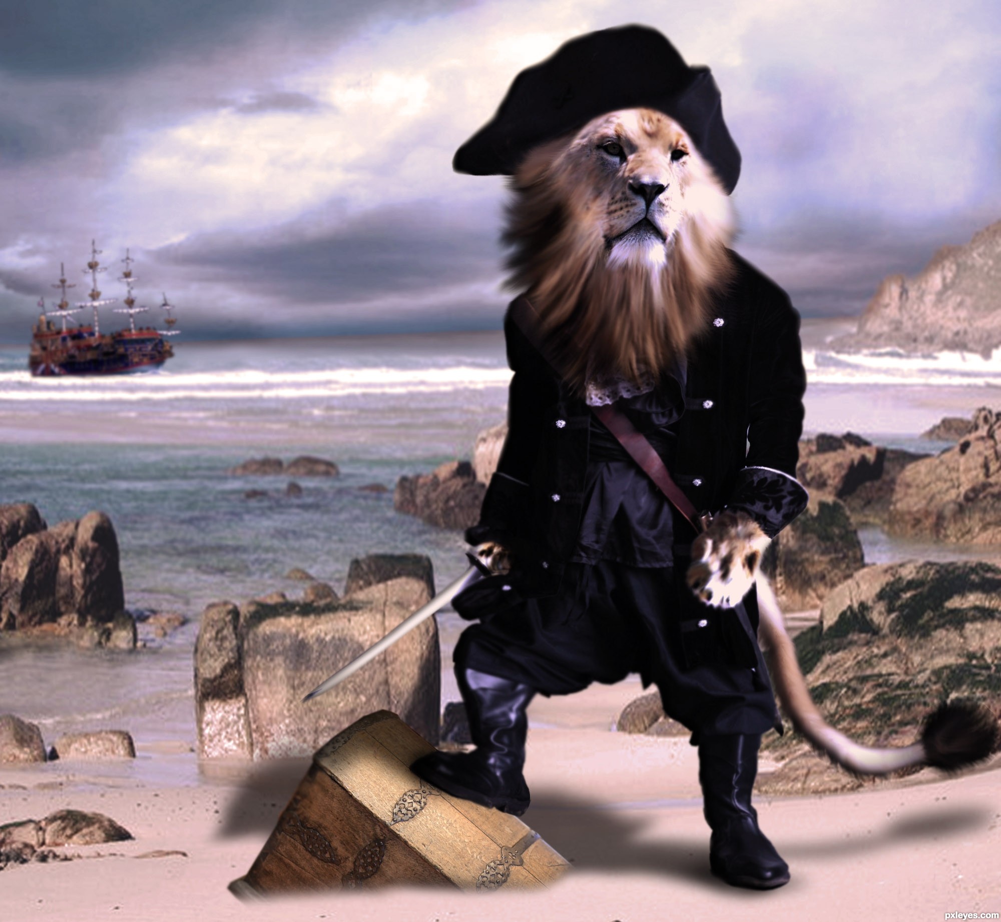
Yo ho ho, and a bottle of ROAR.
Thanks to:
mjaranum @ deviant art: http://mjranum-stock.deviantart.com/ (5 years and 2500 days ago)
now he is fun...gl author
This head seems a little big, but because it's so funny, it's beautiful, bravo
Howdie stranger!
If you want to rate this picture or participate in this contest, just:
LOGIN HERE or REGISTER FOR FREE
This was just screaming at me to be done. Texture was quite similar and I feel worked very well. Comments/improvements welcomed.
Looking for solid blend here .. . . . (5 years and 3527 days ago)
This looks exactly the same as the first image. You can't tell by looking at it that you changed the hat.
ah, Dear Visba - that is a compliment I believe. Indeed, I tried for an absolutely realistic effect. To say that it looks "exact" is quite and honor. However; the Step-by-Step guide cleary shows the differentiation of the textures and ther steps taken to achive this "exact" effect. Thank you for your comment.
hats not working for me...perhaps you should leave it more the gray color EDIT: Looking better Author
you know Lchappell - it seroiusly considered leaving it grey. It went well with the uniform and left more of that "original source" feel to it  Where were ya an hour ago??
EDIT: When a level 16 gives you some advice, it's probably wise to take it 
There you go, sir. The grey shade works much better. Thanks for the tip.
excellent experiment and Idea... I would suggest that you split apart the SBS into single sections... write a much more detail description of each step and qualify it into a tutorial, this would make all the work you've put into it worth it, and help a lot of beginners out on how to match tones/ textures/ feel... etc..(and just an added cheekiness, I'd of put a bird peeking out of the black fur... but that's just me 
Clever use of source, good luck!
Much better
wow, I almost thought this wasn't even photoshopped!
aah, indeed K5683 . . . . that may be working against me at this point. If it weren't for vispa and lchappell - this image would be suffering.
I LOVE all the fantasy stuff that is out there, but alas - it is beyond my capabilities. Please review the SBS and you see that the image has in fact been photoshopped. But I would LOVE to see the idea created by some of the members here with some SERIOUS skills (golem, Waz, CMYK, Lchappell . . . . any of you...!)
Howdie stranger!
If you want to rate this picture or participate in this contest, just:
LOGIN HERE or REGISTER FOR FREE
Photography and photoshop contests
We are a community of people with
a passion for photography, graphics and art in general.
Every day new photoshop
and photography contests are posted to compete in. We also have one weekly drawing contest
and one weekly 3D contest!
Participation is 100% free!
Just
register and get
started!
Good luck!
© 2015 Pxleyes.com. All rights reserved.


I like it..... Good idea and nice selection of sources. Good luck author.
Thank you Sir!
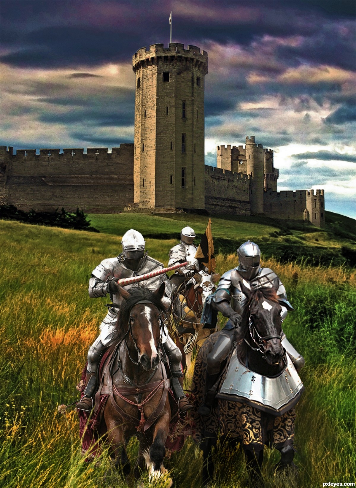
Good Job author, nice concept! am liking the mood!! - the only things I have to say is that some of the edges could do with a little tweaking!?, but the main issue I have with your entry is that the Horse on the right for some reason is Blurred?! the original stock isn't!! ... IMO it needs to be as in focus as the original.
Thank you for your commentary and critique....does this mean you like it? BTW good to see you back, JamesD where ya been?
I think I would have liked to have created a little DOF effect - but think this is a really good job. Well done.
I did try too simulate some DOF, I presume you mean the castle being more out of focus perhaps a little more wouldn't hurt Thanks for the comment.
Too late now but in retrospect I think i may have blurred the wrong layer attempting to generate some Depth of Field. ooops.....
Must have been that horse LOL
Well composed image! The hi res shows some white edges (the top of the castle and around the knights). But apart from that it's nice image.
I really appreciate your comment dustfinger but I think what you are seeing as a masking issue is indeed the clouds from the source image showing...
Yes you can take it to mean I like your entry :P - glad to be back!?!.... I took a long leave of absence life problems zapped my creativity and enthusiasm!! but it's all good now! looking forward to competing again!!
Congrats ...I thought from the beginning that it is a nice image....and it is....You did a good job!
Congrats, Loyd!
Congrats
Howdie stranger!
If you want to rate this picture or participate in this contest, just:
LOGIN HERE or REGISTER FOR FREE