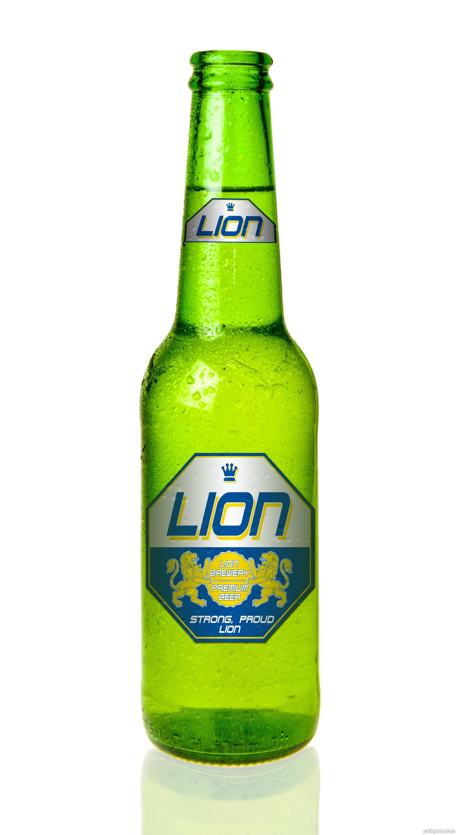
have a refreshing sip of lion beer in the evening, quenches your thirst and gives you new strength for next days work.
Please have a look at the full res, thank you. (5 years and 3244 days ago)

I wanted to do a picture with a lion and at first I wanted the zebra to be a person instead. But I couldn't find a good stock image of a person running away so the zebra is going to get eaten. (5 years and 3265 days ago)
This is a pretty good piece. I really like it. I do have a couple of suggestions though and will wait to vote. First, do a little research of the size of a lion relative to a zebra. Your picture seems like the lion is a bit large. If both are in the original then I will just accept that I know very little about lions and zebras  Second, putting one of the frames in front of the lion might add a little more dimension. Finally, the exposure on the hands doesn't really match. Not sure how to fix it, just seems not quite right. Just some food for thought.
thanks for your suggestions. Instead of making the lion smaller I made the zebra a bit bigger. I moved both animals to the left and put the frames in front of their tails to make it seem more like they are in the pictures. And lightened up the hands to make them a bit more pale because the whole picture kind of just has a pale look to it.
i like the concept. maybe darken the background a bit, to draw attention to the photograph frames?
also, there are some sort of mask on top of the animals, is a little distracting.
I lowered the brightness of the background and it does help the foreground pop out a bit, thanks. and the mask that is over the photographs is suppose to be some gloss how pictures have, but I lowered the opacity of it over the animals.
Very cool image author...one of the best ideas for OOB image...u should fix some minor details such making edges of animals bit softer and maybe with smudge tool u could work on hairs and fur....also, this is OOB image but don't forget shadows...GL
Howdie stranger!
If you want to rate this picture or participate in this contest, just:
LOGIN HERE or REGISTER FOR FREE
(5 years and 3267 days ago)
The perspective of the feet is at a different angle than the body, with the front legs shorter than the back.
Howdie stranger!
If you want to rate this picture or participate in this contest, just:
LOGIN HERE or REGISTER FOR FREE
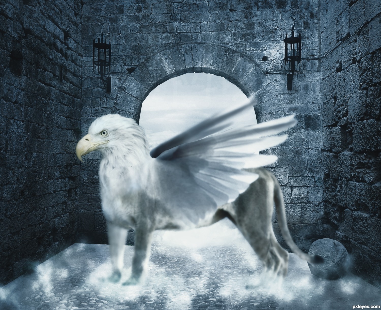
Thanks to http://fantasystock.deviantart.com/
for lion source
and to wxphoto http://wxphoto.deviantart.com/
for bee source (5 years and 3268 days ago)
SO HANDSOME!!! great blend
thanks
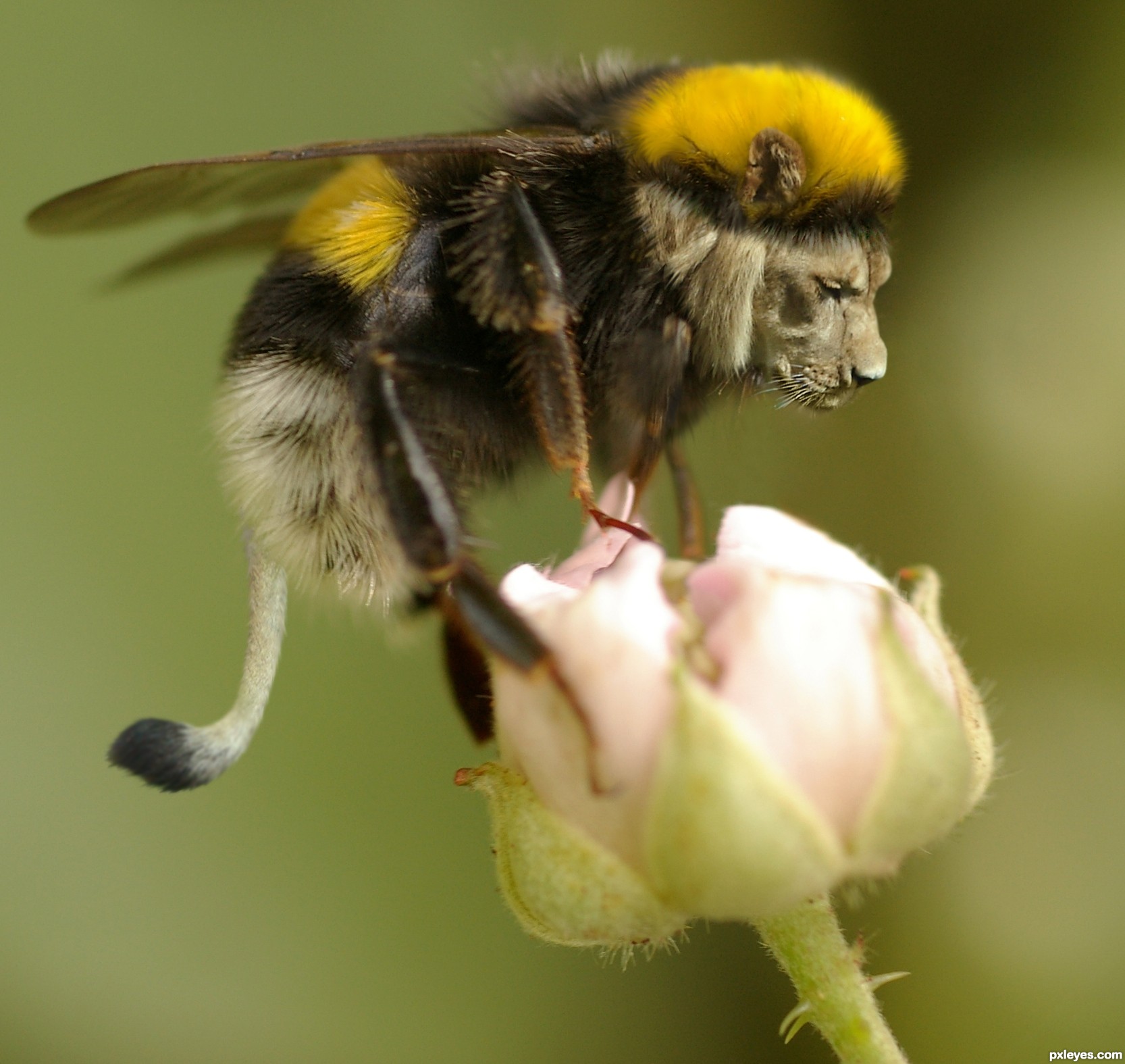
reminds me of "Carebears"... one of them look like this one
I guess its "bite" will be more painful than its "sting"....
Yes, very good blend. 
Great idea and perfectly blended
Howdie stranger!
If you want to rate this picture or participate in this contest, just:
LOGIN HERE or REGISTER FOR FREE
only source and PS (5 years and 3295 days ago)
Lovely! And I wondered, who's are those eyes?
Lovely chromatics.
Very cool design, author, and what a crazy font in your sbs! Love how the creature emerges.
Nice horns
Very clear and precise work. Great creation
Congratulations
Congrats!
Howdie stranger!
If you want to rate this picture or participate in this contest, just:
LOGIN HERE or REGISTER FOR FREE
Photography and photoshop contests
We are a community of people with
a passion for photography, graphics and art in general.
Every day new photoshop
and photography contests are posted to compete in. We also have one weekly drawing contest
and one weekly 3D contest!
Participation is 100% free!
Just
register and get
started!
Good luck!
© 2015 Pxleyes.com. All rights reserved.


Very well done!
very realistic, it's good!
great work...
Nice label, but the lighting is off. The bottle shows lighting from the left, while the label is lit from the center. Other than that, this is very well done.
thank you MossyB, I can understand your point of view but I'd like to disagree. Don't be fooled by that highlight on the bottle neck. It's just the reflection of a small striplight to model the bottle.
If you look at it a bit longer, you will find that the light on the bottle is very even. I actually used 4 lights for this shot, one coming from behind to make the liquid inside glow, one from the bottom, one from the front and that small striplight to put a highlight on the bottle neck. If you look at books regarding product photography you will see how it's done. Lion beer would not want the light to be off center when advertising the product.
Very compelling with lots of appealing nuances. I do feel repeating "LION" after "STRONG, PROUD" is an unnecessary redundancy, however. What especially concerns me are the perfectly straight horizontal edges/elements of the labels that are clearly on a curved surface. (Note, for example, the disconnect between the curved bottom of the bottle and the straight bottom of the big label.)
I Like it!!!..
thank you all very much for your comments, I really appreciate them. About the straight horizontal lines: I do not see them to be a problem, as the label is pretty much level with the eye, whereas the bottom is slightly below. If you look at a bottle standing in front of you, you will notice that the higher your eyes go, the curvier the bottom gets. If your eyes are level with the bottom, you will see the bottom as a straight line. But thank you for pointing that out, it's an interesting aspect.
great..
Great job author...one of the best in the contest for sure...best of luck
Clean work of art! One of my favorites indeed!
Congrats well done
Congrats!!
Congrats on your Win
Howdie stranger!
If you want to rate this picture or participate in this contest, just:
LOGIN HERE or REGISTER FOR FREE