(5 years and 2951 days ago)
1 Source:
- 1: source

Thanks to brycedriez and juliaf for the sources! (5 years and 2968 days ago)
It's a bit too opaque, and looks more like it's just painted on, rather than tattooed into the skin...Perhaps changing the Blending Mode and/or the opacity a bit would make it look more part of the skin.
Howdie stranger!
If you want to rate this picture or participate in this contest, just:
LOGIN HERE or REGISTER FOR FREE
(5 years and 2993 days ago)
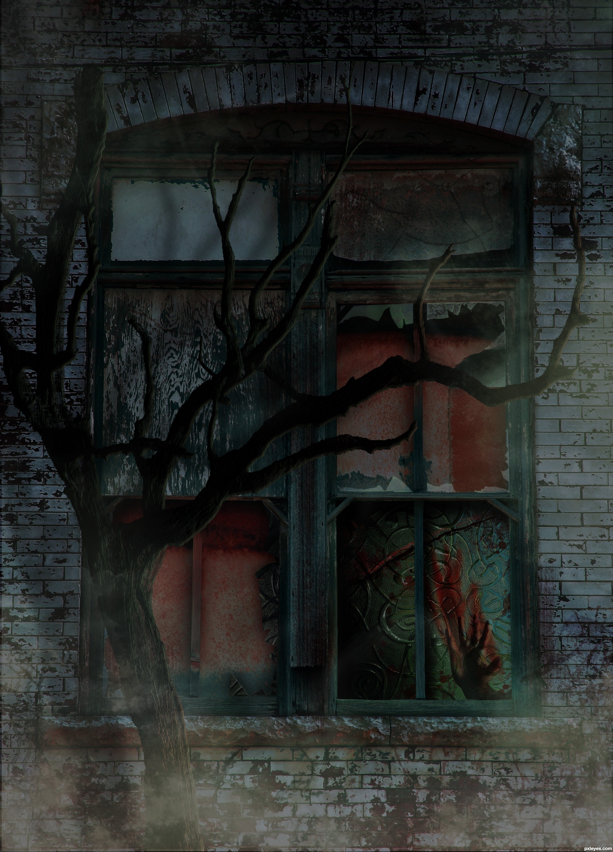
Nice idea all round... reaching out for the hand that is smacked.. Kinda Kate Bush... Suspended in Gaffa.. nice image
Nice job 
REally good spooky creation = )
Appreciate you comments 
Gruesomely eerie and interesting take on the source. Tree appears a little flat in places (could have used some shading to add come "curve" to the branches) but well put together otherwise.GL Author!
Congrats for your third place, Mad!
congratulations...
Thank you Lelaina and ramesan.
Congrats!!
Howdie stranger!
If you want to rate this picture or participate in this contest, just:
LOGIN HERE or REGISTER FOR FREE
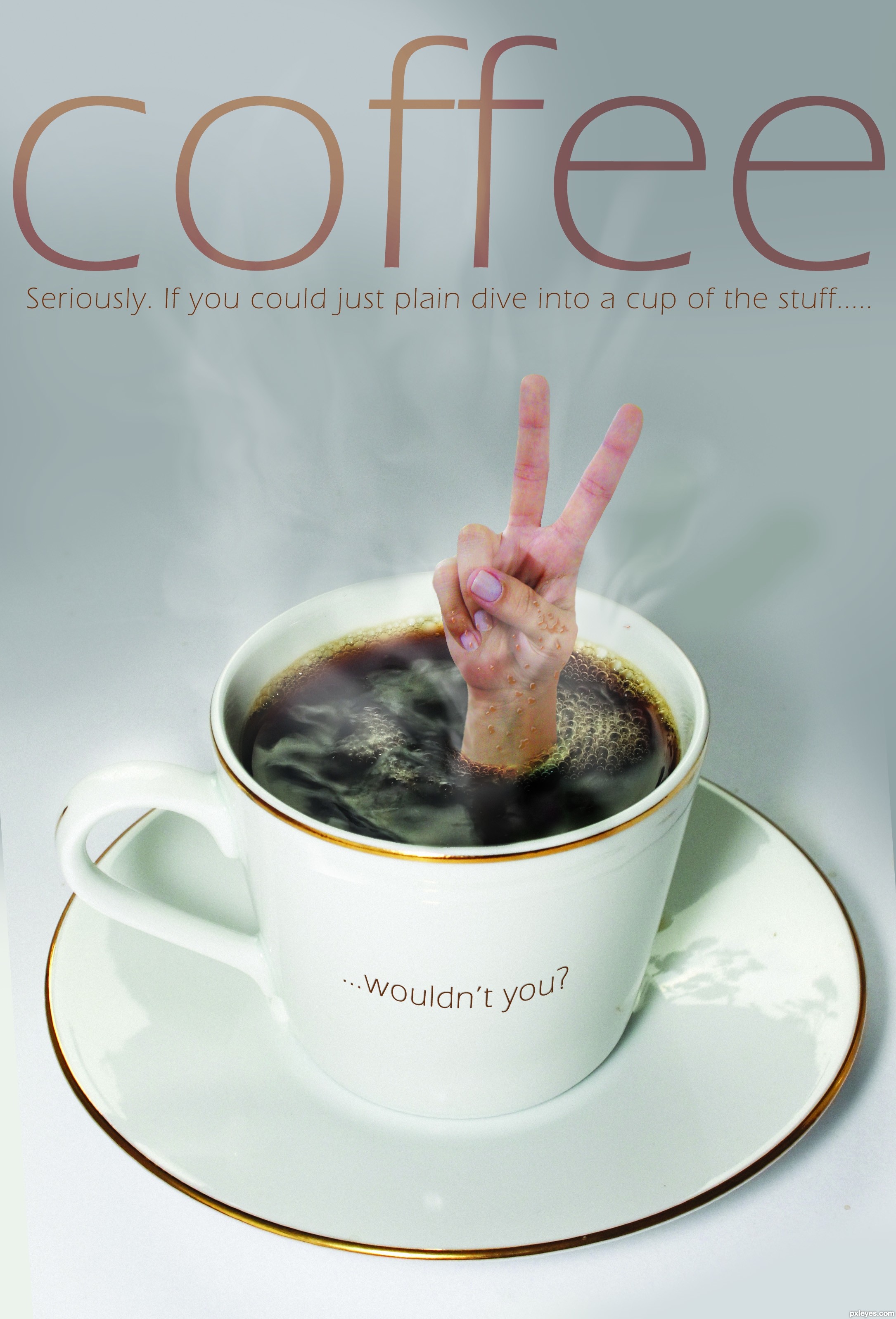
I found two versions of the coffee cup on SCX, one version with bubbles from coffee being poured in and the same cup without the pouring. Melded the two to get a bubbly surface. Also, tilted cup straight, then added in a bit more diffuse grey background.
Sourced a hand, cropped and placed in the middle of the bubbles. Added some more bubbles around the wrist, by duplicating, clipping and flipping a few times. Also used 'multiply' on some of the layers until was happy with the look. Added in some stream by drawing a few lines with big soft brush, then smudging back and forth with different sized brushes, doing this over a few layers, and changing the transparency in places.
Added in the shadow from the fingers. Added in the lettering at the end.
(5 years and 2998 days ago)
Well done, nice result. The hand image is from a it less quality than the coffee cup, but that's a nitpick. Good luck!
Yeah, I might (dive in that is). Nicely done, good luck.
Nice... I think it would be much better if the "... wouldn't you?" was curved to match the curvature of the cup... and yes I'll have one... long black please
Yes, the hand was a bit less quality than the cup...I did actually try to even it up a bit, by adding some 'noise' to the cup image, but didn't want to add too much and spoil *that* image!
Have gone ahead and curved the text to the cup. I had pondered over this at the start, but had decided against it, for some reason. But as it's been mentioned, perhaps I should have gone that way to begin with. Any better, you think?
Nice job! I like the shadow the wrist and hand are casting on the surface of the coffee. My only thought is that the droplets on the hand could be shaded a dark brownish color to help realism. 
EDIT: I think it looks better...but perhaps not all need to be the same brown. Vary it up a bit since light refracts differently at different angles. Sorry to nitpick with all these suggestions...just like the image and would like to see it do well.
very very nice work...gl
Have just tweaked the droplets to a brownier/tanner colour on the hand, I hope, to better effect.
Oddly, the coffee doesn't appear toooo dark on the skin in real life (my coffee, anyway - just tried it!), but is darker than previously as in retrospect I agreed - either the drops were too light, or it was a very weak cuppa!
Very nice work on this, Always love the Mary Poppins Bag effect, reminds me when she pulls the lamp out of the bag and in this case you can pull the Person out of the cup
very nice work, love the idea. Only thing I would have suggested (if I would have seen this in time ) is to lessen that pinkish look on the fingers, to try to blend it more in the rest of the image. Cool stuff!
Best entry IMO, great job.
Congrats, well done
congratulations...
Congrats!!
congratulations...
Thanks, everyone, for the congrats, the help and the votes!
Howdie stranger!
If you want to rate this picture or participate in this contest, just:
LOGIN HERE or REGISTER FOR FREE
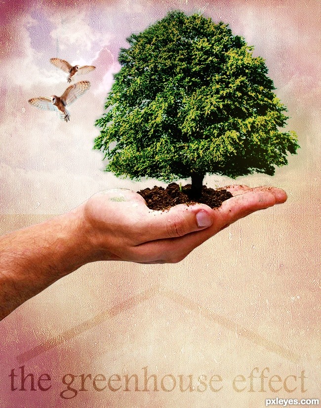
Used blending and masking to create the final image following the tutorial.Create a Nature Inspired Photo Manipulation in Photoshop from Psdtuts+ (5 years and 3004 days ago)
You almost need a third owl to balance the effect (and since you have the ability I would turn the owl to LOOK INTO the image and not off the page.. old newspaper layout rule LOL..).. the middle finger got slammed pretty hard in the masking process.. but it's only visible in the high res... Your overall design is quite nice... (watch the distort when enlarging the OWL.. hold down the shift key when resizing.. his head is a tad bit squished... Puppet Warp would be best but gentle liquify and/or warp can work as well... (when repeating the same image it's important to alter the images slighty so they don't look like perfect clones.. unless that is your goal then go for it...
Good Luck Author.. and welcome to PXLeyes
Thank you so much for your feed back......the best way to learn in my book......i will try to look at it again if time allows. Thanks for your welcome.......must say entering my first contest made me quite nervous :0 lol
Your color tones are a bit off, with your tree somewhat yellow and sickly looking, and the hand too pale. You can (if you wish) correct both of those with Image>Adjustments>Selective color, choosing yellow adjustments for the tree (increasing the cyan and decreasing the yellow) and the reds (slightly increasing the magenta and black) if you have the hand and tree on separate layers.
Your overall composition is somewhat compromised because you have the background lighter areas too large, resulting in a whitish "halo on the RH side of the sickly tree, and too much light above the hand on the LH side. This subtly pulls the focus outwards.
The owls are also now a bit too large and distracting within the overall image.
A very nice tutorial you found, the effects used can be applied to many other types of images.
Thank you MossyB for your feed back, have made a few adjustments along the lines suggested.
Ooooh! MUCH better!
Now you've improved upon the tutorial with the sky behind the owls, and the eye is drawn to the tree, and then moves around the image.
Nice work.
Looks good, not sure about the green bit on the palm.
Thank you MossyB I agree that it looks much better now with the changes, the feedback was so appreciated.
Welcome and nice finished image!
Nice work, the message is strong. Very effective use of texture
great work...gl
Howdie stranger!
If you want to rate this picture or participate in this contest, just:
LOGIN HERE or REGISTER FOR FREE
Photography and photoshop contests
We are a community of people with
a passion for photography, graphics and art in general.
Every day new photoshop
and photography contests are posted to compete in. We also have one weekly drawing contest
and one weekly 3D contest!
Participation is 100% free!
Just
register and get
started!
Good luck!
© 2015 Pxleyes.com. All rights reserved.


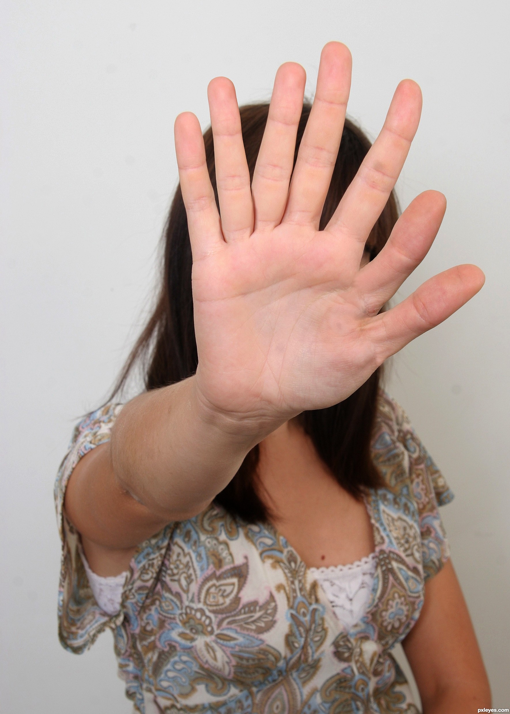
ewe and cool, all in one!
Very nice!
Um, I only see 5 fingers; and 2 thumbs... she could really make a 5 finger discount... lol
Good work, and good luck author.
Really cool... not looking fake!
Brilliant chop! Must make typing really easy?
Good job, author. I'll bet her fingers can really fly on a keyboard, and um, other places.
Congrats, nice work
Congratulations!!! Have a cookie!
note: cookie is purely hypothetical.
Congrats!!
Thanks!!
Howdie stranger!
If you want to rate this picture or participate in this contest, just:
LOGIN HERE or REGISTER FOR FREE