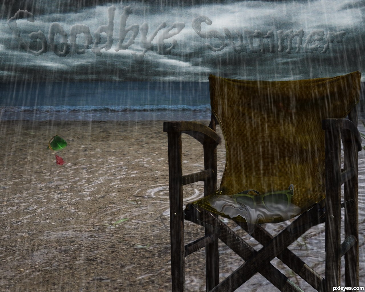
For this job I have used various images and to unite the pieces I have used tools and masks, options of fusion and regulations, various filters but all of default in photoshop cs6.
(5 years and 2407 days ago)
(5 years and 2522 days ago)
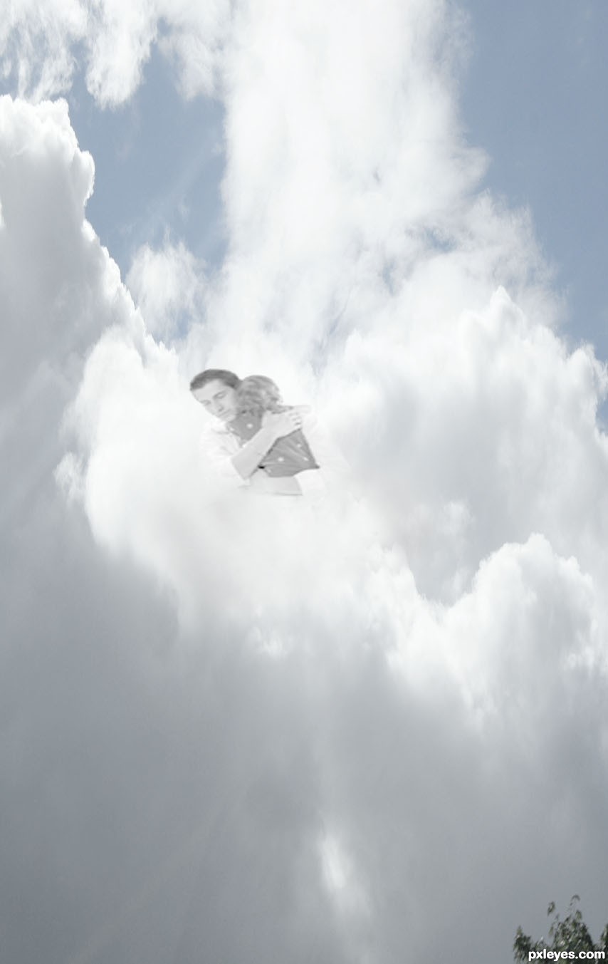
Sad
Howdie stranger!
If you want to rate this picture or participate in this contest, just:
LOGIN HERE or REGISTER FOR FREE
thanks to the following for STOCK PHOTOS:
EquineStockimages D'art
for birds.
Falln: D'art for stock and brushes.
Goblin Stock D'art
Kuoma Stock D'art (5 years and 2834 days ago)
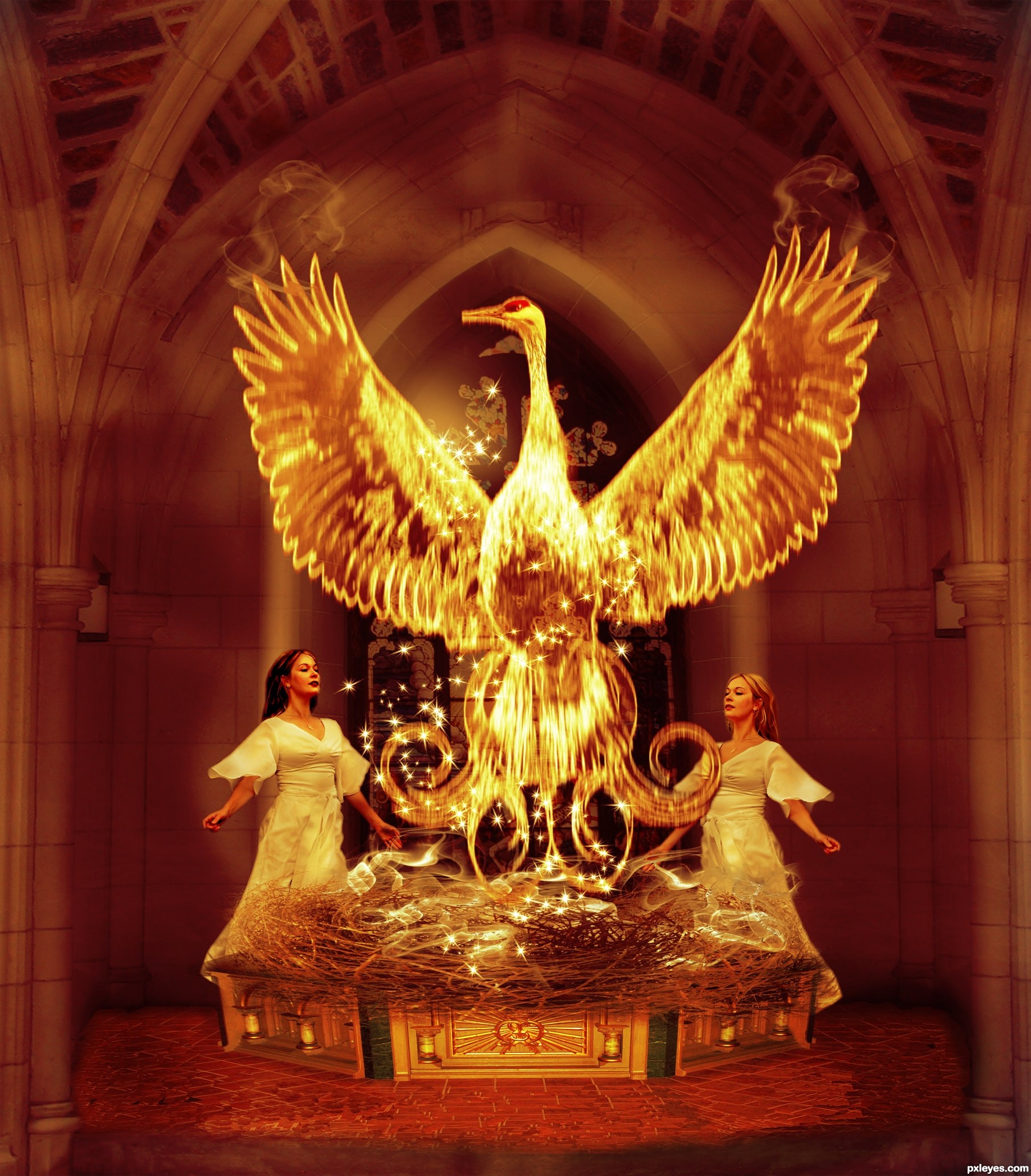
You have made a very complex image here and I see what you are trying to achieve.
IMO there are a few things that need to be corrected if you have the time.
The masking/cutout of the lady on the left could use some refining (if you can try using layer mask they can help refine the cut). The floor is a little too Cloned looking, you could try to use the cut and paste-over in small section, then position the bricks so they line up (which takes a fair bit of time) or try to get a full brick floor. The base could use a bit of perspective fixing ... the sides are slopping out a bit too much, I would say the upper-far corners could be moved in toward the center of the image a bit (using the Transform tool and hold down the Ctrl key to Free Transform individual corners). You can also see through the left hand side of the base at the back just in front of the lady (a quick way to fix this is just to duplicate the layer until it becomes solid and then merge the layers together). I know this is a lot but your idea is very nice and I believe you are headed in the right direction. If you have any questions just PM me 
THanks VERY VERY MUCH !!! it is through this type of feed back one can grow . I wont have time to fix.  but i will take on board your tips for next time...
Howdie stranger!
If you want to rate this picture or participate in this contest, just:
LOGIN HERE or REGISTER FOR FREE
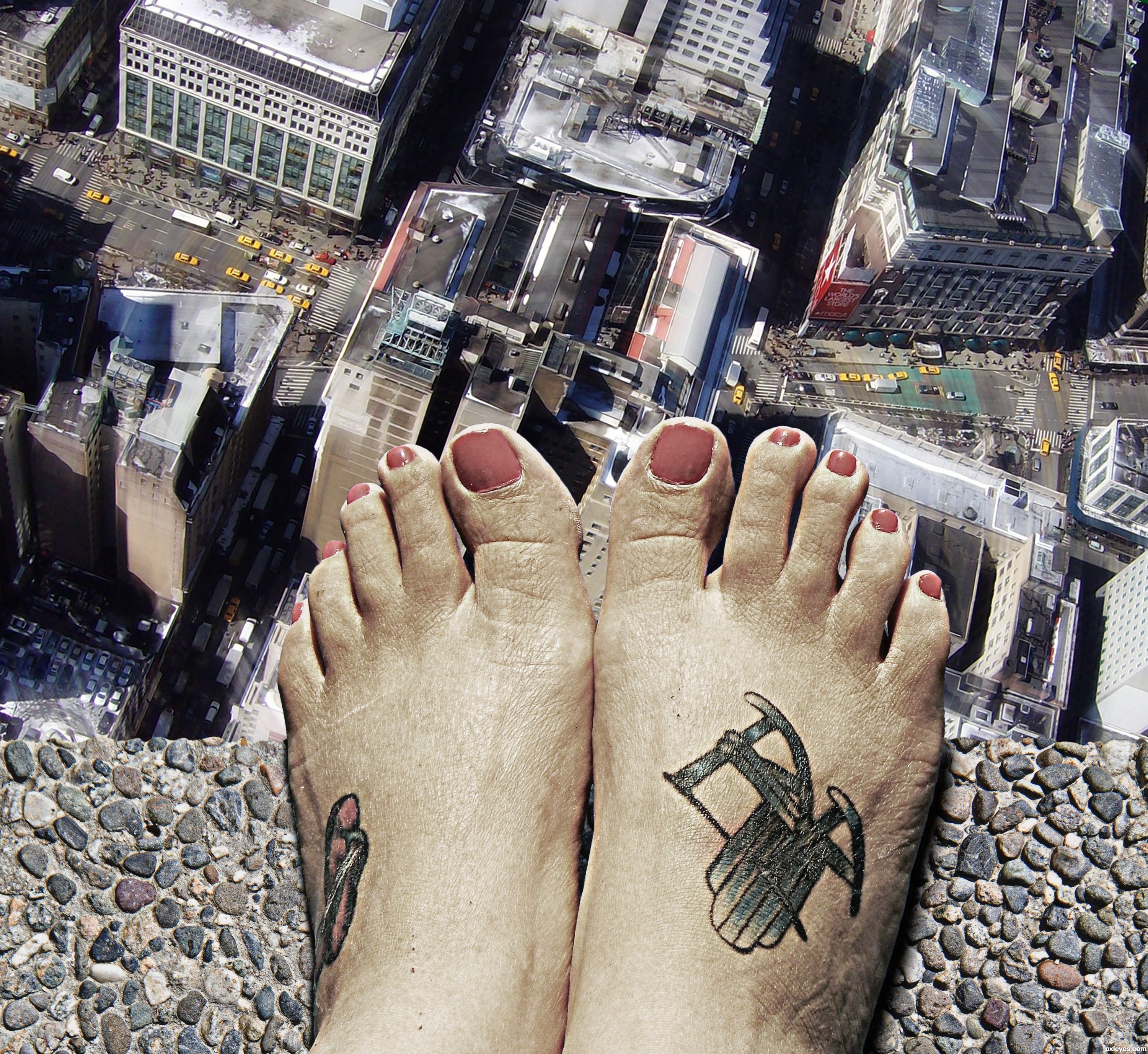
thanks to:
nevinstyre: concrete
hbrinkman: new york (5 years and 2873 days ago)
Very cool!
Oh... Don't jump! Nice.... GL
believable!
Congrats!!
congrats, good work
Thank you all
Congrats!
Howdie stranger!
If you want to rate this picture or participate in this contest, just:
LOGIN HERE or REGISTER FOR FREE
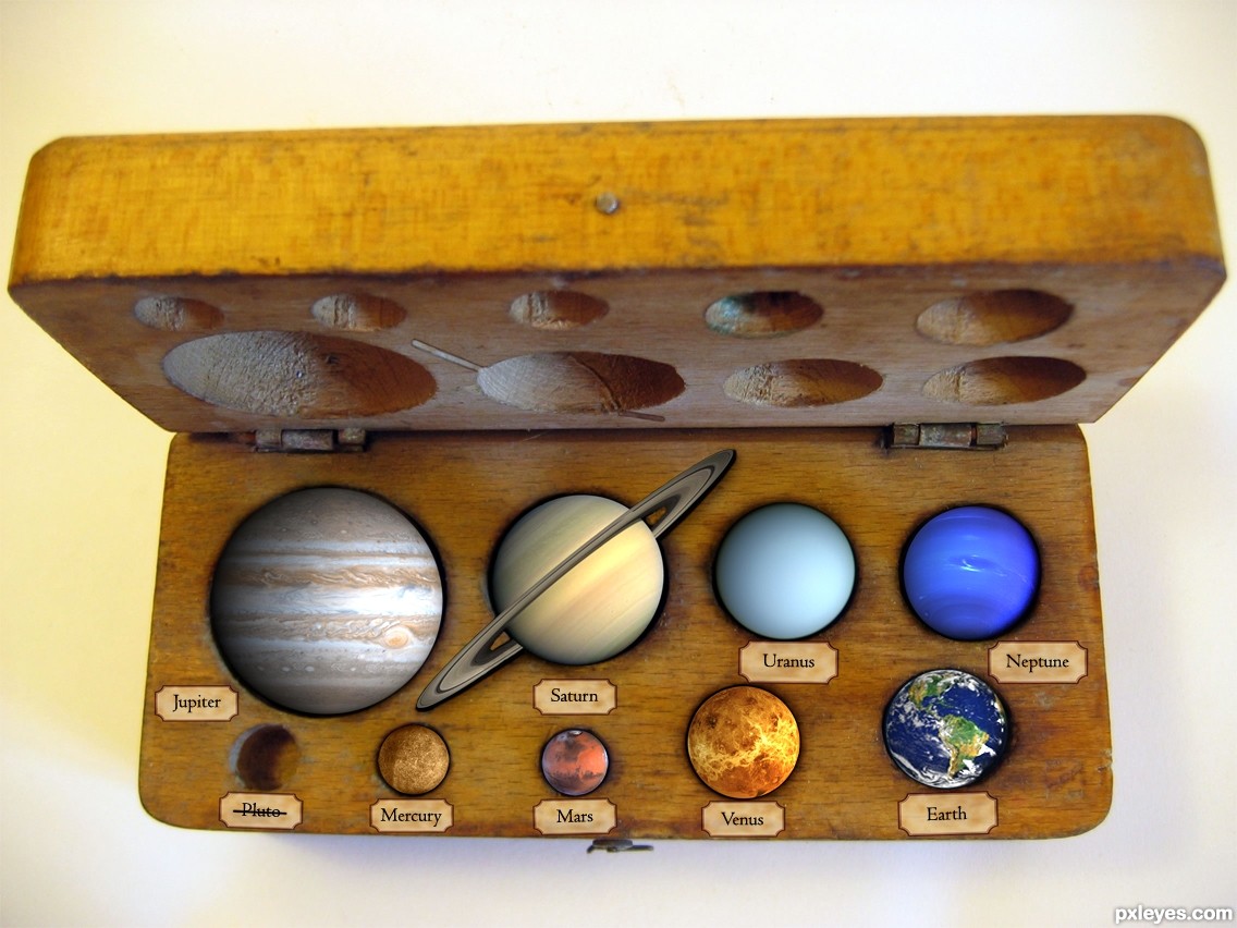
A little piece of my childhood died making this, 9 just seemed like a perfect number. Now the rhyme is "My Very Easy Method Just Speeds Up Naming". Naming what?
The idea I had was this to be a high school scientific resource from the 50s/60s, now updated to remove Pluto
Anyway, made with copying, resizing, burning, bluring, cloning. The usual suspects, nothing fancy.
Edit: I cleaned it up a little and removed the text as I felt the Pluto message to be stronger this way. (5 years and 3129 days ago)
like ur concept....
gud job 
Clever and amusing. The planets need more shading to appear less flat and more like 'marbles' in the box. The back half of Saturn's rings should be inside the box bottom. (I like the slits in the box cover for the front half of the rings.) The labeling on the cover side is extremely bland [euphemism for 'boring']. Something shorter like "The Planets in a Box" spread across the entire front in colored, kid-friendly type would be more appealing.
LOVE IT! Especially the crossed out "Pluto."
Simply Excellent. I hope you win with this one!
Great work author.
My only suggestion would be that Uranus has rings too.
Pluto should still be a planet IMO
Love it! Did you consider taking the balck out from the centre of Saturn's ring? s oyou could see the box behind it instead of space?
it is very nice and new good luck
Edited a little (hope thats okay!), thanks everybody for your crits and comments. I need to work on my ability to shade.
itgik, I hated Uranus for having rings after I did Saturn, but they are comparitivly mild so I decided not to include them . I agree with Pluto, keeping it for old times sake, but damn I didn't know how many other Pluto sized objects there are: http://en.wikipedia.org/wiki/File:EightTNOs.png
nice idea and good chop Author I want one.
Nice 1! GL!
Great concept author...And i like Pluto idea so much...LOL...best of luck
Very clever and original ... Poor Pluto!
Howdie stranger!
If you want to rate this picture or participate in this contest, just:
LOGIN HERE or REGISTER FOR FREE
Photography and photoshop contests
We are a community of people with
a passion for photography, graphics and art in general.
Every day new photoshop
and photography contests are posted to compete in. We also have one weekly drawing contest
and one weekly 3D contest!
Participation is 100% free!
Just
register and get
started!
Good luck!
© 2015 Pxleyes.com. All rights reserved.


nice bit of work on the chair and the lighting -- may could do without the writing but that is just my opinion
Thanks for the favorable judgment. The writing I wanted to do her/it on the sand but I didn't like however I wanted to leave her/it so I have transformed her and put on the clouds.
Howdie stranger!
If you want to rate this picture or participate in this contest, just:
LOGIN HERE or REGISTER FOR FREE