Photoshop Pictures: City (page 14)


results 66 - 70 of 110

Heaven City - created by genuine2009


Heaven City
Favs: 11SBS: 6Hi-resRank: 2/13Score: 62.1% (36)37827 views

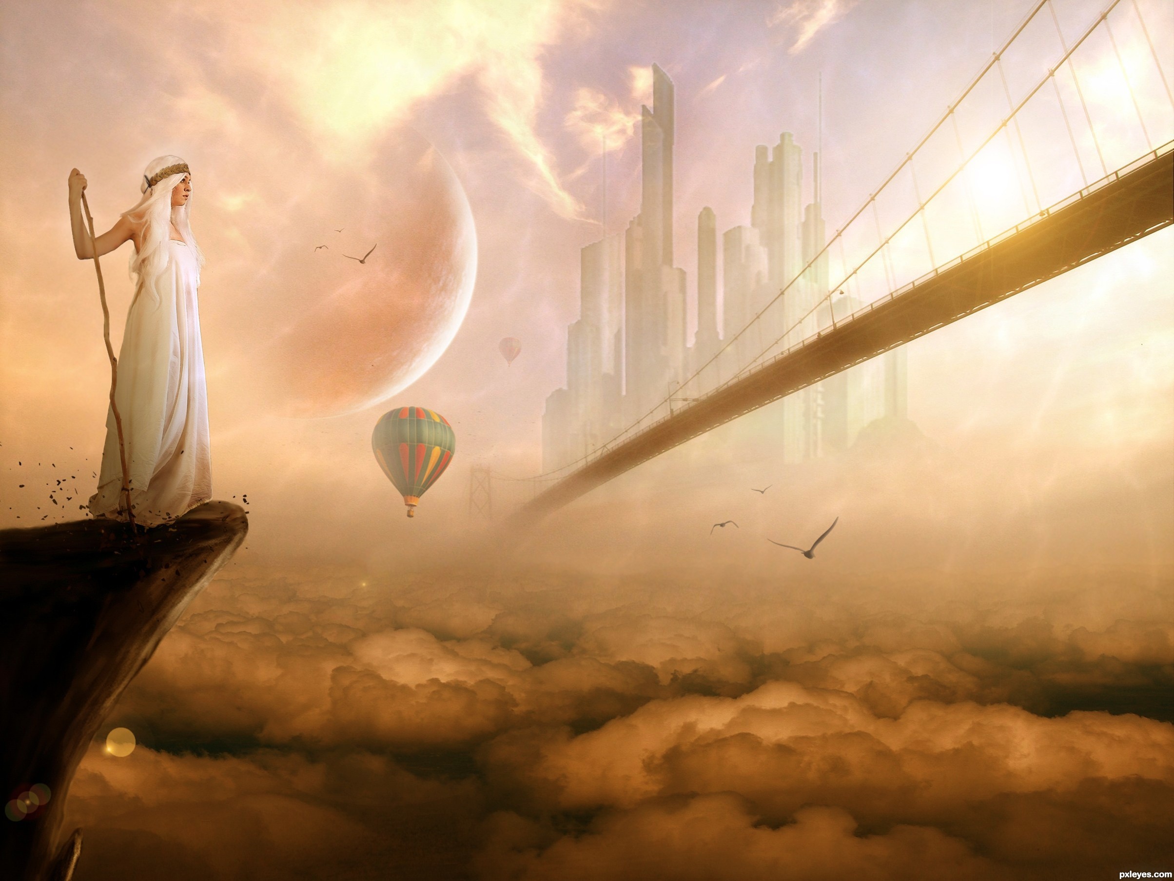
Thanks to "faestock" for source 1
Thanks to "dudquitter" for source 2
Thanks to "thelastminuter" for source 3
Thanks to "michellelove39" for source 4
Thanks to "lautner-lover" for source 5
Thanks to "Liquos" for source 6 (5 years and 3179 days ago)

6 Sources:

avatar Chalty669
Chalty669 says:

superb job, especially like the detailed shattered rocks. Good luck!

avatar skeletor
skeletor says:

Very nice scene, good job!.... . would try to get rid of the thin black outline on the model in some areas (particularly her arm), IMO... GL!

avatar gamemastertips

BEAUTIFUL!! Very well thought and executed.

avatar spaceranger

Really good ethereal quality nicely done!

avatar jack2
jack2 says:

nice

avatar wazowski
wazowski says:

Looks quite ok. I'd make the birds a bit softer (blurry edges), so they fit more in the image. Right now imo they dont seem to be part of your heaven. Good luck!

Edit: good improvement

avatar langstrum
langstrum says:

I do agree with above comments . You could erase more on top of her hair and around some buildings, the dark stroke on her hair is still visible and the white halo around the building can be seen in the Hi-Res. Also, making some painted hair on her should be nice . It is the best so far, good luck!

avatar erikuri
erikuri says:

Very beautiful... Nice compo.

avatar hereisanoop

Very welldone..... realy heavon fealing

avatar silencer32

a modern heaven...cool

author says:

thx for your comm an sugestions!!!!!!!!! ......i'll try to fix/solve all the problems here!

avatar swordfish
swordfish says:

wonderful ...............

avatar Nickk
Nickk says:

Very VERY cool work Like it very much

avatar elficho
elficho says:

awesome! the only thing i'd suggest is to fix the patterns. The birds in both flocks are positioned the same. minor nitpick.

avatar neeraj55
neeraj55 says:

nice work !

avatar erathion
erathion says:

Great job author...well done..u could erase traces of the lens flare in lower left corner...best of luck

avatar RickLaMesa

nice one...top3 easily

avatar shaadow
shaadow says:

wonderful image

avatar cabldawg71

Yea another fine chop Author. Top 3 I agree with Rick

avatar EmiK
EmiK says:

Super depth here, lovely colors, it creates really nice mood here.

avatar CorneliaMladenova

Fabulous!

avatar dustfinger

Good composition, well blended. Good job!

avatar jaskier
jaskier says:

Super.

avatar Tuckinator

incredible work!

author says:

thx all....for your comm..and fav......!!!!

avatar nasirkhan
nasirkhan says:

Congrats!

avatar erikuri
erikuri says:

Congrats!

avatar hereisanoop

congrats

avatar swordfish
swordfish says:

congrats ..........

avatar erathion
erathion says:

Congrats...

avatar langstrum
langstrum says:

Congrats buddy

author says:

thx........youuuuuuuuuuuuuuu..alllllllll........!!!!

avatar artgirl1935

Congratulations!! This is closest to my vision of heaven than any ot the others. Peace, peace, peace. Beautiful!

avatar neeraj55
neeraj55 says:

Congratulations!!

avatar spaceranger

Congrats!!

Howdie stranger!
If you want to rate this picture or participate in this contest, just:

LOGIN HERE or REGISTER FOR FREE


the lost city - created by jack2


the lost city
Favs: 0SBS: n/aHi-resRank: 13/13Score: 51.3% (0)4906 views

(5 years and 3180 days ago)

6 Sources:

avatar silencer32

nice

avatar neeraj55
neeraj55 says:

great idea ! g l

avatar erikuri
erikuri says:

Lake is too much placid for two waterfalls; water needs to be more turbulent. Other than that it's an interesting image.

author says:

yes i thing about that butt this image is the best i find whit the right engle

Howdie stranger!
If you want to rate this picture or participate in this contest, just:

LOGIN HERE or REGISTER FOR FREE


Old Days City - created by silencer32


Old Days City
Favs: 0SBS: n/aHi-resRank: 13/13Score: 51.4% (0)5480 views

(5 years and 3189 days ago)

2 Sources:

avatar Tuckinator

nice idea!

avatar CMYK46
CMYK46 says:

Shadow needs to move left and touch the rear wheel. If you made a SBS this would be better.

avatar erikuri
erikuri says:

I suggest you besides moving the shadow to the left, make it darker, as the shadow on the wall, and make the sky lighter.

avatar elficho
elficho says:

the shadow looks more like a reflection.

Howdie stranger!
If you want to rate this picture or participate in this contest, just:

LOGIN HERE or REGISTER FOR FREE


The night sky - created by Nickk


The night sky
Favs: 0SBS: 6Hi-resRank: 11/13Score: 50.7% (0)7712 views

Title says all you need to know about the picture.

Everybody succes with this contest!

(Please say if you think there should be improvements or adjustmends!) (5 years and 3192 days ago)

3 Sources:

avatar Tuckinator

IMO it would look better if it was more black than blue just turn it black and white or something

author says:

yeah you are probably right, but since the planet at the skyline is blue it gives a blue light to this planet. Like the moon gives a white light on our planet at night. I also think the blue light gives a bit a surrealistic look and I really like that !
But thanks for the comment !!!

avatar CMYK46
CMYK46 says:

Good image...I like your approach to things.

Howdie stranger!
If you want to rate this picture or participate in this contest, just:

LOGIN HERE or REGISTER FOR FREE


Building The City - created by oasisman


Building The City
Favs: 1SBS: n/aHi-resRank: 5/13Score: 55% (15)10900 views

Comments welcome - Still learning this photoshop... (5 years and 3192 days ago)

2 Sources:

avatar Tuckinator

nice one

avatar erikuri
erikuri says:

Nice composition. But I don't know, I feel that hook's perspective is a bit odd comparing to the bars... maybe a slight adjust can solve it. GL!...

author says:

@erikuri Hadn't noticed that but now you mention it ... aaaghhh lol

avatar CMYK46
CMYK46 says:

Remove the shadow from the building in background.

avatar sunzet
sunzet says:

Nice idea, I like it a lot. Agrees with CMYK, remove the shadow behind the hook, and also - motionblur the hook a little, ´cause the perspective of it makes you feel that it´s swinging towards you. GL!

author says:

Added a bit of motionblur on the hook to 'fix' the perspective issue - thanks sunzet

avatar jawshoewhah
jawshoewhah [banned] says:

This is one of the better entries! GL!

Howdie stranger!
If you want to rate this picture or participate in this contest, just:

LOGIN HERE or REGISTER FOR FREE