(5 years and 2797 days ago)
1 Source:
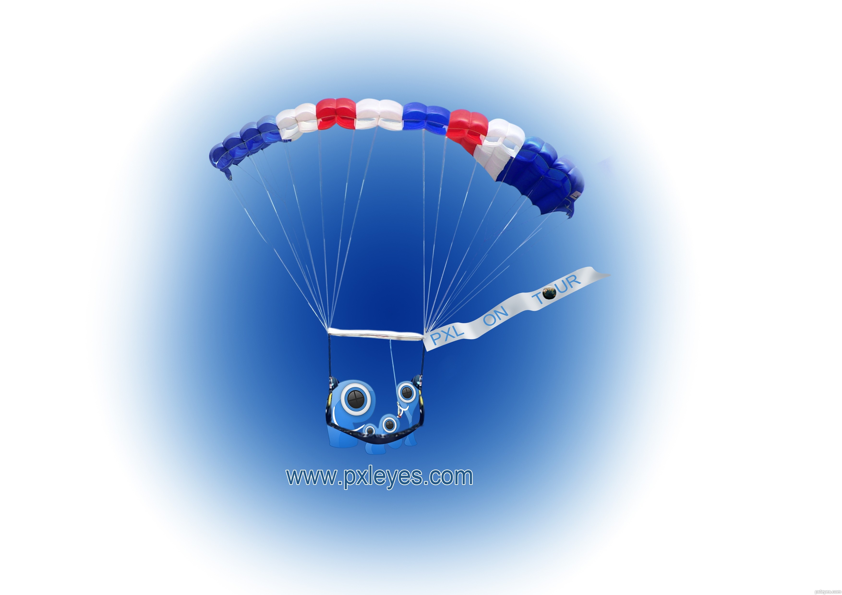
- 1: Parachute
Yippee!! World Tour!!  by iquraishi 13175 views - final score: 67.5% | Around the World in 365 Days  by Majkman 11550 views - final score: 67% | On Tour  by Hayato 12544 views - final score: 64.3% |
PXL World Tour  by lchappell 9271 views - final score: 62.9% | Around the world in an year!  by iquraishi 9581 views - final score: 62.2% | on tour  by kushpatel 3185 views - final score: 62.1% |
Up up and away  by Milena 8923 views - final score: 61.6% | Around the world  by robvdn 5424 views - final score: 60.9% | On Tour  by robvdn 3648 views - final score: 60.8% |
PXLeyes On Tour  by solkee 4569 views - final score: 60.4% | Pxl On Tour  by jordyponce 5931 views - final score: 60.3% | ...simple T  by Drivenslush 3210 views - final score: 60.2% |
Aliquam in PXL  by lchappell 4764 views - final score: 59.7% | Luckiest person in the world  by steelclaw 7546 views - final score: 59.3% | we are family  by kushpatel 5493 views - final score: 59% |
simple  by kushpatel 4007 views - final score: 58.2% | world tour..  by mounirupa 5652 views - final score: 57.4% | PXL On tour  by mounirupa 5529 views - final score: 57% |
Pxleyes.com World Tour  by Chuck 6098 views - final score: 55% | Join Us On Our World Tour 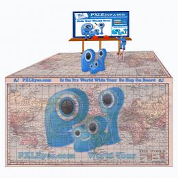 by Chuck 7936 views - final score: 54.2% | traveling SHIRT  by scratzilla1 5748 views - final score: 53% |
The Great World Wide Tour  by Chuck 7409 views - final score: 52.9% |
Howdie Guest!
You need to be logged in to rate this entry and participate in the contests!
LOGIN HERE or REGISTER FOR FREE
Photography and photoshop contests
We are a community of people with
a passion for photography, graphics and art in general.
Every day new photoshop
and photography contests are posted to compete in. We also have one weekly drawing contest
and one weekly 3D contest!
Participation is 100% free!
Just
register and get
started!
Good luck!
© 2015 Pxleyes.com. All rights reserved.


simple and powerful ................ it needs just the website URL .......www.pxleyes.com
oh....... sry i forgotted..
thank u...
very cute one, i giggled when i saw this... nice job
The blue spot behind the logo makes it hard to see the Pxl letters, which already have the black edge cutting off part of them. I'd make it much lighter so that the logo has a better contrast.
lovely work author good luck
cool idea
From a distance, this just doesn't really do much for the eye. The website address is overwhelmed by everything else going on, it's just too small and indistinct. It would have been better in solid black than lightly outlined blue. It's an original idea, but not strong enough visually.
Howdie stranger!
If you want to rate this picture or participate in this contest, just:
LOGIN HERE or REGISTER FOR FREE