TUTORIAL USED
http://psd.tutsplus.com/tutorials/drawing/create-flowerpot-photoshop/
All CS5 (5 years and 3460 days ago)
Photo Manga  by MossyB 19328 views - final score: 60.8% | Vector-Style Woman Composition  by CorneliaMladenova 21592 views - final score: 59% | My Little Green Apple  by EmiK 46566 views - final score: 58.7% |
PopArt 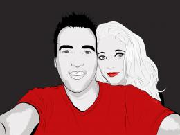 by Floortje1973 25763 views - final score: 57.8% | TuT  by RIPSAW 11889 views - final score: 57.8% | tea time  by steed 10198 views - final score: 57.3% |
The Greenhouse Effect  by blueorchid2011 15752 views - final score: 57% | Pie chart photo manipulation 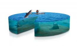 by ibmaxed 15036 views - final score: 56.7% | 3D Glass Icon by CorneliaMladenova 9027 views - final score: 56.1% |
Exploding Moon 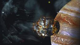 by lchappell 8758 views - final score: 55.5% | Mysterious night... 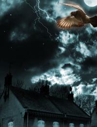 by nishagandhi 7022 views - final score: 54.9% | Little Pink Flowers  by lchappell 7015 views - final score: 54.8% |
FIRST!!!!  by Dragoncide 7942 views - final score: 54.4% | Interweaving Photo Strips 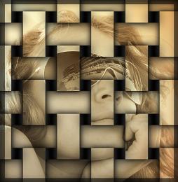 by DYNOSSAURUS 17003 views - final score: 54.2% | Sketch ME 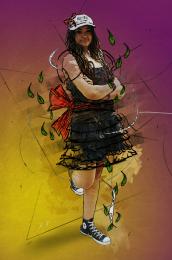 by duma8821 6997 views - final score: 54% |
Sarchophagus. 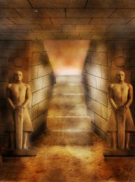 by Lamantine 5198 views - final score: 54% | Just out from the tricky holes  by Augustinaart 10769 views - final score: 53.6% | Heart Bokeh  by swan10 14156 views - final score: 53.6% |
water boy 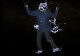 by kathyw 8049 views - final score: 53.3% | Old Man  by vwluvrs 10854 views - final score: 49.2% |
Howdie Guest!
You need to be logged in to rate this entry and participate in the contests!
LOGIN HERE or REGISTER FOR FREE
Photography and photoshop contests
We are a community of people with
a passion for photography, graphics and art in general.
Every day new photoshop
and photography contests are posted to compete in. We also have one weekly drawing contest
and one weekly 3D contest!
Participation is 100% free!
Just
register and get
started!
Good luck!
© 2015 Pxleyes.com. All rights reserved.


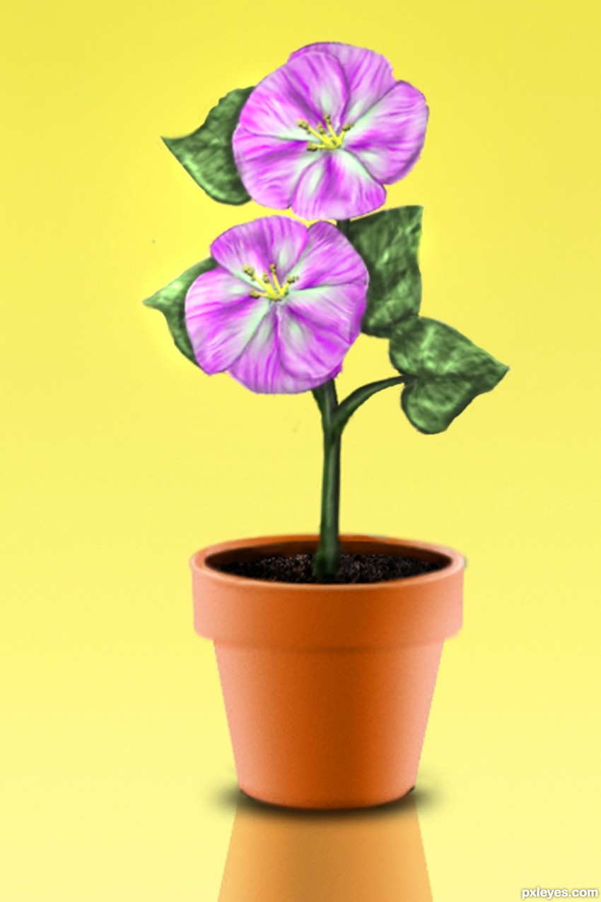
The flowerpot looks very realistic! Good job.
Nice job, author. Everything looks a bit fuzzy or soft.
it looks so real!! great job!!
Lovely work and I agree ... looks like you could reach out and touch it!
The pot looks gorgeous, well done
-there are some masking problems where the stem meets the earth.
- you could have used a lower saturation for the background to make it a bit more neutral.
- dodge/burn tools should have been on a lower oppacity for less contrast on the leaves and petals.
People use clipping layers of black& white with lower opacity to make shades & lights, cause it's difficult to redo the dodge/burn, but you can always erase & adjust a clipping layer.
It's a good start, anyways.
greymval thanks for the input....I have been at this a while, it is the way I want it to look though.
Nice work! I would have loved to see more detail in the leafs, but overall I think you did a stunning job.. Great work author and GL!
very cute
Really precise work!
Fantastic work author...well done
Howdie stranger!
If you want to rate this picture or participate in this contest, just:
LOGIN HERE or REGISTER FOR FREE