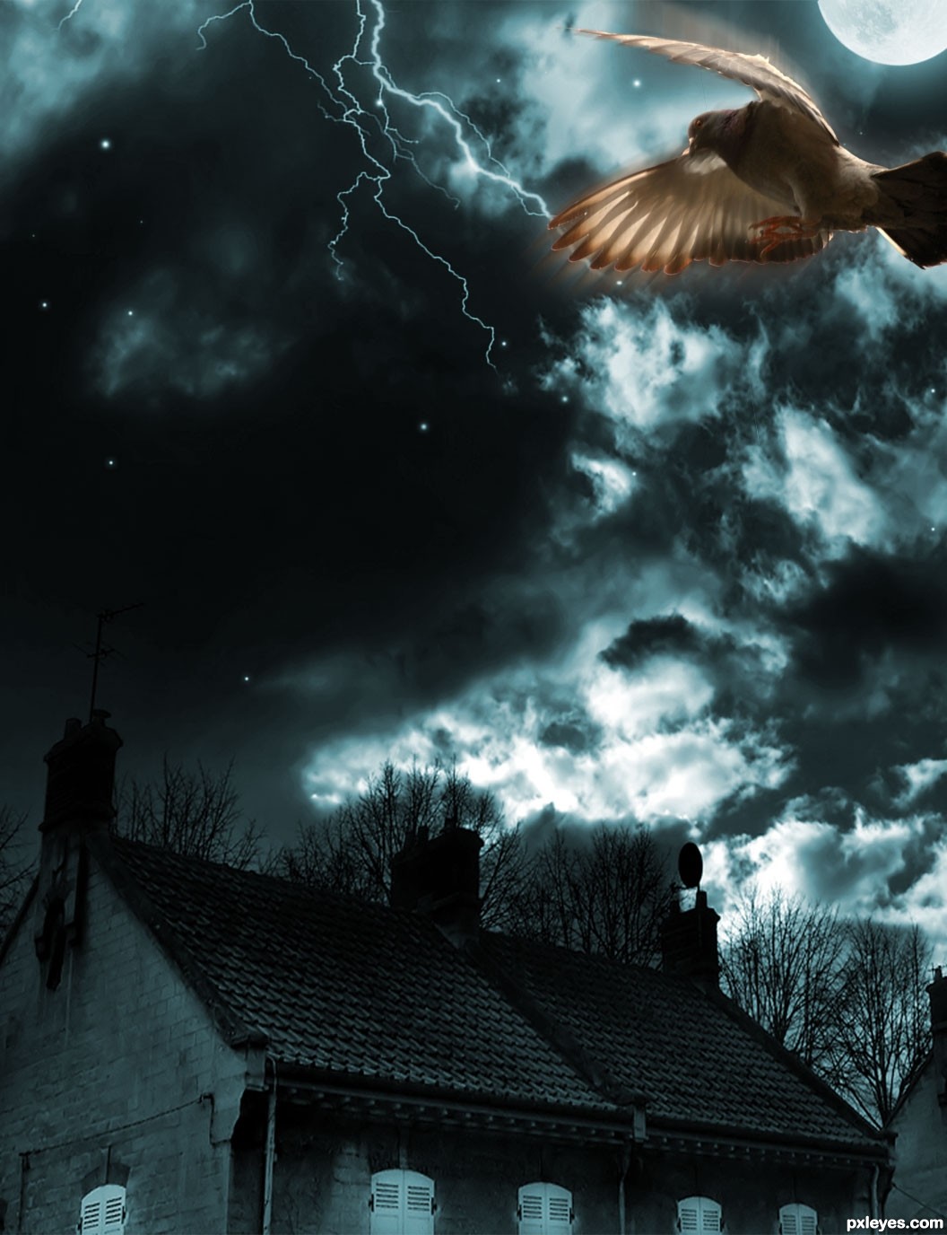
http://madyiordache.com/blog/2010/01/moon-flight-create-a-ghostly-effect-in-photoshop/
thanks to this tutorial
i had added the bird also from the tutorial link... (5 years and 3440 days ago)
Photo Manga 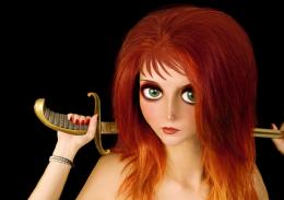 by MossyB 19251 views - final score: 60.8% | Vector-Style Woman Composition 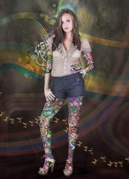 by CorneliaMladenova 21532 views - final score: 59% | My Little Green Apple 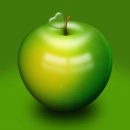 by EmiK 46513 views - final score: 58.7% |
PopArt  by Floortje1973 25681 views - final score: 57.8% | TuT  by RIPSAW 11864 views - final score: 57.8% | tea time  by steed 10154 views - final score: 57.3% |
The Greenhouse Effect  by blueorchid2011 15664 views - final score: 57% | Pie chart photo manipulation 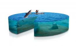 by ibmaxed 14992 views - final score: 56.7% | 3D Glass Icon by CorneliaMladenova 8988 views - final score: 56.1% |
Exploding Moon 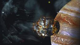 by lchappell 8729 views - final score: 55.5% | Mysterious night... 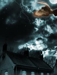 by nishagandhi 6991 views - final score: 54.9% | Little Pink Flowers  by lchappell 6986 views - final score: 54.8% |
FIRST!!!!  by Dragoncide 7917 views - final score: 54.4% | Interweaving Photo Strips 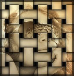 by DYNOSSAURUS 16903 views - final score: 54.2% | Sketch ME  by duma8821 6953 views - final score: 54% |
Sarchophagus. 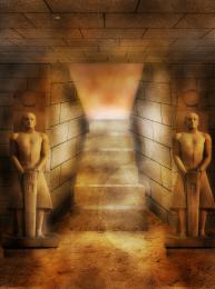 by Lamantine 5181 views - final score: 54% | Just out from the tricky holes  by Augustinaart 10701 views - final score: 53.6% | Heart Bokeh  by swan10 14123 views - final score: 53.6% |
water boy 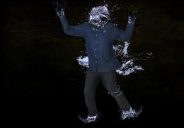 by kathyw 8006 views - final score: 53.3% | Old Man 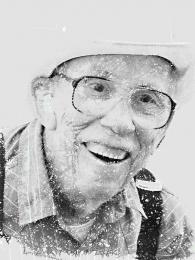 by vwluvrs 10831 views - final score: 49.2% |
Howdie Guest!
You need to be logged in to rate this entry and participate in the contests!
LOGIN HERE or REGISTER FOR FREE
Photography and photoshop contests
We are a community of people with
a passion for photography, graphics and art in general.
Every day new photoshop
and photography contests are posted to compete in. We also have one weekly drawing contest
and one weekly 3D contest!
Participation is 100% free!
Just
register and get
started!
Good luck!
© 2015 Pxleyes.com. All rights reserved.


wow cool
In her tutorial, madalina had some compositional tricks that she did not explain:

- those branches, create some sort of dynamic frame;
-the moon covered by the wing is the first checkpoint- it's not random that you find it in the lower 3rd of the image.
-pigeon has orange, to make a chromatic contrast, etc,etc.
The right half of your image is unatractive- compositionaly speaking, therefor i think that if you would crop it in half and keep only the left side, i would look so much cool.
Rotate that lightning strike 45 degrees.
You could also add a bit of orange on the pigeon.
Try it, and if it doesn't look better, never listen to me again
agrees with grey
thank you Greymval....made changes...thank you
It looks beautiful.
The image looks badly composed, although it has improved by adding color to the bird.
When you adapted the tutorial to include the house, you changed the overall composition.
The branches in the tutorial "framed" the focal point (the colored bird). Your house, with parts of another house on the side, throw the focus off the bird, and visually "weigh down" the image at the bottom. I would suggest eliminating the house(s) entirely.
thanks Mossy...this is my very old work done in 2009 ... thanks for ur comments.. i have the other version too with the same background also...i thought it would be too similar....i will add it in my sbs..
I have made changes again....thanks for the suggestions all...and thanks to locale for his suggestions on my entry..
very nice
Ooooo, great improvement The bird resembles a little bad angel
Very nice piece author...gl
Howdie stranger!
If you want to rate this picture or participate in this contest, just:
LOGIN HERE or REGISTER FOR FREE