(5 years and 3743 days ago)
5 Sources:
- 1: sail ships
- 2: Mark Sardella
- 3: kanjiroushi
- 4: Jay C Dubbya
- 5: leboef
(5 years and 3743 days ago)
Fighting  by nasirkhan 18055 views - final score: 68.9% | Air Ship  by RAZ0R 11100 views - final score: 62.1% | Altgard  by Akassa 13416 views - final score: 62% |
Impetusium  by Missy 11107 views - final score: 61.5% | Aion Fantasy  by nasirkhan 13668 views - final score: 60.3% | phantasm  by spygirl1978 4883 views - final score: 60.1% |
Aion Angel  by genuine2009 6751 views - final score: 59.6% | Winter  by chakra1985 4250 views - final score: 58.2% | Arcane Warrior  by pearlie 5852 views - final score: 57.2% |
Cloud City 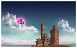 by lchappell 6267 views - final score: 56.8% | Brothers In Arms  by lchappell 4887 views - final score: 54.7% | Lightning Battle  by k5683 6590 views - final score: 54.5% |
The Core Abyss  by lchappell 6483 views - final score: 54.3% | Soldier  by nasirkhan 4289 views - final score: 53.9% |
Howdie Guest!
You need to be logged in to rate this entry and participate in the contests!
LOGIN HERE or REGISTER FOR FREE
Photography and photoshop contests
We are a community of people with
a passion for photography, graphics and art in general.
Every day new photoshop
and photography contests are posted to compete in. We also have one weekly drawing contest
and one weekly 3D contest!
Participation is 100% free!
Just
register and get
started!
Good luck!
© 2015 Pxleyes.com. All rights reserved.


GOOD !
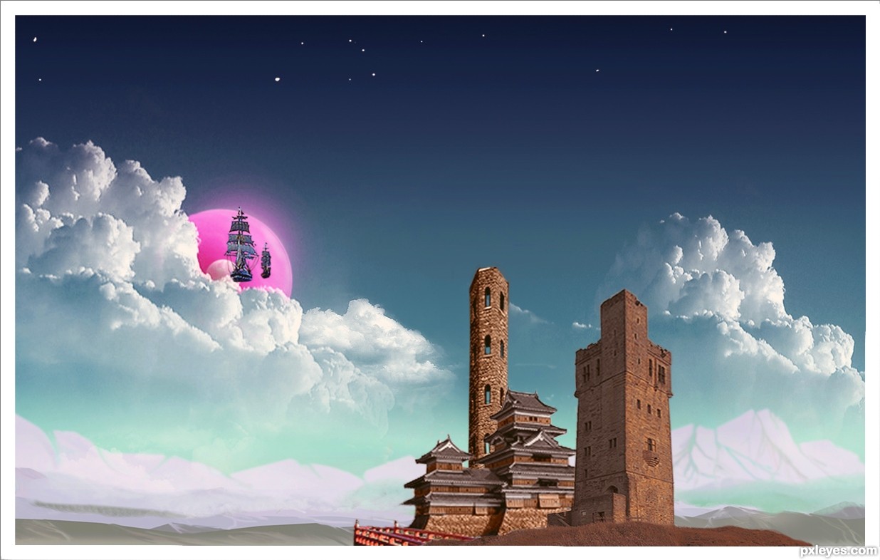
The towers look like they're falling backwards. The tall, skinny one apparently has no back wall as the sky can be seen through the windows. Moving the foreground structures away from the center and towards the right a little per the Rule of Thirds might improve the composition.
Nice effort.good luck .
.
I really like this! Wonderful mood and feeling of space! (sorry...really... no pun intended this time...) DanLundberg has a point about composition but I would only move the buildings so the tower isn't dead center, the pxleyes logo is very intrusive and does have an effect on the image.
I love it!
Looks just right to me now, nice subtle change, sweet... one of your best IMHO!
me likey the clouds
The only thing I complain now is the Hi-Res is quite pixelated. I really like the color distribution and the composition with an Asian mood, especially the purple planet (or sun, or whatever) attracted my eyes at first sight. With some decorations, it can be used as the game poster . Good luck!
great work ! good luck
I like the better image balance and the uniform lean/lens distortion among all three structures.
great job
beautiful
what a concept - a city in the clouds, very fantasy-like, and love that "bubblegum" planet. nice blend of building styles, too.

lol
Howdie stranger!
If you want to rate this picture or participate in this contest, just:
LOGIN HERE or REGISTER FOR FREE