
me likey Ps!
Special thanks to naraosga from sxc for use of their photo! (5 years and 3816 days ago)
1 Source:
Tall Green Tip Monkey  by Drivenslush 22812 views - final score: 60.3% | City lights 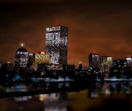 by buzzy 19779 views - final score: 59.8% | Sequinfalls 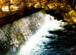 by bjaockx 31082 views - final score: 58.6% |
Sequin Sumo  by Drivenslush 21737 views - final score: 58.5% | temple of death  by weso 19666 views - final score: 58% | paradise 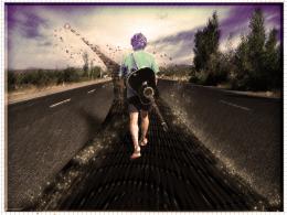 by basem11361 4340 views - final score: 57.1% |
Public Art  by Drivenslush 6497 views - final score: 56.8% | Cube top 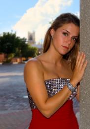 by enty 4738 views - final score: 55.7% | They're nearby  by Akassa 5059 views - final score: 55.3% |
DISCO MAN  by lolu 7580 views - final score: 55.1% | Disco Ball  by Goberphoto 8076 views - final score: 54.9% | Dancer 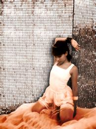 by bjaockx 4926 views - final score: 54.7% |
Dancer 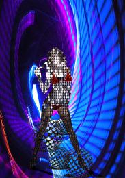 by weso 4206 views - final score: 54.6% | Scales  by bjaockx 5207 views - final score: 54.3% | Sequin model  by Lamantine 6758 views - final score: 53.3% |
Disco 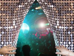 by erikuri 5748 views - final score: 53.1% | Pxl eyes  by vinji 4906 views - final score: 51.7% | The Other Side  by DigitalPro 4614 views - final score: 50.9% |
Pacman =D  by kevinice95 13924 views - final score: 49.3% | Going Home  by DaniCMe 4827 views - final score: 48.6% | PXLEyes Squins  by Chuck 4560 views - final score: 47.1% |
Earth  by DaniCMe 5896 views - final score: 46.5% | Itsy Bitsy Spider  by Chuck 5681 views - final score: 46.2% | sexy 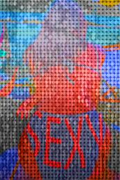 by basem11361 4464 views - final score: 45.5% |
Dog Sequins  by Chuck 5142 views - final score: 44.8% |
Howdie Guest!
You need to be logged in to rate this entry and participate in the contests!
LOGIN HERE or REGISTER FOR FREE
Photography and photoshop contests
We are a community of people with
a passion for photography, graphics and art in general.
Every day new photoshop
and photography contests are posted to compete in. We also have one weekly drawing contest
and one weekly 3D contest!
Participation is 100% free!
Just
register and get
started!
Good luck!
© 2015 Pxleyes.com. All rights reserved.


White areas are pretty blown out compared to the source pic, but not bad...
You've got a corner that seems to just disappear behind her arm, rather than being a visible edge. Do you see what I mean? I'll hold my vote.
Nice...
Thanks guys, some adjustments made per suggestions in comments! jaw, hope that is what you spoke of... CMYK tried to blowout the wall some more without losing too much detail...
That's exactly what I was referring to. Much better!!! The ONLY other nitpick I have that I didn't notice until now is see how there's repetitive sequins on the left? Probably where you connected the source to make it into a wall? (see the 8 dark sequins that look like they're in a pattern?) I would try and blend those a little better. It would look more natural that way. The corner looks good though. You should do well. GL!
Author, I was referring to the lost detail on the white areas of the dancer.
ahhh i see. i dind't think of that cuz i was going for a blown out over exposed feel to it.... thought i had maybe missed the mark on the bg though.... thank you sir!
Good one....
Howdie stranger!
If you want to rate this picture or participate in this contest, just:
LOGIN HERE or REGISTER FOR FREE