
Originally I changed the spots on ladybugs, but eventually decided to leave them like they are.
Hope you like. =) (5 years and 3866 days ago)
In Bugland 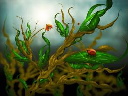 by jaskier 12555 views - final score: 64.3% | Genesis 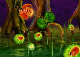 by marina08 12930 views - final score: 63.5% | leaves world 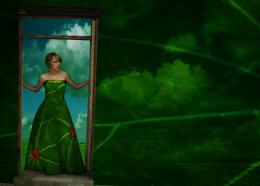 by mariosilva 18124 views - final score: 61.9% |
A Close Look 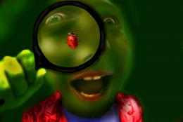 by donh 12175 views - final score: 58% | Get Off  by darkshellie23 12678 views - final score: 58% | Look out!  by divair 4421 views - final score: 57.4% |
Be a character, not a type  by wlado 10446 views - final score: 55.9% | Harmony  by ponti55 4308 views - final score: 55.4% | Ladybug Spider 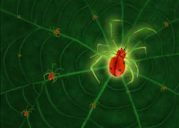 by darkshellie23 8854 views - final score: 55% |
Rainbow Bugs  by divair 17909 views - final score: 54.4% | shoot 'em all  by smalapatekut 12574 views - final score: 54.3% | Lady Bug  by siderismaris 5900 views - final score: 54.1% |
Ladybug on the leaves  by Goberphoto 9183 views - final score: 54.1% | ...come here, my lady! 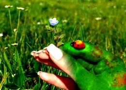 by kitty 6237 views - final score: 53.6% | ladyfrog 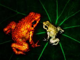 by PondMaster 5670 views - final score: 53.2% |
Lady Beetle 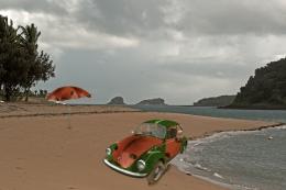 by erathion 9758 views - final score: 52.8% | Robobug 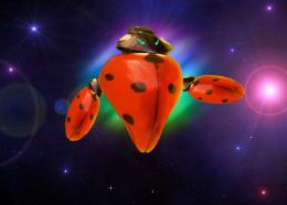 by suhybov 4744 views - final score: 52.3% | From the Garbage  by vinshine 8108 views - final score: 50.7% |
Ladybug  by Clinge 8542 views - final score: 49.6% | Golden ring  by Artemis 10832 views - final score: 48.3% | Bug of destruction  by Andersk 8215 views - final score: 45.1% |
Worm hole  by PhotoRepair 7714 views - final score: 44.4% |
Howdie Guest!
You need to be logged in to rate this entry and participate in the contests!
LOGIN HERE or REGISTER FOR FREE
Very nice idea, i like the difference in size and orientation. Great job!
Thanks! =)
Maybe give it more light, the vignette makes it very dark...
Nah, when I brighten it it looks to contrasted, and when I remove the vignette, it looks bad... I'll brighten it just a liiiiittle bit cause you're right about it being to dark =)
EDIT: Done. did +20 to the brightness, and it looks OK to me now. =)
Nice work! But a suggestion: instead of using a new layer filled with pure black, try to use, on this new layer, a very large soft black brush with 10% opacity, applying half of its diameter, or less, around the image border until you get satisfied with the result. You can always use the eraser tool with the same settings. It'll give you more control on your work and it'll look more natural Good luck!
Thanks Divair! I'll make sure to try it out with this image and update it if needed. =)
Nice
Great message and nicely done. I like that you took the time to make them different sizes etc.
Thanks. =) I also changed the spots on each one at first, but then I decided to leave them all the same, since it kinda fits the title even better. =) Tho, maybe I should've changed the spots on the blue one....? Nah, nevermind =)
Very nice idea,lighting is very good,maybe to make upper right corner a bit lighter because is closer to the central bug then lower left,and u have the same lighting on both sides...Beside that very nice final result...good luck author
Nah, I actually like the kinda 'asymetry' of the lighting compared to the blue bug.... The bug is already in the centre of attention.
The vignette was done well and I think it puts more focus on the blue one. Well done and good luck.
Thanks. =)
Howdie stranger!
If you want to rate this picture or participate in this contest, just:
LOGIN HERE or REGISTER FOR FREE